The Start of Something Small - Character Development of The First Spryte
I wanted to submit posts about the process of creating "The Start of Something Small" at every stage creation process. I think doing so will give readers better insight into the characters and story, as well as possibly help others in their own creative process.
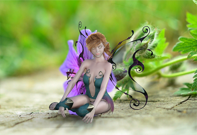
This was the first render adaptation of the original spryte I created for the first post in this series: The Start of Something Small. I added a colorful flower garden image courtesy of Pixabay, mostly because I wanted to bring their world to life, as well as illustrate how small they really are in regard to their natural surroundings. The way the plantlife turned out was probably what I'm most pleased with. The leaves on the right have the most visual emphasis, with the remainder of the background out of focus. I was trying to emphasize realism without taking focus away from the character. I think I got that right.
Another positive is how I pulled off her hovering effect. In the introduction for the first part of The Start of Something Small, I pointed out the Spryte's ability to not only fly, but levitate as well. I plan to make them doing doing it, and subsequently not doing it, a major part of the whole story, so I think I pulled this effect off pretty well.
Overall I like how her body and clothing turned out as it looks pretty real and was the look I was going for. I got the proportions just right, I think, and the detail with her feet, hands and torso turned out well. The clothes are especially good, but I will have to work hard to render them differently for the future characters as I want them to all be a tad different in some way, eg. color, fit, style.
Now for the negatives. I think it's obvious that I messed her face up pretty bad. In truthfulness, it was the part I spent the most time on and need more practice. Getting the eyes just right is an art form in itself, so I need more work there. I do like the hair throughout though.
Also, you'll notice her hands disappearing behind the boots. I fixed this in the next render by adjusting their placement.
I think the issue with her wings is that they're transparent and the busy background bled through too much, causing them to look differently than they're intended. I was able to improve their look in a later render as you'll see.
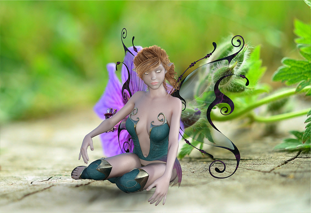
In this render, I increased the focus on the character, making her appear larger and changed the image to more Spryte and less vegetation, while still keeping it a main part of the image. I adjusted her arms to fix the issue with the hands blending with the boots by raising them and changing their rotation. I think it really increased the detail of her hands though, in a good way.
I changed the camera angle a bit as well as panning out. I think it made the character a more focused part of the image, but until I fix the obvious flaws, that may be a negative rather than a positive.
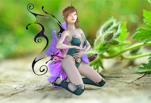
In take three, I got frustrated with how the face was going, so I changed the pose and hoped starting over would fix my mistakes so far. I'm actually pleased with the end result for the most part. The kneeling pose brought out the positives with the body and clothing, as well as make her larger in the scene.
I think the hovering effect is much better realized and looks more realistic. I think changing the pose and re-rendering had a positive affect on the plant being "in-focus" in parts from right to left, thus bringing emphasis to her. The stamen in the flower is killer as well, I like how it turned out.
A big improvement can be seen in how the wings turned out. By changing their location to have a more solid background, the render handled their detail much better. In the previous scenes, they just seemed pasted in and not part of the character. Now they look much more like they're intended to be.
Her face, her face, her face. I should be slapped for what I did to it. She really looks like she's about to hurl split pea soup like Linda Blair in The Exorcist. Today's mission is to work on nothing but faces and see if I can get it right. My mistakes here are killing the entire character.
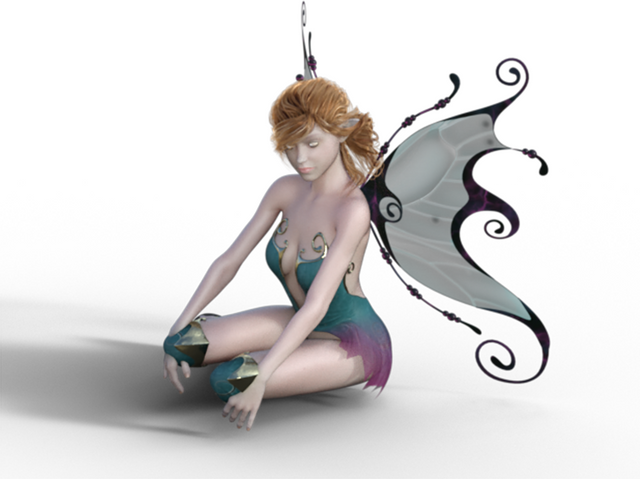
This was the original scene I used in The Start of Something Small. I have to admit it's still my favorite thus far. Transparent on the white background seems to give it a more innocent look, sort of pastel. Mistakes aren't as visible, but I think my goals with these characters are to bring them to life. An image like this will work well on a book's back cover at the bottom maybe. Which may very well happen someday. Thanks for reading :)
really good 3d modelling,keep it up.Welcome to check mine 2,https://steemit.com/travel/@dixonloveart/living-in-melbourne-a-lazy-afternoon-in-cbd
Thanks
Your spryte looks good to me. I like her clothing, and the face is not too bad.
It Looks like you like fantasy stories. I have done an ARTICLE on 'The Hobbit' by JRR Tolkien which to me is the start of fantasy fiction.
I enjoyed you post. Will follow you.
Thanks for the reply, I have enjoyed the Hobbit for a long time.
Good post!
Thank you!