Who Wants To Design The Logo For My New Charity Project On Steemit? Giving Away $150 SBD To The Winning Graphic Designer(s)
Creativity arises from our ability to see things from many different angles. - Keri Smith
I couldn't have said it any better, Keri.
The most efficient way of looking at things in a different angle is to involve others and ask them to share their perspective.
A couple of weeks ago I asked graphic designers on steemit to design a new logo for my own blog: @surfermarly. The output was amazing. Now I need your help again, but this time it's for a special cause.
Who wants to create the logo for a new charity project on steemit?
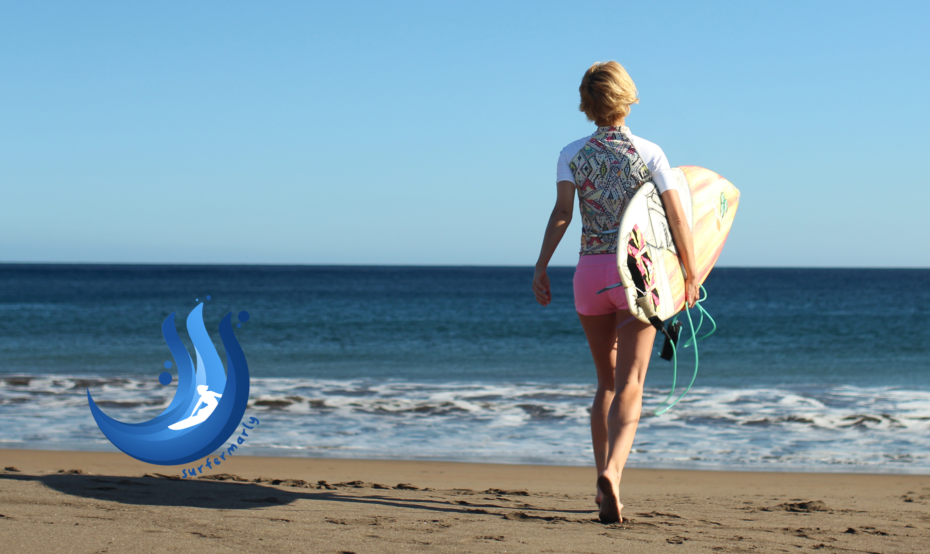
@surfermarly living her 'Dreams of the Ocean'
It's for a good cause
During the past months I've been working on a charity project that is now taking on form.
My whole life I wanted to do something like that, but either I was short of money or I didn't find the right organization where to address my contribution. Charity always has to deal with confidence issues. It's not easy to find a project where the financial activities are completely transparent.
That's why I decided to set up my own project in the end.
Since cryptocurrencies are providing a maximum of transparency in financial affairs, I considered steemit being the right place to set up my idea.
I still don't want to reveal all of its magic since this will be part of my presentation at @steemfest. But to not leave you in complete suspense, here's a first rough idea:
'Dreams of the Ocean' @dreamsoftheocean is steemit's first charity project dedicated to support kids in need through watersports activities.
To address my main concern regarding charity in general, 100% of the generated funds through the account will be addressed to the cause.
The very first activity will take place in four days, so this is a REAL project with a REAL impact.
During the next weeks there will be three events scheduled, hosting a total of kids/teenagers. The budget for these activities was $1,500 Steem, financed by @surfermarly's account.
So these fifty lucky ones are supposed to have 'the day of their lives'. But you know: there can be always done MORE. Now in the future the plan is to organize a lot more of these activities with the help of further donations.
Everybody's always talking about changing the world with the help of cryptocurrencies, so then let's just do this.
This is actually not 'a charity project on Steemit', but a 'charity project backed by Steem'.
I will keep you posted on the details soon.
The results from the first events will be presented in Lisbon, and I will also publish the corresponding video here on steemit.
I hope you will get flashed, and together we will make a lot more kids happy in the future!
Now back to the contest!
This design contest calls for graphic designers on steemit who are interested in creating the new logo for the account https://steemit.com/@dreamsoftheocean.
It was set up today, so everything is still fresh.
The rules of the game
- The creation needs to include the name Dreams of the Ocean.
- There are no specific rules regarding coloring, font style or design in general. However, 'the Ocean' as a concept should be somehow reflected in the logo. Also: less is more. Try to be precise and clean. The logo needs to stand for: transparency, efficiency, liability, trust and care.
- A link to @surfermarly's logo (see picture above) should be rather avoided. This is a project that will be completely autonomous, so the logos should also have their own personality.
- The logo needs to be provided as a vector graphic, enabling its scalability.
- The logo needs to be a 100% original creation, NOT including any third party elements (and related copyrights).
- All proposals need to be submitted by publishing them in the comment section of THIS article. If you want to do a separated blog post to promote your entry, do it! But don't forget to drop the logo here anyways. We need them all present on one page!
- Of course, other users can upvote the submissions then. However the logo that receives the most upvotes doesn't need to be necessarily chosen as winning creation.
- If the most popular logo (most number of upvotes from other users, independently from the rewards) wasn't the winning logo, I would reward it with 50 SBD. Then the winning logo would receive 100 SBD and the most popular logo 50 SBD. If the winning logo was the most popular, too, the creator would receive the full reward of 150 SBD. Rewards are provided by @surfermarly. So go get your friends voting for you! 😉
- All proposals have to be submitted until Tuesday 24th of October 2017.
- The winner will be announced and paid on Wednesday 25th of October 2017.
- Once elected the winner, the creator assigns and transfers the full right of use to @surfermarly and @dreamsoftheocean.
- In the unexpected event of not receiving any proposals that mirror the idea of the project, I reserve my right to not reward any of the participants. Submissions need to meet a professional standard as well as ALL of the above mentioned general rules.
Are you ready to win these $150 SBD?!
I hope you will have fun being part of this project!
As I said in the beginning, this is something I have been wanting to do my whole life.
Sometimes we just need to stop talking and start acting.
Now I can't wait to see the first logo entries. If you have any questions on the contest or the brand, please ask me at any time.
Thanks for your great support, steemians.
Let's do some magic again!
Marly -

Thanks for your valuable time!
This blog was launched at the end of July 2016
aiming to provide stories for open-minded
people who enjoy living on the edge of their lives,
stepping out of comfort zones, going on adventure,
doing extreme sports and embracing the new.
Welcome to the too-much-energy-blog!
PS: Don't forget that this is a troll-free zone.
Original content. Quotes found on brainyquote.com and likesuccess.com.
Concept #2
Click logo to enlarge.
Typeface: Keep Calm
- Upvoted for visibility -
Oh wow, you did a second one! Great!!!
Even though I like the first one most :-)
Thanks for your efforts and have a wonderful weekend!!!
😉 Well then... when I get another moment I will get some more finalized and finished looks on the first logo for you, see if they will do the trick. I always like when I have the chance to change things up and design instead of program all the time.
this ones quite nice too
This is simple and lovely . Worthy of my vote...
I have a few ideas on your logo, but limited time, so I started with this concept. I can always tweak it, if its headed in the right direction that is, otherwise I'll try to get a moment to get some others in.
Click on the logo to view fullscreen
I can also rough sketch a few if you'd like
Oh I really love this concept!!! If I had to choose, I'd pick the third one. The heart is sort of a 'learned concept' in the field of charity, so that's a very smart move. Also the colouring convinces me. Nice adding: the heart works alone, as an avatar for instance (which is important being thought to become a steemit blog logo :-)).
Now the leveling board is extremely high! Great entry, @blueorgy!!!
(I won't upvote your entry only for the reason that I want to keep being neutral during the challenge.)
Second attempt to comment on your entry. The last one was eaten by steemit's blockchain :-)
Thank You! Glad you liked it, luckily the Steemit logo/colors go well with an ocean theme and are easy to turn into waves ;). I then wanted to capture that this is a giving charity, so the heart is a good pick, which always comes through as a great symbol. I also had the heart incomplete in a way, being formed by the Steemit logo elements (splashing ;)) into each other.
I will try a few variants on this concept, and hopefully get at least one other concept in :)
Yeah, you're right! That's a great plus which @sjennon already took advantage of when designing the logo for the @surfermarly account :-)
You really did well.
you were part of the inspiration on my latest post ;)
https://steemit.com/funny/@blueorgy/that-feeling-you-get-when-using-steemit-recently
Awesome, resteemed it :-)
@blueorgy
Eaten by Steemit blockchain you say! So you also experience such...I even blogged on it and called on your name...😏
Hi @surfermarly, here's my entry
Here's my online posting submission -> Busy.org link or Regular Link
NICE on! I love the shape. Cool combination of image and text. Also the wave could be perfectly used as avatar on steemit which is a great plus.
(I won't upvote any entries by myself to be neutral during the challenge but you may tell your friends :-))
Thank you for the kind comments :) - look forward to you sharing your updates on this charity project after you present it at SteemFest! Ah, jealous, wish I could be in Lisbon for that :) ... I hope to attend the third SteemFest whenever that gets announced!
Marly, I wish you the best on this great project! Looking forward to news as you move ahead... Hugs!
😄😇😄

Thanks my friend! Can't wait to see them paddling out :-) On Saturday we'll have the first group of youngsters in the water.
Big hugs!!!
Created a logo!
I have different color variations in the post itself :)
https://steemit.com/steemit/@sjennon/contest-dreams-of-the-ocean-logo
I absolutely love this design!
Thanks!
Oh YES! You did it again :-)
I love the concept! The white version over the Ocean shot in your own post totally got me.
So that's gonna be tough choosing one next week, puuuuh! :-)
Have a great weekend, and thanks for your efforts and creativity!
Ha! Glad you like it - it's always a gamble ;)
Yeah, it's super flexible when it comes to backgrounds and images so usable for a lot of things. Also variations of colors (even the gradient one) is super easy to customize.
Happy to compete in your contests! Cheers!
Fully agreed :-)
As I said, it feels like poetry to me.
The colour selection is so good, the design so great that I'd say that it's a paragon of logos.
Wow thank you for you deep, kind words! I appreciate it :3
Hi @surfermarly. This is My Entry For Your Contest.
all entries are the same, just different font layouts.
for more about the process and more: https://steemit.com/art/@podanrj/logoartdesign-9-dreams-of-the-ocean-combo-mark-logo-identity-20171019t21432404z
Yeah! That's a fantastic entry, @podanrj! I love the 'white on black' version!
You know what: I think I'd like it even more without that little sun in the 'D'.
Would you mind doing the very first of these 3 (D left and text right) without the sun? I think then it would be brilliant.
Thanks for your efforts! Upvoted and resteemed your own article :-)
Edited. Thanks u for feedback.
I will provide according to the rules of the system identity logo. so try your best. the major proportions and compositions and message messages contained in the logo
Nicely done! I like it much better now :-))
This one will be definitely one of my favourites!
Thanks u mis. if i have any other ideas. will come again on another concept.. from 3 concepts, only 1 that I spended to quality, not quantity.
Ya. Vector editable. Ai. Png. Jpg. Pdf.
Is your logo made as a vector graphic?
R u want branding. Like card, letter head, envelope etc
Yeah. Editable vector. Ai. Png. Jpg. Pdf
Excellent!
The winning logo will need to be available in all these formats.
No letter heads, but I will need to print it on t-shirts :-)
This is my favourite. Particularly the third set of variants and in that, the blue-on-white or the white-on-charcoal.
Thanks u buddy. Keep conected
thanks for the feedback. this we can change.
great article from @surfermarly. I really like the design.
and good advice from @ podan.rj, you make me amazed with the logo design that you created. would you help me create my company logo?
@surfermarly should appreciate it well.
wow. thanks u buddy.
Great idea! Just tweeted this to my homies! https://twitter.com/BitcoinPosse/status/920346866406928384
Cool! Thanks for spreading the word :-)
I want!:D
I really had fun making this logo proposals I hope you like them n_n
This is the first idea with some variants (I need to say the first one is my favorite):
And the isolated icon:
I have always say that if you need to explain a design is not a good design at all... I think it all expresses everything just to see it.
Anyways I will justify my entry: It's a big heart formed by the ocean, the waves and the sun. But, why a heart? It is a charity project, and the word charity comes from latin caritas, which means love, and is there a better icon for love than a heart?
Keeping the idea of the waves and the heart I dared to make another entry:
And again, the isolated icon:
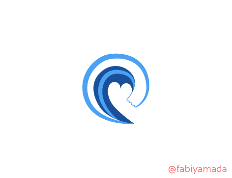
A different approach as you can see, this one has an arm-wave, embracing the heart :)
And here is the post: Logo for Dreams of the Ocean (proposal)
Wish you all a happy weekend!!!!:D
I love it! I gave you my vote!
Oh and I had fun watching them now!! :-)
I'm trying to upvote and resteem your own post, but steemit.com is very low today. So I hope it's gonna work later during the day...
Thanks for your submission! I like the combination of heart + wave :-)
Crossing my fingers for you.
Oo, looking forward to this! I will come up with something soooon! :D
I was hoping that you would say something like that :-))
Hahah good. I hope I won't be disappointing you!
What a super idea.
Kids love the water and helping kids that are struggling take their focus away from problems they’re facing is such a great cause.
BRAVO 👏
Thank you, Stephen! That's exactly what I believe in :-)