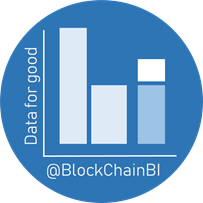
BlockChainBI Logo Design Concept
About one month ago I came up with an initial concept for the #bisteemit channel while also doing some logo design concepts for #steemitbc.
Since then there has been some changes to the platform, most significantly the impact as a result of Steemit Inc that has caused many of the branding updates.
Following the announcement made by @paulag resulting in the name identify of bisteemit
https://steemit.com/bisteemit/@paulag/the-shocking-revelations-of-bisteemit
It was necessary to update the logo design concept as there were some design elements tied to the old steemit identify, but to avoid repeating the primary concepts behind the design, I have provided a link to my original logo design concept here:
https://steemit.com/steemitbc/@plushzilla/bisteemit-logo-design-concept
This post will briefly go over some of the changes made based on the feedback and comments I have received since the original post, and hopefully open up for further suggestions and ideas for the new logo/banner.
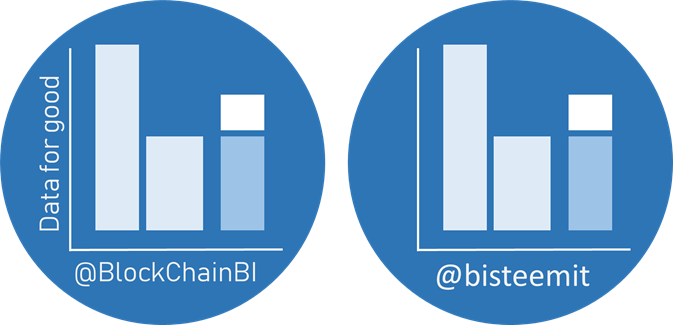
If you compare the original design (right) to the revised version (left) there are only two major differences:
- the label on the x-axis has been changed from bisteemit to blockchainbi
- an additional label has been added to the y-axis 'Data for good' (or whatever we think the motto/slogan) should be
I have also tried to come up with a suitable banner design concept except I think it will be very difficult to get it lined up properly:
Some thought s about the banner design:
- I wanted to make sure of the shape of the profile photo in the banner because it is something that most people haven't incorporated into the banner design
- I wanted to have the slogan repeated because it is too hard to see on the logo itself
- I wanted to provide the sense that we are looking through data to find something important and valuable to share with all steemians
So that's it for my short update to the blockchainbi logo concept design update.
P.S. There has been some discussion on Discord about the design of the letters 'b' and 'i' so I have added some design variations here for comparison ( @scipio and @miniature-tiger let me know what you think).


I love how our community all work together. I really like your designs, and glad to see the input from other community members as I am hoping we will all use this in our posts :-)
Thank you for all of your work @plushzilla - looking forward to the input from the team
It's the best way I can think of giving back to all the wonderful people doing lots of fantastic work on blockchainbi (I better get used to saying this). And your encouragement + support has really helped me to find my feet so I can't thank you enough so it is very satisfying to see how this group has grown in such a short space of time! Next year is going to be very exciting :)
https://steemit.com/about/@tjunaidi/a-glimpse-about-snow-4a4d1062c3405#comments
Well done @plushzilla , the design looks great. I like the 1st of the 3.
@rt395 - thanks for the feedback. Any thoughts on the motto or slogan?
I do like the slogan as well.
Saya sangat menyukai posting anda
Thank you for the kind comment. I hope that BlockChainBI is helping with the Indonesian community, something that @paulag and @lestatisticien are working hard on :)