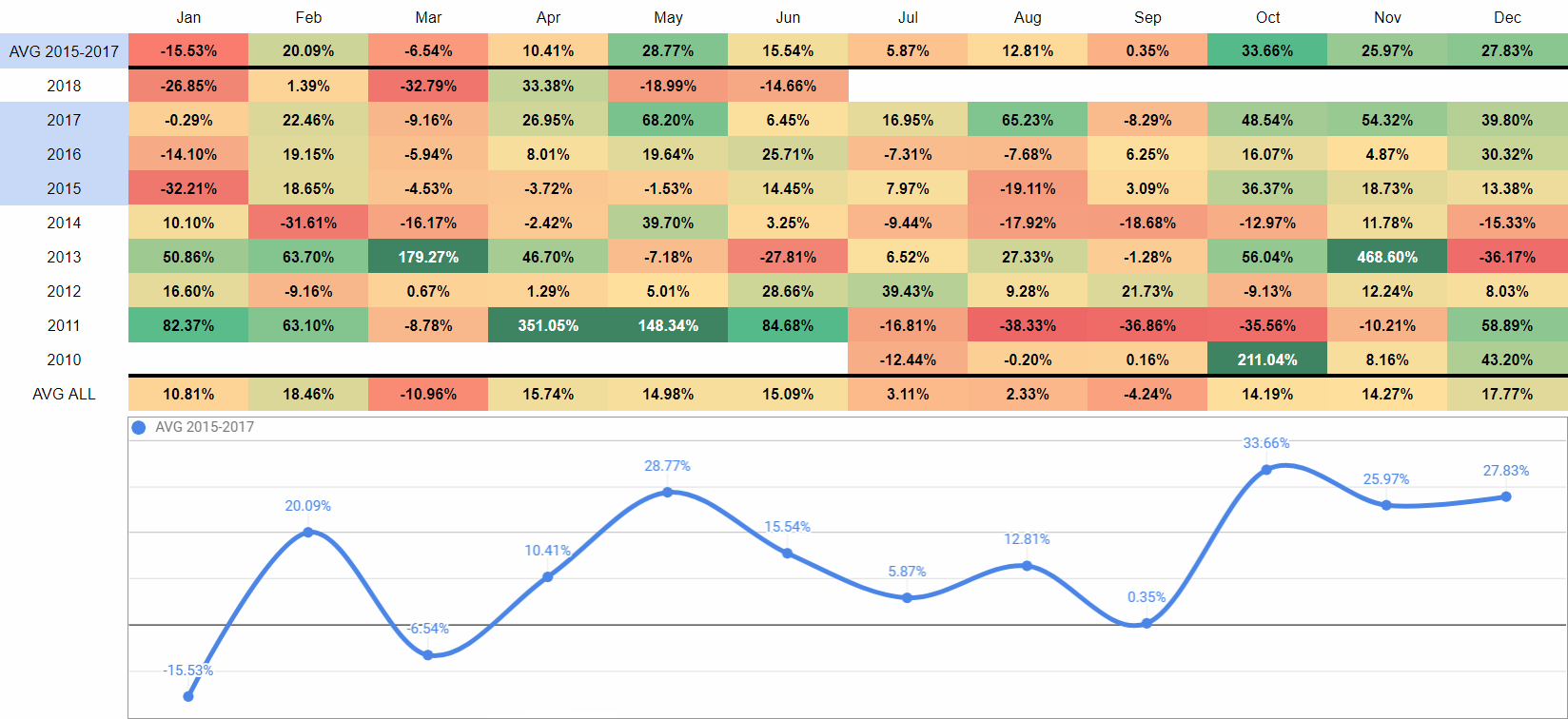
Bitcoin Heat Map from the Beginning in 2010
I saw a similar idea done by the others and since I wanted it slightly differently I've made my own Bitcoin Heat Map with some of my own adjustments.
Data comes from TradingView's "BraveNewCoin Liquid index for Bitcoin" as it has the whole of it. I've excluded these massive price spikes to not to dilute the colouring scheme too much and the AVG 2015-2017 only includes data from 2015 to 2017, so right after the previous 2013 bubble bear market has ended, so it starts clean so to speak up until the end of 2017 when the last recent bubble has burst.
upvote for me please? https://steemit.com/news/@bible.com/2sysip
Congratulations @fatetrader! You have completed the following achievement on Steemit and have been rewarded with new badge(s) :
Click on the badge to view your Board of Honor.
If you no longer want to receive notifications, reply to this comment with the word
STOPDo not miss the last post from @steemitboard:
SteemitBoard World Cup Contest - Round of 16 - Day 4
Participate in the SteemitBoard World Cup Contest!
Collect World Cup badges and win free SBD
Support the Gold Sponsors of the contest: @good-karma and @lukestokes