Steem - Post Payouts & Steem Health
Can we use post payouts as an indicator of the health of the system?

Image Source: pixabay.com
I have analysed posting activity and looked at it through several different lenses. Posting frequency is an important way to view the activity on the Steem Blockchain. In this series we looked at how this is distributed across individual accounts, automated accounts, accounts of different durations and I will begin producing reports to provide this snapshot on a regular basis.

Post Payouts
Everyone is interested at some level in payouts. After-all Steemit is not Steemit without Steem.
The aggregate size of post payouts is driven mainly by the Steem Price, with the individual distribution being driven by voting.
I would propose that by examining Post Payouts we get more of a view of the health of activity on the Steem Blockchain, rather than quality or growth of activity. Post Payouts in aggregate are driven by the Steem price so the key factor to analyse here is how activity is distributed. Are rewards being distributed to a wide audience or to a select few?
The two key statistics I will examine in this post are:
- How much is paid out?
- How is it distributed?
Total payouts per day (Oct - Dec)
This first graph gives an overview of the total payouts per day on posts (excluding comments) in the last 3 months of 2017, with the units displayed in Steem Dollars (SBD).
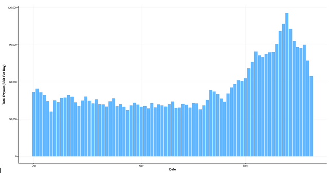
In this period the rise in the price of Steem drove a big increase in the aggregate payouts but the story doesn't end there. Something very unusual happened at the end of 2017.
The SBD Drama
From 1st of November there was a bonanza for post payouts due to the price differential of Steem Dollars (SBD) and US Dollars (USD). The following graph represents approximate ranges of payouts, expressed in USD values.
Not everyone chose the 50 50 option for payouts and there was an adjustment to the ratio of SBD created in this period so the actual values are not easy to calculate but the real USD value lies somewhere between the green and blue line. The red line is the SBD denominated post payout.
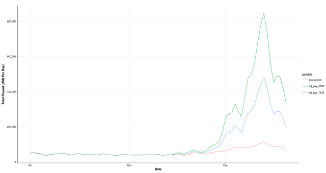
At the higher end of estimates payouts per day amounted to over 800k per day in USD value.

The aggregate picture is useful to have in mind but the focus of the rest of this post is the breakdown of these payments across different cohorts of posters.
Payouts per post (Oct - Dec)
This following graph plots the payouts for individual posts in estimated USD value.
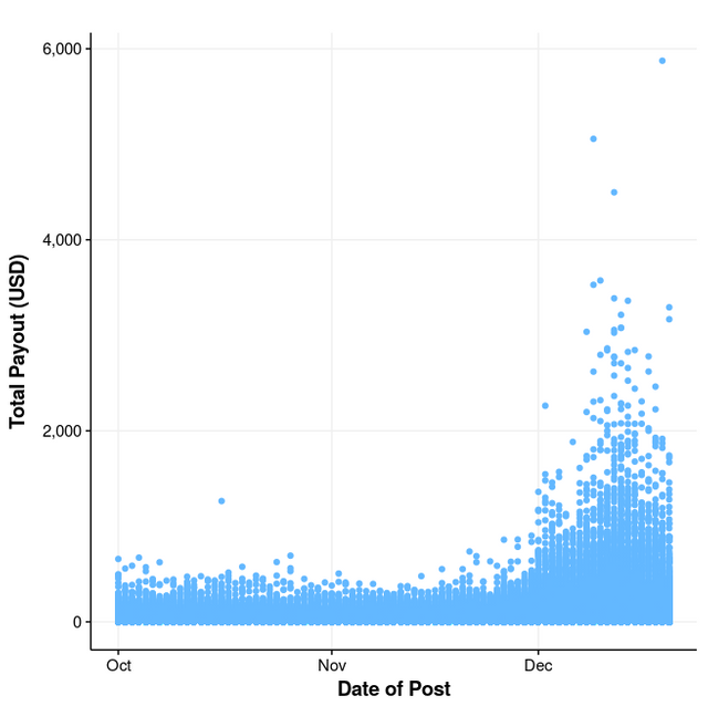
Payouts are show using conservative estimates of the USD value.
- Some posts received over 4k dollars in value, with one close to 6k in value!!
Which cohorts of people are posting?
A few posts stand out already but in the next few graphs we will use a different lens to look at this data.
Value of Payouts grouped by posting account (Oct to Dec)
What picture will emerge if over we combine all the posts over the 3 month period on individual accounts?
Distribution by account creation date
The following graph groups total payouts over the period with each dot representing an individual account. We then plots the value versus the date of account creation. The colour represents the reputation of the author.
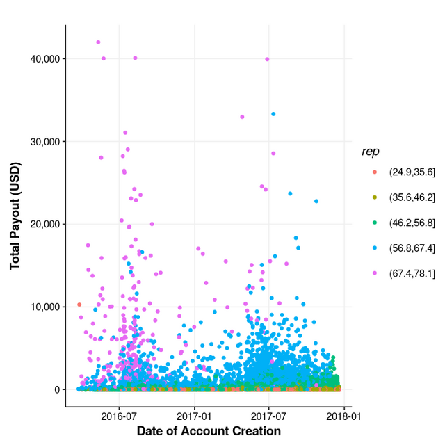
- We see a lot of activity in the right hand area of this graph which shows that new users are getting decent rewards.
- The high rep authors made hay during this bonanza (blues and violets)
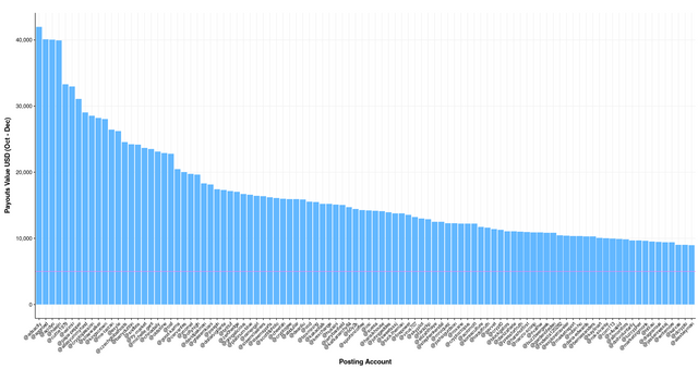
- Some accounts generated more than 40k USD in this period.
- 7 accounts made more than 30k in this period.
Payout Value Per Account (Top 100)
We can also look at this picture with accounts shown in descending order of payout.
Rep of Authors
This following graph looks at the total post payouts per account split by the reputation of author (x axis) and here the colour represents the account creation date.

Dark Blue = Older Accounts
Light Blue = Newer Accounts
- Longer established authors on Steemit and higher rep authors are making more on payouts.
- A small few authors get the majority of the daily payout

Related Posts
I am taking a deep dive into the Accounts and Activity of Users in this series of posts. The plan is to produce a series of regular reports based on the outcome of this series. You may also be interest in:
- https://steemit.com/stats/@eroche/steem-comment-data-and-automated-accounts
- https://steemit.com/stats/@eroche/steem-post-data-and-automated-accounts
- https://steemit.com/stats/@eroche/steem-network-growth
- https://steemit.com/stats/@eroche/steem-distribution-of-posting-rewards-by-account
- https://steemit.com/stats/@eroche/steem-distribution-of-posts-by-account
- https://steemit.com/stats/@eroche/steem-account-activity
- https://steemit.com/stats/@eroche/steem-geographical-distribution-of-accounts
Thank you for reading this. I write on Steemit about Blockchain, Cryptocurrency, Travel and lots of random topics.

a very good analysis - i'd be interested to see one further chart - something that in some way excludes votes from the most popular bots. The numbers are no doubt inflated by people paying for votes.
That is a fantastic idea.
Some of the bots have third parties that vote so it would probably be difficult to capture it properly
You could probably monitor the wallets and change looks to a different colour or something
I'm good at coming up with the ideas, not so at implementing them
This is great analysis, as always. Could you maybe do a bar chart for the payouts by rep, like you do for the top 100, but just with 5 bars? I think @arcange does something for different 'levels of user' (whales etc) - but this would be much more interesting... if you have the data it's just a matter of presenting it in a different way!
Maybe two versions... totals and then averages per account per rep.
Also, have you played around with different bins for the rep categories?
To be contentious... I have to say it.. looking through those names in the top 100, as much as I love some of their contributions... are their posts worth £30K over such a short time, basically no (would they care if they knew I think this, probably not).
Whether that's good because it suggests anyone can earn serious coin by posting let's say 'reasonable' content, or whether that's bad because it just shows how people bandwagon for the curation rewards... I'll leave that decision up to the reader!
Either way, good to lay the data bare.
I have two further graphs for you.
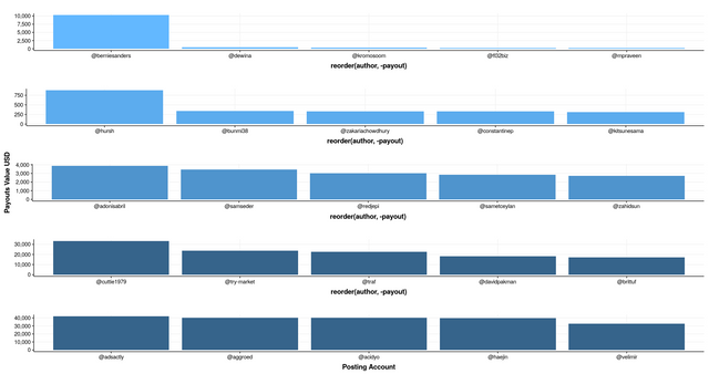
In this first one I have plotted the top 5 at each reputation
This is interesting but I don't want to focus too much on individual names.
This second one colours the bars in my original graph by reputation. I think this is a really nice way to see who is positing and even without the names at the bottom it would be very informative.
Thank you - now it's very clear - taking rows 5,3 and 2 from the top picture, it's pretty much:
For some reason this springs to mind... high reps on the right, low on the left (maybe...)
Nice post beautiful presented and explained.detail oriented with nice information
Thank you for shareing sir @eroche
Thank you so much.
YOU are wellcome @eroche !!!
Thanks for sharing an informative post.
I always visit your site.
I gather a lot of information by your post.
Thanks .
@Resteem done
Great thanks so much.
Welcome brother. Thank you so much.
It's interesting. What are you doing with the information you gather please (apart from publishing it)?
I am compiling a list of the most useful metrics and graphs which I will start publishing on a regular basis.
I will begin to produce a regular report that anyone can examine to see what type of activity is happening on the Steem blockchain. What groups are active on a week by week basis, that sort of thing. These reports will be a compliment to the wonderful metrics that are already produced regularly by people such as @arcange but with a slightly different slant.
Thanks for reading.
Thanks. I will look out for your reports. It's interesting how fast things change.
You may find this site very interesting.
http://tool.steem.world/Follower
Thank you. It's improved since I looked into it before.
Great Insights. I have observed that its only authors with reputation upwards of 55-60 that make good money here consistently
Also, it is relatively easy to reach 50 reputation but extremely difficult to move up the ladder as you cross 50.
If a dolphin votes you, your reputation goes to the moon.
The people who have been on the longest generally have the most rep, and due to their time on the platform and connections they get the biggest regular upvotes. Stick at it you will get there ;)
Wow this is a lot of research, well done
I also noticed that the power of each upvote varies with the rise and drop of the value on the market.
The aggregate daily offering of Steem is distributed at a fairly fixed rate but then the value of that (i.e. the upvotes) is derived from the market price of Steem.
Pretty well explained, easy to grasp even for us the non technical people. A valid analysis @eroche
Thanks @socialreformer
really social media is very out of the way, open to users, who can see how his account entry, and how the activities of all users ...
thank you for posting, very useful for beginners like me, keep enlightening for us all ...
you are the best @eroche
That's a lot of information to digest. Yet the numbers all point to one thing - the most popular author gets the most payouts. Not really surprising, but it would be nice if some of those votes goes to newer less popular ones. I'm seeing a lot of good post with very few votes or even without a single vote lately. This is quite disheartening considering that some of those popular post are not even that good. Sorry for the rant. Kudos to the great article. Have a nice day.