Lee Can't Sleep
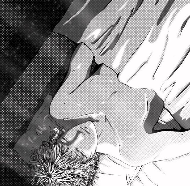
Its essence, light, creates a subtle, fluid dance.
In the flickering dust and silver shades it asks:
Which day is this morning? What time is it by chance?
But these questions memory cannot help but lapse
Since this mind's forgotten how to decide. Perhaps.

Hello everyone. As said in my introduceyourself post, I wanted to definitively prove I'm Anya Ehrim before really going at it with this Steemit blog. My only creative idea was to show a layer breakdown of my most recent artwork. I got a reply from Wildflowerjessi (and thank you to much!) to just do it. So I am. :-)
The focus of today's post is Leonardo Lucas Raywick. Lee is the main character of my novel-in-long-long-progress. Summarizing the plot into one word, it's a story about his maturity. Psychologically. He's trying to come to terms with his reality throughout the novel, and to most of the other characters he has some very serious mental issues. I lack such mental issues (and don't know anyone who has them), so I've been spending a lot of time researching illnesses from post-traumatic stress disorder to retrograde amnesia to disassociative personality disorder so to properly write down this poor, poor man into someone real on the page. He's the character I draw most, and he's been through too many style changes to count. I believe I'm finally settling on a style to portray him in. Proper proportions, but relatively innocent (and almost always) sad eyes.
Now that he's introduced (I'll be writing about him a lot), let's get into the meat of this post.
Lineart
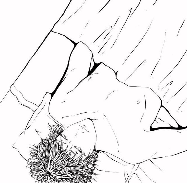
I tend to do my lineart in multiple layers. His hair is a layer all on its own so that when I mess it up (which is a lot) I'm not erasing his face to fix it. His face and body are separate from the bed and pillow. (I tend to trash layers I no longer need to keep layers clean; sketch layers are unfortunate victims. I'll be able to show them in future posts.)
Shading
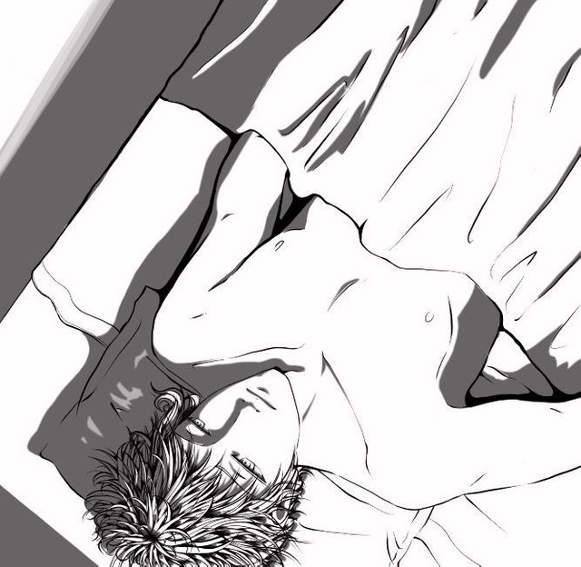
My usual technique (at least in grayscale pieces) is to work in black, and lower the opacity of the entire layer instead. It's easier to do touch-ups this way, and it can be adjusted across a full range to help with the intensity of the light source. The shading here is set at 60%.
Screentoning
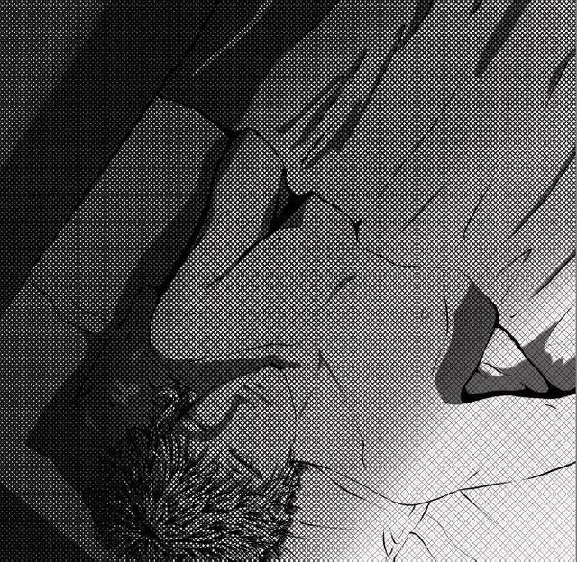
I love screentones so much. They apply uniform texture which doesn't detract from the work. They double as shading and triple as gradient (given the right brush variables). I usually apply multiple screentones, but I felt this piece shouldn't be too busy (I really wanted to screentone the blanket). This layer was set to 90% opacity so that the bed and the floor in the upper left weren't too dark. Yet.
Masking
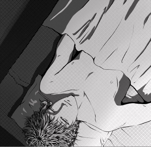
This layer is just above the screentone to lighten it's effect on his body and the sheets. By creating a 40% transparent mask, the piece now had four different shades. Magic, right? (No way, haha.)
Highlighting
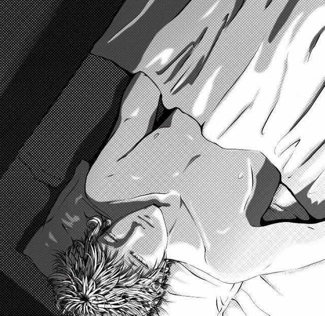
The highlighting is in two layers. One is set just above the screentone at 100% to break up its dominance over the piece. Applying a gaussian blur to it helped to soften the light. The second layer is placed just above the lineart at 50% to help this further by lightening the lineart. My favorite part of highlighting is adding the transparent strands of hair on Lee's head.
Depth
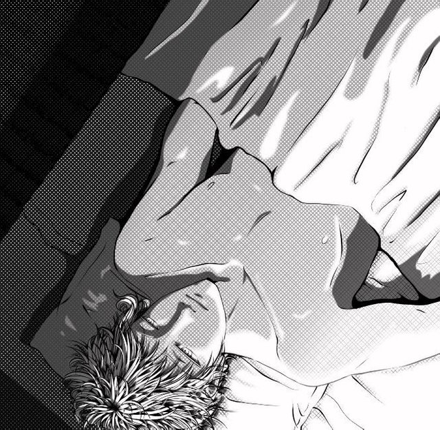
The floorboards. Despite the final layer obscuring it, this is an important aspect of the piece. They really set the perspective, allowing the viewer to feel as if they're looking down on Lee from near the headboard (explaining the upside-down angle). It also gives the viewer a sense of how high the bed is off the floor. It even indicates that he's lying on a bed in a room. There's so much being told just by that single addition.
Final Touches

The god rays (made of two layers for opacity differences) and dust particles both helped to break the balance of the piece's gradient from utterly light to utterly dark. Without it, you get the impression that the piece is split in two, and while that certainly seems to fit Lee's personality complex, he actually wants the light to break into the darkness, as it should. Light should always break through the darkness. These two final additions to the piece are meant to symbolize that wish.
I hope this first (likely long) post turned out helpful in some way for other digital artists. That was my true intent for choosing a creative way to prove who I am. (Holding up a sign is just so meh.) I had fun explaining how the piece came together. I'm not remotely an expert, though. While writing this, I found numerous cringe-worthy mistakes. And, of course, the blanket is the major flaw of this piece, and I'm positive the better artists around noticed. Folds are still something I'm working on. I have lots of reference photos, though, so don't worry about me. Haha.
But yes. What do you guys think overall? Did the poem make sense after you read the post? Is the amount of explanation too much? Want to offer any advice, tips, or tricks? Let me know in the comments. Let me know all the things in the comments. Heck, let me know what you had for dinner. I mean, why not?
Cheers, everyone!

Thanks for reading!
;-)
Welcome to Steemit and congratulations on starting with such a well formed and engaging post! I look back at my old posts and they are a bit embarrassing in comparison!
I enjoyed the art and the process description very much, thank you for sharing and I wish you the best of luck in the beginning of your journey on Steemit!
I have featured you and this post for a curation contest here :
https://steemit.com/payitforward/@bengy/payitforwardentry-week20-zeyxpge1fl
You can also join the contest here :
https://steemit.com/payitforward/@pifc/week-20-pay-it-forward-curation-contest-71556c5823d6cest
Thanks so much for featuring me. I have already heard of you, oddly enough, but I can't remember when, where, or how. (x_x)
No problem, it was a pleasure!
You have a minor grammatical mistake in the following sentence:
It should be its own instead of it's own.Silly bot posting immediately like that. Thanks, though. :-)
Oh man, if this bot gets wise and goes and reads my own posts. Thankfully we can edit them now . Fantastic post btw!
Thanks. This took a while to compose. It's been a long time since I messed with html formatting. Hopefully the quality improves.
Awesome breakdown of the process! Your grayscale drawing style looks really dramatic. Well done:)
Oh. Dramatic isn't something I've heard about my art before. Hmm... :-)
In a good way, of course;)
Really nice, Anya! I loved reading the process, as I'm always threatening to by myself a drawing pad thingy and start doing digital sketches...
I don't know much, in fact, about this style but when I saw the first image, I thought you had borrowed it from some animé series, so that means I think it is really, really good, right? ;P
Hmm... Since you're a writer, I'm thinking you might make a great "third" for an idea I'd like to re-try... Will tell more later, or if I see you on the server =)
I hope I won't convince you by saying this, but even though good digital drawing tablets are expensive, they are so nice to have. And stop flattering me (geez.... what will Snekky think)?
I'll hear more from you soon, I'm sure. waves
6 steps needed to take only for one scene, wow.. @anyaehrim, how long does it take to finish one scene like that? I really have no clue how artists doing their digital drawing step by step.. and thank you for sharing this because now I know how all those beautiful pictures please our eyes. anyway.. I spotted something weird with the blanket .. hahahaha, it's look like a paper blanket to me.. hehehe, Keep Up the good work and the poem perfectly suited the picture, IMO.
Oh! Hahaa... it took me a while to come back and read the rest of these comments. I was inundated by other Steemers for collaboration projects immediately after this. It's insane how busy it has gotten already.
This piece took over 20 hours... Well, actually, I didn't keep track of how much time it took, but the median effort is usually around 5 hours, so making it presentable and meaningful takes at least three times longer. Messing with layer order, with individual transparencies, with shading and lighting... This piece was nice to me; usually I hit dead ends, and erase entire layers I don't think are working out.
Thanks so much about the poem. I made it up on the spot, so I was asking in case it didn't make any sense.
Whoooaaa... 5 hours 😱 that's really cool. Thank you @anyaehrim for your explanation 😉 wish you continued success. As long as you're doing what you like and best at.. you're gonna be more busy but I knew.. You are someone who loves to keep in touch with others too😊 fyi.. your post and comments are enjoyable to read... Thank you
And almost 6 hours later I'm finally able to cast my vote, yay!.
Honestly though, I love reading things like these since I suck at drawing (won't get any better so don't even try convincing me otherwise). Most just show the final piece so it's nice to see the process and some text to flavor it too!!!
Haha... it's alright. And I did notice how lacking in explanation the art progression posts are. It really felt like, "Geez, did you put effort into this?"
I do understand why, though. Explaining how and why you did something is actually quite difficult to summarize. This post was in construction for over ten hours before I even tried formatting (it was at least 33% longer). I'm going to hope the pace I output content is alright since it's likely I'll end up doing that for every single post, not just the art pieces. (sigh... I must be a turtle.)
Well, I usually spend about two to three hours bouncing the idea in my head... two to three hours more writing the text itself, hour and half with edition and formatting and one final hour for hyperlinks and images... I'd say you're doing just fine.
I came to you post because @bengy featured you in the pay it forward curation
https://steemit.com/payitforward/@pifc/week-20-pay-it-forward-curation-contest-71556c5823d6cest
lol, sorry about that. Just realized how long ago this comment was. ^_^; Looking at the wrong post comments again.
It happens 😀
No worries
@bengy is so nice. I'll give him my thanks.
Me encantan estos trabajos, Hola @anyaehrim, gracias por compartir tu arte, llegue a tu post porque @bengy presentó tu publicación en esta semana Concurso de pago por adelantado si estas interesado click Aqui
Hello and welcome I found your post from a entry into the @pitc by @bengy. That is a lot of work that went into this piece I know if we only saw they end most of us would not know that.
Haha. I'm sure if the oil/acrylic painters I see on this site showed their development, it would be just as impressive. Just from trying painting myself I know how difficult it is to make something realistic in oil paints.
Just realized how long ago this comment was. ^_^; I thought I was looking at a more recent post.
Welcome to steemit @anyaehrim! And I love this digital piece of artwork :)
I found you post because @bengy featured you in a Pay it Forward contest entry; you should consider joining us next week with an entry of your own :) It's a great way to help build your own community here as well!