How to visualize a graph in RStudio
Hello Steemians,
this is a visualization guide from your best data visualization friend datatreemap :-)
It is a guide on how to visualize a graph in R by using the igraph package. A graph can be visualized starting from its adjacency matrix data which shows what are the nodes of the graph and how are they connected. Here you can read more about it Adjacency Matrix
In my case, my adjacency matrix contains the following data:
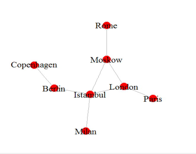
"Milan","London","Berlin","Rome","Copenhagen","Paris","Moskow","Istambul"
"Milan",0,0,0,0,0,0,0,0
"London",0,0,0,0,0,1,1,0
"Berlin",0,0,0,0,1,0,0,0
"Rome",0,0,0,0,0,0,1,0
"Copenhagen",0,0,1,0,0,0,0,0
"Paris",0,1,0,0,0,0,0,0,
"Moskow",0,1,0,1,0,0,0,1
"Istambul",1,1,1,0,0,0,0,0
These are the data that show if a city is connected with another city through a flight. So the data says that there is a flight from Berlin to Copenhagen but there is no flight from Copenhagen to Moscow.
For visualizing this information as a graph we need an R package called igraph. So let's install it and load the dataset in a matrix we call traffic.txt:
install.packages("igraph") ## install igraph

library(igraph) ## load the package

flightmatrix <- as.matrix(read.csv("C:\Users\Alket\Documents\traffic.txt"))
So what the above code does is installing the igraph package and using it or the current R session. Then with the third line the code loads the data in the "flightmatrix" object.
Now, let's model the flights as connections between cities. We will use the igraph package for this modeling and in particular the adjacency() function as in the following lines. More on this we will use an undirected graph as you can see from the mode = "undirected"
flight <- graph.adjacency(flightmatrix,mode="undirected", diag=FALSE)

set.seed(1)
And then plot the results of the flight modeling by giving to the nodes a red color and labels a black one.
plot(flight,layout=layout.fruchterman.reingold,

vertex.label=V(flight)$name,vertex.color="red",vertex.label.color="black",vertex.frame.color=0,vertex.label.cex=1.5)
And here is the result below. As you can see it is fairly easy to visualize a graph with R and the igraph package.
If you liked this guide datatreemap will soon come up with more so stay tuned.
That is very useful! Thanks for sharing.
You're welcome. In the next days there will be more on data visualization so stay tuned :-)
@originalworks
The @OriginalWorks bot has determined this post by @datatreemap to be original material and upvoted it!
To call @OriginalWorks, simply reply to any post with @originalworks or !originalworks in your message!
To enter this post into the daily RESTEEM contest, upvote this comment! The user with the most upvotes on their @OriginalWorks comment will win!
For more information, Click Here! || Click here to participate in the @OriginalWorks sponsored writing contest!
Special thanks to @reggaemuffin for being a supporter! Vote him as a witness to help make Steemit a better place!