Steemit Design Update - Justifying the Content Box
Gif by @deveerei
Gif by @deveerei
What you see here is Steemit's pop-up content box. This opens when you click on a post or reply/comment in desktop view.
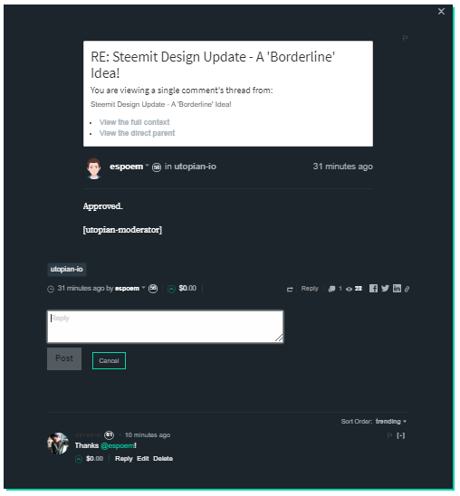
I think that this feature needs improvement. There are a few things I can suggest they make changes to. To justify my suggestions, take a look at the same page in mobile view:
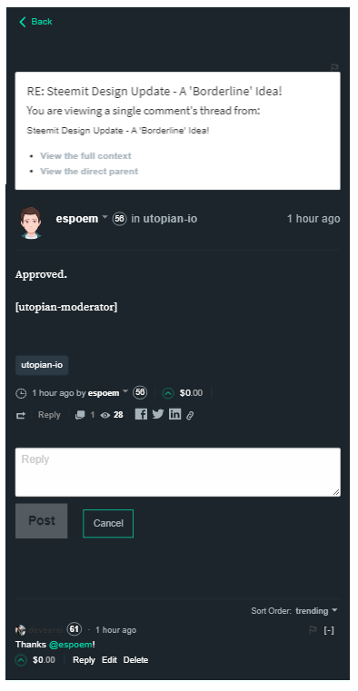
What's the difference? It's symmetry and alignment!
I made this mock-up of the same page, only it has a more symmetrical design than the original. The text box and the white post-information box at the top has been made into the same size.
The information about the author of that comment and the comment itself has been justified to the left and the timestamp has been justified to the right.
The "Post" and "Cancel" buttons have been made the same size and has been properly aligned.
I also applied my previous suggestion about the shadow becoming a border.
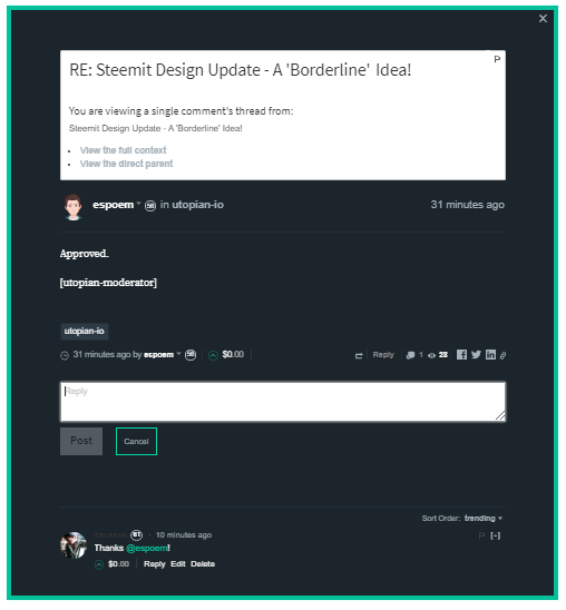
Here's a look at a side-by-side comparison of the two: The Original/Current Design V.S. The Revised Justified Design:
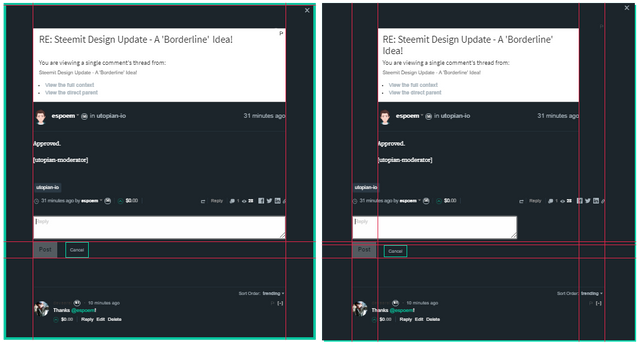
I added guidelines to show you that the elements do not have symmetry at all. You can see it through the lines I placed on the right panel, it shows the alignment and position of those elements. While on the left panel, I was able to use less lines that means it's more symmetrical and are properly aligned.
Open Source Contribution posted via Utopian.io
good update.
Thanks @nightgirl!
thank you for the contribution
but. can you delete the first picture above.
the image with the writing idea is common. you can change the image to match the main topic of your post.
after that i will approve
[utopian-moderator]
I see- I actually made that one - it's customized to match my previous post. But I will work on it.
I have update it - I just replaced 'IDEA' with my post's title instead.
thank you .
i verified this post
[utopian-moderator]
Thanks!
Totally true man, and good point of view. Lets see if they decided to change and fix it.
Good work mate.
Hopefully - because it does look a bit better. :) Thanks!
Yeah, if you are one of those like me who love to see things where them should be, yeah.
Anyways have a good day mate, and good post.
Hey @deveerei I am @utopian-io. I have just super-voted you at 56% Power!
Suggestions https://utopian.io/rules
-Your contribution is less informative than others in this category.
-Utopian has detected 1 bot votes. I am the only bot you should love!!
Achievements
-Good amount of information. Thank you!
-Votes on this contribution are going well. Nice!
-You are having more votes than average for this category. Nice!
-You are generating more rewards than average for this category. Super!
-Seems like you contribute quite often. AMAZING!
Up-vote this comment to grow my power and help Open Source contributions like this one.
Another bot vote daw @ruah.
I like your suggestion here, it does make a big difference.
Thanks!
I like your ideas re design.
But I wish they would fix the content. What a waste of space, telling me all the info about what is NOT displayed!
Why not just give me something, short headers, first few words, anything really would be better than zippo we get now.
We may not know maybe they'll make another update soon.
I love it Kuya!
:P
Indeed, it looks a whole lot better!
Thank you for thinking the same.
You're welcome!
Well spotted. On mobile it does look better, however I don't know if just a thin box would look good on a wide computer screen.
Steem on!
Oh and look at this bug:
Needed to highlight your response to read it.
More info here: CLICK FOR POST
I noticed that too, yes. They definitely need to fix it!
It's kinda hard to open another tab or go someplace else, refreshing the page does not work.
Wonderful GUI ideas, I'm going to follow you from now on!
Thanks @scipio. I made a post about a bug and you were kinda featured. :D
Saw it already, cool! ;-)
Thanks!