Steemit Design Update - A 'Borderline' Idea!
Gif by @deveerei
I have posted about the updates on Steemitstage recently and it didn't take them long to update Steemit.com with those new updates and even more.
They have revealed the new Logo and color scheme. We also have night mode on top of it!
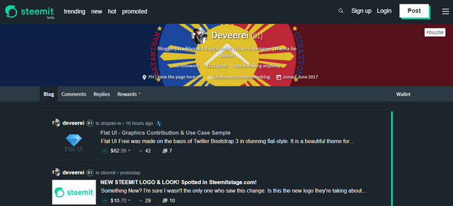
Steemit.com Night Mode
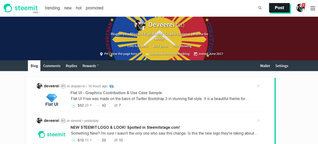
Steemit.com Day/Normal Mode
I was surprised about the Night Mode - that made me like the whole new look of Steemit. I must say that they did a splendid job in this update. It made me like almost everything that has been updated. There's just one thing that I think needs fixing. This made me come up with an "Idea".

Notice the colored shadow on the right side of the content box:

It matches that of the "Post" button to Create a New Post:

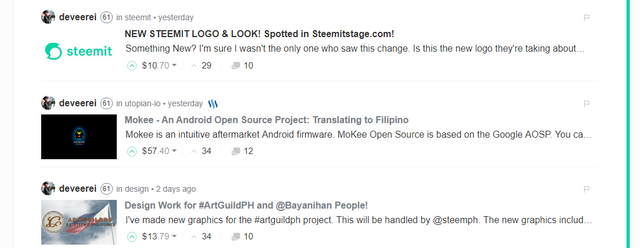
It does look good but it looks weird, reason being: TOO ASYMMETRICAL . Once you scroll down, it just looks like a weird line on the side, it doesn't look like a shadow for the content box:
Here comes the Lightbulb:

Instead of a shadow, why not just make a border go around the content area. I have played around a bit with Photoshop and made a mock-up of how it would(or should) look like if that were the case.
Day/Normal Mode:
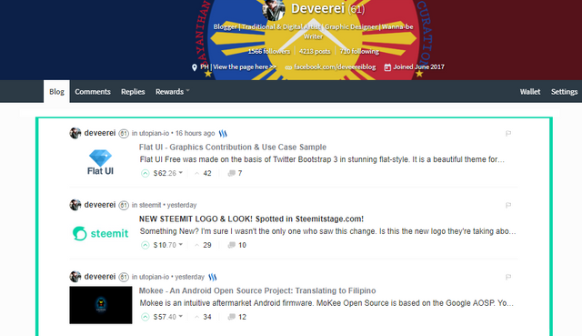
Night Mode:
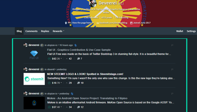
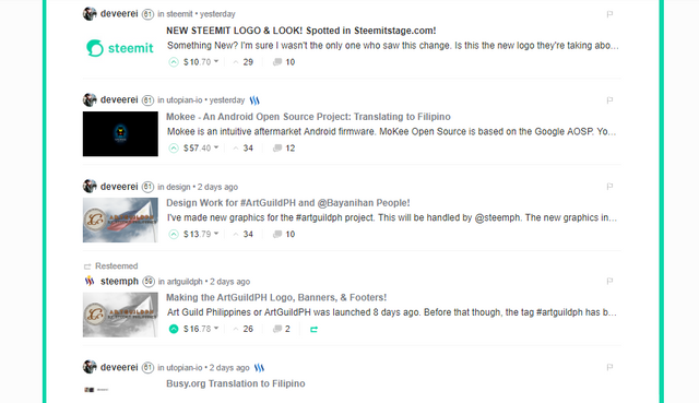
Here is another set of mock-ups to show you how it looks like when you scroll down in a list of posts. It looks more symmetrical and this design makes a lot more sense rather than having a weird line on one side being lonely and all:
Day/Normal Mode:
Night Mode:
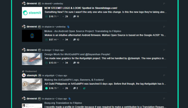
Do you see the difference between having just one of those bright bars and having two of them?
Open Source Contribution posted via Utopian.io
The shadow does look weird. You'd need to take a minute to fully grasp that it's a shadow, because there isn't really a gray drop shadow with it. I like the night mode, but I'm still not quite fond of the color combination. Maybe it's just me, but the brightness hurts my eyes a bit.
Thanks for the comment! When I saw it back in Steemitstage, I never saw it as a shadow or part of design - I thought it was a bug and it wasn't meant to be there at all.
Overall, they still need to work on the contrast both in Night Mode and Day/Normal Mode.
There are a lot of components that have yet to have a night mode equivalent. Add to that, there are a lot of images tailor-fitted to the white background. I should've planned ahead and made them with a transparent background.
Hey @deveerei I am @utopian-io. I have just super-voted you at 76% Power!
Suggestions https://utopian.io/rules
-Utopian has detected 1 bot votes. I am the only bot you should love!!
Achievements
-Good amount of information. Thank you!
-A very informative contribution. Good job!
-Votes on this contribution are going well. Nice!
-You are having more votes than average for this category. Nice!
-You are generating more rewards than average for this category. Super!
-Seems like you contribute quite often. AMAZING!
-You have just unlocked 6 achievements. Yeah!
Up-vote this comment to grow my power and help Open Source contributions like this one.
I don't know which bot voted on me again. I do not use bot services. @ruah are you able to check?
Night mode seems to be fascinating! :) I personally didn't like the blend of colors using green and white. Both of them are light colors. Black-green combination seems to be perfect! As always, you did great dude.
All the best,
Jass
Thanks Jassen.
Hi, can you change the repository to steemit/condenser? And remove the bottom part, please.
[utopian-moderator]
Updated now.
Approved.
[utopian-moderator]
Thanks @espoem!
Nice Idea. Let's see if steemit implements it !
Thank you! Maybe. :)
Very nice work.
so change, much wow, very innovative
I feel like the border I made was too thick haha. Maybe 1px will be best - or none at all. This is just a suggestion to them.