How i made this Matte-painting using Photoshop ? Digital Illustration & photo-bashing process tutorial
Hi everyone,
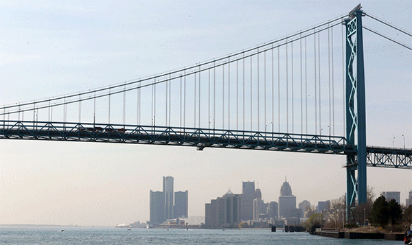
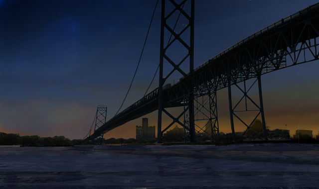
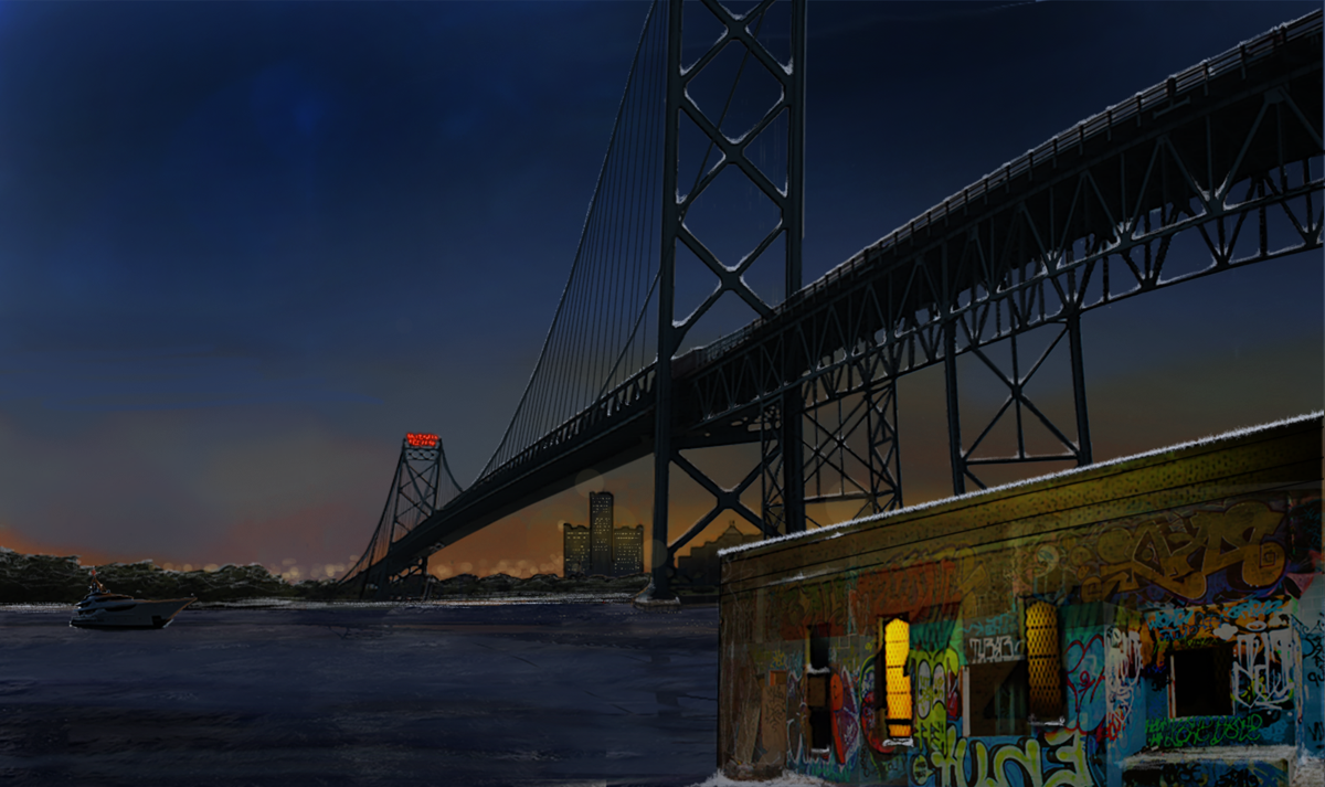
Here is a first look at the final digital illustration i made at around the start of this year : 
(photobashing, photo-manipulation, matte-painting, digital illustration or whatever you want to call it , completed.)
This is a tutorial article describing my process as i progress through the creation of the illustration.
Why i made this digital illustration ?
This was a test-piece entry I made for my application as a comic artist for a freelance job opportunity actually. I was supposed to make a single panel/scene as a test for the comic/graphic novel script. The test piece was paid for and the writer wanted to leave the exact composition and constituents in the illustration free to be chosen by the artist. Here is the written description provided to me in its entirety :
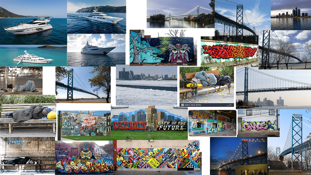
"It’s a late winter night in Detroit, it starts out with dark water, then it starts getting lighter as a yacht/cruise goes by and we see the Ambassador Bridge and Detroit in the background. There’s a lot of scenery of the city and its life; Renaissance centre, sports, homeless people, artwork/graffiti, etc."
Vague right ? !!! well that's exactly what my thoughts were when i first read it. But i knew i was being tested, which is why i wanted to keep the seeming confusions to myself. I read it over and over again. It sounded more like a description for a video-scene/cinematic. Usually i would have expected the composition of the scene/still/screen-freeze and the writer conveys the storytelling through descriptions of exact scenes/situations or rather stills from a video. This was clearly a different approach.
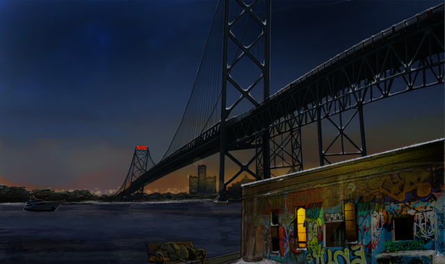
Process Gif :
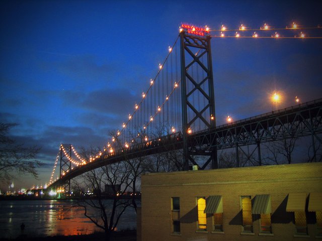
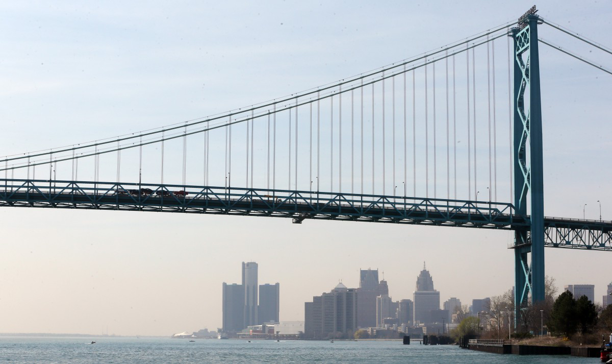
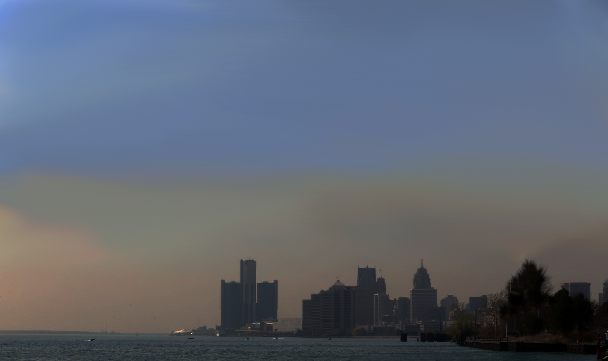
After looking at this image on the right, Can you believe that the final image i made, was not a photo-manipulation of this one , but rather my base photo was the one shown below (left) ?? The reason why i picked this image out was because of its dull colours and the horizon line with the buildings in it. Also i felt like it would be easy to select out the bridge and then use content aware fill tool to erase it out.
WIP 2
Here you can see that i removed the bridge, picked colours of the sky from the original reference image and flipped the image horizontally. Removing the bridge was a combination of the freehand lasso and the content aware fill techniques. Putting the colours in was easy as the base photo colours were close to Gray.
WIP 3
At this stage , i added the bridge in the correct angle that i wanted , in two halves , from two different photos. Next i tried to add a faint reflection of the bridge. I did this by merging the duplicate layers of the two halves of the bridge, vertically flipping them, ctrl + U (shortcut to edit hue/saturation) on Photoshop, pushing down the lightness to complete black, distorting the perspective, reducing opacity of the layer and finally smudging the translucent black of the bridge reflection in random spots to make it look irregular due to the ripples on the water.
WIP 4
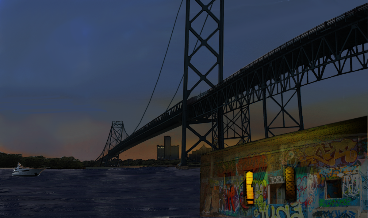
I chose not to work on the base of the bridge as i always intended to cover it up with foreground structures/buildings to show graffiti and homelessness too. So i went ahead and took out the building from the original target image and fit it into my work in progress in the correct lighting and perspective. Now i knew what parts of the base of the bridge needed attention. When tackling such things , it is easy to figure out as you go , because when you get down to actually working on each detail , it takes time and there is ample time to think through the things you are currently doing. So no point getting overwhelmed with creating an exact composition as thought of at the start. I feel better with flexibility to change anything if needed, including the process. Point being , that i did not come up with hiding the base of the bridge with the structure , until i actually started working on the bridge !! So relax, sometimes , its OK to know just the next few steps towards the destination. One does not have to know the entire exact path to get there. Your result will still lie within the target domain, and take it from me , it will never look EXACTLY as you or the client envisioned BEFORE you started working on something similar. It is a constant compromise and negotiation between your initial vision , the client's initial vision and your ongoing imagination. I think this philosophy extends to a lot out there ! At this stage i had also managed adding the vague graffiti elements to the building as well as the yacht to the scene, in the perspective i had wanted. To add the graffiti , i basically just blended in 2-3 graffiti photos from the mood-board with smooth gradients and erased out the window areas.
WIP5
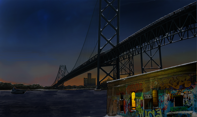
This is the stage where i realised that a lot of the composition was now set in stone !! And i got to thinking about the colour corrections, shadows and lighting etc. That's when it hit me !! It does not look like a cold place, so how can it be winter ?? Now i'm from New Delhi and the winters are barely 5 degree Celsius and summers get as hot as 47 degree Celsius on their peaks. But i have survived 3 Scottish winters during my masters, so i have seen my share of snow ! Its more than enough to be able to draw it, thank you very much, haha ! Notice where i added the snow and how. I took a round brush , added a roundness jitter, a random texture, pressure sensitivity to opacity and size and drew them on top of the bridge layer, in the grooves where snow should settle, the flat areas like the roof of the building, the banks of the river, etc. etc. you get the picture !
WIP 6
Here, I had to really meditate on the image and really try to live in that scene for a day or two to realise what kind of details it needed. Things such as the really far-away background city lights like blurred lens flares, the buildings needed lights, the red lit up letters on the top of the Detroit bridge etc. etc. By here even the bridge wires were already added and i chose to ignore the ones in the foreground half of the bridge. I made the bridge reflection layer slightly stronger again. You can open any one of these images in a new tab to check them out in a higher resolution of course, to see the details and changes more clearly. If you do that , then you will also notice how i flattened all the layers and took the upper sky-half of the image, duplicated it and then flipped it vertically to cause a stronger sky reflection on the water , which was of course a translucent layer and erased irregularly to go with the waves/ripples of the river.
WIP 7
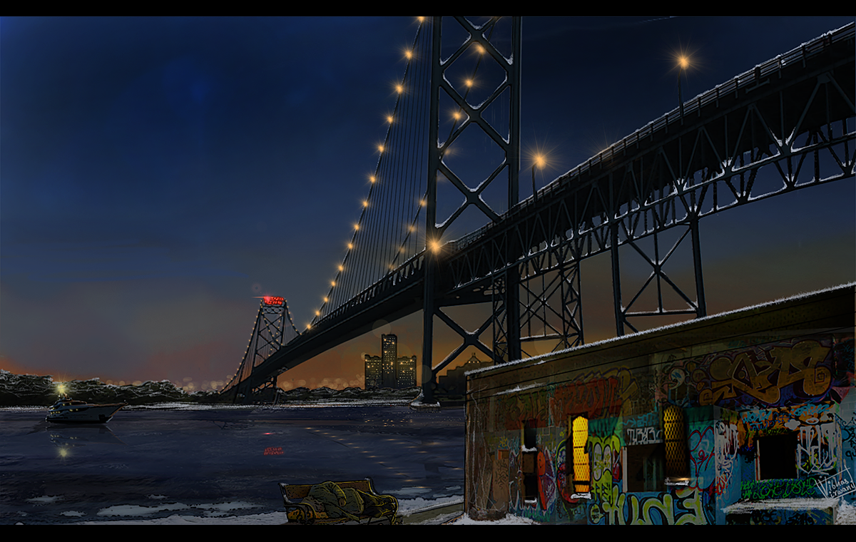
By now i had already spent about 5-6 hours on this illustration. I keep my left hand constantly on the keyboard and my right hand uses the pen tablet. By now i have my Photoshop keyboard shortcuts down , my studio-space/desk organised for the best flow. I dont look down onto the keyboard or the tablet much at all really ! My eyes are usually glued to the screen and it took me a quite a bit of practice to get that muscle memory down. Only now do i feel fluent with it as any other traditional medium such as oil painting, acrylics or just sketching in general. It had been 5-6 hours already and that in my mind is already quite a lot for a single comic book panel !! I think professional comic book artists manage creating about a page every day or two !! So i needed to start wrapping it up, which is when i realised that i got a bit lost in rendering and forgot about the homelessness !! So from the previous WIP(work in progress) image , the only difference in this one is homeless man sleeping on a bench drawn from a pic on the mood-board. It was the only image i could fit properly in the correct perspective. To manipulate the lighting and shadowing i first made the homeless man on the bench - cutout , into a Gray-scale layer ! Adding the colours on top of this Gray layer with a clipping mask and a combination of layer modes : multiply , soft light , colour and overlay. That might have taken me about 15-20 minutes tops and now i could totally focus on final rendering. I gave myself about an hour for the task, but of course got carried away, and it took me about 7 and a half hours in total to finish the image.
Here come the finishing touches !! Rendering elements further, cleaning up bad erasing jobs on various layers , adding snow/ice to the foreground bank of the river, adding the lights on the bridge, adding the light on the yacht , adding reflections of the yacht, bridge lights, and the city lights onto the water and removing the light falloff on the building in the foreground. A quick note on how i made the light flare. I observed the target image often during the whole process, and thought through the way to do this. On a new layer , i first made a round hard brush single dot with a shade of yellow picked from the target image. Now i picked up a pressure-sensitive pointy hard smudge brush and started smudging out strokes outward from the centre of this dot so replicate the flare look. Duplicated this layer 2-3 times and blurred it up differently on each of these duplicates ( original hard edge flare still showing through) i played around with the layer modes on these duplicate blurred layers also till i finally got a close enough result ! I merged all these light layers , and then basically duplicated them all over the bridge and other places in appropriate scales. And ....The final image again:
So you tell me, Is this thing even Art ?
I hope this has helped teach a few of you at least some tricks. Maybe this tutorial is not for an absolute beginner, and may require at least beginner level knowledge, but i would love to hear about how i could improve on that. I have battled sceptics all my of my short young career, lol. People who don't believe i did this. OR people who believe its simply computer generated and the computer does all the work, no real skill involved in it. OR people who feel like digital art is not really art, because its not really tangible. I would love to hear your feedback comments and criticism. Thanks a lot for the patient read & hope you enjoyed it.

Absolutely amazing. I love your "art" and cannot wait to see more. And yes it definitely is art.
wow , thanks a ton ! I really appreciate your patience to check out the post :) I'm glad you like it and think it IS art ! :) Humbled ! :)
Wow! great work and an awesome tutorial. will try it out for sure.
@originalworks
The @OriginalWorks bot has determined this post by @vibvir to be original material and upvoted it!
To call @OriginalWorks, simply reply to any post with @originalworks or !originalworks in your message!
To nominate this post for the daily RESTEEM contest, upvote this comment! The user with the most upvotes on their @OriginalWorks comment will win!
For more information, Click Here!
This is great bro... Nice art let's see your next work... Tempting me to do some as well ... Steem on friend!!
thanks a ton ! :) I'm glad i have you hooked on and wanting more :D
Wow, you explain the process of creation including the psychology.. I was in your brain for 10 minutes. Great work btw, the artwork is awesome and this post is even better.. resteemed
oh wow ! lol i was writing my brains out :P I think the psychology of the process is sort of important to understand, specially with the improv. aspect involved. and to avoid catch 22 situations of getting stuck with rendering parts of the image. :) lol. Humbled by your response. Thank you very much :)
Wow, this is too good to be true!! 😔 😅 Nailed it man, more respect for your skills now.
haha thank you so much for that compliment @siddartha ! peace !
Definitely Art!
Great work, thanks for sharing
thanks ! I'm glad you think this is art ! :)
This post has received a 3.01 % upvote from @booster thanks to: @vibvir.
awesome my friend, just awesome! :D
:D :D thanks ! humbled !
This post has received a 9.62 % upvote from @buildawhale thanks to: @bethalea. Send at least 0.100 SBD to @buildawhale with a post link in the memo field to bid for a portiona of the next 100% upvote.
To support our curation initiative, please vote on my owner, @themarkymark, as a Steem Witness
I have a soft spot in my heart for City Art, this one included. Thank you for sharing.
you are most welcome ! please remain hooked for more :)