Nina/Alexander y Edward Elric (Full Metal Alchemist): Ilustración y proceso / Nina / Alexander and Edward Elric (Full Metal Alchemist): Illustration and process
Español
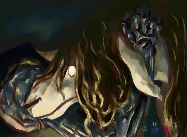
En esta ocasión quise realizar un fan art del animé Full Metal Alchemist, pues es quizá mi preferido dentro de la animación japonesa. De igual modo, me resultó interesante plasmar a uno de los personajes que más ha conseguido sobresalir dentro del mencionado animé, a causa del modo en que fue transmutado. Así pues, quise añadirle aún más dramatismo a la escena, incluyendo al personaje de Edward Elric, acompañando a Nina-Alexander, sin poder hacer más que eso, ocultándose, apenado, tras ella/él, mostrando una de sus características más denotadas: el automail. Dicho esto, iniciaré a explicar el procedimiento de esta ilustración.
English
On this occasion I wanted to make a fan art of the anime Full Metal Alchemist, as it is perhaps my favorite within Japanese animation. Similarly, I found it interesting to capture one of the characters that has managed to excel within the aforementioned anime, because of the way it was transmuted. So, I wanted to add even more drama to the scene, including the character of Edward Elric, accompanying Nina-Alexander, without being able to do more than that, hiding, distressed, behind her / him, showing one of his most denoted characteristics: automail. Having said that, I will begin to explain the procedure in this illustration.
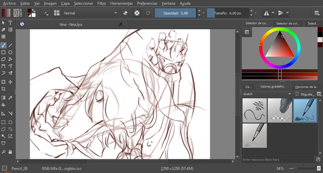
1.
- Como es lógico, comencé por realizar un boceto con el Lápiz 2B (disponible en el menú desplegable de pinceles, en la categoría sketch), con un color terracota similar a la sanguina, pues quise emular el efecto de la misma.
- As is logical, I started by making a sketch with the Pen 2B (available in the drop-down menu of brushes, in the sketch category), with a terracotta color similar to sanguine, because I wanted to emulate the effect of it.
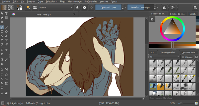
2.
- Una vez finalizado el esbozo, en otra capa, procedí a ubicar el color propio (el color propio es, por lo general, el tono medio del objeto) de cada elemento dentro de la composición, de un modo más bien plano, con el pincel quick circle big.
- Once the outline was finished, in another layer, I proceeded to locate the own color (the own color is, in general, the average tone of the object) of each element within the composition, in a rather flat way, with the brush quick circle big.
3.
- Continué por bajar la opacidad del boceto, y en la misma capa que creé en el paso anterior (cabe destacar que en los procedimientos siguientes, a excepción del fondo, únicamente pintaré sobre esta capa), comencé a ubicar los tonos bajos (oscuros/sombras) de cada elemento presente en la composición haciendo uso del pincel basic wet (disponible en el menú desplegable de pinceles, en la categoría wet) con color azul, pues este color se encuentra presente en todas las sombras en la realidad.
- I continued to lower the opacity of the sketch, and in the same layer that I created in the previous step (it should be noted that in the following procedures, except for the background, I will only paint on this layer), I started to locate the low tones (dark / shadows) of each element present in the composition using the brush basic wet (available in the drop-down menu of brushes, in the category wet) with blue color, because this color is present in all shadows in reality.
4.
- Seguidamente, añadí los colores de cada elemento, pero en tono más bajo, sobre el azul, de igual modo, con el pincel basic wet.
- Next, I added the colors of each element, but in a lower tone, on the blue, in the same way, with the basic wet brush.
5.
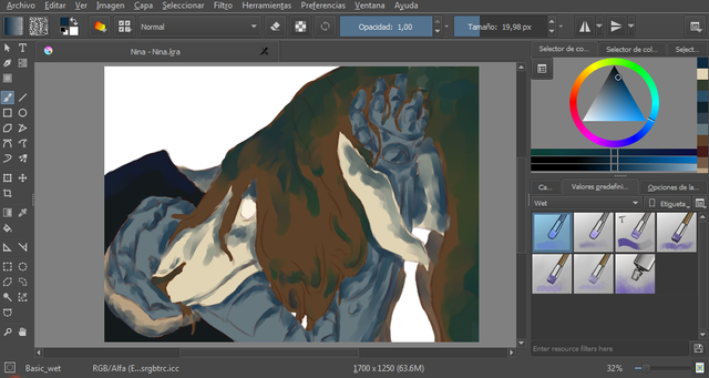
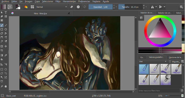
- Acá comencé a añadir una luz amarillenta en contrapicado (con dirección desde abajo) con la intensión de sugerir dramatismo. Asimismo, con el objetivo de generar más contraste tonal, y por consiguiente tridimensionalidad, opté por intensificar los tonos bajos (basic wet).
- Here I began to add a yellowish light in low-angle shooting (with direction from below) with the intention of suggesting drama. Also, with the aim of generating more tonal contrast, and therefore three-dimensionality, I opted to intensify the low tones (basic wet).
6.
- Creé otra capa para comenzar a trabajar el fondo, con el pincel quick circle big, de un modo netamente plano. Utilicé un color perteneciente a la gama de los azules, con el fin de realzar aún más los tonos altos (luces amarillentas), pues el azul es complementario del amarillo, por tanto, se genera un contraste de color. Por otra parte, el azul evocaría una sensación de aflicción que no lograría el violeta, también complementario del amarillo.
Por otra parte, además comencé a trabajar las texturas del metal, continuando con el pincel basic wet, generando pinceladas diagonales que coincidieran con la dirección del automail, con la finalidad de sugerir la dureza del mismo. - I created another layer to start working the background, with the brush quick circle big, in a clearly flat way. I used a color belonging to the range of blues, in order to enhance even more the high tones (yellowish lights), because the blue is complementary to the yellow, therefore, a color contrast is generated. On the other hand, blue would evoke a sense of affliction that violet would not achieve, also complementary to yellow.
On the other hand, I also began to work the metal textures, continuing with the brush basic wet, generating diagonal brushstrokes that coincided with the direction of the automail, with the purpose of suggesting the hardness of it.
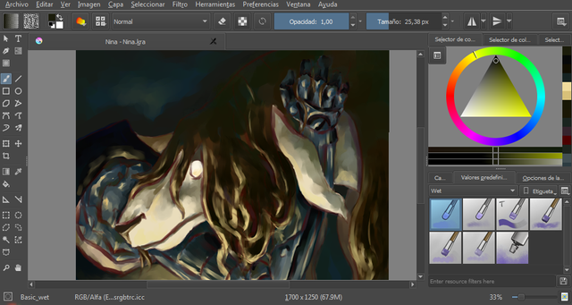
7.
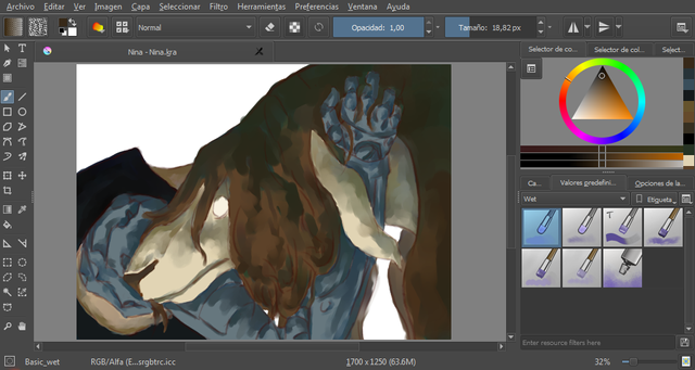
- Seguí trabajando en el fondo, añadiéndole tonos más bajos a modo de viñeta. Asimismo, también continué trabajando el metal, añadiendo las luces de tendencia amarillenta, sin embargo no en tonos bruscamente altos, pues daría la impresión de ser un metal excesivamente lustrado, y no es el caso del automail de Edward, que por el contrario ha sufrido múltiples accidentes.
- I continued working in the background, adding lower tones as a vignette. Likewise, I also continued to work the metal, adding the yellowish trend lights, however not in sharply high tones, as it would give the impression of being an excessively polished metal, and this is not the case of Edward's automail, which on the contrary has suffered multiple accidents.

8.
- Decidí utilizar un color rojizo acarminado, y un magenta en tono muy bajo para realzar algunas zonas, a modo de líneas divisorias, que al mismo tiempo hiciesen la vez de sombras (basic wet).
- I decided to use a reddish-brown color, and a magenta in a very low tone to highlight some areas, as dividing lines, which at the same time made shadows _ (basic wet) _.
9.
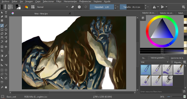
- Continué añadiendo detalles, véase el cabello, así como el automail.
- I continued adding details, see the hair, as well as the automail.
10.
Una vez añadidos estos detalles, proseguí a plasmar los matices, que no es más que incluir, en cantidades mínimas, todos los colores de la composición en todos los elementos presentes en la misma. Así, por ejemplo, el cabello tendría azules y amarillos, como el color de la piel y el automail de Edward. Por otra parte, también coloqué el color reflejo, que es muy similar a los matices, sin embargo solo se añadirán en un elemento, en los tonos bajos (oscuros) del mismo, los colores de los elementos más cercanos a este.
Once these details were added, I continued to capture the nuances, which is nothing more than including, in minimum quantities, all the colors of the composition in all the elements present in it. So, for example, the hair would have blues and yellows, like skin color and Edward's automail. On the other hand, I also placed the reflection color, which is very similar to the nuances, however, only the colors of the elements closest to it will be added in an element, in the low (dark) tones of the same.
%20y%20finisco.png)
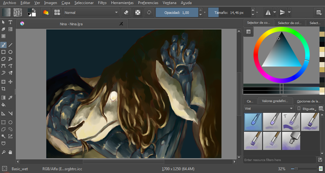
Y he aquí la ilustración finalizada. Me divertí muchísimo pintando a estos personajes. Gracias por leer hasta el final, estaré subiendo más procesos de mis ilustraciones/dibujos/pinturas. Se despiden la luna y el lobo <3.
And here is the finished illustration. I had a lot of fun painting these characters. Thanks for reading until the end, I will be uploading more processes of my illustrations / drawings / paintings. The farewell of the wolf and the moon. <3.
Y si te gusta nuestro trabajo puedes seguirnos en nuestras redes/ And if you like our work you can follow us in our networks:
Facebook
Tumblr
Instagram
Deviantart
Attribution 4.0 International License"
Copyright @elsll - All Rights Reserved
La ilustración fue realizada con el programa Krita/The illustration was made with the Krita program
buen trabajo, congrats!!
Para compartir tus art-draws, (dibujos, pinturas), búscanos en discord Arte spanish latin color
Muchas gracias!
Este post fue elegido para ser votado por theunion.

Puedes unirte en nuestro canal de https://discord.gg/SmW4gA
Wow! gracias nuevamente! <3
me gustan tus ilustraciones men!
Muchas gracias!
wow what a sketch seriously i am giving you an upvote and following to
my id @dashingh
thaaanks!
do followme @dashingh
i love Full metal! nice piccar!!
Thanks! <3
Congratulations @elsll! You have completed some achievement on Steemit and have been rewarded with new badge(s) :
Click on the badge to view your Board of Honor.
If you no longer want to receive notifications, reply to this comment with the word
STOPDo not miss the last post from @steemitboard!
Participate in the SteemitBoard World Cup Contest!
Collect World Cup badges and win free SBD
Support the Gold Sponsors of the contest: @good-karma and @lukestokes
You've received an upvote from @slothicorn! Click Here to Read our New Curation Policy And Updated Rules
(@justatouchfey) ((.)ω(.))
ohhhh thaaaaanks! :D