Improving Tauchain and Agoras branding

Hi @kevinwong we are proud to present you our proposal to improve both Tauchain and Agoras branding. Hope you enjoy it.
INTRODUCTION
We know the Tauchain project since late 2016. The concept and its possibilities have always captivated us. Since then, we collaborated with the project by acquiring some (AGRS) Tokens and also by creating a distinct wallet paper exclusively for Agoras.
Ohad Asor is a genius, thats a fact, and we are convinced that he will pursue to achieve his purposes and that Tauchain will be revolutionary.
As an answer to the convocatory of a contest based on the Tauchain project, we have embarked to give an answer to both proposals: Tauchain and Agoras.
For such responsibility, we: @capitanart, @Fragenstein, @HippieCycling & @jordiles members of the Tauchain community have united, motivated by the same admiration for the project, to give the best proposal to both objectives.
Below we describe our proposals:
TAUCHAIN ISOTYPE
For the Tauchain Logo, after studying its history, symbolism and semantic meaning, we focus on the mathematical meaning of Tau as a constant equivalent to (2π) and its direct relationship with the geometric figure of the circle. For millennia, this geometric figure has been considered the most perfect, symmetrical and easy way to define. Symbolically and linking these concepts, we consider that tau should be contained within a circle because of the mathematical meaning exposed.
That’s why we recognize mathematics as the "universal language" and at the same time language as the pillar of this project. Our main idea was the written word "tau" showing in it both the Tau symbol, and the Alpha of Agoras.
And that's how our idea was born.

AGORAS ISOTYPE
Regarding the logo of Agoras we were clear that the Alpha symbol is the protagonist and follows the aesthetics present in the Tauchain logo. For that reason, we represent Alpha in the center of a circle.
We want the two logos to be related, not only in their geometry but also in their names, since the letters (A) are replaced by the Alpha symbol of Agoras.
As a hidden symbolic curiosity, if we rotate the Alpha anti-clockwise 90º we can distinguish how it becomes an already fertilized uterus, referring to the hermetic meaning of tau and at the same time a parallelism with Tauchain's project as the living being that is is brewing and maturing in the placenta.
![]()
LOGOTYPE
The choice of this typography is not accidental, we consider that the bold type (Bold) sends a striking message, also with the peculiarity that the two letters (A) from Tauchain are at the same time the logo used for agoras.

LOCK-UP
These are the main brands of Tauchain and Agoras, which will be displayed by the customers. It is important, especially in the initial stages, to associate the name with the brand and vice versa.
Only after the brand has been established it is possible to start using them separately but until then, this would be its distribution.
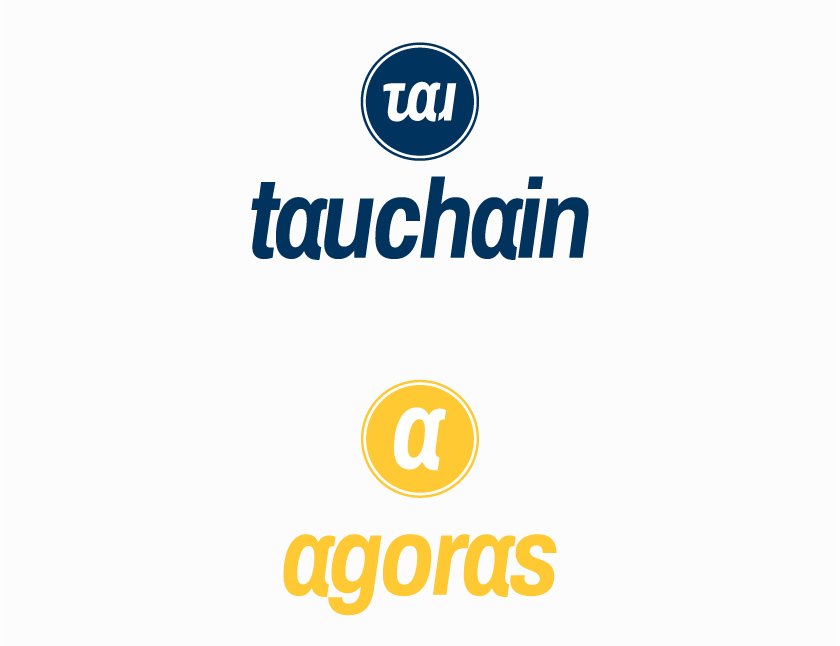

COLORS
These are the main combinations for our brands. Blue for Tauchain that inspires confidence, security and stability. Yellow for Agoras a color related to creativity, innovation and ideas. They will be used whenever possible.
If there is a color limitation, black and white will be used.

DESIGN AND COMPOSITION
Tauchain and Agoras uses the typography Archivo Narrow Bold Italy and the logo design for tau uses some of these letters.
For the design we have used the letters u + a + u superimposed on each other, forming the whole.
To the first (U), the tick marc of tau has been added to it.
To the letter (A), a termination in the upper right to represent alpha.
To the last letter (U), a cut to make the Alpha symbol evident.
We already have Tau and Agoras!
When we propose the dimensions of our logos within the circle, we start from a golden rectangle. As seen in the design, circle number 5 is the one that serves as our base. We make a division of thirds to place tau on those margins and alpha on a diameter inside circle 3.
Once our logos are centred, we create an internal border with dimensions that are calculated leaving a margin 4.2% smaller than the total diameter. Then the thickness of the line is removed by having the previous percentage (2.1%).
All the details were taken into account.
Of course, this design is vectorial and can be adapted to any dimension.

WHITESPACE
It is important to keep a blank space around our brands, add confidence and clarity. The minimum is calculated by reducing the logo by 50% as shown in the following examples.

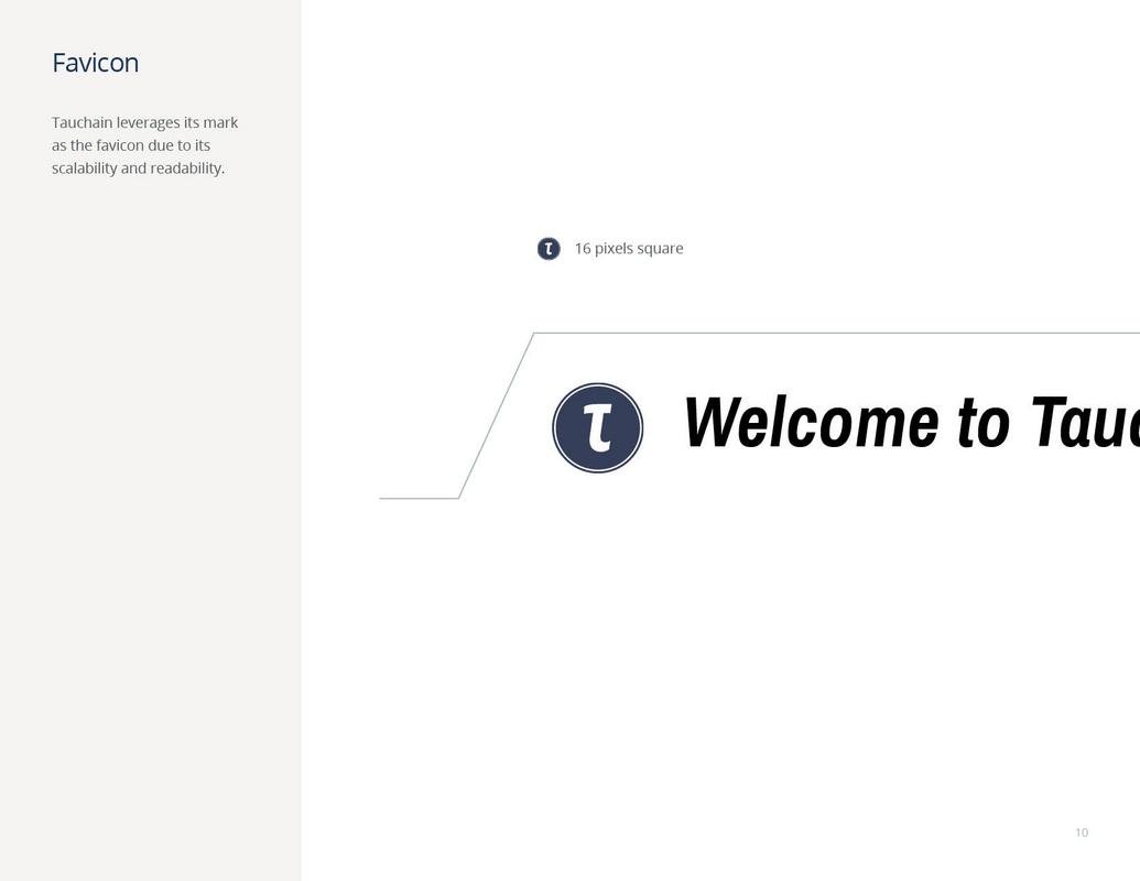
MINIMUM SIZES
We must take into account that the logos will be displayed in small spaces such as favicons or in a mobile app.
We propose a minimalist version of the tau logo with only the (t) which is also in the main design.
The Agoras logo works perfectly at any size.
CONCLUSION
Our proposal is clean and clear and allows multiple combinations, something important for a brand in order to adapt to the future and never go out of style.


![]()
![]()
![]()
Please vote our project if you liked it. Thank you for your time.
Very nice designs, appreciate the effort
Good luck in the competition
thank you for your time, the truth is that the project has all kinds of details
Just caught this right before bedtime!
Love the concept and thought process behind them @capitanart. Appreciate the work you've put into the designs. Resteemed!
This is the best effort I've seen so far.
It is very kind of you and a compliment that you bother to write us @dana-edwards
I got a heart-attack when I misread bedtime as deadline.
Phew!
Thank you @kevinwong, it has not been a hard work, we believe that the project deserves the effort.
Thank you! We have done it with great enthusiasm. Tauchain is the best project in the Crypto world.
hey, I have just come across your work and really like it. I am just going to go ahead and plug my stuff in here . We are a non profit in Switzerland looking to do conference but are in need of a logo
Since we are non profit we cannot pay that much but we will give credit on the website and link to yours.
https://steemit.com/contest/@felander/contest-design-our-logo-and-win-25-sbd
the account that will be using it is @cryptoworldzug
if you are up for it we would appreciate you making an entry
thanks in advance
greetings felander !! Thank you very much for your comment. We will study your proposal, it will be an honor to participate in this challenge as well.
cool, looking forward to the entry
Wicked! I like it
hahahaha, thanks saliv8
Nice work. Tough competition!
There really are very good jobs, we have put a lot of effort to stand out. Thanks for your comment
Very good designs, appreciate the work you've put into designs
very kind ariyo, in fact it has been a teamwork, each of us four has contributed an important part.
Wow this is amazing! I love the simplicity of it.
We believe that this project requires a clean image, here is the greatness of the simple. Thanks for comment.