The New Steemit Logo Is "Meh" [ #SteemitLogoChallenge ]

I'm not the one to complain and not have a solution or a suggestion. I was excited to see all of the upgrades on Steemit this last week. One thing I was not to fond of is the logo. I get what they were trying to do with the "S", but it looks like a messenger app to me. I sat around thinking of some ideas on how to make it better. I'm not much of a graphic designer but I came up with this logo.
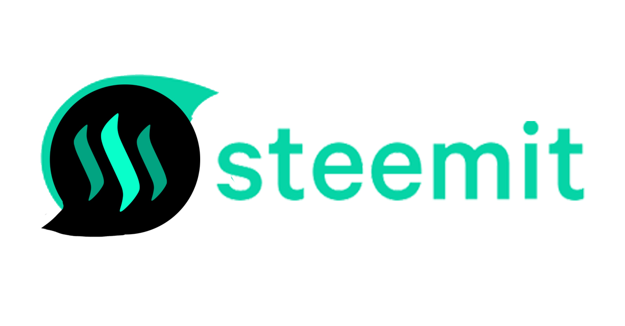
I figured the reason it felt weird was the lack of "steem". So I simply added the old logo to the design. Nothing crazy. Tell me what you guys think. Post any suggestions in the comments. Being a little guy on this site I doubt I can make much of a difference but, I feel like with all the people I see complaining about it we can make them change it if we all make similar posts.
The biggest problem I have with it is the color. Or atleast, if they are going to keep it that way, they should make it possible to easily change the color scheme for the rest of the site.
I didn't think much of the design of the logo but I guess it's a bit boring. Your logo looks better, in my opinion. But I remember reading a big reason why they changed it was to make the difference between Steem and Steemit less confusing. So they might not want the Steem in there at all.. Peace
yeah the color sucks... but the last color scheme was facebooky...
I don't do FB; but, I do love lapis blue. I also loved the previous logo. Steemit has many concerns. The logo wasn't one of them. It's too bad we didn't do a democratic one of three vote.
Somehow, I think your challenge will be like my current post, "Get the Feeling, No One is Listening."
If they wanted your input, they would have announced the challenge. That said, I'm glad the bubble wearing a toupee, isn't just me.
Respectfully, the designer of this logo put a lot of creative energy in the design. He made a recent post on his thoughts behind it.
Thanks for this post!
Peace.
Do you have a link to the post? I would like to read it.
@voyceatlas I wasn't sure which link you were speaking of; but, you will find the links to all of the posts listed at the end of the post listed below:
https://steemit.com/steemit/@spiritualmatters/will-the-steemit-logo-hurt-future-success
I hope this helps!
Peace.
Thanks! I was asking about the designers post.
✌
Nice work.
That would be visible as a thought bubble, plus tie in the Steem blockchain.
If they use this, it would be completely acceptable. I could see it as an app button on my phone.
Thanks! also great video laying everything out.
Cheers. Appreciate it. And like your work. Are you a graphic designer?
I prefare the old logo too. Much better than this.
MUCH Better!!!! We need the steem in it. I mean the double chat S is cool...but lacking.
I like the one with the steem in it. I liked the old logo. Things needed to change but the logo was not very high on that list in my opinion.
I like your logo better for sure.
thanks