You are viewing a single comment's thread from:
RE: Steemit Welcome Page Design Concept 3 - Final Entry
Funnily enough out of everything you said, making a reflection for the letters is the easiest thing. I actually already did it, but ended up hiding the layer as it looked unnatural. The texture on the extrusion is an excellent idea, I hadn't considered that. As for the reflection of the logo, it is portrayed exactly how a reflection would be, I fear that If I made a gap between the two it would no longer look like a reflection..
Those changes may take a little while but, I quickly made a version taking your advice about moving the shadow effect.
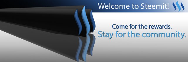
Better?
one other thing I should have mentioned, that is quite relevant - I did not take into account that amount of work involved in implementing any of the changes.
As someone who is constantly on the receiving end of suggestions to just put that there I know how frustrating some of the suggestions can be.
So please take anything i say with a grain of salt, and if it will take a bunch of effort, or you disagree with it, feel free to ignore my suggestions.
I won't be offended, honest.
As for this change - I think it works better. there is greater contrast now so the words stand out more. Otherwise the background tends to look a little 'dirty'.
I can't think of a better way to describe it.
As for the reflection - keep in mind this is a logo, not a photograph. It does not have to mimic real life. It's art, so place the components in such a way that the convey the message most effectively and / or are most pleasing to the eye.
Again, just my 2 cents worth. ;-)
No.. They are very good suggestions. Sometimes you need some fresh eyes to point out things you have overlooked when you have been working on something for a while. I thank you for the suggestions.