Hi, today I have decided to write about how to resize images of steemit posts when you design your blog posts. Firts of all , I consider you know a little bit about markdown and html markup. If You are newbie at coding and you want to make your post design beautiful, just follow my blog.
Well, I am not a writer. especially when writing in English :) So I will not write nice novels here :) the only thing, I can promise, is that I can give you the tricks, what you can make beautiful blog posts with them.
So, We have 2 choices for styling our posts - the 1st is html markup , the 2nd is markdown.
Both of these 2 methods have their own advantages and disadvantages. But we can make powerful design tricks with help of mixing the methods.
Web designers don't use markdown for styling their websites because markdown is not relevant to coding. it is just used for documention of programming libraries etc. Steemit does not support CSS - Cascade Style Sheet that is why we can not change text colors, width of elements , font types and more...
Steemit has own 3 css classes to change layout and text of posts. By the way I do not know why steemit does not create more css classes for making more amazing desings.
class="pull-left" - float elements to the leftclass="pull-right" - float elements to the rightclass="text-justify" - Use it to justify text

Lorem Ipsum is simply dummy text of the printing and typesetting industry. Lorem Ipsum has been the industry's standard dummy text ever since the 1500s, when an unknown printer took a galley of type and scrambled it to make a type specimen book. It has survived not only five centuries, but also the leap into electronic typesetting, remaining essentially unchanged. It was popularised in the 1960s with the release of Letraset sheets containing Lorem Ipsum passages, and more recently with desktop publishing software like Aldus PageMaker including versions of Lorem Ipsum.
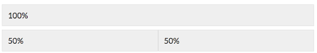
When you use class="pull-left" and class="pull-right" the browser add some css codes like below. These classes change width of sections and divide container width of entire post into 2 Parts as 50% / 50%
.pull-left {
    float: left;
    padding-right: 1rem;
    max-width: 50%;
}
.pull-right{
    float: right;
    padding-right: 1rem;
    max-width: 50%;
}
I hope you learn some things so far here . Now let us Shrink size of image 4 times.
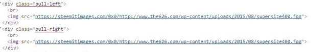
When you add
class="pull-left" inside
div 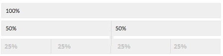
now We have learnt how minimize the size of image 4X times. if we go deep nesting we achieve to minimize 8x times
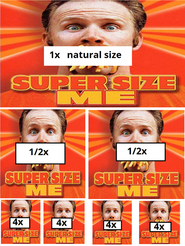
Bonus trick to minimize images by 1x , 2x, 3x, 4x, 5x, 6x, 7x, 8x, ......But I do not advice to use this method to decrease image size
My last trick is if you are not good at coding, just try your photo editor to resize and edit images. this is an easy way. That is all my friends.
👉👉👉Size Your Text 📑 How many you want - micro sizing - read more
LongLongLongLongLongLongLongLongLongLong LongLongLongLongLongLongLong
TEXT1TEXT1TEXT1TEXT1

You may also like my other posts
If you think How to donate to this ℒady 
If you think others will enjoy this Please ReSteem it!


I was wondering how to do this, then I just gave up lol. Thanks for the guide.
It is difficult for me to explain messy codes, You will agree with me when if you see that codes, for example below
LongLongLongLongLongLongLongLongLongLong LongLongLongLongLongLongLong
Vert nice effect.
NiceNiceNiceNiceNiceNiceNiceNiceNice
Thanks Ladyluck! We were able to resize our images thanks to your help!! Here is the post: https://steemit.com/introduceyourself/@rappingprof/yo-steemtown-rappingprof-intro-and-daily-top-three-proposal
I am happy to help you
Whew! Thanks for this!
👼👼❤🙌
👼 ❤ @artgirl
Helpful guide!
thanks