New design concept for Steemit website
Hi Steemit Community,
I have been using Steemit for several weeks now and have had the opportunity to see the platform change and evolve. The devs have done a great job listening to the community and updating the site functionality by adding new features. There are several new amazing tools and add-ons developed by community members that have improved the overall experience.
A lot of the content that has been created by both of the devs and the community are not readily incorporated into the current website GUI, which means a lot of new users, unless they look very hard, don't get to experience some of the amazing work that others have put into their creations
Im not much of a Graphic Artist, but for the past week I have been working on concepts and mockups that incorporate some of the features that community members have built as well as features that I would like to see in the future. Included is also some minor updates to the existing platform that I think make the site more pleasant.
As usual, I appreciate any feedback, comments, or suggestions and look forward to seeing Steemit continue to thrive.
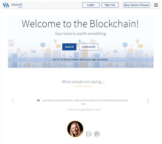
Front Page - Sign Up Page redesign - simplified the front page view to reduce clutter
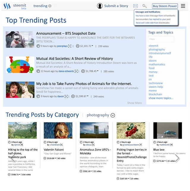
Front Page - Trending Page - Added color and made a few to the layout. Added a Messages and Notifications button which will allow users to message one another as well as get updates on replies, transfers, and other notifications (I read some posts by some users who would like these features added.) Layout allows for different panels so users aren't endlessly scrolling down the page. This layout allows the user to view by top rated content as well as content from categories they are interested in.
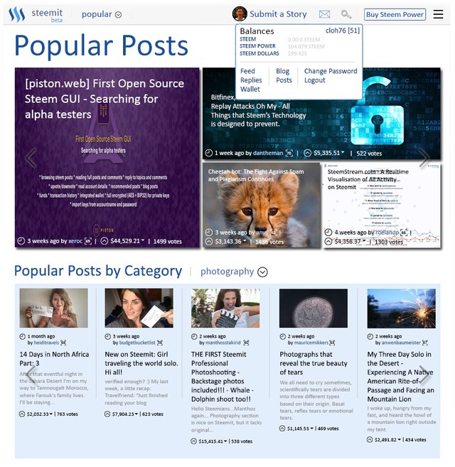
Popular Posts view - Reorganized the category view. In this example, the "Popular" category. The top popular categories of all time are highlighted and thumbnails are sized according to popularity. This also allows users to view by their favorite tag/topic category within the popular category. I have also updated the profile button to provide more account detail such as your Steem funds and the users reputation.
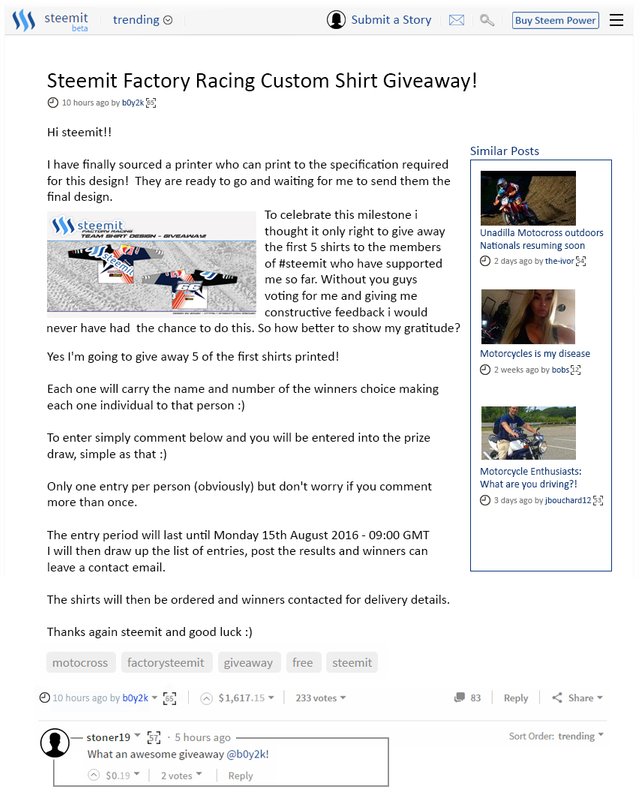
Post View - The post view has been updated to include suggested similar posts which users can link to and view. I have also updated the replies section so that it looks cleaner and easier to read. Additionally the ability for wrapped text around images to better utilize space and organize information on the page
I hope you enjoyed some of the ideas I have to share. Hopefully some of the features in these mockups will show up at some point. I think through continuous collaboration and sharing of ideas, this platform will continue to grow and develop
Interesting, it looks like some news portal. By why not.
+1 for Similar Posts section
These look really great! After they're implemented, we're very likely on the way to being the next Reddit!
looks interesting... looking forward for it to be implemented soon...
Similar posts section would be amazing.
Great suggestions. I totally agree with a cleaner home page. As far as better profile and transaction status I'm sure they will have updated all of that soon. Right now the Steem Dollars I selected to withdraw as Steem (I'll be converting to Power) are nonexistent on the site. I can't find anything about them. I'm sure I'll see them as Steem when the 7 days is over lol.
This post has been linked to from another place on Steem.
The Steemit Wish List - A Comprehensive List of Enhancement Requests from the Steemit Community - v1.1 by @timcliff
Let’s Make Steemit Better - Comprehensive list of suggested UI/UX improvements to make to the Steemit.com website! by @timcliff
Learn more about linkback bot