How I made my cover image look good on all devices (tutorial)
Yay Steemit has cover images! Oh wait, why does my cover image look great on my desktop but terrible on my phone? If you have asked yourself this question this post is for you! If you haven't heard that Steemit has cover images now, look under "Settings" and you will see that there is a place to upload a cover image URL right below where you upload your profile picture URL.
How to upload an image to Steemit to use for a cover image or profile picture
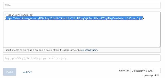
Before I get into how I designed my cover image to look good across different displays, I want to share something else I figured out last night. This may be old news to some but it was exciting to me! You do not have to upload your cover image or profile picture to a 3rd party site in order to display it on Steemit! You can just upload it to Steemit first instead. Click the "Submit a Story" link as if you were going to make a new post. Drag & drop, paste or select your image in the new post creation window. Once it is uploaded, just copy the image URL and use that URL in the "Settings" menu! Now you can discard the post and the image has still been uploaded to Steemit.
See example below - the highlighted portion is the image URL that you need:
Designing a Steemit Cover Image that will display well on all devices
Steemit uses a single cover image for all devices. As different devices have different display aspect ratios, you have to carefully plan out your cover image for it to look good on all devices. Standard best practice for web design (which this falls into) is to design for mobile first - it is always going to be hardest to get your page looking great on mobile. Steemit uses a responsive design that resizes the content of the website based on the width of the display.
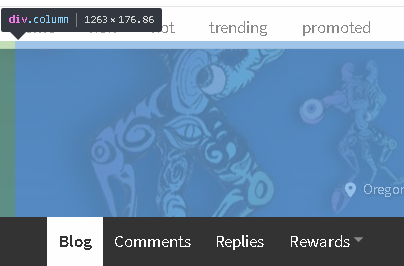
I started off my cover image design with an image that would look good at the smallest size the responsive design would display the image it - in this case that means that your image should be in a 72 : 31 aspect ratio. You can test this out for yourself even if you are on a desktop/laptop - just resize your browser window down until it reaches the minimum width that the Steemit CSS will allow. Once you have reached that size, you can inspect the header element with your browser's "Inspect" tool (most modern browsers will have an "Inspect" tool, usually reached by right clicking the area of a webpage that you want to inspect). The Steemit header image is contained in the "Div.column" div - it has a minimum size of 360px by 155px. 360 by 155 is a 72 : 31 aspect ratio.
Now obviously you don't want to upload a 360 px wide image as it will look terribly pixelated on a computer monitor! I used a 2160 x 930 image, which is in the same 72 : 31 aspect ratio.
EDIT - Cover Image Selection for non-graphic design types
The rest of this tutorial assumes a base level of graphic design experience and tools available to you - in specific an image editor that will let you work in multiple layers as you build your own cover image. If this is not you, you are best off just finding a high res image and cropping a section in the 72:31 aspect ratio. I would recommend a minimum size of 1920px by 827px, although I used 2160 x 930 myself.
Tips for Image Selection
- Pick an image that will both make sense zoomed in to a narrow horizontal strip across the center (desktop) as well as when viewed as a whole (mobile).
- Pick an image that is relatively dark, particularly in the center. The Steemit header uses white font and the text does not display well on lighter background images.
- Pick an image that that is not too "busy". You want your cover image to enhance the viewer's experience, not detract from it by making it hard to read.
Good luck!
Designing a Steemit Cover Image for graphic design types
The first thing I did was create a test header image that I looked at in a variety of display widths to see where the text elements of the header fell at different screen resolutions. This is the image I used:
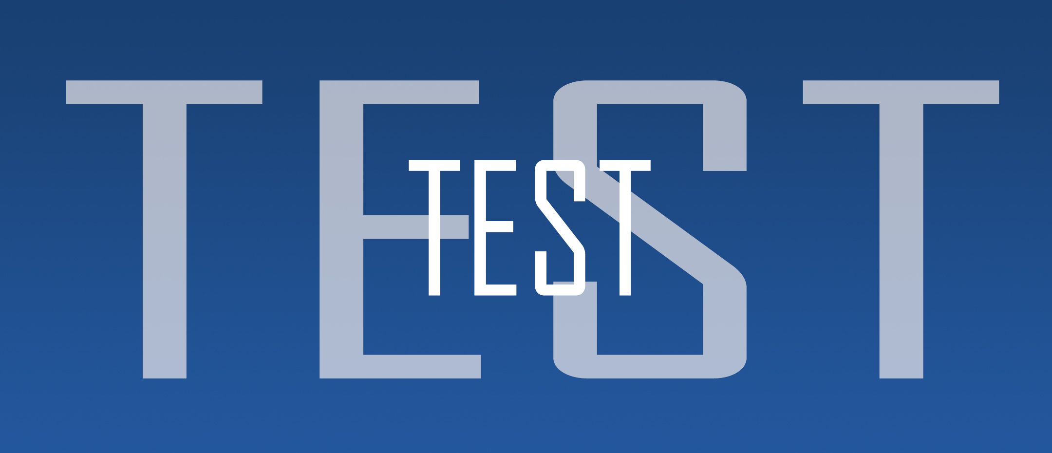
I release the Gnashster Cover Test Image into the wild with no restrictions or reservations. Do what you will to and with this image. Give me an attribution or not as you see fit. Cheers - Carl
The smaller "TEST" text in my test image is roughly the same size as the header text that Steemit will display if you are looking at the image on a desktop aspect ratio (I say roughly because the exact size of the text will vary based on how many characters your username is, how many characters your location is, etc.):
The larger "TEST" text in my test image is roughly the same size as the header text that Steemit will display if you are looking at the image on mobile:
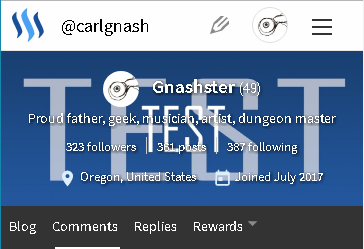
Feel free to use this test image as a template / guide layer to help you plan out your own cover image! Click here for the full sized test image.
Next I designed a cover image that would look good when a strip of it was displayed on a desktop, but would also look good when displayed on mobile in the 72:31 aspect ratio. The portion of the image that will be displayed in a desktop aspect ratio is a 176.86px tall strip centered vertically - the width will scale out for higher resolution monitors but the height will not go up past 176.86px as shown below:
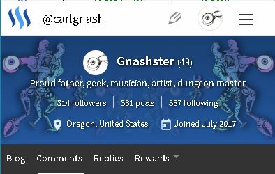
Keeping this in mind, I used my test image as a guide layer to help me place my design elements in the right places. I wanted one set of my eyeball mutants to display fully in desktop so I kept them under 176.86px in height. I wanted set of eyeball mutants to display fully in mobile; since I started with the correct aspect ratio to display fully in mobile, this set of eyeball mutants can take up most of the height of the entire image.
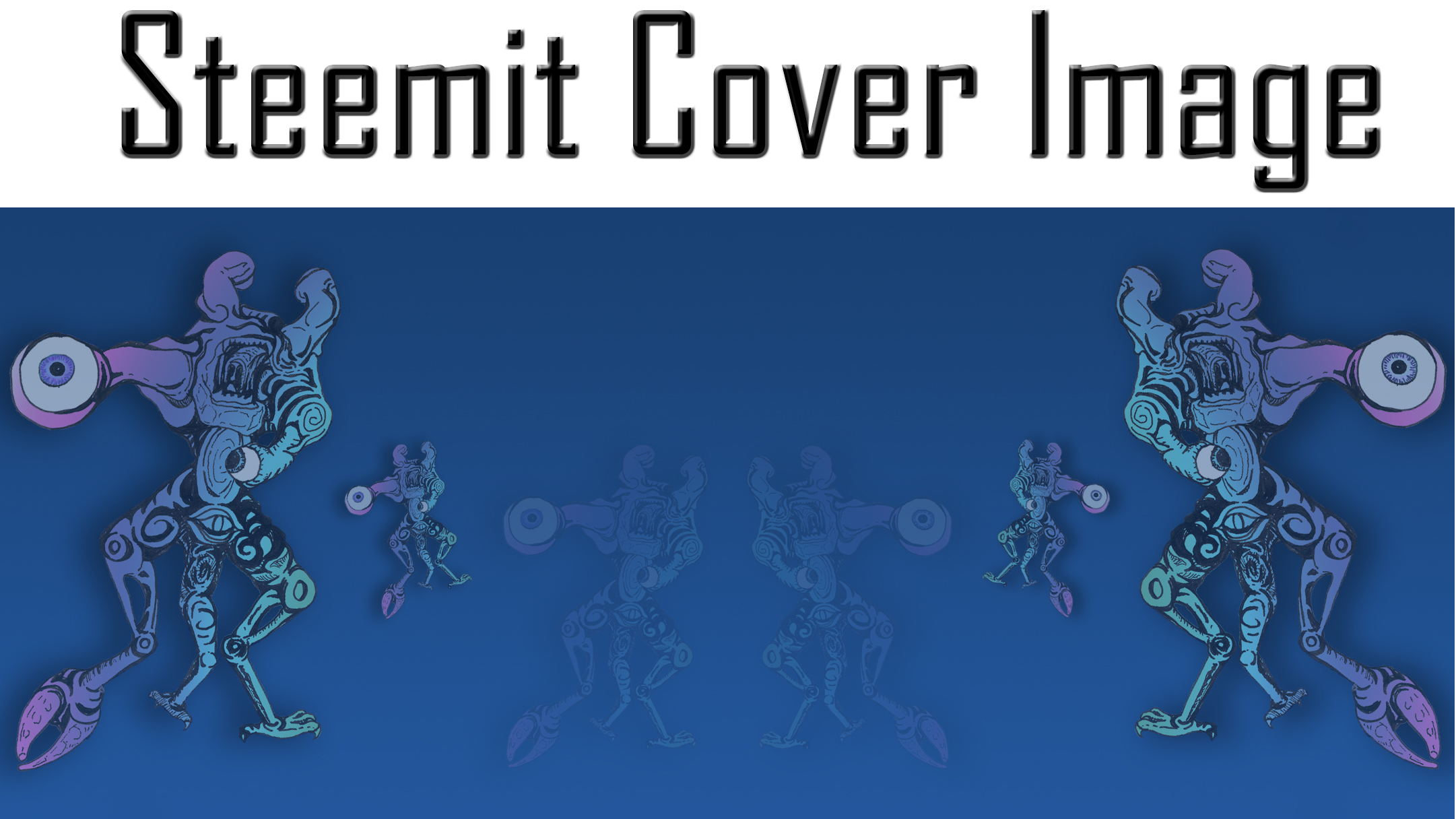
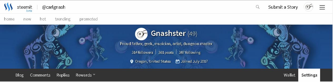
The end product is what you see at the top of this post. The eyeball mutant is my own original art - this is the same piece of art that I cropped my profile picture tentacle eyeball from.
The inside set of eyeball mutants are very transparent over a dark blue gradient background - this means that they will not interfere with the header text when displayed on desktop.
The middle set of eyeball mutants are displayed full size taking up the entire height of the header on desktop.
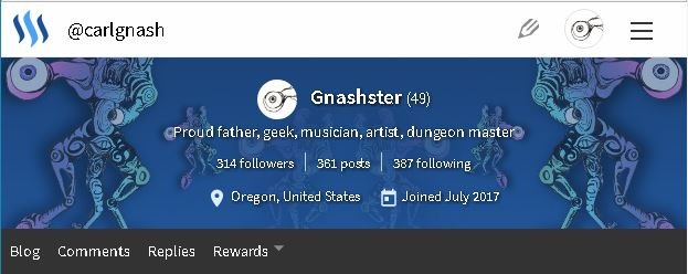
The outer set of eyeball mutants are displayed full size taking up the entire height of the header on mobile.
I like the way the header text looks sitting inside the eyeball mutant bookends. There are some inbetween screen sizes (hello tablets) and for these I tried to keep the larger eyeballs on the outer set of eyeball mutants inside the display area as a nice echo of my profile pic.
Here are some screenshots of it on different devices:
Mobile
Tablet
Desktop
EDIT - What I would do differently
This was my first stab at creating a cover image and I can pretty much guarantee you it is not going to be my last! I would expect my cover image to change a few times over the next few days as I fine tune things and try other stuff out. I may create a few different cover images to rotate through.
Having looked at my existing cover image on more devices now than I had when I wrote this post this morning, I am going to move my major design elements farther in from the left and right margins - the ends of the largest eyeball tentacles are cut off on some (most?) phones and tablets.
I am also considering a darker overall theme (in terms of color palette) to allow the white text to be crisp. I honestly don't like the css shadow that has been added to the header text - I understand why they did it, the text needs to be readable even on a white background - but I think it makes the text look fuzzy. If the center of the cover image design is black, the text will be crisp and white again with no visible shadow.
Original Work
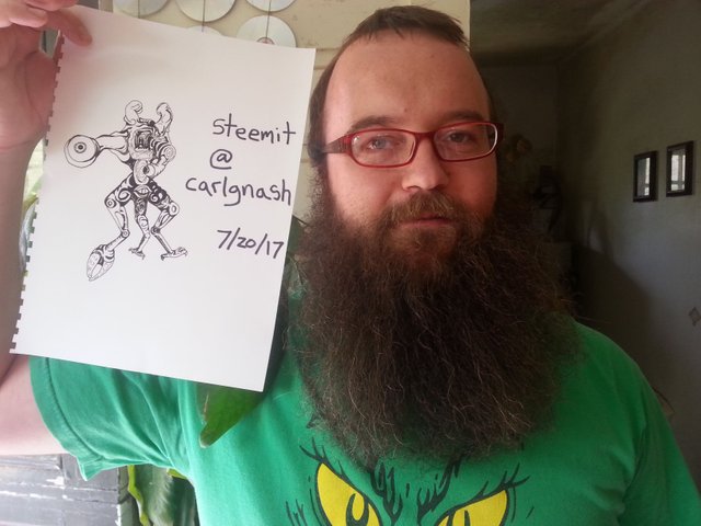
And just for fun, here I am holding the original Eyeball Mutant piece of art - I signed on top of it when I created my introduceyourself post, so there really is no question here that this is my original work!
Thanks for this useful information. Never knew there is a cover image :)
Well it just was added yesterday, so you haven't been missing out for very long!
Oho! I was wondering how I missed it. Thanks for clearing that up.
Cool
Very helpful information, thanks for putting all this together.
Thanks @shaka! I was looking through a few posts that people had made on the subject yesterday and it didn't really seem like anyone was tackling it from a mobile first design perspective. I hope this post is useful :) Cheers - Carl
The part about not using a third party to get an image url was new to me. Thanks!
Cool yeah I didn't know if that was common knowledge or not, I just figured it out so why not share it right? Following you now - I am an Oregonian as well :)
Awesome! Let me know if you hear about any steem meet ups in our area.
Great tutorial and love the sketch- resteeming
Thanks @anneke! Following you :)
VERY useful post which I have bookmarked for when my creative imagination comes up with a design of some sort to play with. Swirls of color? Hmmm. Really appreciate your step by step guides.
Thanks @hereandthere! Good luck when you do get around to playing with the cover image :) Followed you :)
Great job in here! Very good @carlgnash! Keep doin' it!! 👍
Thanks @em3di and thanks for the resteem! Following you :)
You' re welcome!
Cool . i like thes thx
@originalworks
@OriginalWorks Mention Bot activated by @carlgnash. The @OriginalWorks bot has determined this post by @carlgnash to be original material and upvoted it!
To call @OriginalWorks, simply reply to any post with @originalworks or !originalworks in your message!
For more information, Click Here!
Here are 10+ FREESteemit covers.
Feel free to use them!
https://steemit.com/cover/@antoniokarteli/pzrkd-10-free-steemit-cover-images-customized-steemit-cover
Resteemed and 100% upvoted. Thank you for using my service!
Read here how the new green bot from Berlin works.
@resteem.bot