eSteem 1.4.5 - An impromptu review of the Steem mobile client.
eSteem is a very powerful Steem Client. A mobile application available for iOS and Android, that lets you do everything (and MORE) than what you can do on steemit.com. It was developed by @good-karma. A lot of time and effort has gone into the app and it is an overall good app with great potential. You can read about its official features HERE.
I've been using it for a while and I decided to put out a detailed review of its functionality from the perspective of someone with a balanced approach to using the platform: I post, comment and curate, but I don't focus specifically on any of those activities. If you do, keep this in mind, as your mileage may vary. I'll discuss its features first, emphasizing its strong points, in case you want to be sold on it quickly, which is perfectly understandable, and I don't think you'll regret it. Then, I'll write about the weak points of the app and I'll share some heavily biased and personal suggestions, hoping they can be of use.
TL&DR: It's a very good app, with some technical spark and smoke. It has very useful features for serious and casual posters alike, such as Bookmarking and Scheduling, but it could be more visually attractive, you know, more eye-catchy for when you intend to show it to others. #esteem-feedback
eSteem Features
(P. 1 - Navigation Menu)
You can get eSteem very easily from the appstore on your preferred mobile OS. Unless you have a Windows mobile device, in which case there may be more important issues in your life than your inability to post to Steem while on the go. If there is one, good for you. Install the app and login with your Posting Password. The tooltip in the app asked for my WIF or Master password first, only letting me use my Posting Password after clicking the "advanced" option. While the app certainly offers features that would require the Master Password, they are few and they don't prevent this app from doing what it does best, letting you interact with the community: Posting and replying. This can be done with the safer to carry around Posting Password.
Maybe it's just a play on words, but I'd propose the idea that using the Master Password should be the "Advanced" option, rather than the other way around.
After logging in, you will be greeted by a very clean interface that shows you your familiar Hot feed. An interesting thing about opening into the Hot feed is that it makes the app more similar to other social media apps, as you see content streaming from the start. This makes it easier to share with other people, as you can lead with the "social" aspect instead of with:
"Let me tell you about this website where you can make money that sounds like a multi-level scam, but it's not; so let me tell you about this super complicated technology that makes it not scammy."
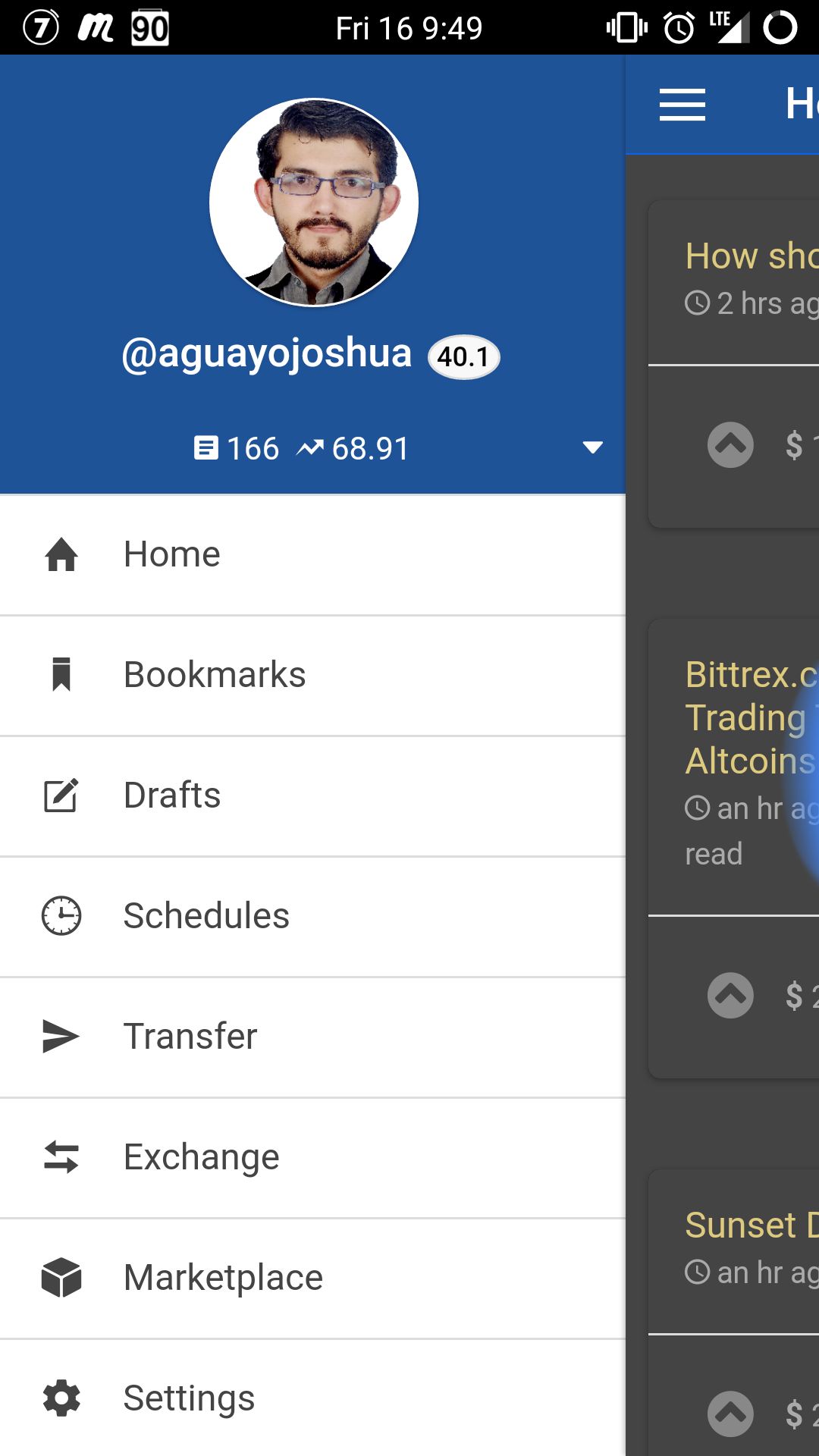
Furthermore. The interface is intuitive and will come to you rather quickly, even if you are not particularly tech-savvy. One of the first things that you will find in your exploration is the Navigation Menu, by swiping left to right (P. 1)
Bookmarks
For now, ignore everything else and look at Bookmarks. This feature alone can be enough to win a lot of people over. Essentially, you can go to any post or reply you want and add it to your Bookmarks. So you can save those links you want to talk about, those projects you wanna try, or those stories you wanna read later, it's quick and easy to add or remove them and this feature is a direly needed one for the web client.
Drafts
Maybe I just don't know how to use the web client, but this seems like another critical feature missing in the web client that this app makes you realize is missing. On eSteem, you can Submit a Post from the corner of the Home tab. But when you are ready to publish, you will also get the option to "Save" your post. Once saved, your post will wait for you in the nice and cozy Drafts tab, while you continue to procrastinate.
Schedules (Needs Master Password)
What's that? You will post tomorrow morning for sure? That's fine, open your Saved Post in your Drafts, tick the Advanced option and now you can Schedule your post for tomorrow morning. Make sure you give the dev @good-karma some love, because he may have just saved you a few headaches and second-guessings.
Transfer and Exchange (Need Master Password)
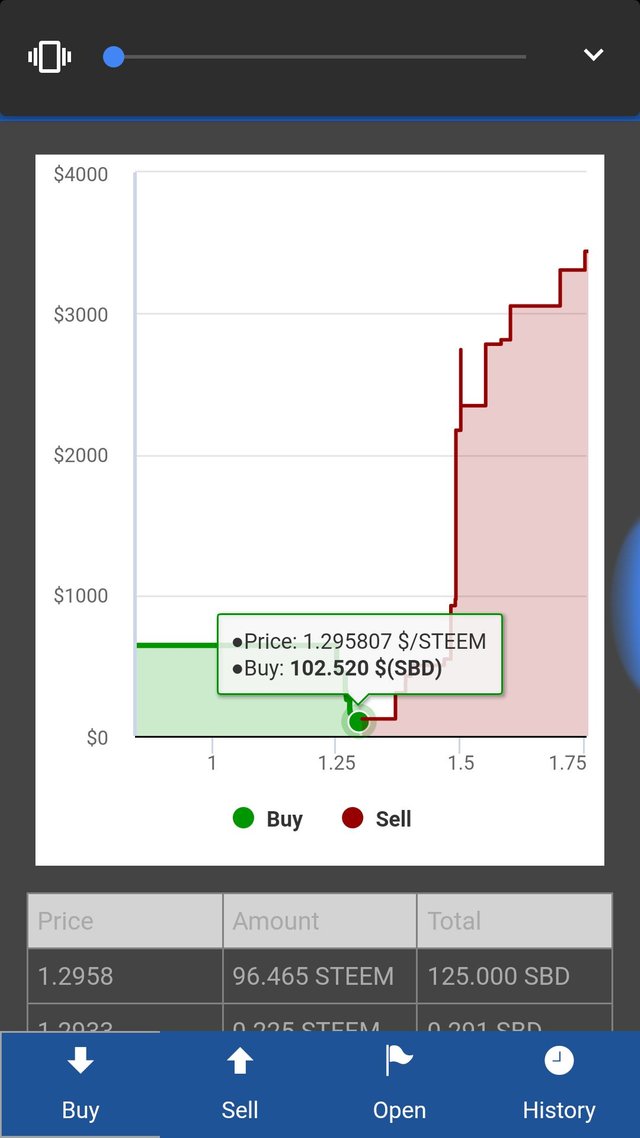
This should show you how much power this app packs. Not only you can do things you can't do in the webclient, it also lets you control your Steem bucks, in any flavor you have them. I really like this feature, and that is another reason for which I think it would be better practice to use the Posting Password as default login. From Transfer you can move your Steem around in any way you like. While in Exchange you can trade STEEM and SBD, just make sure you notice the buttons at the bottom of the screen, it took me awhile to realize they were there.
Marketplace
I didn't get to play around with this one too much, as I didn't clearly understand what it was. A small tooltip would probably enrich this tab.
As I understand it, these are apps-within-the-app or plugins that can further extend the functionality of the app. If I am correct, this feature if worthy of praise and publicity, as I think the app is already pretty solid as it is and could only get better with community collaboration.
Finally, the Settings tab and its contents are pretty self explanatory but, in general, there is nothing there you need to mess with unless you want less notifications, or to un-hide those dirty, dirty, nsfw posts.
Congratulations! You now not only know the features of the app, you can also use the app! Good for you. But with this newfound knowledge, let's talk about the shortcomings it has.
Weak Points
Bugs
I experienced a number of technical issues with the app from the very beginning. After installing it and logging in, my screen had everything but images. No post was showing its thumbnail, but if I opened them, any images would show fine. Furthermore, it would crash often, usually when I'd least expect it. The app did just fine in the patchy 3g coverage of a suburban highway, but would freeze and crash on wifi. It also seemed to be more prone to freezing if I was posting in some way, instead of just reading. Changing between Compact and Card view only added empty space, but otherwise did nothing.
I managed to fix the Thumbnail issue by reinstalling the app, but it continues to show spikes of lag from time to time. It could be my mobile device is to blame, so I'd suggest you judge this one by yourself.
Night Mode and Comments

Perhaps this happened because of my first issue with the images, but I thought that the comments not loading was a bug rather than a feature. It is just an extra click, but it feels weird not being able to see the following comments. Some posters even use the immediate following posts for polls or extra info, and people could miss those if they don't feel like clicking the button. Plus, that funny guy with his dank memes below could use some extra spotlight that doesn't take away from the main experience.
Going to the more practical side, the interface could use a little polish…
*When reading the following, please keep in mind I have minimal knowledge of aesthetics and my color choices are usually as poorly motivated as my life choices, so the following is an absolutely personal opinion, but I hope it helps in some way. *
… The reason I suggest there is room for improvement, is because as it is, there are aspects of the app that are functional but not very cohesive, making it perhaps harder to navigate than it needs to be in order to maintain its functionality. Here are a few examples I thought of while writing this article:
- "Exchange" and "Marketplace" as tab names are hard to distinguish from each other. Where can I sell my Steem? In the Marketplace? Or in the Exchange? They both evoke the same idea, so it's easy to lose track of which is which, specially because an average user won't be interacting with those two tabs as much as he will be interacting with the others. Again, with zero formal knowledge of the matter, I'd recommend keeping the "Exchange" name and changing "Marketplace" to something more distinctive and related to the plugin/app idea, such as: eStore, SteemApps, eSteeminis... The name of this tab could even be used to subtly draw attention to this feature, as I mentioned earlier, I believe it has a lot of potential.
- Profile: I had a hard time finding my profile, maybe I'm special, but some subtle indication that the portrait can be clicked, or a secondary way to access it would likely make it more accessible.
- Night Mode: While the standard presentation is clean and attractive, I find it hard to say the same for Night Mode. It can be activated from the right-top corner menu in the Home tab. While it does the make the screen easier on your physical eyes, the eyes of your soul may not find the combination of colors attractive, and there are areas that simply don't change. I don't think this is too important of an issue, but perhaps there'll be something useful in my further thoughts about it:
- The yellow of the text and blue from the UI are too harsh of a contrast. On top of that, the sidebar and menus don't change their whites to match, so if you open any of those, you get half a screen of white and blue, making it harder for people who read in the dark. I'm sorry that I can't really recommend a better palette for the general public, but personally, I'd be happy with black and green. Matrix-style so I can feel like a l337 hax0r while posting dank memes. If you know about these visual artsy things, why not offer the devs your talent?
- Finally, the Reputation Level numbers remain black, and so they are harder to read against the dark background when in Night Mode.
And with that, we have had an overview of an excellent mobile client for Steem. Make sure you keep an eye out for the new release of eSteem which should be coming very soon. And, if you are the political type, consider voting for the developer (@good-karma) as a witness. Also, I encourage you to follow and support his work.

Hello! Thank you for reading this far. If you enjoyed the review and/or the app, I also invite you to follow me and to share this post with others. I write fiction too!
- If you'd like to support my curation of interesting writing in the platform, you can follow my Trail here.
- If you'd like to support me and my writing, you can also join my Fanbase here. (You'll need to register, same account for both)
And with that,
I'll see you next time.
I used e-steem on my handphone and I find it very useful and handy
Nice! Don't forget to show the app to others, I think that's something it's very useful for! ^^
yes, it's useful and I used it almost everyday.
I write poems, do follow me if you liked them
Good points, thank you for taking time and suggesting improvements! Noted them down and will work on them ;)
No problem. Thanks to you for creating it! I really like it. ^^
Very nice write up
Glad you liked it!
It doesn't seem to be that superior compared to the web.mobile version (which is actually not that bad, maybe for posting)
Yeah, I don't know if I'd say "superior" either. I think what it does have is interesting features for posting which aren't present on the web app. I don't think the web app is "bad" either.
Congratulations @aguayojoshua! You have completed some achievement on Steemit and have been rewarded with new badge(s) :
Click on any badge to view your own Board of Honnor on SteemitBoard.
For more information about SteemitBoard, click here
If you no longer want to receive notifications, reply to this comment with the word
STOPBy upvoting this notification, you can help all Steemit users. Learn how here!