Black and White Challenge Reflection
I completed the black and white challenge and boy was it.... challenging. I know there is some controversy surrounding the challenge- is this what steemit is really about? Does it require as much effort as other posts on steemit, and should it receive the same amount of upvotes? To me, those are good, reflective questions that we should be asking ourselves, but ultimately should be up to the individual poster and voters. I doubt that Steemit as a community will ever come to a consensus about the type of posts that "should" be on the blockchain. I know that I learned a lot about black and white photography, and about myself, as I chose the images. One major thing that I know after completing this- I will be thinking about what I want to communicate with my photos, and what works best (B&W vs Color) before I post. Thanks to @dbooster, @tinypaleokitchen, and @tanglebranch for the idea to do a final wrap-up post, and thank you to @torico, @intuitivejakob, and @ankapolo for challenging me!
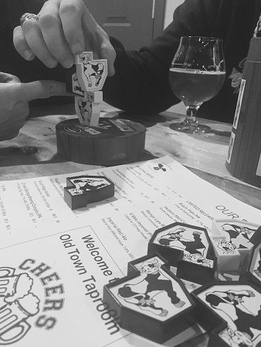
In my first post of the Black and White Challenge, I took a photo while I was out with a couple of my favorite steemians- @rebele93 and @intuitivejakob, at a local brewery. There we played a game that was kind of like Jenga but with little plastic cows. Making new friends through steemit has been the highlight of my year, and it seems fitting that this was the first black and white image. Unfortunately, I got a little delete-happy when I was running out of memory on my phone and don't have a color version of this one for comparison. Changing it to black and white changed the focus from the bright yellow beer in the background, to the cows in the foreground. This then improved the story of the image, as its no longer about the drinking, but about the fun times that were had. Ultimately, I think this image works better in black and white.
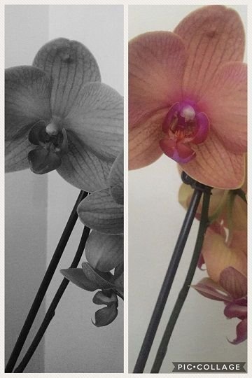
My mom got me these orchids as a birthday gift, despite the fact that I am *really* bad with plants. I take great care of my pets, but that's because they cry when they need something. I would like to be better with plants; I love the atmosphere that they add to a room. One way that I try and get better about taking care of them is I name them-the orchid is Delilah, and I also have an aloe plant that I named Ophelia. I managed to keep these alive and well, until I left them alone while I traveled. Now they are a little droopy and have lost the majority of the blooms. I'm glad I got a photo of them when they were healthy. I think this photo worked much better in color- the thing with orchids is that they are super colorful and exotic. But it fulfilled the key part of the challenge- giving insight into my daily life. Now you all know what a terrible plant mom I am.
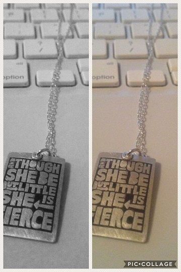
The necklace that I featured for Day 3 is probably the second photo that works better in black and white than it did in color. The necklace is silver and the background is my old white mac laptop- nothing that really needs to be in color. Plus the original photo was a little warm; it really needed some color correction done. I regularly wear this when I need a little bit of courage to get through the day. It's a quote by William Shakespeare, from one of my favorite plays "A Midsummer Night's Dream". Shakespeare and I have a thing.
**Day 4**
This is Charlie. I don't have any kids, so she's the closest thing in my life to that kind of relationship. I wrote about her rescue story here, although the photos no longer work. I was using HTML to resize the images and now all the links are broken. Charlie is a huge part of my life, and definitely deserved a place in this challenge. I took a series of photos of her in the front yard of my apartment complex when she was about 9 months old, and this was my favorite of the photos. I have a print of it on my cabinet in my classroom. This photo works in black and white as well as color, although I think the color image is way more interesting than the black and white.
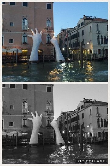
This photo probably had the most engagement of any of my black and white challenge posts. I spent a month this summer traveling through the major cities in Italy and France, and it was a trip of a lifetime for sure. It was taken in Venice, as I was riding the water bus along the main canal. This photo works well in either black and white or color. In black and white, the hands become more of the focus, since they are so bright and the rest of the photo is so dark. I like how the reflection on the water draws the eye up to the hands. The color photo works well too, and is almost a little more interesting, but it doesn't have the same focus on the hands that the black and white does. So really, this one would almost be a toss up- but I probably would have featured the color one instead if it wasn't a "black and white" challenge.
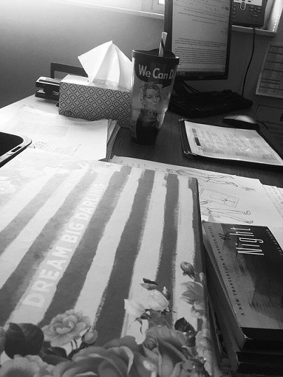
This is my desk in my classroom. This photo probably taught me the most about black and white photography, especially the importance of contrast and composition. In color, the most distinct part of the photo was the wording on my prize box that says "Dream Big Darling", as it's metallic gold and in the front. When I converted the image to black and white, those words are so light against the background that they almost didn't show up. I had to play with the black and white filter a lot to get them to just be visible. So this is one that definetly worked better in color than in black and white, at least for the things that I wanted the viewer to focus on. In the black and white image, my Rosie the Riverter cup becomes the focus, rather than the prize box. Which is ok, but not what I wanted.
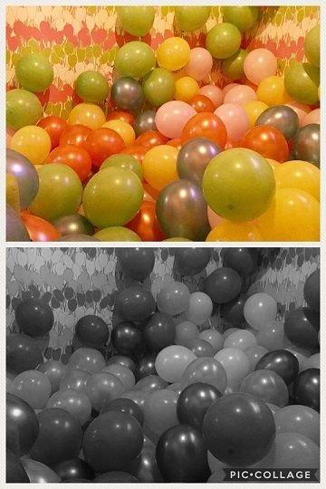
I spent my New Years Eve hopping bars around Denver. This was a room full of balloons set up for kids to play in at Punch Bowl Social, and of course... I had to go play in it. And take photos. It was a lot of fun. This photo works in color and in black and white, although I think the color version is way more interesting. I mean, it's a bunch of colored balloons, how could it not be? But the texture of the balloons comes through a lot more in the black and white image. And the composition is a lot more important in the black and white. Ultimately, I would have been more likely to share the color image. I think I will be converting a lot more photos to black and white to see how they work, and if the meaning of the image alters based on that change. I enjoyed this challenge and think more photographers should take advantage of it, simply as a learning process.


Words and photos are property of Sunravelme
black and white is part of life.
somethimes your in life is everything stable
and sometimes life doubtful.
I do like to dance in the grey ;)
hehehe nice one @sunravelme I also like #bille dance
Despite all the color photos I post, I greatly prefer monochrome photography. I find it more challenging and more interesting. Without color to distract or attract, we have to work much more at composition. And also old tricks such as dodging and burning become much more important as we try to guide the viewer's eye.
Anyway, well done. I love all your photos. And I disagree with you about the dog one—I think it works much better in monochrome. I think almost all portraits work much better in monochrome.
Glad to see this idea of a summery post gaining traction!
Actually, I think I might agree with you about the portrait. The shading on her face isn't nearly as distracting in the black and white as it is in the color version. Black and white does push a photographers skills in a different way than color photography!
I wasn't aware of any Steemit controversies re: black and white challenges, but what you've put together here is interesting and worth pondering, so I'd say … two thumbs up 👍👍, and thanks for sharing your thoughts on the process.
P.S. My favorite pic is the one from Venice with the hands reaching out of the water. That's kinda trippy. Makes me want to go visit at night to see what those hands look like in the dark.
Venice is the best at night, for sure. All of the tourists are gone and its just gorgeous when it's all lit up. Highly recommend for sure.
I don't know if the controversy is highly public or just in my little corner of the internet. But I think it's a good question to explore- what are the expectations for a post on steemit? What makes a good one vs. a bad one?
I tend to think it's a gray area when it comes to good posts vs. bad posts -- at least a lot of the time. There are obviously posts that are super great, and posts that are just super bad and abusive of the platform. And then there's everything in the middle that we must ponder :) But the question is a very good one to ask, because when people ask it, it probably indicates that there's interest in making Steemit a better place.
Exactly! I think it's a very individually determined answer myself but I like that people are asking the question