Game Reviews - #16 - Overkill's The WALKING DEAD.
All that hype for something more underwhelming than the bedroom performance of someone called, 'Captain Cum Quick'.
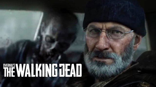
The Devs over at Overkill had us all wanting more after there first trailer for this game was released. They gave us something and led us to believe that it was all in game footage. Technically yes, it is in game footage, but it was all pre rendered cutscenes, and that is the only good part of this game. Everything else is just a poor imitation of better games with many problems in the narrative, visuals and gameplay.
I Streamed this game on Friday, and was disappointed with it. I played it for a couple of hours yesterday to see if I could be persuaded, but it just enhanced my belief that the game is as useful as a chocolate condom. And looks the same too after use. But I digress. As always, I have played this game live for you to see for yourselves as all my reviews, and this is a round up of my thoughts on the game.

Narrative.
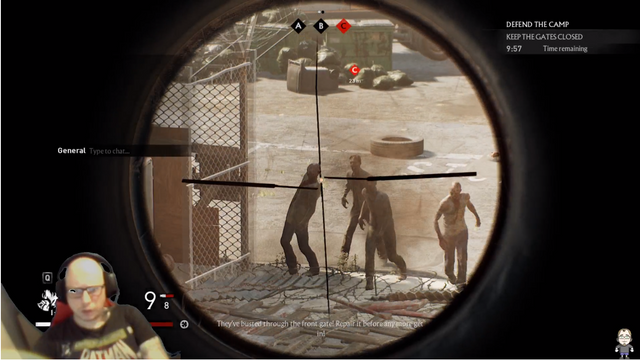
This is a bit of an awkward one. So when you start to play the game, you have to first defend your base against a horde of Zombies sent by, the 'The Family'. Another group of survivors who steal your water purifier... despite the fact that the opening cutscene to the game was your group stealing the purifier from them in the first place, but make out that there actions are justified and the Families isn't.
You get the option of choosing between 4 survivors / classes, each with there own unique skill set that can be improved via a skills ladder. Aidan is a tank, goes in all guns blazing, close quarters action. Heather is a scout, no need to explain here role. Maya in support, basically a medic, and then you have Grant the tactician who is basically a sniper. Past this, there is little to let you know more about them than what you see in the cutscenes. Yes we know there skill set, but what about there character. The TV show is as good as it is thanks to immediate character development, you know what drives them to survive. Here in this game, there is none of that, just some action that looks cool.
I know this is just the beginning of the game, and the narrative and character development may get more enticing the further into the game you get, but because of its many flaws in every area of the game, there is little chance that I will explore this, that's if I play the game again, because I have removed it and got my money back for reasons explained in this review.

Visuals.
As I have mentioned, the trailers look fucking awesome, almost reminiscent of the TV show itself but with an 80's action film / Steven Seagal vibe. It is what got everyone hyped about the game. The Devs /publishers led us all to believe that this was indeed the product that we were going to get. Now I want to stab them all in their ovaries for letting us down so fucking much.
The visuals seen in the trailers are all pre rendered cutscenes and have next to no connection with the playable characters or the environment. It is almost like the graphics where on ultra for the cutscenes and the gameplay is set to the lowest graphical settings, even though I had everything at its highest level.Yes, the environment looks crisp and the character models are OK. But when you compare it to something like the first Mass Effect that is now 11 years old, you have to wonder why Mass Effect looks just as good. Just everything in the game seems to have a north Yorkshire ''That'll do'' attitude, with no real care about aesthetics at all. It is just bland.
Today, you can take an iPhone and with some simple tech trickery, you can make a motion capture device to put your face on anything you want. You know Overkill have this tech as most of the cutscenes use this method to make them look as good as they do. But when you get into the game and look at the other characters as they talk, it looks as though they took a stock unity animation from 15 years ago and pasted it in. WHY! It looks beyond shit and in a game that is story driven, this is something that should have been avoided, especially when they have the technology to do so much better. This was the last straw for me, as it is indicative of just how lazy the development was.
Items that you collect around the environment and other things in the environment have little to no animation what so ever. You go to pick up some ammunition, it is a simple box with bullets in it, then it is just an empty box with no animation. It is the same for scavenging, collecting resources or anything. No hand animation, just a magic trick, 'Now you see it.... Now you don't'.
It is a similar story with the fence at the start of the game. It takes 3 planks of wood to fix it, with no animations to show how it was applied to the fence, and then when you put the final piece on, just by magic, it reappears as a chain link fence again, with zero animation. Another case of 'Now you see it.... Now you don't'.Finally on the visual side of things is the Zombies themselves, aside from the terrible AI, they do look the part and when you stab them or hit them, depending on where you hit them, there is some good blood splatter (that don't splatter anywhere else.). You can shoot there limbs off and just leave a torso rolling around on the floor. It is the only part of the visuals that I can appreciate. On the other side of that bloody knife, their facial animations are just as bad as the rest of the characters and the same 5-8 zombie models are constantly being reused. When you have a supposed horde coming at you, you would think that more zombie models should have been used. Again, lazy or rushed development.

Gameplay.
- For Fuck Fucking Fucks Sake...!!! where do I begin?
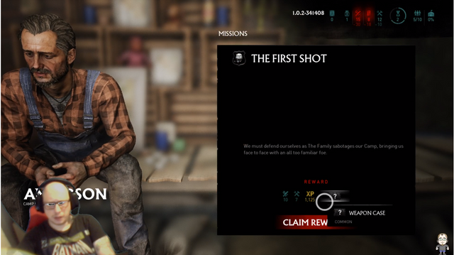
I know that some games go overboard with tutorials, telling you how to play the game for longer than necessary. Then you get simple games like Mario that needs no tutorial because you only use a D-pad and a jump button. But to have an overly complicated user interface, control layout and class trees, you would think that at least there would be a simple tutorial to help you walk through it. Instead there is nothing! You are left to figure it out for yourself. It took me 10 minutes to figure out how to activate the first fucking mission by clicking it on the map. No other bloody game does this, or at least none I haven't played, so why use this method at all? It would have been far simpler to just have a mission list with highlighted ones that are available and dimmed ones that aren't..... you know... like in every other fucking game? What is worse, when it came to getting to the second mission, I had to figure out how to upgrade a map? In a tech tree that is disconnected to the map...
Basically, the UI is more messy than a prostitutes cunt after a week of solid work in the red light district in Iraq. With no Tutorial either, it just hinders the game and put me off the game entirely.
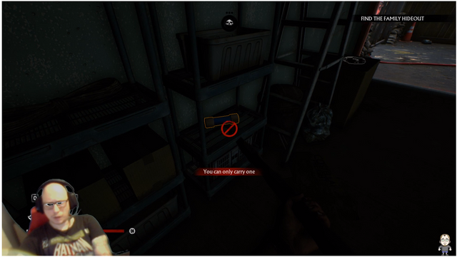
Now I know the game is aimed more towards multiplayer, which I can respect, but when you are a lover of single player, story based games, such as myself and more than a few fans of the franchise, you would expect that you can play this game by yourself. Technically you can, but it is difficult as hell. In the second mission you have to collect 6 fuses and 2 cans of fuel to turn on a generator, seems simple enough. The problem is you can only carry one of each item at a time. WHAT!? So I had to run back and forth like a dick 8 times just to pass this single obstacle. Even when playing with a friend in a private server, it is still just as annoying and just as difficult.
The layout of the missions is very linear. Now with some games this can be a good thing, take a look at Hitman Absolution or Hellblade, both awesome games and very limited in the environment available, linear, but still fantastic games to play. This on the other hand is just a mess, simple map design that hinders the gameplay when this is supposed to be the post apocalypse world that you could explore to your hearts content. Fallout 4 is a fantastic example of this and is how a post apocalypse world should be. In this title, you are very restricted in where you can go and how to approach each mission. Single player or multi player, the same problem exists either way.
The last thing on the gameplay I want to touch on is the multiplayer aspect. Yes you have 4 different characters to choose from, but if you are mixing this with multiplayer it looks ridiculous when you have 3 or 4 of the same character entering a mission. It is a multiplayer system that is very much like that found in the CREW, which is a driving sim game. It just makes no sense mixing that type of gameplay with a franchise such as this. If there was a possibility of creating your own character like many other RPG style games, using the main 4 characters as help during missions would have been the better alternative, similar to how D'dog and Quiet are in Metal Gear Solid V.

Conclusion.
- Yes we want a horror survival game based on the Walking Dead franchise, yes we want action, we want a gripping story and yes we would like to play with our friends online, but we get none of that in this game. The linear nature of the missions are more aimed towards single player and story driven gameplay, but the multiplayer destroys that and playing it solo is annoying and difficult, forcing you to play with other people. I DON'T WANT TO! The UI is completely trash and no tutorial, not even a basic one to help you out past a couple of sentences during the very first mission.
3.5/10
- The cutscenes and trailers make this game look better than it is, but when you actually get to play the game, it looks and feels like a single developer in their mothers basement made it in their spare time. If that was true, it is a good attempt. With a developer studio as well known as Overkill who have given us great games in the past like the Payday franchise, backed by 2 of the better known publishers responsible for games like the Riddick games, The darkness and Brothers: A Tale of 2 sons.... it is such a crying shame that this was the end result as we all know, they can do so much better.
I wont be playing or streaming this game again because... well.... it's shit!
Stu @TechMojo

Join the chat TechMojo Discord Channel Follow us TechMojo Dlive Channel Like us TechMojo Facebook Page Follow us TechMojo Twitter
@TechMojo Recommended Blogs you should follow.
@Deeviras @OPGaming @SteemGC @gamesociety @XR-HammerGaming @C0ff33a @Enjar @NegativeSpace
If you want to apper here, then contact us via our Discord Channel!


This post has been upvoted by @opgaming. We like what you're posting, and we want to reward our members who produce quality content. Keep up the good work!If this sounds like the sort of group you want to be a part of, click the image below! We're too OP to be put down!
Your post was upvoted by the @archdruid gaming curation team in partnership with @curie to support spreading the rewards to great content. Join the Archdruid Gaming Community at https://discord.gg/nAUkxws. Good Game, Well Played!
Congratulations! Your post has been selected as a daily Steemit truffle! It is listed on rank 4 of all contributions awarded today. You can find the TOP DAILY TRUFFLE PICKS HERE.
I upvoted your contribution because to my mind your post is at least 10 SBD worth and should receive 229 votes. It's now up to the lovely Steemit community to make this come true.
I am
TrufflePig, an Artificial Intelligence Bot that helps minnows and content curators using Machine Learning. If you are curious how I select content, you can find an explanation here!Have a nice day and sincerely yours,

TrufflePigThank you for contributing to the Gaming Community on Steemit. You have been given an upvote by @steemgg. For more inspiration, visit our platform Steemgg, the first html5 gaming platform built on the Steem blockchain.
Congratulations @techmojo!
You raised your level and are now a Minnow!
Do not miss the last post from @steemitboard:
Your level lowered and you are now a Red Fish!
Do not miss the last post from @steemitboard: