My way of processing. Part 2.
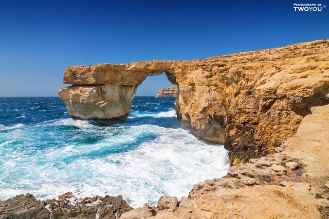
Hi everyone! Today I continue to talk about the processing of photos. So, let me remind you, our task is to get this picture
from here
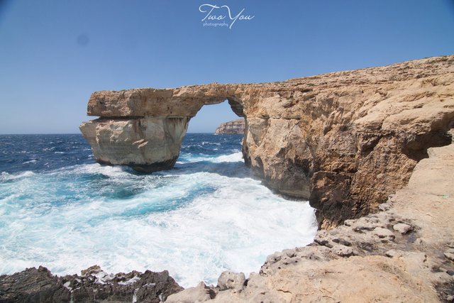
Last time we did a pre-processing in Lightroom (https://steemit.com/photomag/@neony/my-way-of-processing-part-1). It will be enough for someone, but we want to achieve the best result. So it's time for fine-tuning photos in Photoshop.
Let me remind you that the last stage ended with the conversion of the image into a 16-bit Photoshop file. In principle, it was possible to use TIFF with the same parameters, but it is more convenient for us to use PSD, because to save further work we still have to save in this format.
At the heart of the correct image processing in Photoshop is the principle of non-destructive editing. What this means? All manipulations occur is not itself the source, and copies thereof. This approach allows at any stage to restore what was. It's convenient. Minus here only one-the file size. But, in my opinion, at the current stage of technology development, this is not a problem. For non-destructive editing, we will use regular and corrective layers.
What exactly are we going to do in Photoshop? First, gently increase the saturation, polish the colors, slightly darken the sky and slightly compress the dynamic range to get the maximum detail in bright colors.
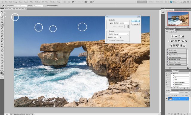
So, let's start. Open the file in the program and carefully examine for various defects. In this case, as readers correctly pointed out last time, dust stains on the matrix are quite noticeable. We are lucky that they hit a fairly uniform area of the sky, and so they will be easy to eliminate.
Select areas of the image using the Elliptical Marquee Tool (in the left vertical column) and press the Delete key. By default, the Content-Aware removal method is set (that is, based on the content). Press Enter-and the spots did not happen!
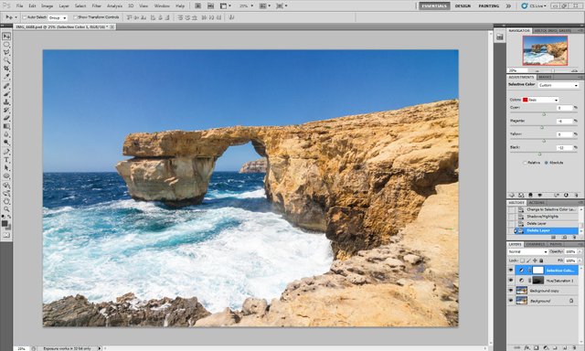
Next, let's deal with selective saturation. For what purpose? We will increase the saturation of areas of the image with a saturated color, and leave everything else unchanged. Thus, parasitic colors will not appear to the same extent as useful. How are we going to do that? We will create a mask and apply it to the adjustment layer. Proceed.
Copy the base layer. Select it, right-click and select Duplicate Layer-Enter. Then go to Image-Ajustments-Selective Color and set the Black parameter for all colors to -100, and for white, neutral and black - to +100. The Absolute checkbox at the bottom should be checked.
Get this picture
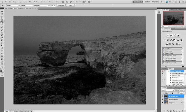
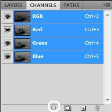
This is actually a layer mask. What is mask? This is a black and white image, and the darker the color - the less impact on this area. Now select this image and apply it as a mask to the adjustment layer. Switch to the tab Channels (in the lower right square) and click on the circle
Then go to Layer-New Adjustment Layer-Hue / Saturation. A new saturation layer appears with a mask in the form of a black and white image.
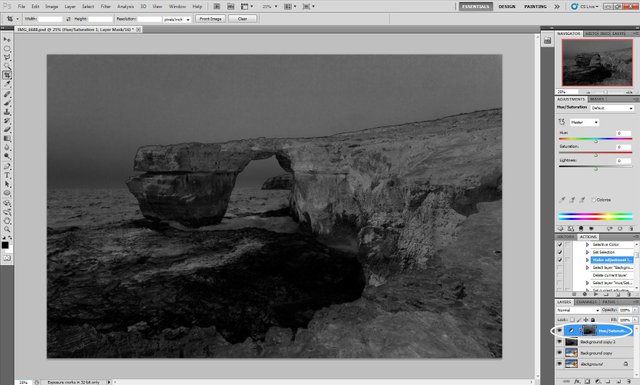
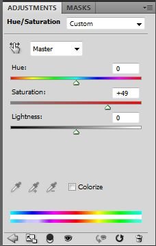
On the right you can adjust the parameters. Remove the black and white layer, we no longer need it. I usually set the following values
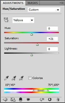
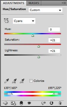
In the end, we get such a picture
Next, grind the colors. To do this, add a new adjustment layer Layer - new Adjustment Layer - Selective Color and set the following parameters
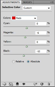
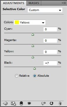
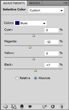
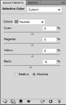
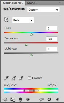
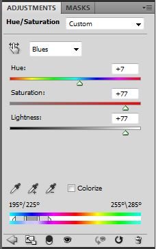
It should be understood that the parameters are not universal, and for portraits, for example, is unlikely to fit. Their setting is controlled visually. What am I guided by? I see that the saturation does not reduce the detail of the picture. Separately will highlight the on blue / blue. Once I attended a master class of Dima Shatrov on landscape processing. In my opinion, this is one of the best travel photographers of our time. He, among other things, gave the audience one piece of advice: reduce the saturation of cyan and increase its brightness and do the opposite with blue. This is one of the best tips I use regularly. But back to our picture. As a result, we get this image
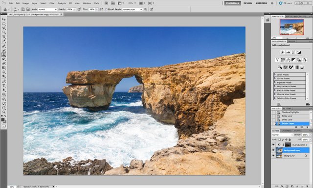
In principle, this could be finished, but there were just a couple of steps to the masterpiece (just kidding! ;- ) We copy the base layer again and apply dynamic range compression to it, that is, raise shadows, dim lights. Now-only light. Go to Image-Ajustments-Shadows / Highlights and set the following parameters
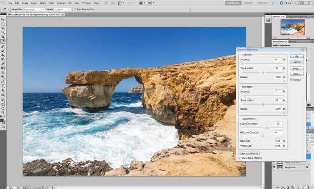
Note that the radius is set to the maximum, it is necessary in order not to appear light or dark halos around contrasting objects.
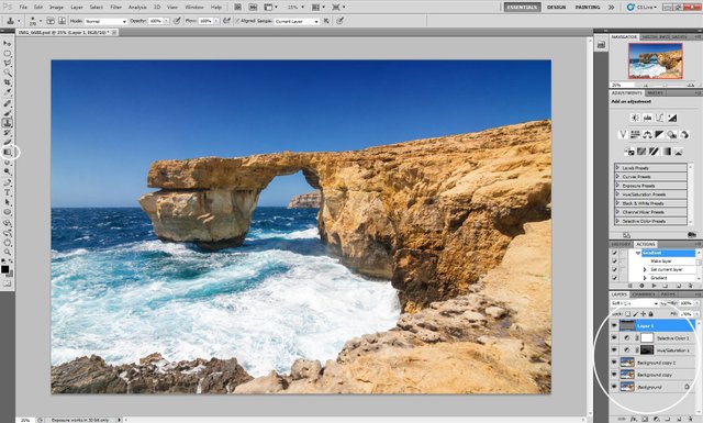
And as a finishing touch, let's darken the sky a bit. To do this, add a new layer, set the soft Light blending mode (just under the Layers tab) and add a gradient from black to neutral gray. To do this, set the color of the upper square (bottom left column) to 0,0,0, and the bottom to 127,127,127. Next, select the gradient tool and draw from the top edge of the frame to the top third. We get here is the final result.
Save the result, merge the layers together and then act according to the task. Resize for web publishing or for printing pictures sharping.
P.S. Open in the new tab to see a bigger version.
Follow me :-) It will be interesting!
Sincerely yours @neony
As a follower of @followforupvotes this post has been randomly selected and upvoted! Enjoy your upvote and have a great day!
very good photo
Posted using Partiko Android
Thank you!
Congratulations @neony!
You raised your level and are now a Minnow!
Do not miss the last post from @steemitboard:
Nice work!
Thanks a lot! :-)
Interesting! Right now I don't get much but I have just decided to attend a photoshop course. So I think that your knowledge will complement my learning. Thank you so much for sharing :)
You are welcome! :-)