My way of processing. Part 1.
Hi everyone! Last week I was so inspired by the support you showed me, my friends, that I decided to share with you my method of image processing. I will show you it and I hope it will be interesting. Of course, I do not claim to be exceptional, each photographer has his own techniques, which depend on the tasks and time. For example, landscape photographers can spend on the processing of each image for several hours, and wedding - a few seconds. What I share today is the foundation of my workflow.
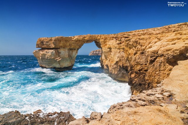
I will try to tell you how to get this picture
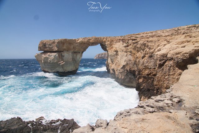
from here
Since the topic is pretty extensive (I want to discuss not only the General parameters, but details), it was decided to split the narrative into two parts. The first part will be devoted to processing in Adobe Lightroom, the second - in Adobe Photoshop.
A little introduction. Lightroom was designed specifically for photographers. The matter is that already at that time in large agencies and magazines there was a division of labor, one shoted, the second - processed. And color correctors mastered the techniques of Photoshop, and photographers - almost none. Then it was decided to develop an environment for photographers that would allow cataloging photos and processing images with maximum simplicity. It is worth noting that the idea was successfully implemented and Lightroom became very popular among photographers. In fairness I must say that there are many important tools, such as layers or filters, so many professionals use Photoshop for the final finishing of the image.
Here we go. We mean that you shoot in RAW format (because it contains the maximum amount of information that can be obtained and used with the Converter) and you have a monitor that displays the colors correctly. It can be both factory calibrated display and standardized at home. Yes, another important point - the color space should be sRGB. AdobeRGB is for magazines and cool printing, there better not to go. Another small explanation - what we'll talk about today, is intended more for beginners, so treat the story condescendingly :-)
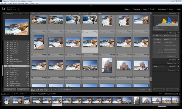
To get started, you need to import photos into the catalog. Here everything is very simple File-Import and choose the desired folder. Then you see all your photos in the form of previews.
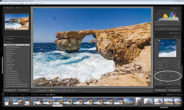
Select the desired file and go to the Develop module (top right). See here is such screen was set up
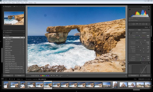
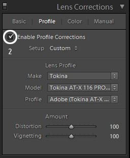
On the left is a list of actions that we perform, presets, etc. on the right - all the basic tools. First of all, I usually set optional parameters, because, as a rule, then you forget about them. In the section Lens Correction tick Enable Profile Correction and Remove Chromatic Aberration. Thus, we allow the use of the lens profile and remove chromatic aberrations (purple or greenish triplets, usually at the edges of the frame).
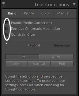
Next, on the Profile tab, select Enable Profile Correction, after which the program will determine the lens model and apply the desired geometry and vignetting correction.
Next, go upstairs and set the white balance (WB) and brightness balance (points 3, 4, 5 and 6). It is worth to make a retreat. The fact that the color temperature of sunlight can change within a fairly wide range during the day. How to be? The easiest way is to take a picture of the gray card before taking the main picture, and put it on the WB. But almost no one thinks about it. You need to focus either on natural color neutrals (shades of gray) or on those objects in the color of which you are sure. For example, you can take the eyedropper tool and click on the white foam. If the color is not satisfied, you can try to adjust manually, but remember, this procedure requires experience.
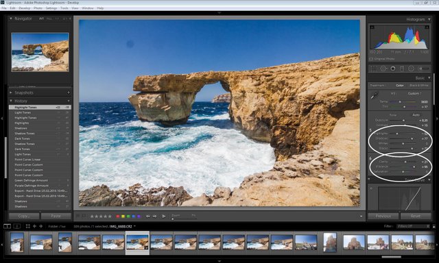
Next, Exposure and Contrast (item 4). We control the exposure visually and with the help of a histogram - a diagram of the brightness distribution in the upper right corner. Ideally, its edges should only slightly touch the edges, almost like in the screenshot. As for the contrast, there is not much to get involved, because the details may be lost in the shadows and lights.

Next, go to step 5. These four sliders are practically the most important tools. With their help, we can pull the details of their shadows and lights. Since I shoot with exposure in plus, then in the Lightroom I first align the exposure, and then the slider Highlights show details in the lights. Then I drag to the right the sliders Shadows and Blacks and show nuances in shadows. Slider Whites almost never touch - it compresses the range of lights, but the gradation of lights at the same time merge into one. How long you have to pull the sliders? Highlights I usually set -52 (-72 minimum), then start to show halos around objects in high contrast scenes. Shadows and Blacks pull to 49-61 (maximum 77). Then you can see the ghosting and noise.
In step 6, we define a local contrast called Clarity. The limit is 49, usually 21-31. Forth saturation. The Lightroom has 2 saturation: saturation of the entire range (Saturation) and saturation of the primary colors (Vibrance). Usually do not touch the first and the second twist is pretty much up to 85-95. But then I adjust the individual colors, this is slightly lower.
It should be noted that this set of parameters will be enough for 90% of subjects and photographers. Next, we'll talk about fine-tuning.
We go to 7 and 8 points - adjustment of the tone curve. What is it? In order to lighten or darken certain areas of the image that relate to lights, shadows and midtones. The tone curve gives more flexibility in adjustment. You can use the sliders (point 8), and click on the box (point 9) and adjust the curve manually. It's simple: drag the curve up - the image becomes lighter and less contrast and Vice versa. Given that this tool is quite powerful - you have to be quite careful with it.

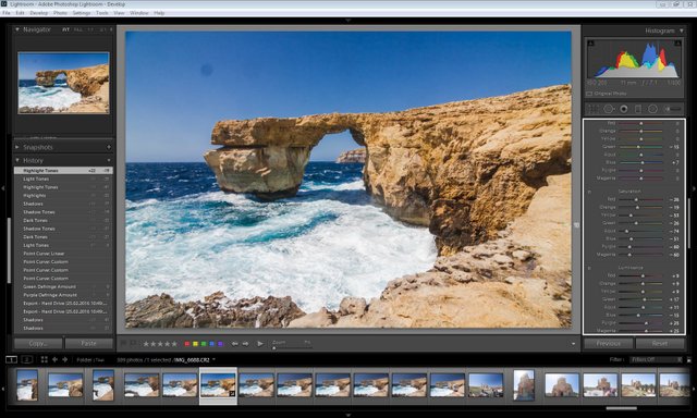
Next, fine-tune the shades (item 10). Here you can set the offset of colors, saturation of colors and their lightness. Here you can see how my colors are set, I can say that they are suitable for my tasks in 99% of cases. Here can be long all to discuss, can only say, that such a configuring situation historically. I want to draw attention to Purple and Magenta : the saturation of these colors, we remove the maximum, and the light, on the contrary, increase. The situation is similar with a hint of Aqua. It is worth noting that if you shoot lilac flowers, this setting will not work.
The Lightroom has a pretty good built-in noise maker. I usually set the value from 7 to 28 depending on the sensitivity, because on the Canon 50D the matrix is quite noisy.
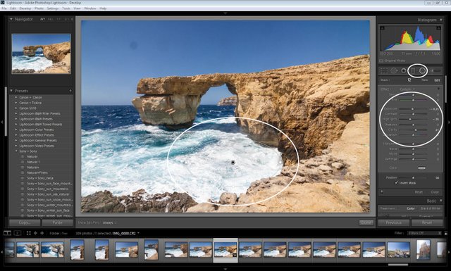
So, these were tools that transformed the image in General, but there are also tools for local correction. This Gradient, and radial Gradient (Item 12) the Trick of these tools is that they are very flexibly configured. For example, you can adjust dimming, lightening, saturation, clarity, and more, even changing the color temperature. I usually use these tools for local dimming. Typical parameters - as in the screenshot.
Next, export to PSD format in order to continue editing in photoshop. Please note that we set the 16-bit color format. This allows you to save as much detail as possible.
That's all for today. In the next part I will talk about the final finishing of the image in Photoshop. If you have questions - I'm ready to answer them in the comments.
P.S. Open in the new tab to see a bigger version.
Follow me :-) It will be interesting!
Sincerely yours @neony