Before & After #3 - Step by step photo editing tutorial with pictures
So today I am going to show a simple Lightroom colour edit and show how I brought my image from how it looked before to how it looked after.
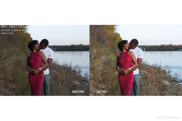
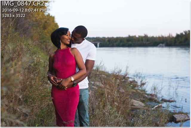
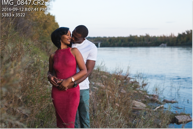
I want to make a note that I shot this image in natural light when the sun was setting so I got nice even light. When I took this shot the sun had gone down so it was a little dark. My goal here was to first brighten it up since the image was a bit too dark, and second enhance the colours that I wanted to stand out which was the blues & red/magenta.
This one is not too long, so here we go!
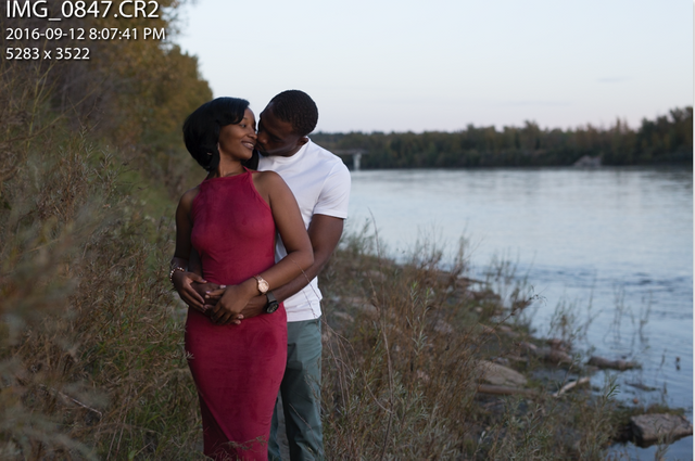
I started with this:
It was underexposed so brightened it a bit as well as added a bit of contrast. The image still was very dark in places so I wanted to even out the light by bringing the shadows up and the highlights down a little, then added a bit of the blacks back in to my liking.
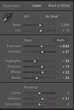
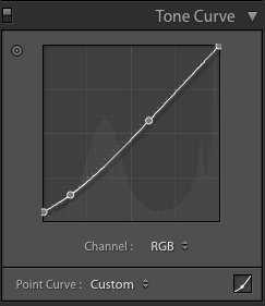
I then did what I normally like to do with the curves tool and I clicked and pulled the blacks up from the bottom left corner straight up, to give that nice matte effect. On this image I did not do too much but depending on your image or the effect you want play around with this. I then also made an anchor point in the middle of the curve to bring the mid range tones down. This is what a lot of the VSCO filters do.
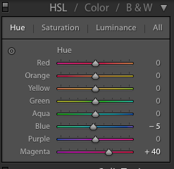
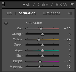
I then got into the colours where I used the hue and saturation to get the colours adjusted how I like them. This is a fun area to experiment in. For this I wanted her dress to be more towards the red side of magenta so it was not so hot pink. I also moved the blue slider to the left a little bit to make any blues in the images have a more turquoise tone, but just a little bit. I then went into saturation and brought a few sliders to the left to make certain colours less saturated. I did this on the dress (red & magenta) as well as yellows. When I brought the yellows down it make my subject pop more and thats why I liked that. I try to do anything that enhances my focal point to make them pop out of the image.
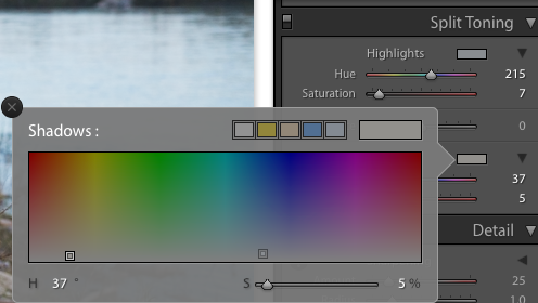
I liked the image how it was bit still decided to do some simple split toning. Also so I could introduce in on these tutorials. The effect you get from split toning is you can choose a colour for your highlights as well as a colour for your shadows. For this image I chose a very light/white blue for my high lights (sometimes I will choose white so I get nice crisp white highlights) and a light yellow for my shadows. I also brought the saturation down very low for both, I just wanted contrasting colours and for my shadows to feel warmer then they did before by adding the yellow. Again this is another area to play around in, I would create extreme effects that did not look good but it taught me what effects could be done here.

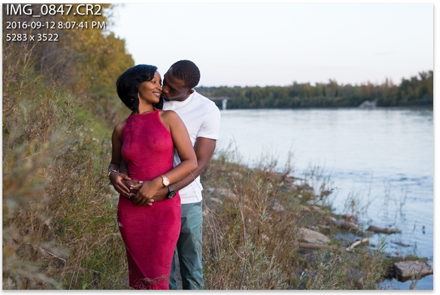
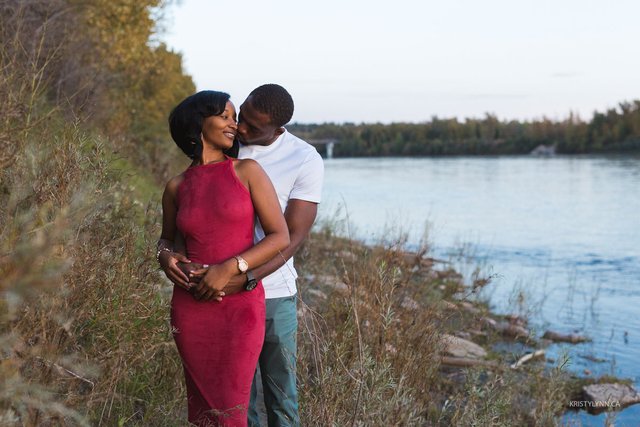
Then there is the final image!
Done! I hope this is helpful and can assist you when you start editing your images in Lightroom . A lot of this can be applied in other editing programs as well, even apps have a lot of these editing capabilities.
Please comment below and let me know what you think! Also if you have any questions or suggestions for further tutorials!
@kristylynn <------ follow me if you like my stuff :)
Nice tutorial! Thanks for sharing :)
Thanks @hitheryon!
Nice!My favorite is Photoshop. :)
LOVE photoshop. It was when I started editing really large amount of images at once (weddings) Lightroom snuck into my life. I use both together its pretty great.
Hi @kristylynn, I just stopped back to let you know your post was one of my favourite reads yesterday and I included it in my Steemit Ramble. You can read what I wrote about your post here.
Thank you so much @shadowspub! I'll check it out.
This post has been linked to from another place on Steem.
Learn more about and upvote to support linkback bot v0.5. Flag this comment if you don't want the bot to continue posting linkbacks for your posts.
Built by @ontofractal