Which Photo Should I Use For My Book? (Options in both Colour and B&W)
Here are six pictures taken by the photographer that I'm considering putting in my book. I'd like some feedback and people's opinions on this. While many of these will be used for various purposes in various places at various times, one must be selected to be both on my website on the official book's web page and in the book itself.
My main concerns are:
- 1-Does it look Professional enough?
- 2-Does the B&W photo look good enough to be in the book?
- 3-Does the colour version look good enough to be on my website.
I know which ones I personally prefer, but I'd like to know your thoughts for each of the following photos. To help you identify each when giving your feedback, I've given them fun little names. Each photos is presented in colour first and followed by its B&W version.
Thanks, your feedback is very much appreciated. 😊
CASUAL SMILEY


CASUAL PORTRAIT


CLOAKED CLOSE-UP


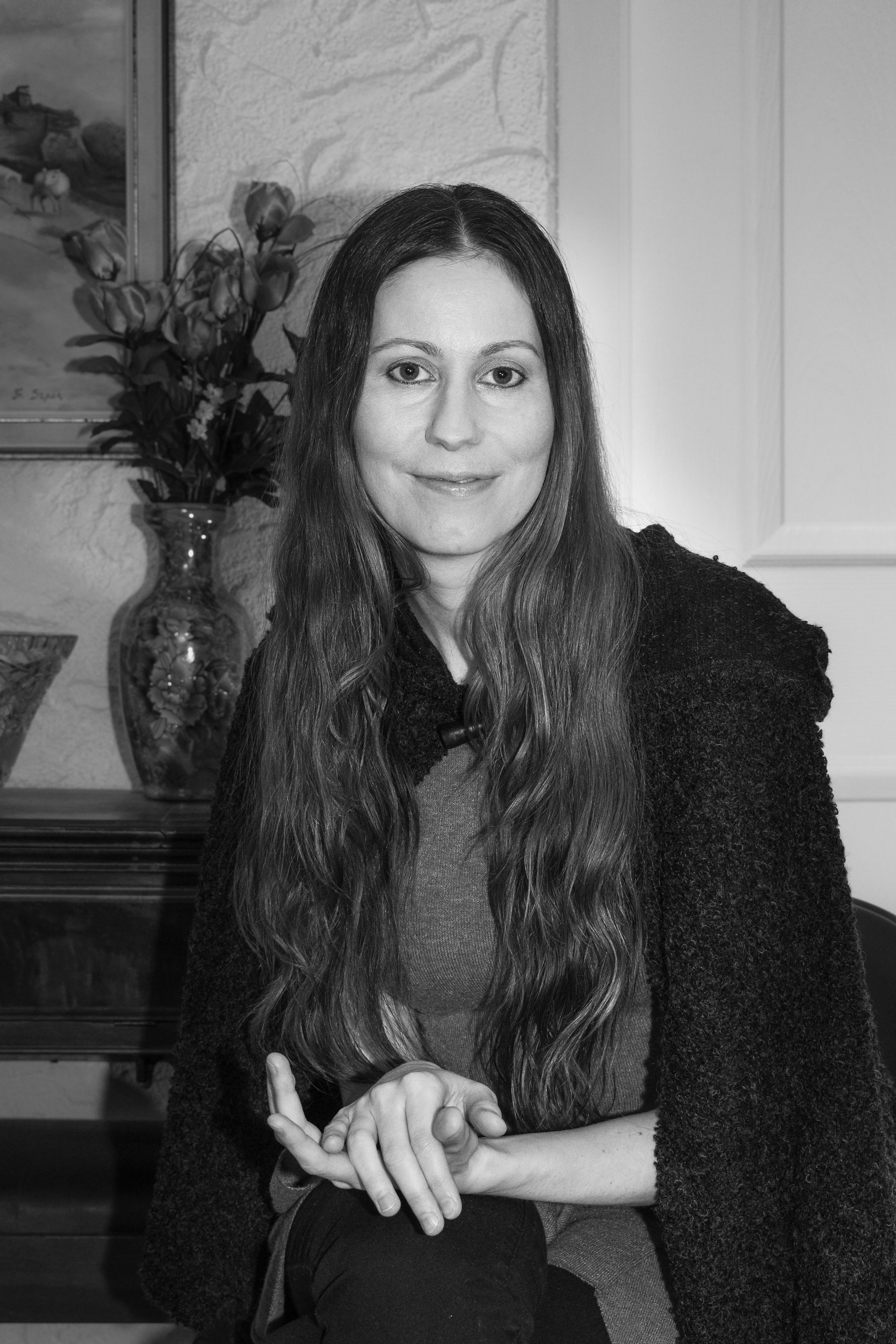
CLASPED HANDS PORTRAIT


CLASPED HANDS MORE NATURAL

CLASPED HAND HOODED


Thanks again! 😉
the 2nd one, casual pose, but... you may wish to tone down, your tooth has taken a reflection of the flash, can be just touched up in photoshop. Good luck, I avoided having a photo in my dust-jacket!
Upvoted (by @rycharde), resteemed (by @accelerator) and has been added to the latest MAP Upvotes post.
= Quality Content Creators can request to join MAP = see the Benefits = Free Membership =
Thanks Rycharde, I had not noticed the tooth. Yes, I can easily fix that, I think just a quick levels adjustment on that one area or the brightness and contrast, will do the trick.
The thinker pose, picture number 1, looks most like a writer ... although I am not sure what to make of the person dancing in your hair on that painting on the wall.
The figure dancing in your would be fun for an imaginative work.
Another big question is: Who painted the picture in the background and is is copyrighted? Silly but you might end up in a copyright law suit if a good chunk of a copyrighted picture is in the cover art. So the second to last picture is probably the safest picture.
It was my grandfather, my mother's father, Francziszek Szpak, who painted it. I think I'm good for copyright since his children and grandchildren have inherited the rights.
Thanks for the feedback. I had not noticed the bonhomme from the painting on my head. It does look strange, now that my attention has been brought to it ;) This is what feedback is for.
When was the picture painted?
Anyway, since you have a familial connection to the art work, I would go with the second image as it balances your image with the painting.
I think he did that one when I was in elementary school. Long before he went senile. He passed away in 2000. Lived 100 years. My other grandfather used to paint too and sometimes I have one of his paintings in the background of some of my videos.
Thanks for the feedback :)
^0^ I personally like the Black and White Casual Portrait, I think the B&W ones are classy and elegant. If I had to pick a color one, I would suggest Cloaked Close-Up with a mystical vibe~
I wish you luck with your publishing! ^o^
Thanks! Appreciate the feedback :)
I like the second pose, black and white version for the book. Both are great, and the color version would be fine for a website I think.
You look natural, relaxed, professional and elegant all at the same time in those. All the photos are good, but that would be my choice!
Thanks. That one happens to be one of my favourites. I have 3 I like a lot. It's good to compile feedback to help make a decision.