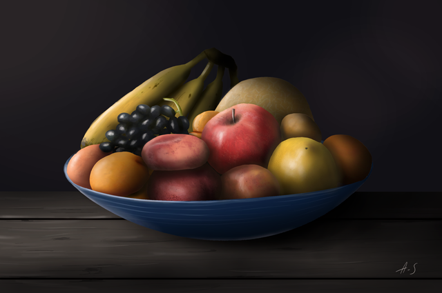
Digital painting : still-life.
Hi everyone!
Today, i share a digital painting that i made. My goals was, like the precedent, to begin by making a study of a photo, and after, leave the model and try to create an atmosphere by myself. It is a method that i appreciate a lot, because it's a complete exercice. First, i learn observation and memorize how to draw certain things, and after, i learn to think by myself about how i can create this atmosphere and this lighting that i want.
It was very pleasant to make!! :D
Here is my model :
https://pxhere.com/fr/photo/576942
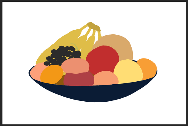
First, i started putting principal shapes and colors. It doesn't look nice at this time, for sure ahaha :D
After, i continue to observe the photography and use brushes to recreate the texture effect of the fruits.
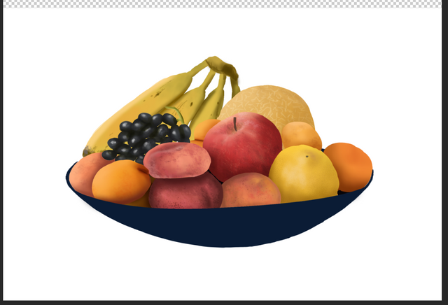
After this step, i leave my model and continue the process by myself. I wanted to make a still-life in chiaroscuro ; it is a lighting that i find magnificent, it gives a very artistic and deep result. This is why i love so much Caravage's paintings.
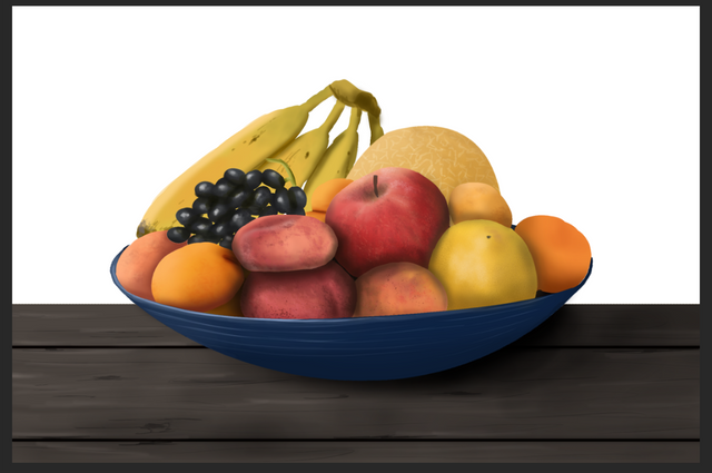
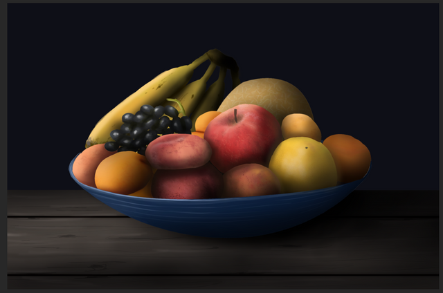
So, here i try to create a nice chiaroscuro atmosphere, hope it's successful. :)

Don't hesitate to leave your advice in comments, i will appreciate it.
Have a nice day everyone, see you soon! :D
Some of the not really good as you mentioned before. But it's still a good artwork at all. You need more time :)
[nTopaz Curator]
The comments from curators are for information and encouragement. The upvotes from nTopaz and rankings are based on the popularity of your art work when posted to the nTopaz platform. Join nTopaz Discord ChannelOk, thanks for your comment!! :)
Que hermoso!! en serio luce increíble jeje y apetitoso, que genial lo que hiciste :))
[nTopaz Curator]
The comments from curators are for information and encouragement. The upvotes from nTopaz and rankings are based on the popularity of your art work when posted to the nTopaz platform. Join nTopaz Discord ChannelThank you!! :p
Congratulations @pipoune! You have completed the following achievement on the Steem blockchain and have been rewarded with new badge(s) :
You can view your badges on your Steem Board and compare to others on the Steem Ranking
If you no longer want to receive notifications, reply to this comment with the word
STOPNice image. This method you propose looks very interesting and especially effective, it is a good recommendation for those who start is this type of art. The final result looks very good, very natural tones and with a play of lights and shadows with which you manage to give enough volume. Excellent work. Congratulations.
Thank you so much :)
Hello!
This post has been manually curated, resteemed
and gifted with some virtually delicious cake
from the @helpiecake curation team!
Much love to you from all of us at @helpie!
Keep up the great work!
Manually curated by @georgeboya.
@helpie is a Community Witness.
For more information about our project,
please visit this month’s UPDATE post.
This post was shared in the Curation Collective Discord community for curators, and upvoted and resteemed by the @c-squared community account after manual review.
@c-squared runs a community witness. Please consider using one of your witness votes on us here
Nice artwork! My advice is in the next work you to look more to the flares and halftones, reflections and the shadows for each element. It will give you important volume with the sensation of the weight of the object.
Thank you so much for the advice. :)