Orange&Teal
Well, it is a color combination very used in cinematography. The choice of orange comes from the fact that it is the closest to the human skin (some are more "orange" than others, though), on the chromatic wheel. If the picture is nicely shot, and has a good amount of contrast, orange&teal looks amazing!
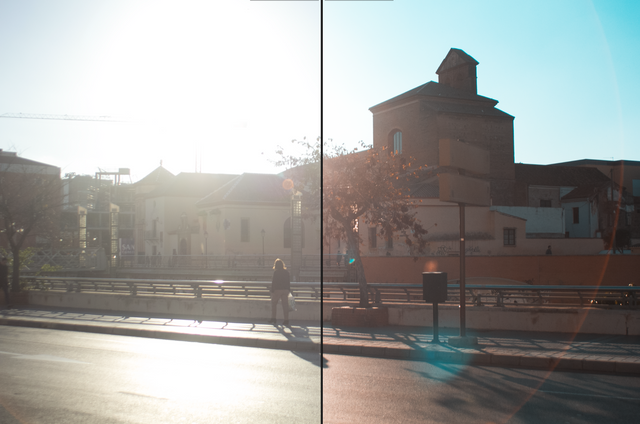
Why? Well, because if we look at that chromatic wheel, teal is at the exact opposite side of the spectrum to our orange. Which means, it accentuates the contrast, but it also kind of harmonizes.
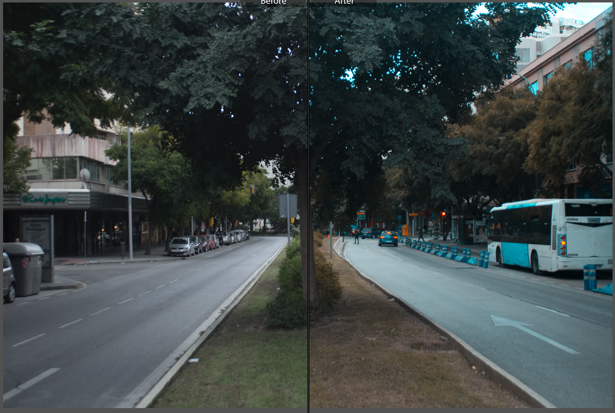
But! We have to take in consideration that everything is color graded in orange&teal. At least in cinematography. Whether that's good or bad, it makes a lot of movies look very similar. Where is the uniqueness?
Still a nice effect, though.
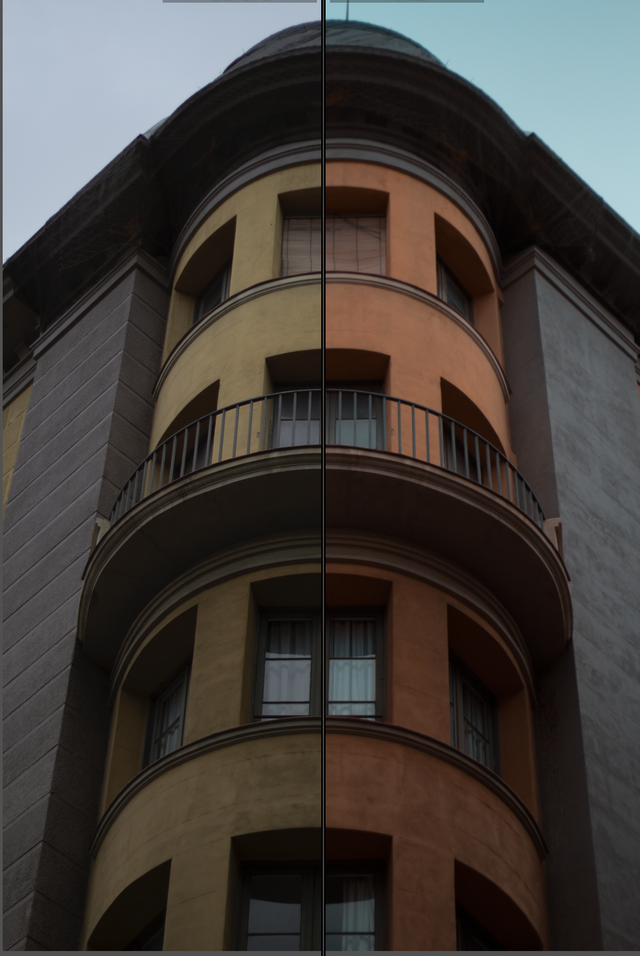
So, what I like to do, is create that orange&teal for pictures, and apply this preset in Lightroom. I toned it down a lot, so it is not as exaggerated.
If you are interested in the Lightroom or Photoshop preset used on the right side of these pictures (the left is the original taken in RAW format), you can find them here
Check out my Digital Store here, for more presets. Maybe you'll find something!
World of Photography Beta V1.0
>Learn more here<
You have earned 5.50 XP for sharing your photo!
Daily photos: 2/2
Daily comments: 0/5
Multiplier: 1.10
Server time: 20:48:58
Total XP: 140.80/200.00
Total Photos: 26
Total comments: 4
Total contest wins: 0
Follow: @photocontests
Join the Discord channel: click!
Play and win SBD: @fairlotto
Daily Steem Statistics: @dailysteemreport
Learn how to program Steem-Python applications: @steempytutorials
Developed and sponsored by: @juliank