HOW TO CHOOSE THE RIGHT COLOR FOR YOUR PAINTING / COME SCEGLIERE IL COLORE GIUSTO PER IL VOSTRO DIPINTO
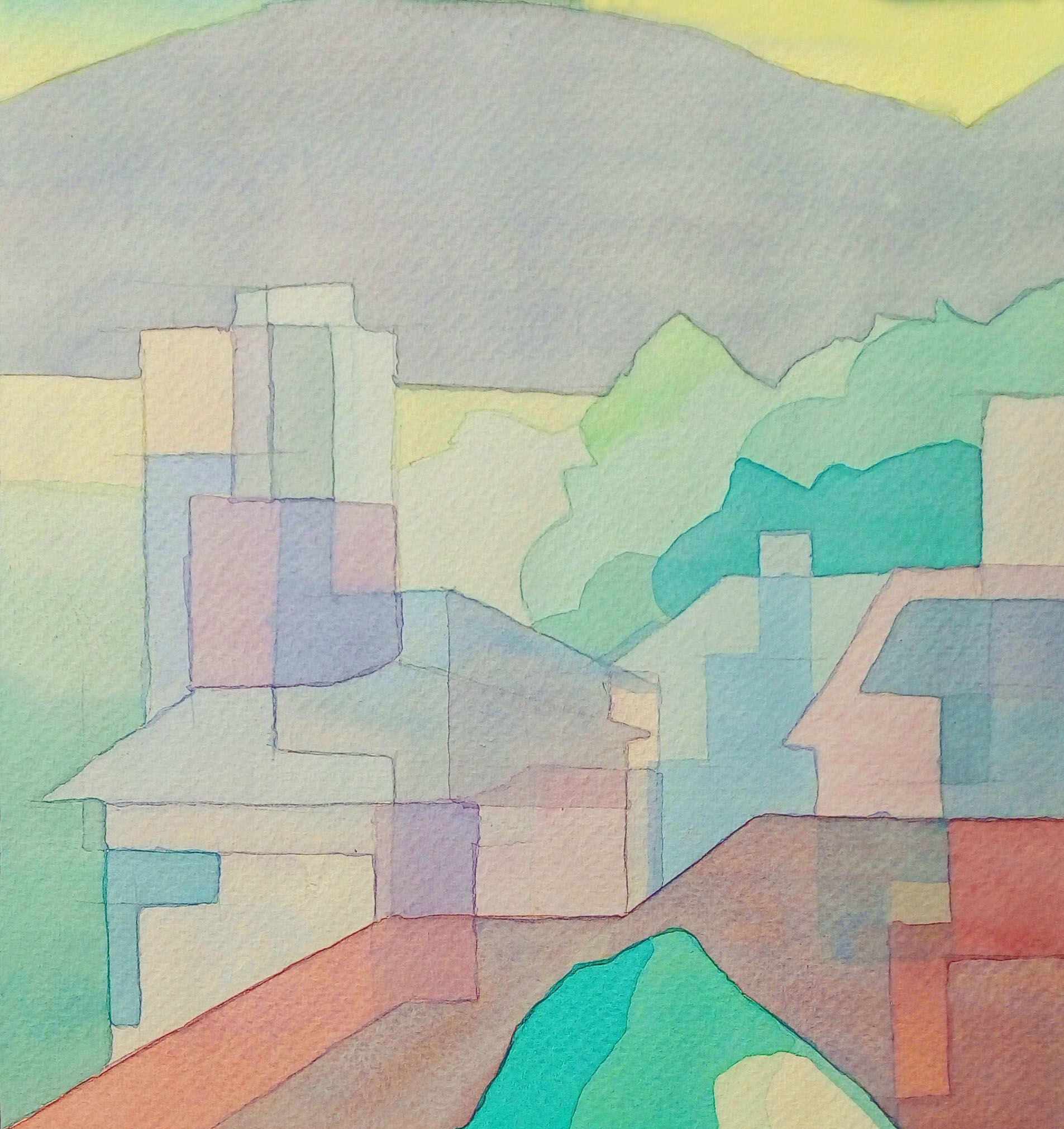
Title of the painting : "Transparent society" / Titolo del dipinto: "Società trasparente"
HOW TO CHOOSE THE RIGHT COLOR FOR YOUR PAINTING
Hi dear friends,
Today I want to talk about the matching of colors!
How do we know which colors are nice together?
When we have to copy an existing scene it's just a matter of imitating the colours, but if we invent this scene we have to decide the colour of each thing.
Apart from the fact that feeling always takes place, there is a theory of colour.
COME SCEGLIERE IL COLORE GIUSTO PER IL VOSTRO DIPINTO
Ciao cari amici,
Oggi voglio parlarvi dell‘ abbinamento dei colori!
Come facciamo a sapere quali colori stanno bene insieme?
Quando dobbiamo copiare una scena già esistente si tratta di imitare soltanto i colori, ma se inventiamo questa scena dobbiamo decidere noi il colore di ogni singola cosa.
A parte che il sentimento ci vuole sempre, esiste una teoria del colore.
source: http://olivieristudio.eu/575THz/tecnica/25
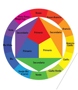
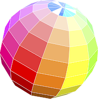
Here you can see how the colour scale is arranged: there are three primary colours
(Yellow, Magenta and Cyan), and three secondary colors (orange, violet and green).
Black and white are the absence of colour.
Looking at this circle we find at each color its complementary, which is the one in front:
For yellow it' s violet, for orange blue, and for red green. These colours stand out each other.
We can now imagine this circle as a sphere where light comes from above and underneath we have the shadow... we must look for the color on the opposite side, which will always match!
Qui potete vedere come è disposta la scala cromatica : vi sono tre colori primari
(Il giallo , il magenta e il ciano), e tre colori secondari ( l’arancio, il viola e il verde ).
Il bianco e il nero sono l’assenza del colore.
Guardando questo cerchio troviamo ad ogni colore il suo complementare, che è quello di fronte:
Quello del giallo é il viola, quello dell‘ arancio é il blu, e del rosso il verde. Questi colori si risaltano a vicenda.
Possiamo ora immaginarci questo cerchio come una sfera dove da sopra arriva la luce e sotto abbiamo l’ombra… dobbiamo cercare il colore dalla parte opposta, che si abbinerà sempre!
source: http://scuola-nc.blogspot.com.es/2017/05/classe-1-teoria-del-colore-consegna-44.html
In addition to the color scale we can also observe nature to see which are the colors that perfectly match each other, because nature in this field is never mistaken. Every hair, every feather, every leaf has been thought in the right way.
And we should also realize that a colour we see up close cannot remain the same if we see it thirty metres away, because there is the atmosphere in between! It will therefore be more intense in the foreground than in the background.
Another rule is that if the subject we draw is a living being it's better to give him a warm tonality, that is warmer than the colour of the environment around it. Can also be a warm brown with a cold brown for example. The colour of the main subject must be more striking than the others, because each colour has its meaning in the painting. It's like music, you need both: the piano and the forte, and also a break.
And remember that the dark colour highlights the light one, the moderate one highlights the strong one, and the cold one highlights the warm one.
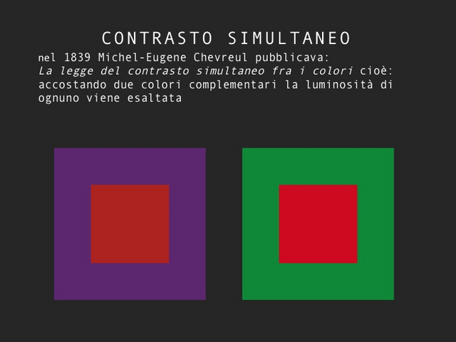
Here is an examples of small and large squares, the same colour a different background.
Oltre alla scala cromatica possiamo osservare anche la natura per vedere quali sono i colori che si abbinano perfettamente l' uno con l' altro, perchè la natura in questo campo non sbaglia mai. Ogni pelo, ogni piuma, ogni foglia è stata pensata in maniera giusta.
E dovremmo anche renderci conto che un colore che vediamo da vicino non può rimanere il medesimo se lo vediamo a trenta metri di distanza, perchè c' è l' atmosfera di mezzo! Sarà perciò sempre più intenso in primo piano che sul fondo.
Un’altra regola è che se il soggetto che disegnamo è un essere vivente é meglio dargli una tonalitá più calda del colore dell‘ ambiente che lo circonda. Può essere anche un marrone caldo circondato da un marrone freddo. Il colore del soggetto principale dev' essere più spiccante degli altri, perchè ogni colore ha il suo senso nel quadro. È come la musica ci vuole sia il piano che il forte, e anche una pausa.
E ricordiamoci che il colore scuro risalta quello chiaro, quello moderato risalta quello forte, e quello freddo risalta quello caldo.
Ecco a voi qualche esempio: dei quadrati piccoli e grandi dello stesso colore su uno sfondo differente
source: https://www.apparte.org/conferenze/
Here we have the same color twice on two different backgrounds, even if it seems different it is always the same color, which shows that the choice of color influences our message: think of the red Coca Cola, or the yellow M of Mac Donald, these are contrasts and colors of impact, if they changed, or if they changed the shape of the writing would lose millions.
Don't put to strong colors on the canvas because you'll get too aggressive a result, start with clear and light colors, and add slowly the intense and darker ones.
When you paint don't use black without mixing it a little with other colors depending on the shade you want to achieve.
And remember that colours are everywhere, in the lights, shadows and reflections.
Finally, as for the colour of the passpartout (that is the cardboard that is put around the design before the frame), stay on a grey, which will highlight all your light and dark and will not disturb in any way your colours. This also applies to the walls, in case you have an art gallery, paint them in light grey, and you will immediately see how the light colours of the hanging paintings will shine.
I hope that this post will be useful to you and thanks to all those who follow me ;-)))
Qui abbiamo due volte lo stesso colore su due sfondi differenti, anche se ci sembra diverso é sempre il medesimo colore, cosa che dimostra che la scelta del colore influenza enormemente il nostro messaggio: pensiamo al rosso della Coca Cola, o alla M gialla di Mac Donald, sono contrasti e colori d' impatto, se li cambiassero, o se cambiassero la forma della scritta perderebbero dei milioni.
Non esagerate a buttare colori forti sulla tela perché avrete un risultato troppo aggressivo, partite con dei colori chiari e leggeri, e aggiungete un po' alla volta quelli intensi e più scuri.
Quando dipingete cercate di non usare il nero senza miscelarlo un poco con la terra d’ombra, oppure il blu, o altri colori a dipendenza dalla tonalità che volete raggiungere.
E ricordatevi che i colori sono dapertutto, nelle luci, nelle ombre e nei riflessi.
Infine, per quanto riguarda il colore del passpartout (cartoncino che viene messo intorno al disegno prima della cornice), restate su un grigio, il quale evidenzierá tutti vostri chiari e scuri e non disturberà in alcun modo i vostri colori. Questo riguarda anche i muri, in caso avete una galleria d' arte, dipingeteli di grigio chiaro, e vedrete subito come splenderanno i colori chiari dei quadri appesi.
Spero che questo post vi possa essere utile e grazie a tutti quelli che mi seguono ;-)))
Sehr interessant! Hab auch grad meinen Schulkindern einen Farbkreis malen lassen!
Cool! Also unterrichtest Du auch? :-D
Unterrichten wäre übertrieben... ich hab einmal die Woche nachmittags 10 Kinder in der Sonderschule zu einem "Kunst workshop". Sie liegen mir alle sehr am Herzen mit ihren teilweise schweren Lebensumständen. Ich freue mich wenn ich sie wenigstens mal für 2 Schulstunden in eine andere Welt entführen kann...
Das ist sehr schön!!!! Beonders Kinder brauchen den Umgang mit Farben und Materialien, und haben besonders das Bedürfniss sich auszudrücken und sich zu entdecken.... Und wenn die Kinder nicht zu viel haben werden sie erst richtig kreativ.... weil wenn einer alles hat, braucht er es nicht mehr erschaffen...
Danke für Deine schönen und aufmunternden Worte. Leider ist es doch schwerer, als man meinen möchte, weil es diese Kinder einfach nicht gewohnt sind, etwas schaffen zu können, oder dass sich jemand für sie oder das was sie tun interessiert. Man muss sich schon sehr intensiv um jedes einzelne kümmern.
Verstehe!!! Aber das machst Du sicher richtig :-))
Molto interessante Caroline.
Grazie per i contenuti del post, cerco di farne tesoro 👍
Grazie a te :-D Anch' io non finisco mai di imparare, e quando imparo qualcosa mi piace condividerla ;-)))
Davvero interessante la teoria del colore...un saluto @giornalista
Grazie mille :-))) Salutoni!!!
Ottime indicazioni Caroline! E' un aspetto che ignoravo assolutamente e invece è fondamentale. Bello imparare sempre cose nuove ;-)
Grazie caro @miti! Si, non si direbbe quante decisioni ci sono da prendere solo per dipingere un quadro, e invece.... :-D
Congratulazioni! Il tuo post è stato scoperto dal Team @OCD e inserito nella sua rassegna quotidiana international daily compilation 153 Puoi seguire @ocd per saperne di più sul progetto e vedere altri post preziosi! Ci sforziamo per la trasparenza. Se desideri che i tuoi post siano rilanciati da @ocd e raggiungano un pubblico più grande, utilizza il tag # ocd-resteem, non deve essere il primo. Per saperne di più puoi leggere qui ](https://steemit.com/ocd-resteem/@ocd/ocd-introducing-ocd-resteem-get-resteemd-by-ocd). @ocd adesso è anche witness. Puoi dare il tuo voto a @ocd-witness con SteemConnect oppure su Steemit Witnesses per aiutare a sostenere altri autori sottovalutati!
Grazie!
Grazie mille :-)))
It sounds easy when you read it but put a nice painting in practice is for sure not easy... I am not much talented when it comes to painting or drawing, even though I find it a nice hobby.
Yes you're right! I hope that this post will help :-D
You got a 11.78% upvote from @pushbot courtesy of @howtoweekly!
Thank you so much :-)))