BASIC RULES FOR PHOTOGRAPHING ARCHITECTURE. PART 2
Hello again to all photography lovers. Before we start with this new chapter, here is a reminder of what we saw in the first installment.
In this second part we are going to see how to compose an architectural image so that it describes the building well, both inside and out.
First of all, everything is susceptible of modification and interpretation, although there are some basic guidelines, which sometimes are not even written down.
It should be noted that the vast majority of architectural photographs are taken with wide-angle lenses. If we take them with a mobile phone or tablet, there are already many that have the wide-angle lens option. So let's put the widest aperture lens we can on our camera.
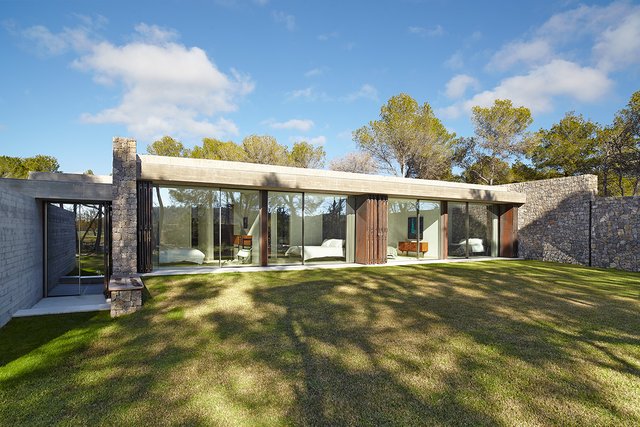
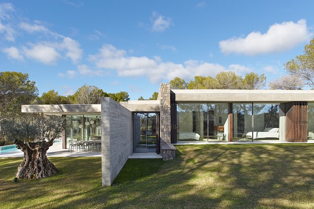
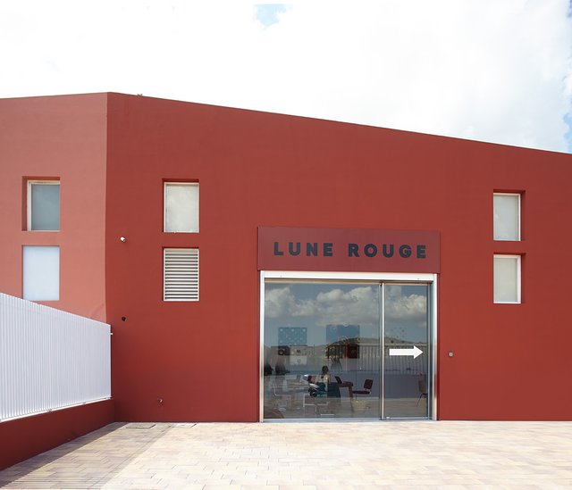
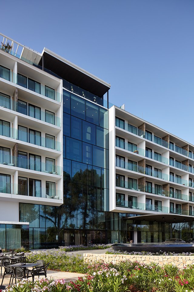
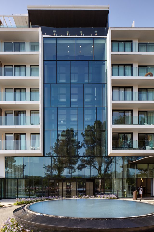
In the basic image of an architectural reportage it is advisable that the camera (the sensor) is completely parallel to the facade of the building or to the back wall in an interior. That is if the space we have to take the photo allows it, as there are times when this is very complicated.
This a clear instance of that, where the complexity of the façade is better capture with the parallel shot.
Another instance of more simply façade
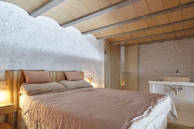
The same rule also applies to interior spaces.
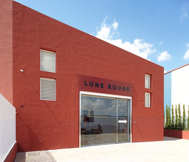
Lets see some exceptions of the rule, basically because the lack of room to place the camera.
Here we have an example of the difficulty of not having space for a frontal shot, as there was an insurmountable wall behind, so the final image was the oblique one, because the frontal one was too tight. Note also that the part of the building to be highlighted, the floating façade, can only be taken vertically.
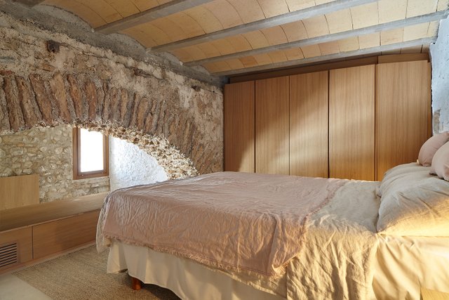
In very small spaces, it is simply impossible to take parallel shots and we are forced to shoot diagonally. In this example we see the shot and the counter shot, to see the difficulty of the lack of space.
Another important aspect is the time to take a photo of the exterior of a building. It is always advisable to visit the area before doing the job and evaluate how it is situated in relation to the sun and the possibilities we have to shoot from different angles.
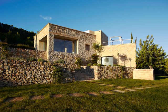
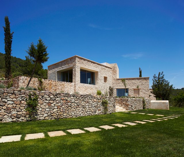
In this example we see the differences in lighting from one shot in the morning and another almost at sunset. In this case I opted for the afternoon shot, as the warm, grazing light enhanced the textures of the stone and gave the house a more pleasant atmosphere than the cooler light in the morning.
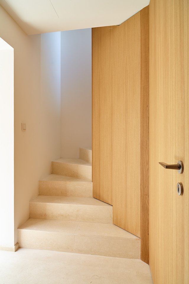
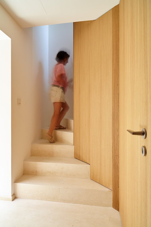
For a long time in building photography it was avoided to put a human figure in the scene. Fortunately this is now a thing of the past and people are now featured in many building photography pictures.
In these two images we can see the difference between a space with and without a human figure.
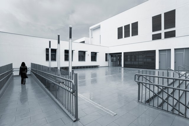
Another example of the inclusion of people in photos of buildings.
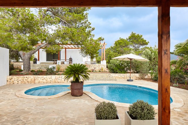
We can also use elements that can sometimes be annoying, and integrate them into the image by giving them a function. On this occasion, the wooden post and the beam served to frame the rest of the scene.
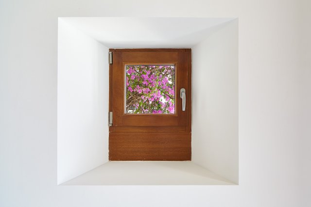
Finally, it is also advisable to show small details of the spaces we photograph. Here a small window with a bougainvillea in the background, which gives the place a natural touch.
Of course there are many aspects of architectural photography that have been left out, there is not enough space in a post to summarize what is a speciality like this, but we will try to keep evolving the topic.
And that's all for today. I hope these tips will be useful and that some of you will be able to apply them to your photos of buildings and interiors.
Thanks to @xpilar and moderator @stef1 for giving me the opportunity to publish these articles.
If you are interested, feel free to ask your questions.
Unless stated otherwise, all the pictures and the words are mine.
Do not use this images without my written permission.
Thanks for stopping by and taking a look.
Camera: Canon EOS 5 Mk II and MkIII
Lens: Carl Zeiss 21 f:2.8, Canon 16-35 f:2.8 and Canon 24Ts f:3.5
Processed with Capture One
Upvoted! Thank you for supporting witness @jswit.
Thanks for sharing! Need more tips on photography.
Many thanks to you for the recognition to my work. Sharing knowledge is the best path to evolve.
Your post is manually rewarded by the
World of Xpilar Community Curation Trail
STEEM AUTO OPERATED AND MAINTAINED BY XPILAR TEAM
https://steemit.com/~witnesses vote xpilar.witness
Many thanks @worlsofxpilar for supporting my work. It motivates a lot!
The lens is parallel to the facade... It's good that you emphasized this. One of the difficulties of shooting buildings is the inability to move away :-) In this case, I take several consecutive pictures and stitch a panorama from them. Now I will definitely take one of these pictures parallel to the building :)
Thank you :)
Объектив параллельно фасаду... Хорошо, что ты сделал на этом акцент. Одна из трудностей съёмки зданий, это отсутствие возможности отойти подальше :-) В таком случае я делаю несколько последовательных снимков и сшиваю из них панораму. Теперь я точно буду делать один из этих снимков параллельно зданию :)
Благодарствую :)
I can imagine and it is becoming easy to understand why the professional photos of hte places and buildings look completely different and look really nice. I agree with you that if someone decided to do a good picture of any crchitecture than the place needs to be visited and studied. I love morning pictures because of more shadows with interesting pattern in the morning hours.
Hello @stef1
I can tell you have an artist's eye. Normally the best light of the day is in the morning, after sunrise and before sunset. Almost everything can be seen much better in that light, although there are buildings that, due to their location, can be seen better at other times, basically depending on the orientation with respect to the sun.
On another note, I have sent you the draft of the contest.
Thank you very much for your comments and support.
Guaoooo que bello trabajo fotográfico.
Gracias por compartir.
De nada.
Gracias a ti también por pasarte y comentar.
It is true that it is not the same to have enough space to take photos of facades, moving away may be advisable to give air to the space.
I really liked the advice about visiting the place beforehand and seeing the quality of the light, or what time is most flattering, I love playing with those aspects. Light is so important when taking pictures.
I also liked what you explain about taking shots in the interior details of the structures.
Thank you very much for sharing your knowledge.