Let's Start at the Beginning - with BLOG HEADERS! (The Blog Spot Issue No. 2)

Design is how you make your first impression with your consumers. Make sure it is a lasting one. - Jay Samit
Ola Steemit! Happy Friday! Hope everyone is having... or has had a brilliant, beautiful and productive one! About six days ago I wrote a post and simultaneously started the first in a new "series" of posts called THE BLOG SPOT - Inspiration for Writers with which I hope to give a little direction as well as inspiration for all of us aspiring writers. You can take a look at that post directly if you want a little more insight on what this is all about... but as for this post - I am just going to dive right in!

Let's Start at the BEGINNING - with Blog Headers.
THE BLOG SPOT ISSUE 2.
One thing a career in graphic design and desktop publishing taught me is that what separates the average from the exceptional is attention to detail - and that is precisely what I intend to focus on with this post. There is an old saying “always put your best foot forward first”. This is applicable in all the arenas of life and the blogging sphere is not any different. People are visual creatures by nature which is why the manner in which things are “packaged and presented” contributes largely to their ultimate success or failure – doesn’t matter what it is. The same goes for your blog posts.
The very FIRST thing people see is your header thumbnail and it really is the BEST chance you have to capture a potential readers attention, so it is incredibly important that it LOOKS GOOD! Yes, I know this has been said before by many, but it is a topic and piece of guidance which is repeatedly ignored in spite of that. Now, please don't misunderstand me - I am not necessarily saying that you have to have a formal, professional or business like header on every single one of your posts... but I do think it is important to create a sense of visual rhythm with them.
Personally, I don't create customised headers for all my posts - so for example, if I am writing a bit of an internal ramble (which I do a lot of, lol) then I will generally just make use of a photo I have taken, but definitely a GOOD photo. I tend to save the customised headers for things which are more topic specific - such as this post, or perhaps a recipe. So between those two primary content topics you will generally see a mix of the two on my feed.
The important thing is you take the time to contemplate who your intended audience is. Whilst most of the readers who view your content will be right here on Steemit - it is by no means limited to that... and there is nothing stopping you from sharing your Steemit blog links with the rest of the world - which I realise many of you may already do - especially if you are trying to establish yourself as a content creator, writer or brand of some kind. it is in these instances that the visual impact becomes highly relevant. However, in the same breath, your readers here... and the impact you make on them is equally important.
There are literally countless resources, sites and apps available which can help to improve your first impression, but there also has to be an understanding of what does or doesn’t look good in order to successfully use the tools at your disposal. I would like to try and assist a little in that regard - and if you have any questions about this facet of the topic (or any other) PLEASE go ahead and let me know in the comments! I will always do my best to give each and every one of you a valuable as well as practical answer - if I am able to.
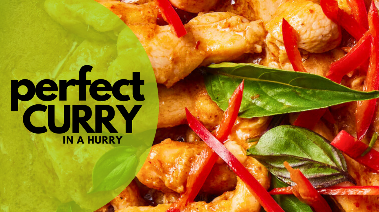
So, say for instance you are going to do a recipe post on a curry you made... Let’s be frank, not everyone is a photographer (myself included) – nor do we all have phones which take incredible photos. Again, what sets an average photo apart from a great one is the creative eye behind the camera and the reality of the matter is – if it does not look at least relatively professional then you should probably not use it on your blog header image. Use it within the blog post, sure – but perhaps not as your first impression - OR at the very least, try and improve it however you can with editing.
Take a look at the below examples. I just grabbed a really bad photo of curry from here and put it into a Canva template. The first example shows the bare minimum in terms of effort and I just used the photo exactly as it was. The second example USING THE SAME BAD PHOTO shows you that EVEN WHEN USING A BAD PHOTO YOU CAN STILL IMPROVE THE OVERALL IMPACT - simply by changing the way you use the photo as well as better use of colour, layout, font etc.

.png)
The image itself as well as how you use it plays a MASSIVE role in the end result, so obviously first prize would always be to try and take the best possible photo you can so that you don't have too much "fixing" to do. Small details can make a huge difference at the end of the day, such as; cleaning your phone camera lens before starting to take photos, changing the angle of the photo or the scene surrounding it. Let me elaborate - look at the below image.

It's an average photo. Nothing particularly special about it. Let's say I decide to use that pic for my blog header and I even go as far as using a design template site such as CANVA to help me design a professional looking header with that image. I upload and neatly place the image on a nice template and put the appropriate heading in etc. I am likely to end up with a result something like this...

Now, that looks decent, but not in any way exceptional. Yes, it certainly beats just using the photo on its own... but it could still be a whole lot more professional and ENTICING! Everyone knows that you are about to share a recipe because your title already says that... so you do NOT need to use your own image for the header if it is not professional enough. The key comes in with you being honest enough with yourself to decide whether it is or isn't. And if you are not sure how your photo fares, go to google and look up "chicken curry" or "curry photography" to give yourself a basis for comparison.
As an example - if you did not want to use your curry photo for the header - go look for a stock image of spices or something which is related to what you are cooking.
There are countless sites which offer free stock photography such as UNSPLASH and PIXABAY and the levels of professionalism are generally pretty good. Personally, I prefer Unsplash from a professional aesthetic perspective - but both have a lot to offer. Now, to really compare apples with apples, AGAIN I have not changed the photo chosen, nor the title - I have simply changed the layout, the colours and the way I have made use of the photo in terms of cropping, placement etc.


Three completely different approaches to the layout, doing nothing more than making a few small tweaks. Small changes can make an incredible difference in the levels of aesthetic impact which the finished header holds. It puts your BEST foot forward first. You can save the "real you" photo's for the body of the blog. It IS good to have your own photos included because this is what humanizes the article and gives you authenticity as a creator, but a balance between using your own photos and stock can be struck. Certain things are appropriate in certain places and for your header thumbnail, professionalism comes first. If you can learn to render good enough results with your own photos... then EVEN BETTER!
The importance of this extends beyond the individual post through to your blog feed. When you create consistently classy and professional looking headers your blog feed will begin to hold it's own sense of appeal to those that land on it because it is attractive to the eye.
I know I have used one example here, but the fact of the matter is that this advice and principle should be applied to ALL your content and posts. Take the time to go the extra mile - it is always worth it! You may struggle a little in the beginning but will improve with time and practice. If you put the effort in to repeatedly create good looking headers, you will look back in a year to the first time you did it be impressed at how far you have come, I promise.
Another little snippet of advice I would like to add to the above, is consistency! When you use Canva or some other template design site, make sure that you choose the same template dimensions every time and also make sure that the size and shape are suitable. Blogs - especially here "generally" (there will always be exceptions) look better in the feed and on your page with the above sampled horizontal / landscape shape, but if you prefer... a square is also aesthetically pleasing - just make sure that the focal points of the design are toward the middle of the square because for those that still make use of the "traditional list view" it will automatically chop the top and bottom of your thumbnail off.
If you want to stand out and get your content noticed...It really is all in the details! I hope this little bit of info gives you a lot of inspiration for your next blog post! Don't be scared to experiment - with both your photographing skills as well as with the design elements!

SUBSCRIBE TO THIS SERIES:
If you are interested in following this series of posts and would like me to tag you in future - please drop a comment below saying that you would like to participate going forward and I will add you to the list below:
@quirk-it, @antonioeviesart, @inspiracion
UNSUBSCRIBE TO THIS SERIES:
If at any point you would like me to remove your name from the list of tagged individuals - please request so in the comments.
Previous Posts in this Series:
THE BLOG SPOT - Inspiration for Writers (Issue No. 1) - THE INTRODUCTION
❤❤❤
Until next time...
Much Love from Country Bumpkinland, South Africa xxx
Jaynielea

ALL IMAGES ARE MY PROPERTY UNLESS OTHERWISE CREDITED
Typos make me human. I may or may not get around to correcting them.
All written content shared here is my property, unless otherwise credited
Hi @jaynie, we are visual creatures, this is very real, and it is what first catches our attention.
Personally, I am also more inclined towards Unplash, because the images tend to be more artistic, suggestive, they have very good material, although sometimes some topics are missed. But without a doubt, your own images add a unique, personal element and even a greater connection with the author, but of course this will also depend on the skill when taking and selecting the photos.
Very good tips, thanks for sharing them.
YES!!!! I could not agree more!!! Their images are absolutely more aesthetic, but the variety of choice is definitely more limited.
Absolutely!!! Always!!! But again, I will say that I am of the opinion that we have to keep on trying to better our skill sets. We don't need to be professionals, but we can always aim higher. Myself included!
And thank YOU @inspiracion for taking the time to read this post and for sharing your insight, personal experience and thoughts on it all!
Much love!
Thank you for the tips Jaynie.. i take many lessons reading it. Please add me for future post like this..waiting for another good tips for writing blog..
You are VERY welcome @mytravelandscape and I am thrilled that you found some value in it!! YAY!!! :D I will absolutely add your name to the list for the next one!
Hope you have a wonderful Friday and start to your weekend!
Thank you for taking the time to share such great tips/advice! Quite literally "food for thought" 😃❤️
Thank you too @quirk-it for the positive feedback! I really appreciate it! I am VERY MUCH looking to the unfolding of this series and genuinely hope that it inspires people at the very least!
Happy Friday!!!
<3
You're welcome! I look forward to more 😍
Have a great weekend ❤️
Thanks! You too :)
Greetings friend, excellent recommendations, the order is important and the visual, as artists the image is necessary, a hug and success.
Much love @antonioeviesart - and thank you so very much for the wonderful input on the second post in this series! It is wonderful to see people interested and keen to "broaden their horizons" :)
TEAM 1
Congratulations! This post has been upvoted through steemcurator04. We support quality posts , good comments anywhere and any tags.Many thanks @steemcurator04 and @o1eh :) much appreciated!
Please, tag me.
I liked reading it (see 2 examples not 3) and have no idra what canva is. 🤣
With pleasure sweetie! I have not had a lot of time to focus on it this week, but may still do the next one before the weekend - otherwise early next week. Either way, I will add you on xxx
Thank you. In the meanwhile I tried the canva thing but I have no clue what to pick, how to make a header. Visited unsplash but I like pixabay better but can depend on the topic.
I hope to read your tips again, take your time.
Thanks for adding me 🙂
🍀❤️
Canva can be a little overwhelming initially and if you are operating it from an old phone... probably infuriating enough to make you want to throw your phone out of the window! lol
Perhaps I should do a simple canva header guide or something like that.
Have you noticed me and my old phone are struggling on?
Btw I would never throw away my phone but simply give up on Canva.
If it comes to overwhelming... I tried a few days for nearly the entire day (just one banner)... better don't ask what my youngest said 🥳
If you make a post please tag me.
🍀❤️
I have :)
I can only imagine how annoyed you must have been feeling by the end of that lol
Well I have an inkling what mine would have haha... so ya!
will do... if I do :)
A happy day dear 🤗
It was very interesting. Add me to the list of subscribers for this series.
YAY!!! :D and thanks @o1eh :) Really value your feedback!
Your color scheme is excellent, which is what I need to learn.
This post has been featured in the latest edition of Steem News...
And thank you again :) Very much appreciated @pennsif!