Art Attack! #9: Character Compilation Challenge! (Part 1)
Hey Steemit!
We're back again with another Art Attack! If you're new to the series, this is where I share my paintings and the process behind them. A behind-the-scenes look at my artwork, if you will. This is not to say that I'm very good at art, or that I'm a professional in any way. In fact this is the opposite, and serves as a reminder to how I first started.
Last week, I shared a quick post about one of my first dabbles in watercolour painting, where I practised painting one of my incomplete pieces.

In hindsight, there are quite a few things I would change about this piece, which is also why it'll probably just end up in my sketchbook forever. But oh well.
Anyway, this week I want to share another one of my big pieces! And by "big" I mean it took a while due to all the details, not the actual size of the paper.
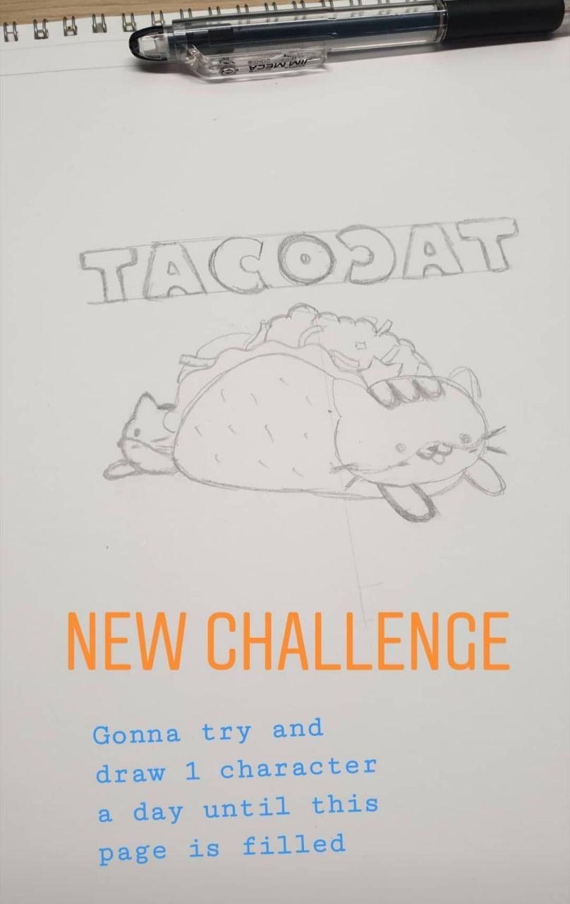
In mid-August 2019, after the first few pieces I did, I imposed a challenge on myself - to draw 1 character a day until my page was filled! I don't think this was an original challenge, because I'm pretty sure I heard about it somewhere, but I thought it was interesting, and decided to give it a shot.
Usually when I come up with ideas for my pieces, either I always start with the focal point and fill in the blanks from there, or I start with the setting and have the whole piece in mind. But whenever I actually start sketching I have a rough idea of how I want the painting to look already, so this challenge was very interesting, since I had no idea how it was going to end up looking.
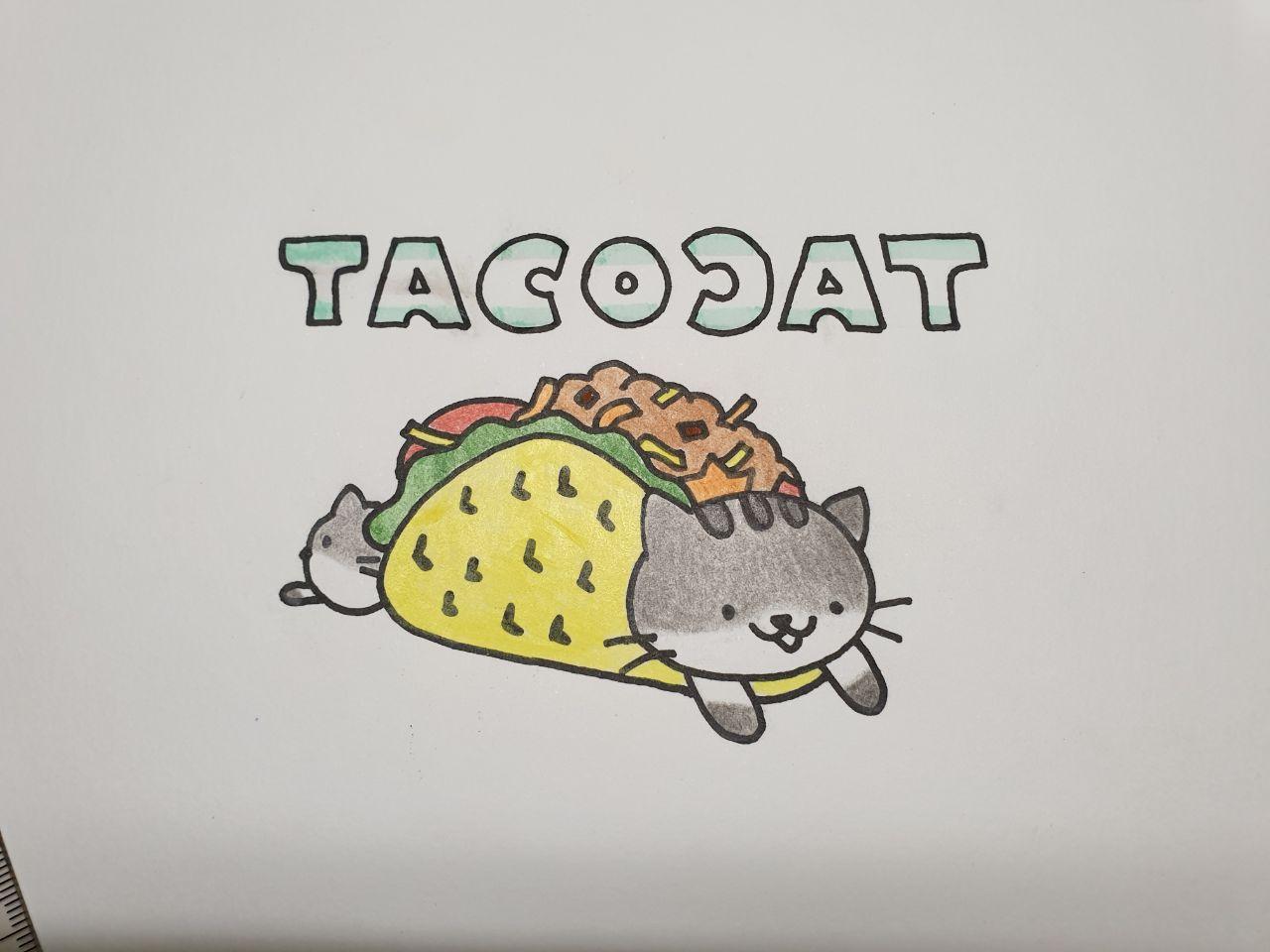
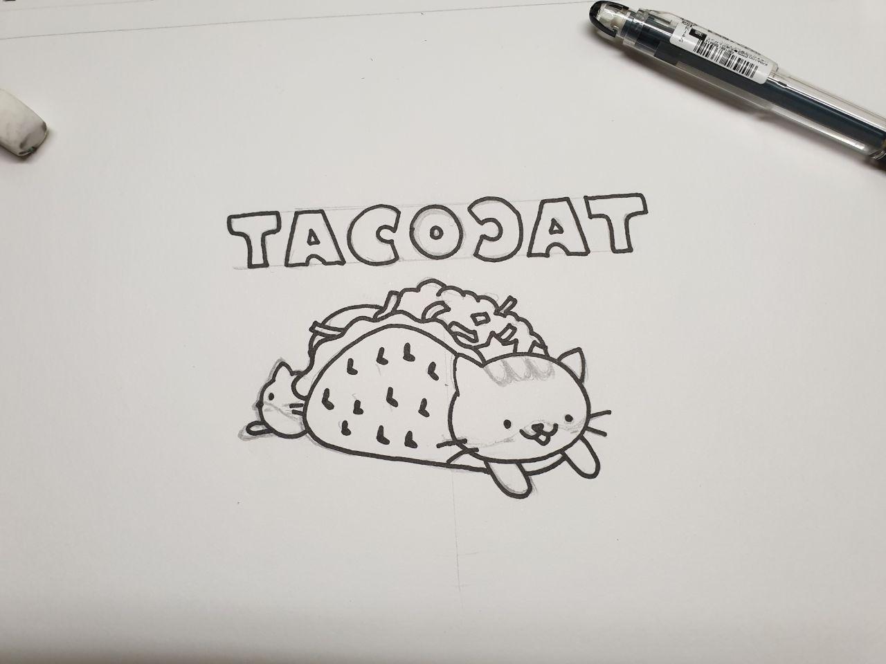
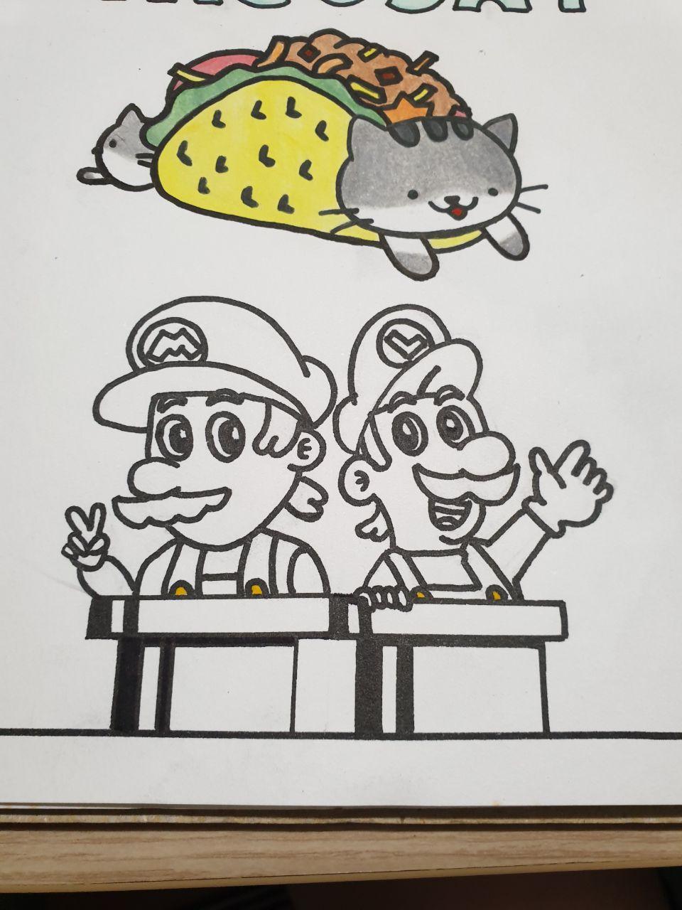
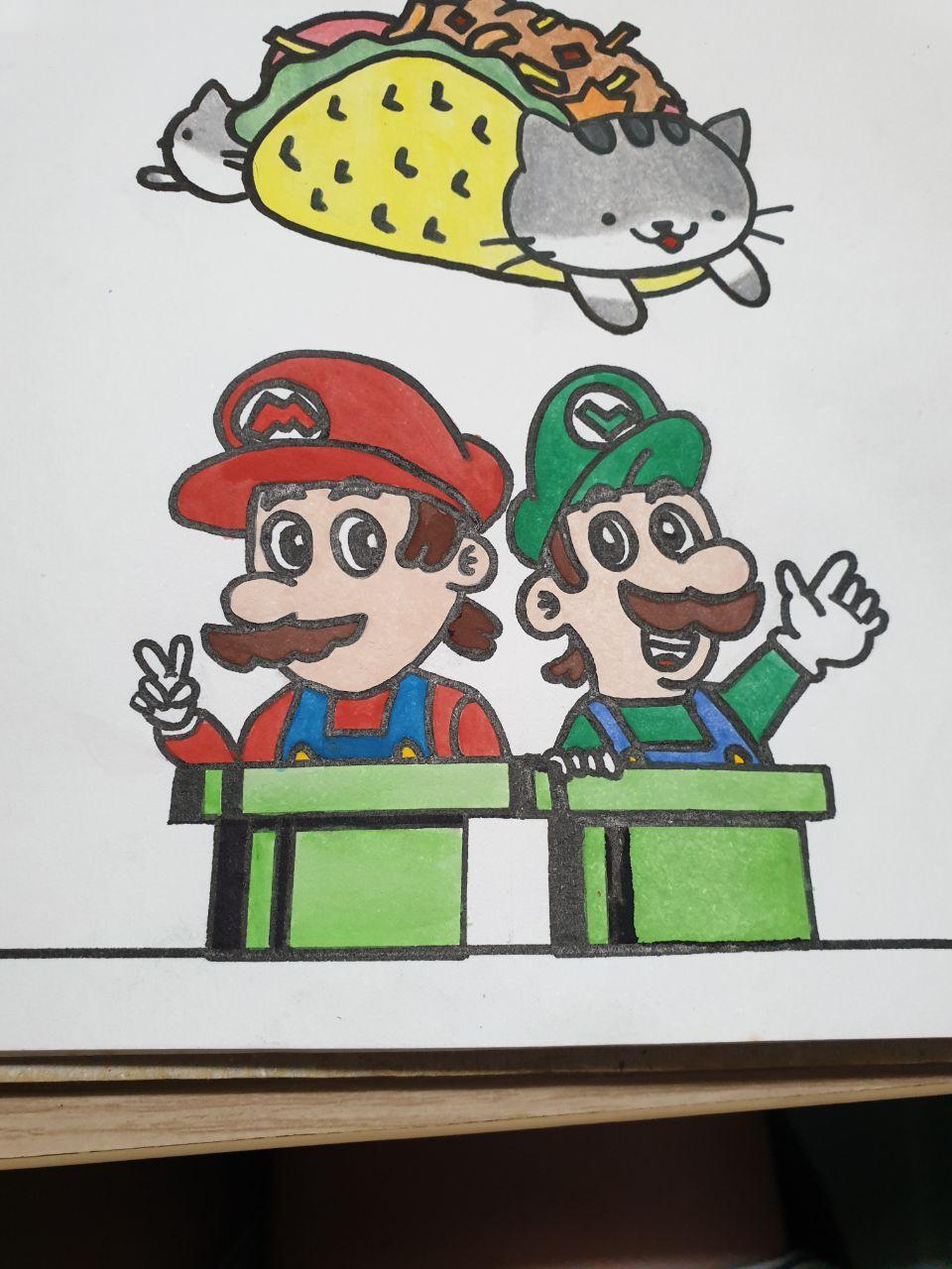
But I decided to start with the classic; TacoCat logo!
For this I took inspiration from a really cute gif I found online from jubbycats:
I really liked this TacoCat design, but I wanted the words to be different and I wanted another cat head at the back (to symbolise the palindrome), so...
I used colour pencils for this; since I was sure I couldn't make the gray so late with watercolours, but now I'm pretty sure I can. But it's alright, I think it looked pretty good anyway.
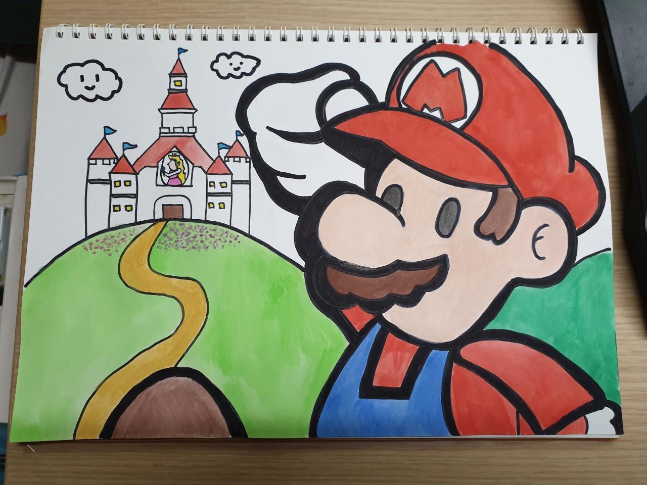
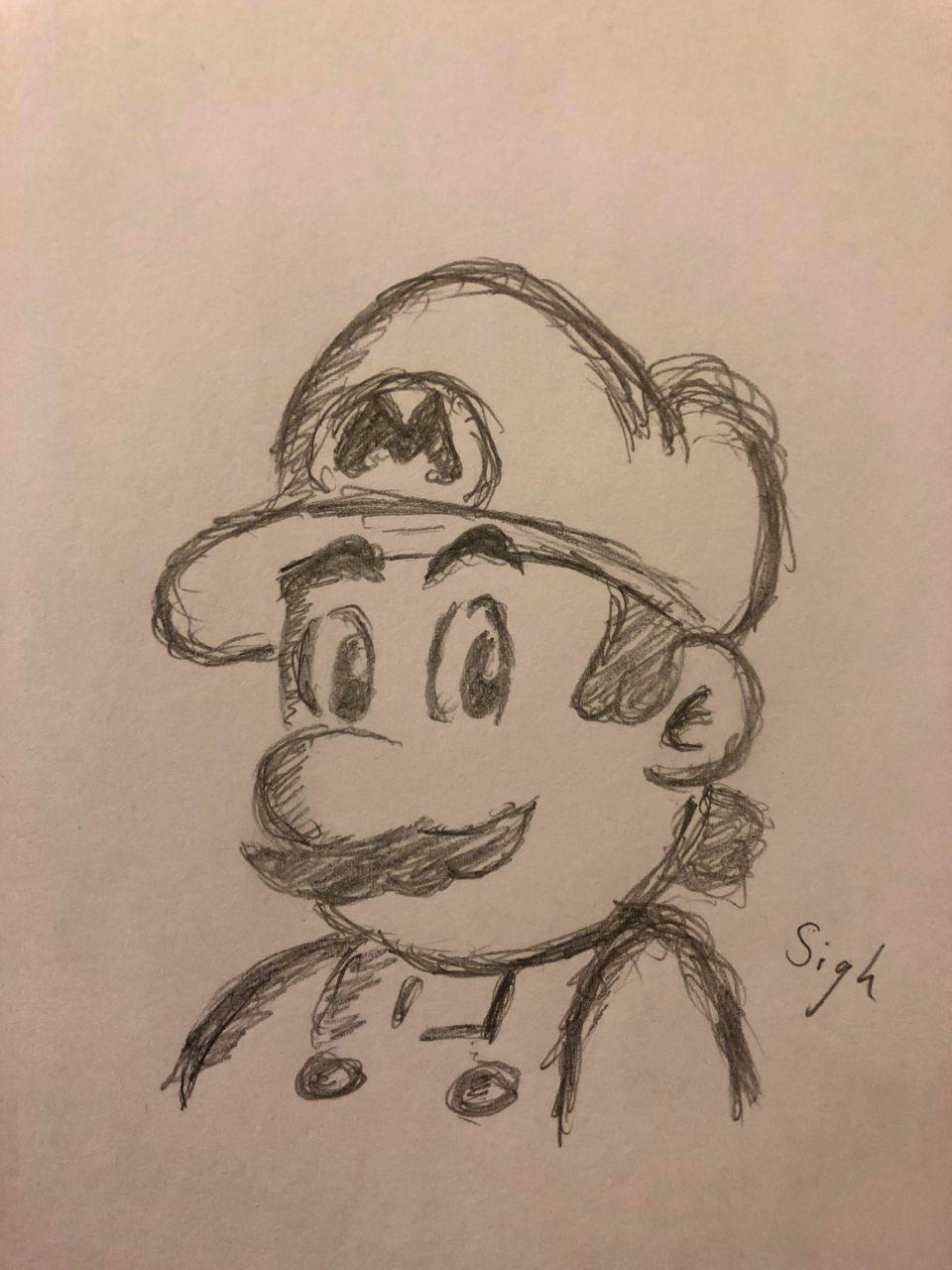
The next character(s) I decided on were my favourite bros, the Mario Bros.!
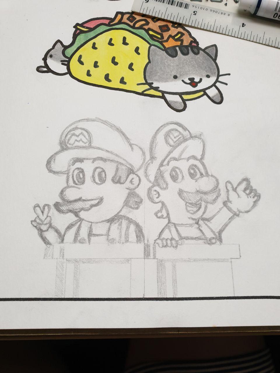
I came across this really cute Mario doodle on reddit one time, and decided to replicate it because I thought it was such a good rendition of Mario!
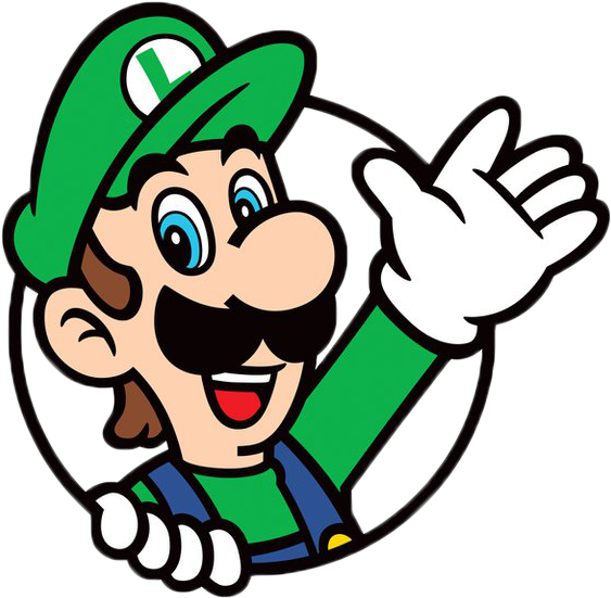
And for Luigi, I referenced this icon (from Super Mario 3D World )! It's also available for use as an avatar icon for the Switch I believe.
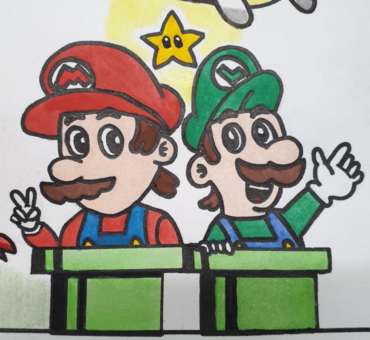
But here's what I ended up with!
And here's what it looks like painted!
Now that I look at it again, I think the appeal of the Mario doodle was the light shadows thanks to the pencil marks, so mine doesn't look as good I would say, but it's okay. Maybe next time I'll do a black and white version. 🤔
I eventually decided to add a Starman between them because of the weird empty space between them and TacoCat.
The next character was a chicken! Specifically, the chickens from Stardew Valley!
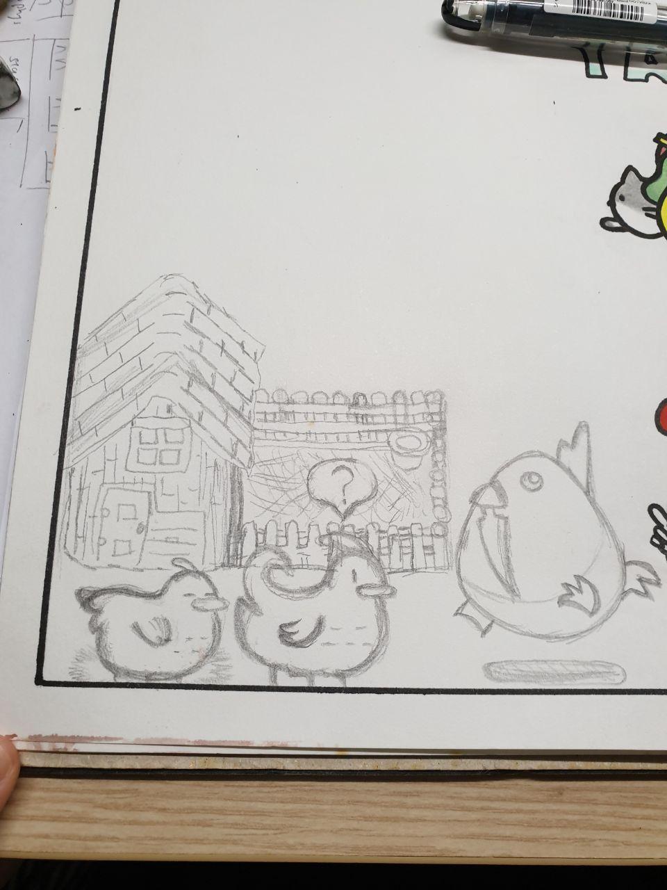
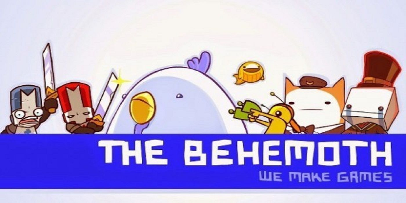
If you've read my other Art Attacks, you'd know one of my go-to ideas is always having characters of different series interact together (typically if they have something in common). So in this case, my idea was to have the Stardew chickens meet the Behemoth!
If you didn't know, The Behemoth is an American indie game company that made hits like Alien Hominid, Castle Crashers and Battleblock Theater (some of my favourite games)!
I always thought the chicken was really derpy looking, so I decided to draw it!
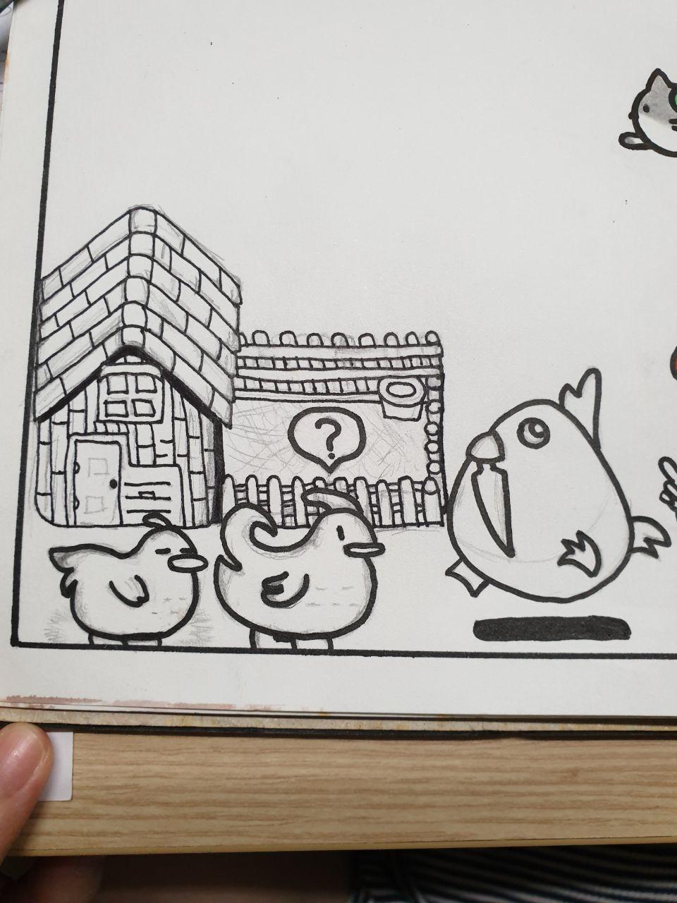
I also drew the coop from Stardew Valley just because, context.?
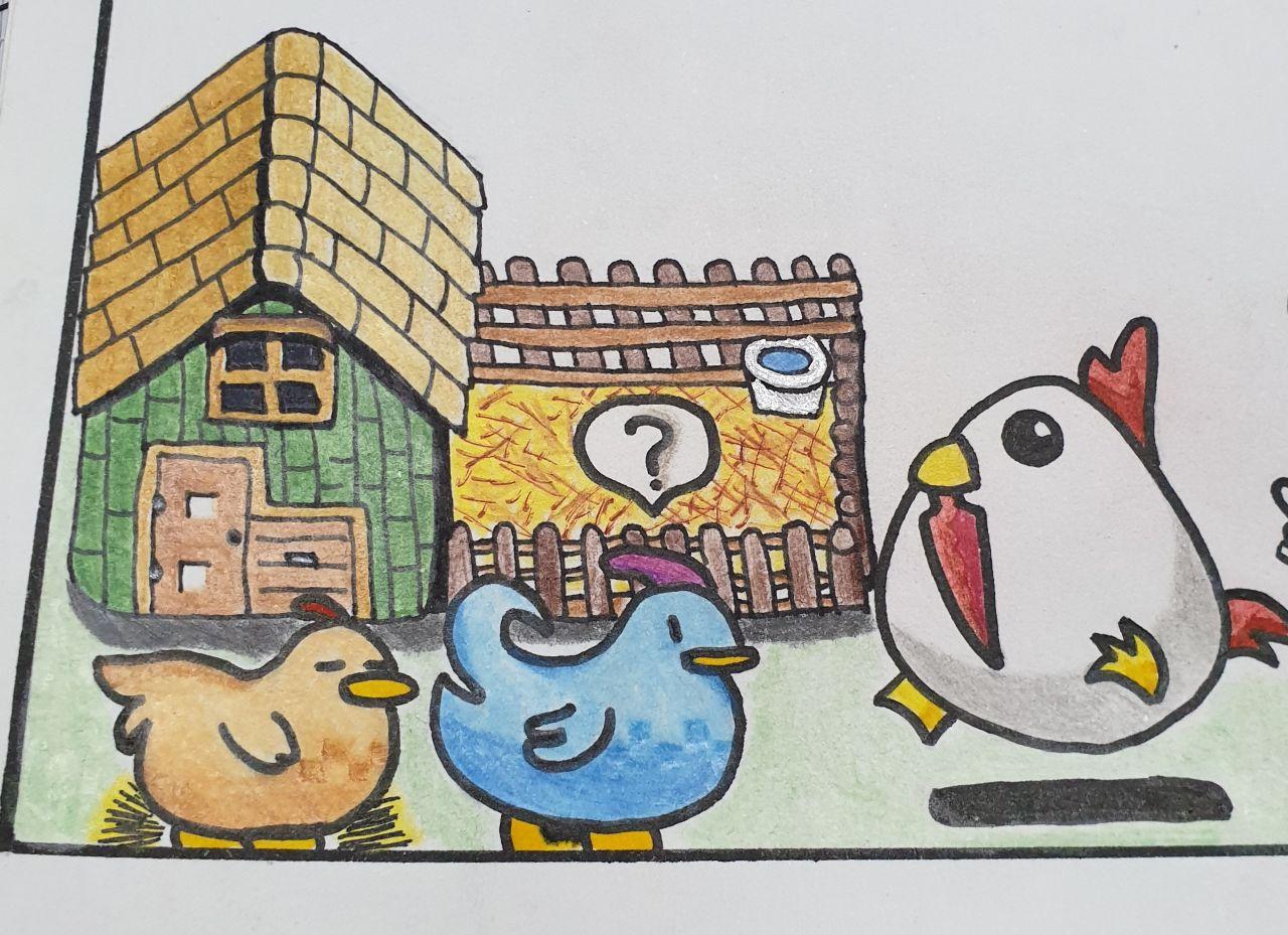
I used colour pencils for this too, since the lines on the coop would get smudged, and I needed the different shades for the chickens.
Because the coop was in the bottom left corner of the page, I thought of drawing another building in the bottom right to even it out. But I also wanted a different style of building (i.e. not from Stardew), and my thoughts wandered to a similar game - Animal Crossing!
I referenced this super cute picture from pinterest.
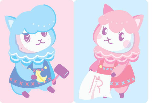
And came up with this:
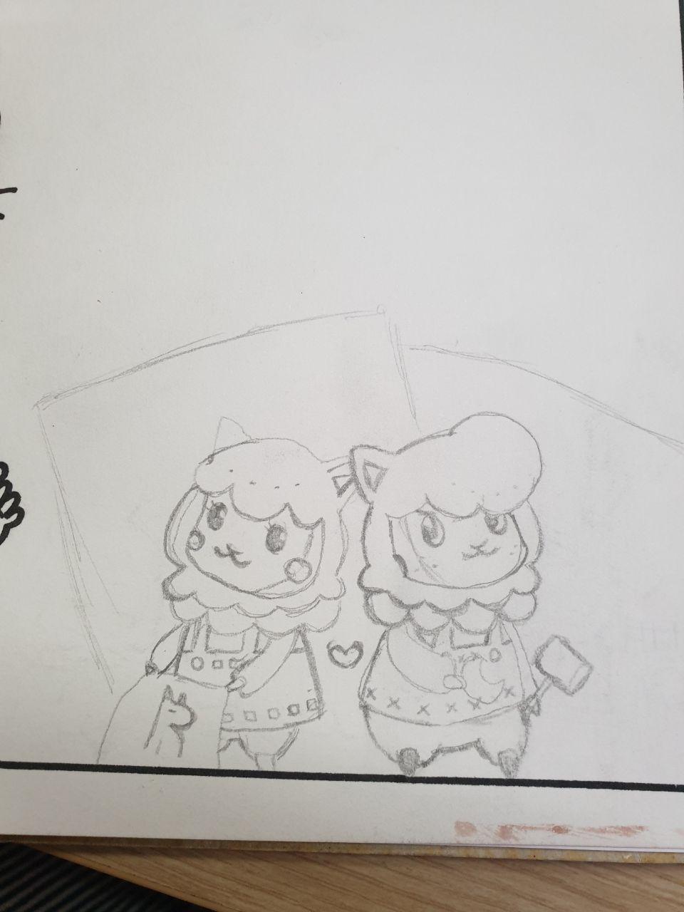
It was really hard to sketch this particular set of characters just right, since I wanted them standing in front of the shop. I kept getting the scale wrong, but ultimately it turned out alright at least.
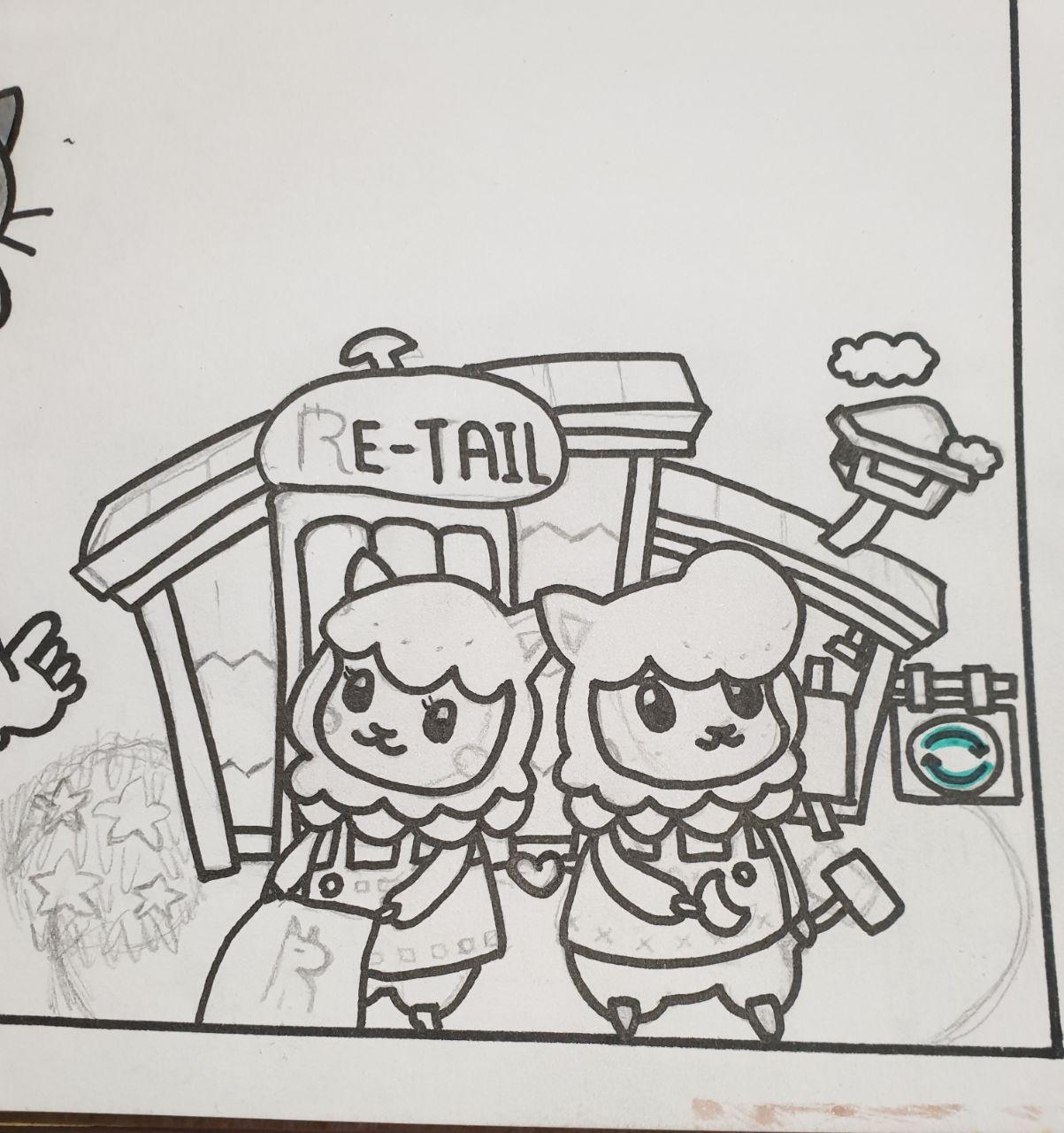
For the colours, I tried my hand at mixing gouache paints to get the shade just right. It took some time, but I'm really glad with the outcome.
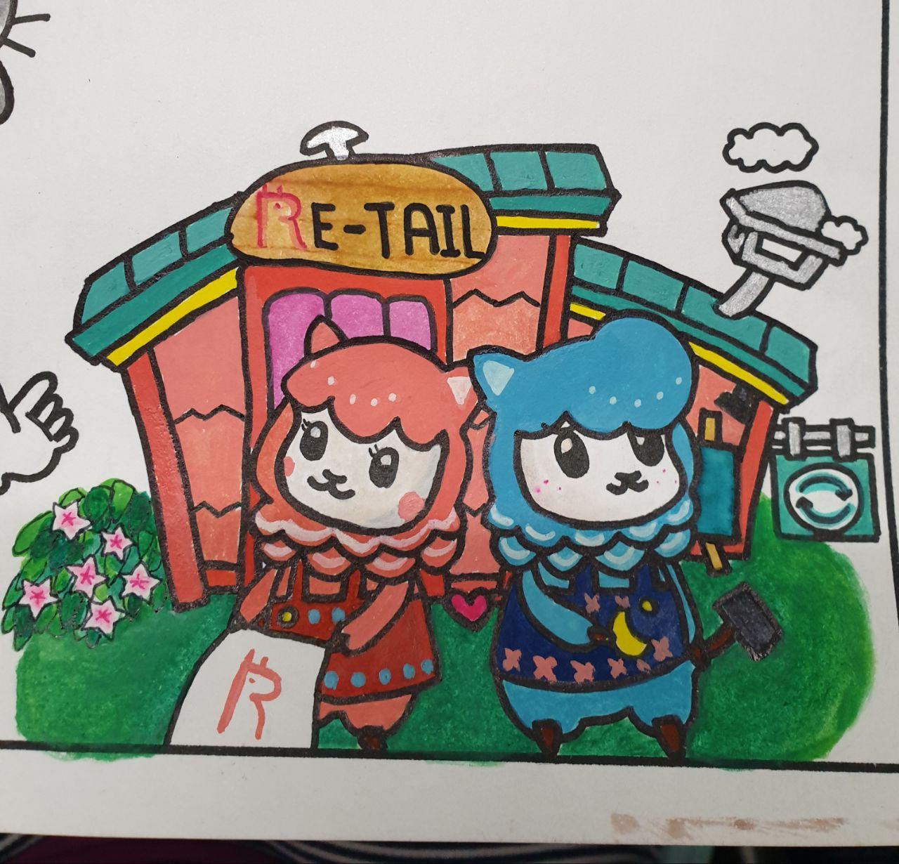
I think maybe I should've used a lighter pink for the shop to make reese stand out more, but oh well. They still look really cute so it's okay.
There are still quite a few pictures left (since we're only about 1/3 of the composition done), so I think I'll leave the rest for next week or this post will be waaay too long. Tune in next week to see the end!
Thanks for reading!
To find out more about me, check out my intro post here!