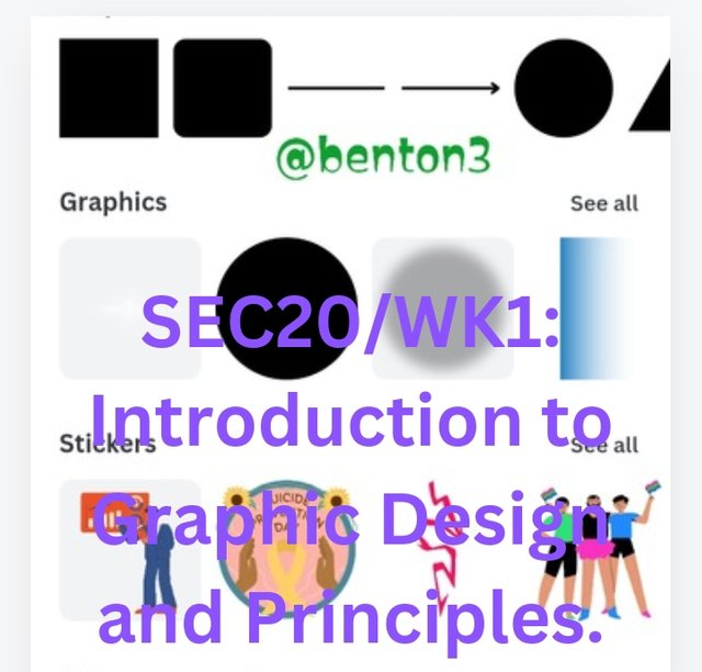
SEC20/WK1: Introduction to Graphic Design and Principles.

Another mode of communication that we do not look at most at times is visual means of communication, which does not involve spoken language but the use of our expressions, hands and other forms of body language.
Such mode of communication can be found too in the computer world. It is known as Graphic Design. What is it all about?

What is Graphic Design? Briefly Share with me your understanding about graphic design.
Graphic design is a form of communication to your audience for things you want them to understand. It is a presentation of your feelings about a subject to help them grasp what you are thinking of about a subject matter.
This presentation is done using visual elements like colors, images, shapes to pass on the message effectively to your audience. It could be done using a computer software or hand to design visual concepts made to inspire, captivate and inform our customers or consumers.
Graphic designing is not that difficult. It demands that an individual be creative, knows what appeals to his customer base, have the time and be dedicated in doing it. Knowing and learning to to use the tools for it can greatly enhance the output of the designer.

Pick any three of the principles of Graphic design and talk about them based on your level of understanding .
Like every other field of endeavour, graphic designing have its own techniques and principles guiding it.
Repetition
This is a design principle that demands that an element is used several times in the same work but of various patterns and shapes, or the different shapes may be repeated so many times. This principle makes our work to become more dynamic, keeping the whole design with just a single thread.
This principle can be used to make an idea or brand to stand out. Additionally, several patterns can be easily created just by adjusting the colour of the design or even its shape slightly. It can be used to take away the stress our viewers will go through to identify the major elements in the design.
Alignment
This principle has to do with the design, layout or arrangement of our work. It could be that we want to arrange our work in straight line format, centralized format, aligning the blocks to images or vice versa. Having a defined alignment creates organization and gives our work a distinctive look.
When this principle is used rightly, there is this smooth link between our design elements, eliminating disorder in our design. So this implies consistency when making our designs.
Emphasis
This principles is all about highlighting the importance of significance of a particular element in our design. It helps our customers to easily identify our point of interest.
Our customers are easily drawn to that specific element from the colour, size, texture, pattern, shape and even placement of the element. The special placement of the specific element, helps the observer to easily identify that this is the focal point of our artwork.

Question 3: Practically show us how to make the graphical image below.
I am going to take us all on a step by step explanation of how to do the assignment.
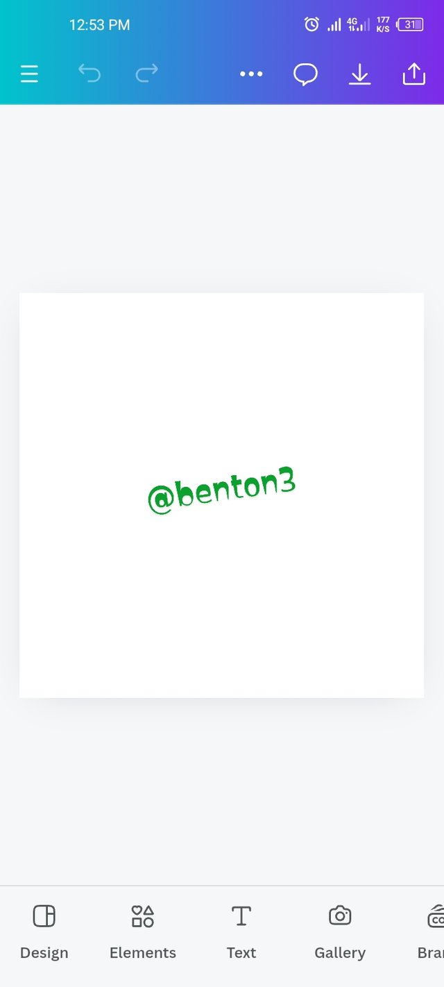
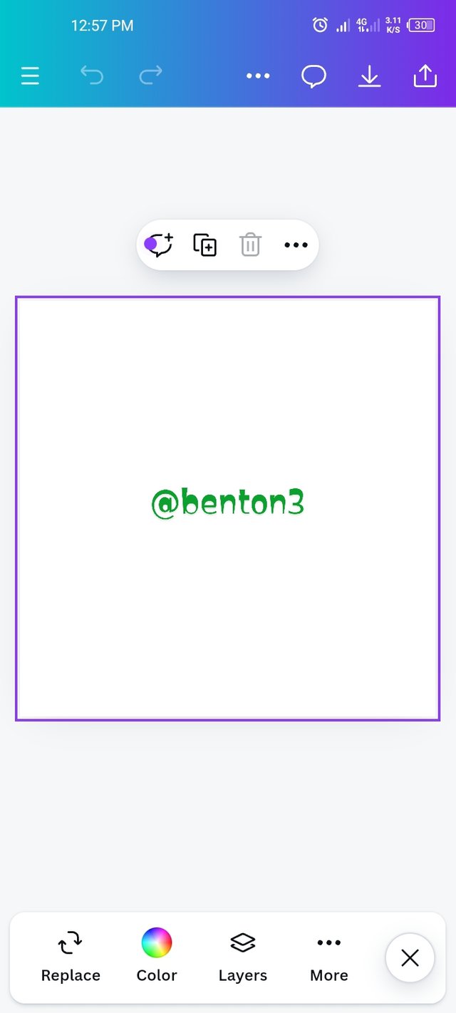
- We start by launching the Canvas app, after down loading it. Them go to search and select the dimension you want to use. I selected Instagram post (square). Once chosen, it came out with my desires squared layout.
 |  |
|---|
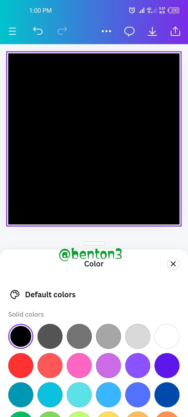
- I went to color icon and added a border line on the square box. Then I clicked on the colour icon to see varieties of colours of which I chose black as the fill colour for the square.
 |  |
|---|
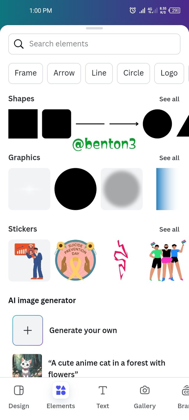
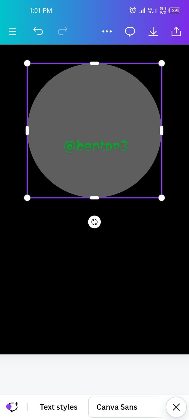
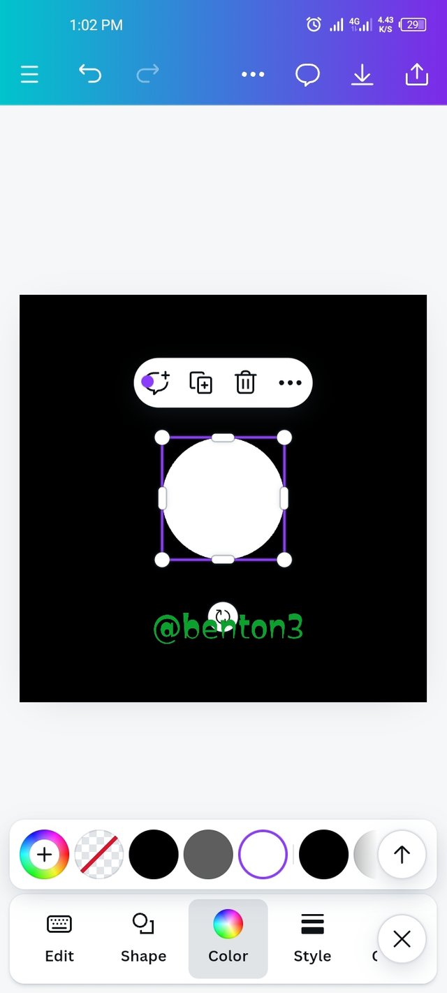
3.. the next thing is to get our circle shape. This I did by clicking on element. It brings out a page where I selected the circle shape. It was then automatically pasted on my work page. The colour of the circle shape was still black, so I had to go to colour and selected white for the circle shape.
 |  |  |  |
|---|
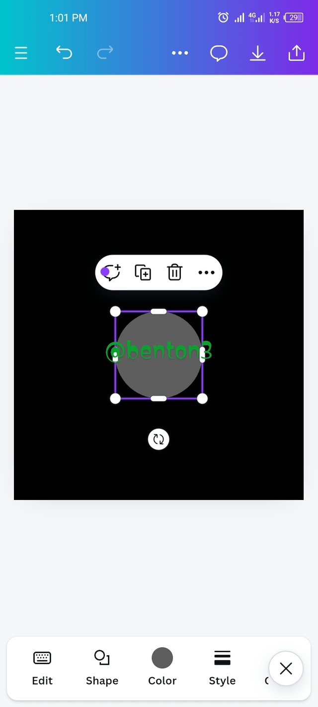
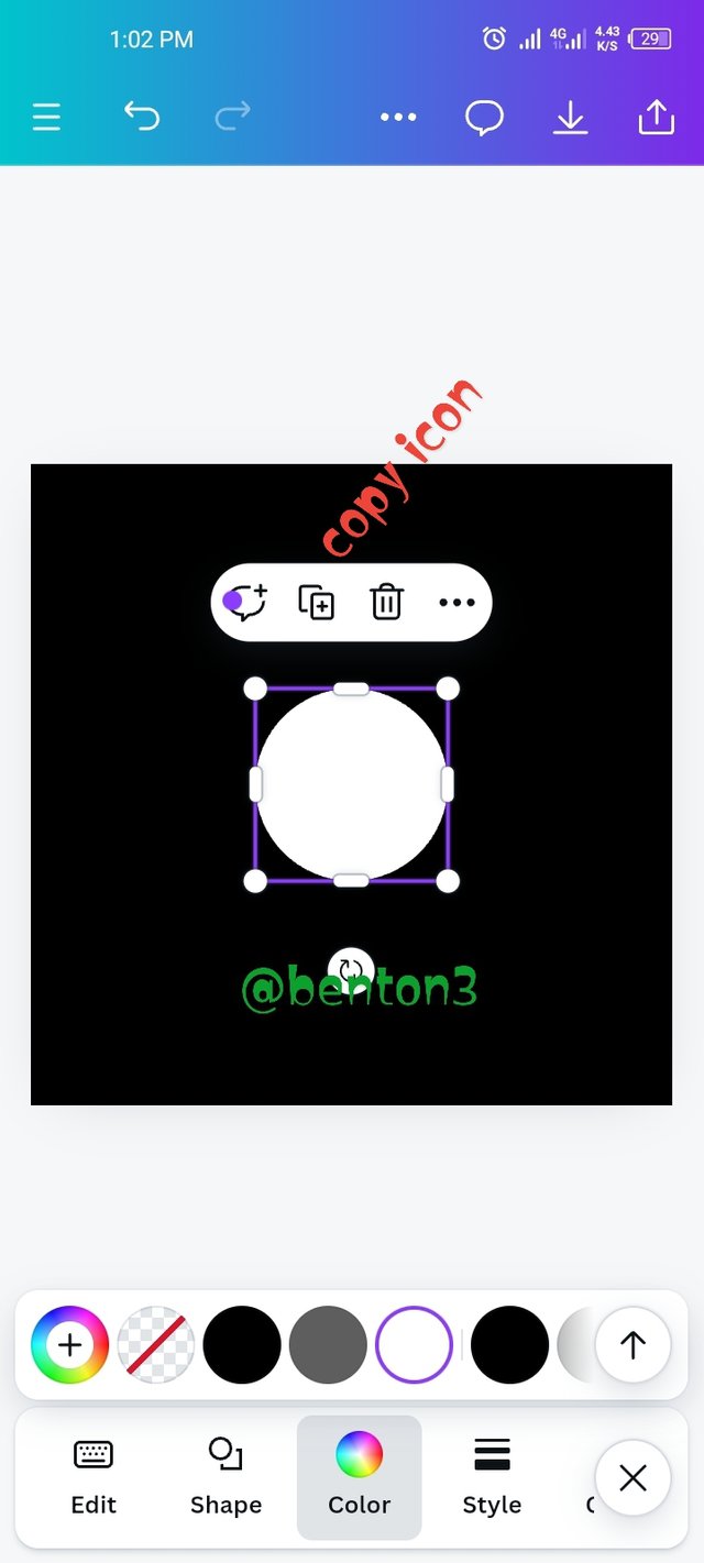
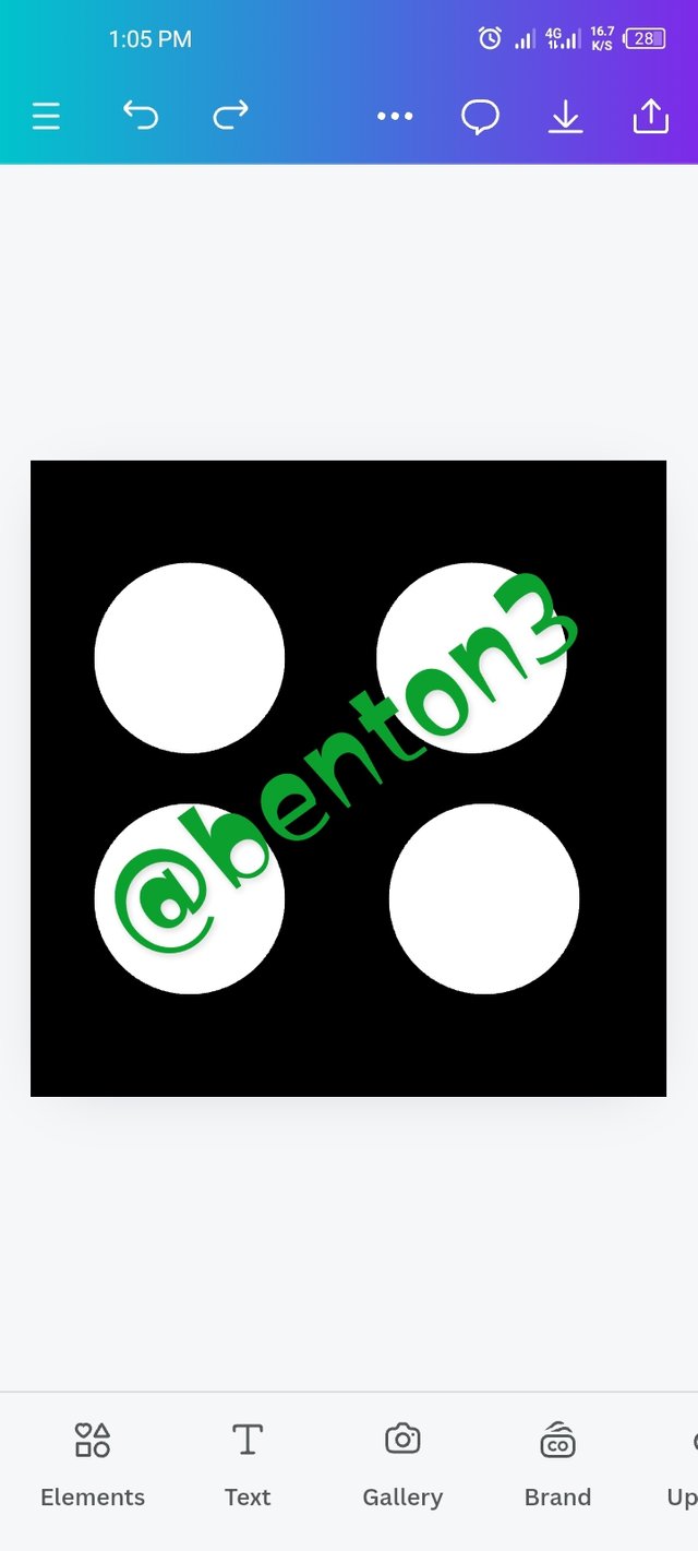
- The next thing to do is to duplicate the white circle. This I did by clicking on the copy icon as shown in the screenshot. Duplicating the white circle 3 more times and placing them the way it should be as required.
 •
•
-----|-----
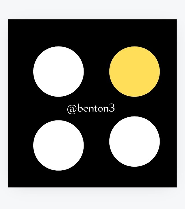
I finally coloured one of the circles yellow, in line with the required graphic design. Hence, the final design.
I invite @adylinah, @wizzyboy3 and @fortwis09 to join in this engagement.
@tipu curate
;) Holisss...
--
This is a manual curation from the @tipU Curation Project.
Upvoted 👌 (Mana: 4/7) Get profit votes with @tipU :)
TEAM 5