Introduction to the Principles of Crypto Analysis - Crypto Academy S4W7 - Homework Post for @imagen
This is my homework post for Steemit Crypto Academy Season 4 Week 7 of Professor @imagen’s class of Introduction to the Principles of Crypto Analysis.

Task 1 – The Difference Between Fundamental Analysis and Technical Analysis
1.1. Fundamental Analysis
Fundamental analysis is a market analysis technique by observing the fundamentals (intrinsic value) of an asset or stock. The things observed can be categorized into:
- The company condition. This includes the management of the company and its financial condition like earnings, earnings growth, valuation ratios, expenses, assets, and liabilities.
- Economic conditions. This includes macroeconomic and microeconomic conditions.
- Related industries condition in which the company is located.
Fundamental analysts observe the market and draw conclusions and assess future prospects based on these things.
1.2. Technical Analysis
Technical analysis is an analysis that bases market observations on aspects of asset price movements. In technical analysis it is believed that past prices have an important role in determining future prices. Therefore, the price movement chart becomes the main instrument in this type of analysis. Technical analysts look at charts of price movements and base their conclusions and actions on them.
In technical analysis, various indicators and strategies have been developed which are used to help understanding the chart of asset price movements, and by that more understanding of market condition. Some of the popular indicators are:
- Moving Average (MA). Moving Average is an indicator that calculates the average price of an asset over a certain period of time, then shows it in the form of a line. The average value can be of the opening price, closing price, highest price, lowest price, or median price.
The Moving Average is divided into:- Simple Moving Average (SMA) or simply referred to as Moving Average.
- Weighted Moving Average (WMA)
- Exponential Moving Average (EMA)
Among the three, the Simple Moving Average (SMA) has the simplest calculation pattern and is often used by traders. Usually, SMA is used for long-term trading.
- Accumulation/Distribution (A/D). Accumulation/Distribution is a volume based technical analysis indicator designed to reflect the cumulative inflows and outflows of money for an asset by comparing the closing price with the highest price and with the trading volume. "Accumulation" refers to the level of purchase (demand), while "distribution" refers to the level of sales (supply). So, the essence of this indicator is to predict future prices from current supply and demand movements.
- William Percent Range (WPR). WPR or Willians %R is a momentum indicator that oscillates between 0 and -100. This oscillator type indicator is used to show when an asset is overbought or oversold. In WPR, data is collected within a certain time span (lookback period) and then analyzed for price movements. In addition to specifying the lookback period, the user also specifies an upper limit and a lower limit, usually -20% and -80%, respectively. When the WPR line crosses the upper limit from below, it is called overbought, an early signal of a possible uptrend. And if the WPR line crosses the lower boundary line from above, it is called oversold, an early signal that the market may witness a downtrend.
- Et cetera. To date, so many technical indicators are available to use.
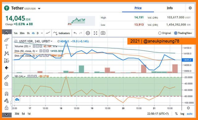
Below is the example of a price chart with two types of indicators applied to it: two EMAs and Willliams Percent Range.
1.3. The Difference
So, the difference between the two is about the object of analysis. If fundamental analysis observes the company's fundamental data, then technical analysis reads asset price movements.
1.4. The More Popular One
I think, of the two type of analysis, technical analysis is more popular (used more often), because this analysis is the easiest to use of both, and it is easier to collect data and tools. On technical analysis, an analyst only needs to come to market, obtains price charts, analyses them. While performing fundamental analysis might be a little bit harder in collecting data, and it -data collecting- possibly takes longer time than on technical analysis.
Ease of getting data becomes important, when traders work dynamically. Traders can make more decisions using technical analysis, compared to fundamental analysis. That is why technical analysis is more dynamic and allows a trader to enter and exit the market in a short time (short-term trading), which is almost impossible with fundamental analysis.

Task 2 – Cardano (ADA) Analysis
2.1. The Project Objective

Cardano is a public blockchain known as the third generation blockchain. Cardano came with the aim of overcoming the problems faced by previous generation blockchains (Bitcoin and Ethereum), namely the main problem is scalability. One of the ways Cardano solved the scalability problem faced by previous generation blockchains is by using one secure type of Proof of Stake mechanism called Ouroboros.

Related to that goal, Cardano proved to be a good innovation. Ouroboros, a new PoS technology used by Cardano, eliminating the need for energy-intensive protocols, has partially solved the scalability problems faced by the previous two blockchain generations. Ouroboros significantly reduces energy requirements, especially when compared to the Proof of Work (PoW) mechanism, without compromising security feature of blockchain. How does Ouroboros PoS eliminate the high needs of energy which happened on PoW mechanism? It simply because in PoW mechanism, mining machines do the most works: validating blocks, verify transactions, charge fees. While in PoS, those works are performed by nodes connected on the network. Ouroboros came with idealism to take the PoS to a higher level.
Cardano plans to take it furthermore: reaching infinite scalability. And for that it is taking advantage of layer 2 solution by implementing a project called Hydra. Hydra is theoretically designed to bring Cardano to infinite scalability.
Apart from Ouroboros and Hydra, Cardano has another unique feature, called Hard Fork Combinator. This technology of Cardano’s allows blockchain to hard-fork without any disruption to the blockchain. The Hard Fork Combinator has been tested and worked flawlessly.
2.2. Financial Metrics
For this purpose, I used information from intotheblock. Financial Metrics observed was In/Out of Money and Break Even Price.
2.2.1. In/Out of Money
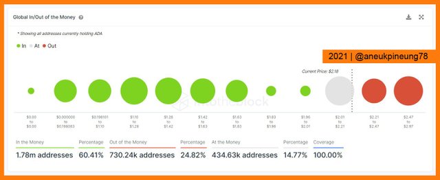
Cardano (ADA)’s Global Chart of In/Out of the Money
At time of writing, 1 ADA was sold at USD2.18. 1.78 million addresses or 60.41% were in the position to make money (profit) if they sold. While 730.24 thousand addresses (24.82%) would suffer loss. And 14.77% (434.63 thousand addresses would not gain any profits nor suffer any losses.
Cardano (ADA)’s Historical Chart of In/Out of the Money
Below is the screenchot image of the historical chart of Cardano (ADA)’s In/Out of the Money.
The historical chart shows that based on year-to-date calculation, 1.17 million addresses (71.02%) would have gained profits (compared to the price when they purchased) if they sold at the time of writing. While 305.9 thousand addresses (15.47%) would have suffered losses. And a total of 215.94 thousand addresses (13.52%) would have not gained any profits nor suffered any losses.
2.2.2. Break Even Price
Cardano (ADA)’s Break Even Price Chart
Below is the Break Even Price chart of Cardano (ADA) at time of writing.
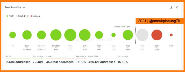
The break even price chart above shows that at the time of writing, if any holder decided to sell their assets at the Break Even Price, then:
- 2.13 million addresses (72.48%) would have gained profits,
- 350.69 thousand addresses (11.92%) would have suffered losses, and
- 459.12 thousand addresses (15.60%) would have experience no profits nor losses.
Historical Chart of Cardano (ADA)’s Break Even Price
Below is the screenshot image of the historical chart of Cardano (ADA)’s Break Even Price.
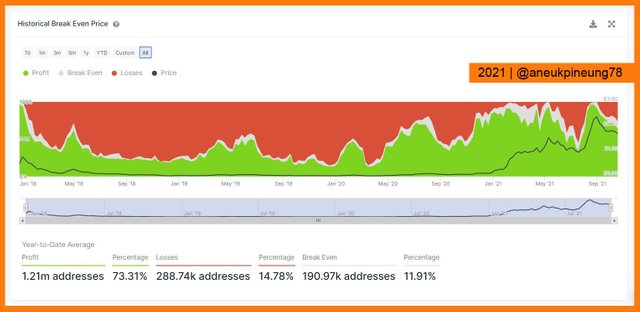
The image above shows that based on the year-to-date calculation, if all holders sold their assets at the time of writing, then:
- 1.21 million addresses (73.31%) would have gained profits,
- 288.74 thousand addresses (14.78%) would have suffered losses,
- 190.97 thousand addresses (11.91%) would have experienced no profits gaining nor losses suffering.
2.3. On-Chain Metrics
I also used information from intotheblock to perform this task. For On-Chain Metrics, I observed these things: 1) number of large transactions, 2) large transactions volume (in ADA), 3) large transaction volume in USD, 4) bulls and bears, 5) price, 6) average transaction size, 7) volatility, and 8) correlation to BTC.
2.3.1. Number of Large Transactions
Below is the chart for the Number Of Large Transactions.
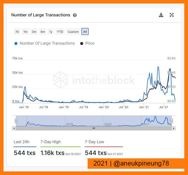
The chart above shows that in the last 24-hour period related to time of writing, 544 transactions occurred, the highest transaction number in the last 7-day period occurred on October 19th when there were 1.16 thousand transactions happened. And the lowest number of transactions in the same period was 544 transaction which occurred on October 21st.
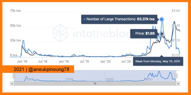
The record for the highest number of large transactions was 63.37 thousand on May 10th at average price of USD 1.88.
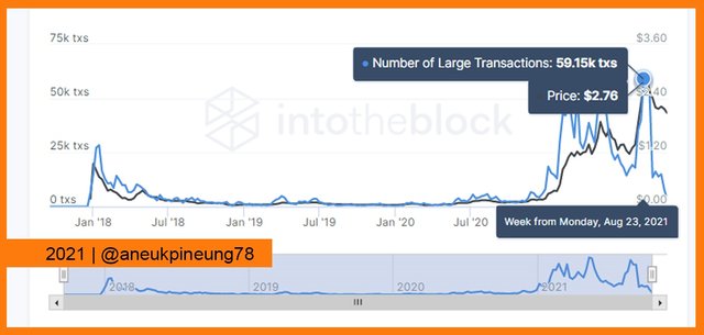
The most recent high number of large transactions occurred on August 23rd with a total 59.15 thousand large transactions at average price of USD 2.76.
2.3.2. Large Transaction Volume (in ADA)
Below is the chart of Large Transaction Volume (in ADA)
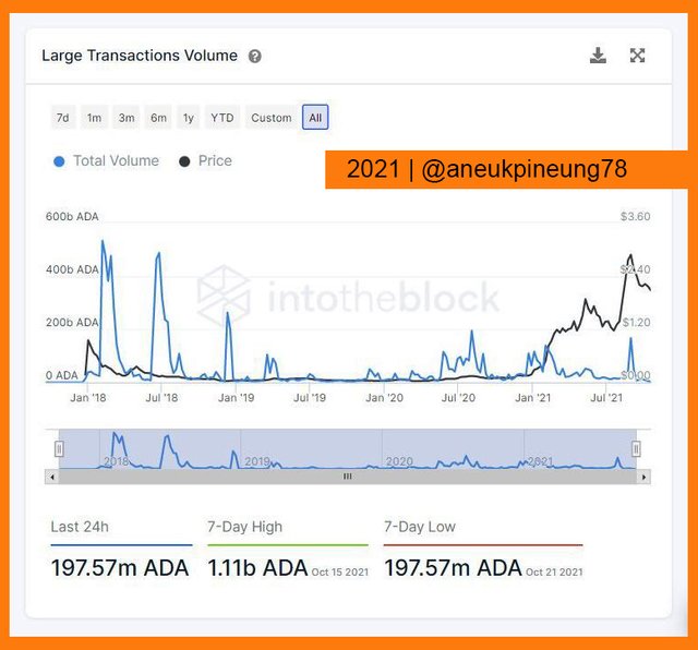
Since January, Large Transaction Volume has shown an upward trend. The peak was on August 30th with a total volume of 166.63 billion ADA at an average price of USD 2.88 per 1 ADA on that day. The highest record to date was on January 5th with a total volume of 532.66 billion ADA at the average price of USD 0.35 per 1 ADA. But when it is measured in the USD equivalent, the highest was on August 30th.
2.3.3. Large Transaction Volume (in USD)
Below is the chart of Large Transaction Volume (in USD)
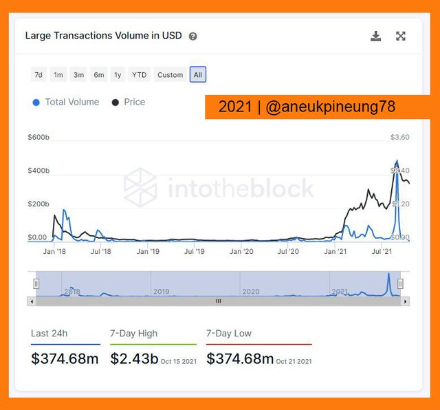
In USD, since January Large Transaction Volume has also shown an increasing trend. It peaked on August 30th, and has since shown a downward trend but remains high above the year's initial value.
2.3.4. Bulls and Bears
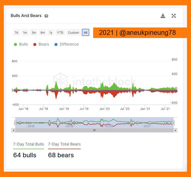
The chart above shows that in the last 7-day period, a total of 64 bulls 68 bears had occurred.
2.3.5. Price
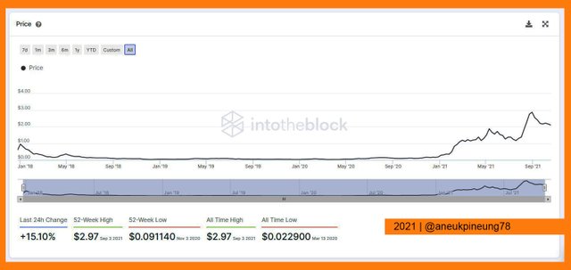
The chart above shows that in the last 1-year period, ADA reached its All Time High at USD 2.97 on September 3rd 2021. Within the same period its lowest was USD 0.091 on November 3rd 2020. The token dropped to its All Time Low at USD 0.0229 on March 13th 2020.
At the time of writing, ADA shows its positive change by raising 15.10% of its price against USD.
2.3.6. Average Transaction Size
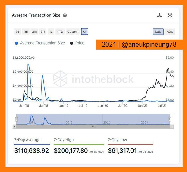
The chart above shows that through time Average Transaction Size of ADA’s goes in low. It made a high value on early of 2018 and has dropped since July of that year. But even if the average transaction size has been low since then, the price shows a positive trend since July of last year.
2.3.7. Volatility
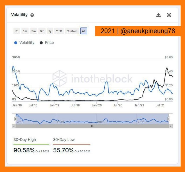
The chart above shows that volatility has tended to decline since June. In the last 30 days, volatility has hit a high of 90.58% on October 1. In the same period, the lowest volatility occurred on October 20 at 55.70%.
2.3.8. Correlation to BTC
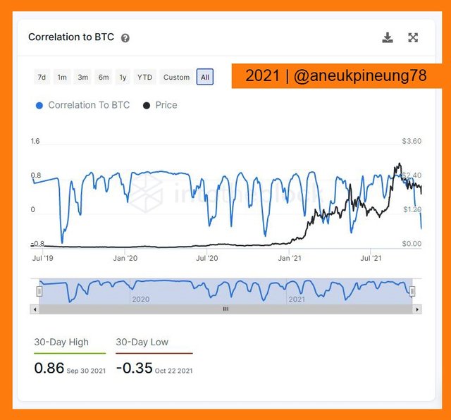
At time of writing (October 22nd) the lowest Correlation to BTC in the last 30 days occurred at -0.35. While the highest in the same period was 0.86 on September 30th.
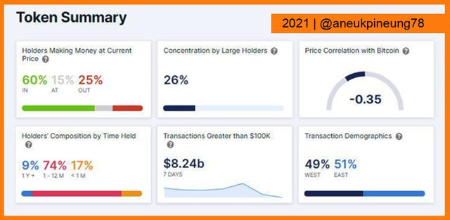
2.3.9. Summary
Below is the screenshot image of token summary from attheblock.com.
Task 3 – USD 10 Worth of Investing
For this task I chose Cardano (ADA), for a simple reason: among all the options (Cardano (ADA), Solana (SOL), Terra (MOON), Chiliz (CHZ), and Polkadot (DOT)), only Cardano (ADA) and Solana (SOL) available on the UPbit trading platform I use. And I chose Cardano (ADA) simply because it has my FIAT pair (ADA/IDR), while Solana (SOL) currently is only available in SOL/BTC pairs. I prefer FIAT (IDR) pairs if there is, than any other pairs.
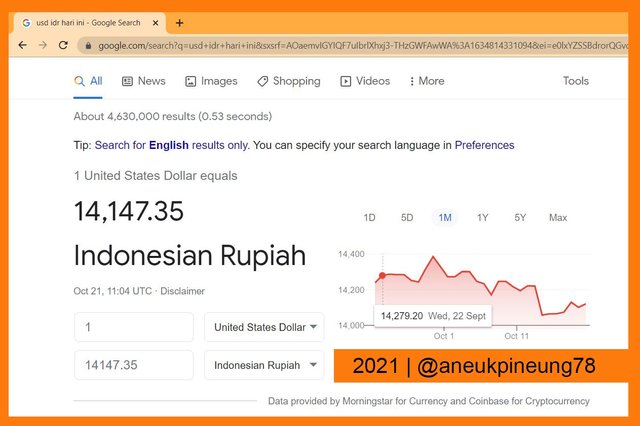
I checked the USD/IDR rate on the internet. At time of writing, it was IDR 14,147.35 per 1 USD. So, for this task, I had to use at least IDR 141,500.00.
I logged in to my UPbit account and opened up the ADA/IDR market page.
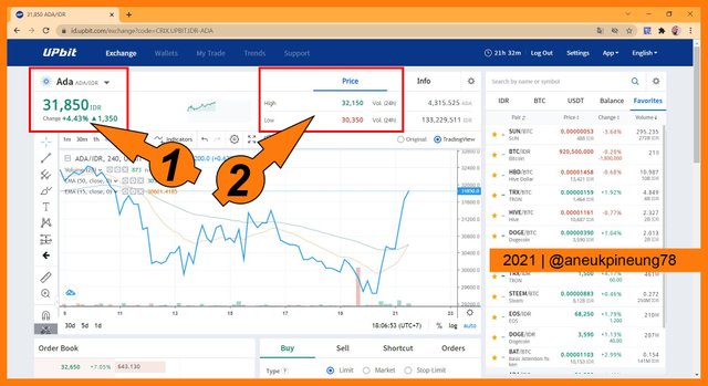
As shown on the screenshot image above, at time of writing 1 ADA was sold at IDR 31,850.00 (indicated by marker no (1)). Marker number (2) showed the highest and lowest price for the last 24 hours which were IDR 32,150.00 and IDR 30,350.00, respectively.
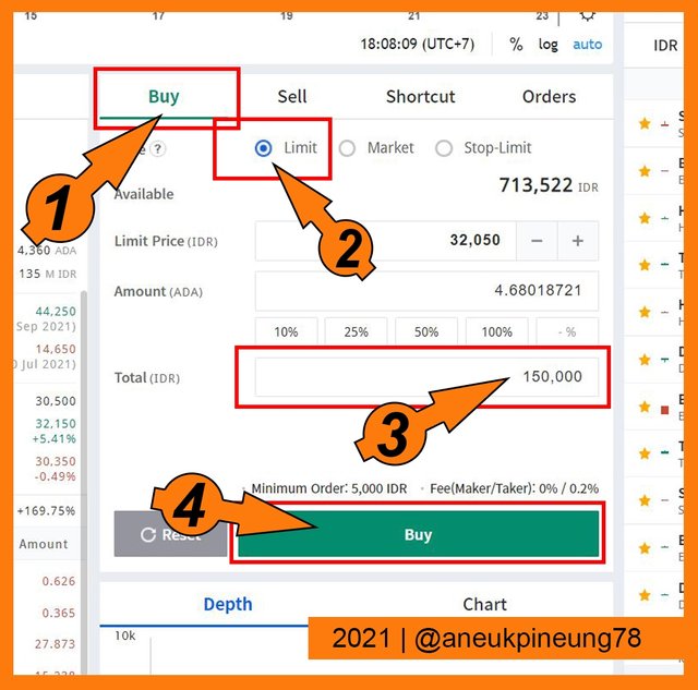
I went to market segment. I chose the [Buy] option (marked number (1)), and ticked the Limit Buy type radio button (marked number (2)). Then I filled the total amound of fiat money (marked number (3)). The amount of ADA I would get was automatically filled in based on the Limit Price of this purchase. Lastly, I hit the green [Buy] button.
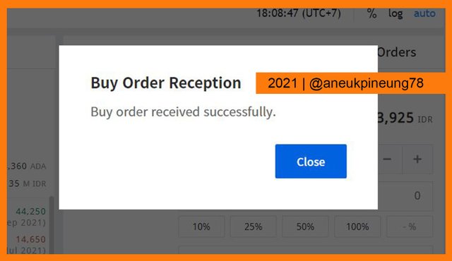
A pop-up box appeared asking for confirmation. I hit the [Buy Confirm] button to proceed.
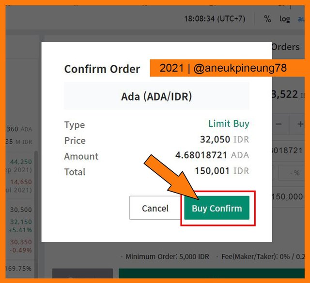
The Buy Order was received, successfully.
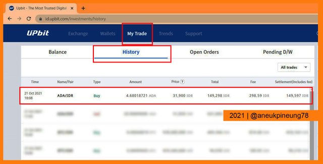
A moment later, when I checked my trade history, I saw that the purchase was successfully made. 4.68 ADA has been sent to my wallet.
Task 4 – Adding Fibonacci Retracement on to the Chart
4.1. Applying Fibonacci Retracement – Hour 0
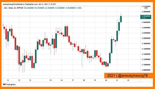
For this task I used the 4-hour ADA/USD chart provided by TradingView as seen on the picture below.
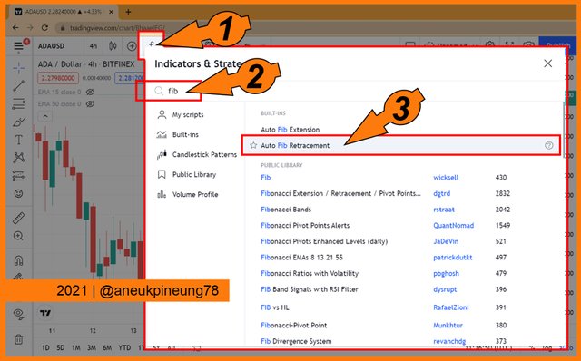
I hit the [Indicators and Strategies] icons (marked number (1)) on the picture below to call out the Indicators and Strategies pop-up box. On the search box (marked number (2)) I typed the keyword “fib” as for “fibonaacci” and then I chose the relevant one from the results list (marked number (3)).
Below is the screenshot image of the result after the Fibonacci Retracement was applied on the chart. This is the 0-hour screenshot image to later be compared with the 24-hour and 48-hour conditions.
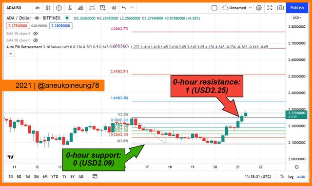
At 0-hour, support was at 0 (USD 2.09) and resistance was at 1 (USD 2.25)
4.2. The Fibonacci Retracement – After 24-Hour Observation
Below is the chart after 24 hours passed.
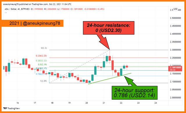
The price chart shows a downtrend after the price break through the resistance line at USD 2.25 and reached USD 2.30. A new support line was formed at 0.786 (USD 2.14), and the price bounce up to USD 2.20.
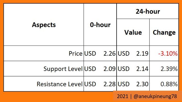
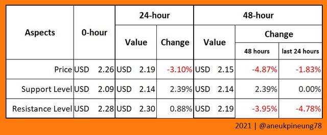
The 24-hour progress table can be drawn as follows.
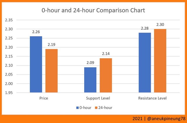
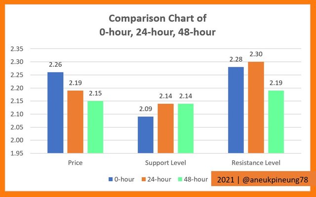
And the comparison chart looks like this.
4.3. The Fibonacci Retracement – After 48 Hour Observation
Below is the 48-hour chart.
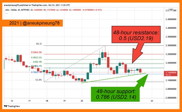
After 48 hours, the new resistance was formed at 0.5 (USD 2.19) and support remained at 0.786 (USD 2.14), while the price was USD2.15.
The 48-hour progress table can be drawn as follows.
The comparison chart is as follows.
The price shows the downtrend after 48 hours. I need to HODL a little longer.
Task 5 – Bollinger Bands®
5.1. What is Bollinger Bands®?

Bollinger Bands® is one of the indicators used in trading technical analysis. Bollinger Bands® is used to measure the volatility of an asset and predict where the price will move. Bollinger Bands® was introduced by John Bollinger in 1980s. It is now one of the most use technical analysis indicators. John Bollinger (born May 27th, 1950 (age 71)) is an American financial analyst, author. One of his books, Bollinger on Bollinger Bands which was released in 2001, has been translated into 11 languages.
5.2. Bollinger Bands® and Crypto Technical Analysis
Using Bollinger Bands®, traders will be able to predict if the market is entering overbought or oversold state. When the market is moving sideways, the price will move between the two bands. When the price goes beyond the lower Bollinger Bands®, this is usually considered an oversold signal, time to take a long (buy) position. Conversely, when the price exceeds the upper Bollinger Bands®, it is usually considered an overbought signal, a signal to take a short (sell) position.
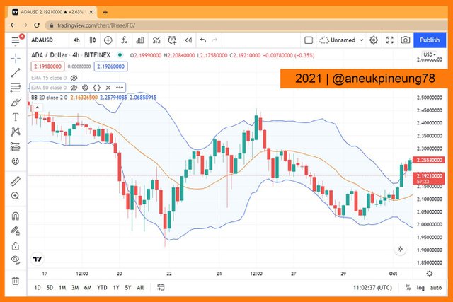
To use it on a chart, for example on TradingView’s ADA/USD 4h price chart, simply search for it in the Indicators and Strategies. Many results for the keyword “Bollinger”, users only have to pick the relevant one.
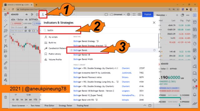
Now the chart had got the Bollinger Bands® indicator applied to it.
5.1. My Choice of Another Technical Indicators In Combination With Bollinger Bands®
But the signals given by Bollinger Bands® should not be taken ”true” immediately. It can happen when the price exceeds one of the bands, the trend does not change, the price can immediately be corrected again. So, it's better to wait a while to get confirmation. Another way to confirm a trend reversal signal is to combine it with other indicators such as Double EMA.
I have found that Double EMA is effective to confirm a trend reversal by providing the Golden Cross or Death Cross. When one of these crosses appears on a chart, that’s likely a confirmed trend reversal. Take this below picture as a case study.
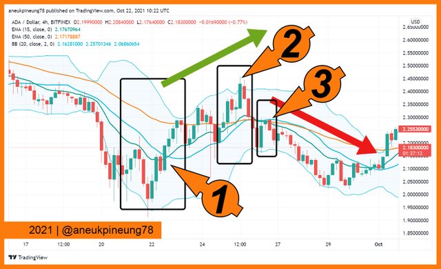
The image above is the screenshot image of ADA/USD 4h price chart as seen on TradingView. The chart was observed with Bollinger Bands® indicator in combination with 2 EMAs. The parameter for each EMA was:
- The short-term EMA was set at 15, indicated by greenish colored line.
- The long-term EMA was 50, indicated by orange colored line.
- Both EMA were calculated on close prices.
These thing were what I observed:
- Marker number (1) on the image above shows when price candle touched the middle band of Bollinger Bands® indicator, the Golden Cross of the EMAs confirmed the upcoming bull trend.
- Marker number (2) shows the price candle moved across the upper band, in the bullish market, it should be the sign of trend continuation. But soon, EMAs showed Death Cross as indicated by marker number (3), which was the bad signal, a confirmation that a trend reversal toward bearish was imminent.
Through the case study above, Double EMA (DEMA) was proven efficiently and effectively confirmed the trend reversal.
Task 6 - Conclusions
It is important to understand the market before one start trading. A proper understanding of what is going on in the market can lead a trader to make profitable decisions. While when they act without proper knowledge, they might end up loosing money.
Markets can be understood using technical and/or fundamental analysis methods. The combination of the two may be strong enough to make a trader understand the market more perfectly.
Various indicators in technical analysis have been introduced as the world of trading stocks and other assets develops. There is no such thing as a perfect indicator in predicting what will happen in the market. A wise trader, will use a combination of several indicators before drawing conclusions and acting.
Another useful information is On-Chain Metrics which recently has become an increasingly popular indicator used, especially in crypto trading. It can be used by traders in combination with technical analysis and fundamental analysis. But only if a trader has enough time to do all that.
Trading with technical analysis is probably more popular because it shortens time significantly. A trader only needs to look at a price chart and analyze it with various indicators they desire, to test the market and draw conclusions. Even when the market is bearish, an observant trader can still see opportunities to make a little profit.
Thanks
Thanks Professor @imagen for the lesson titled Introduction to the Principles of Crypto Analysis.
Pictures Sourcing
- The editorial picture was created by me.
- Unless otherwise stated, all another pictures were screenshoots and were edited with Photoshop CS 3.
Sources and Reading Suggestion
- https://cmtassociation.org/kb/equities-blending-technical-and-fundamental-analysis/;
- https://www.winvesta.in/blog/fundamental-analysis-a-complete-guide/;
- https://www.investopedia.com/terms/f/fundamentalanalysis.asp;
- https://www.investopedia.com/fundamental-analysis-4689757;
- https://www.ig.com/en/glossary-trading-terms/fundamental-analysis-definition;
- http://www.futuresmag.com/Issues/2010/May-2010/Pages/Equities-Using-technical-and-fundamental-analysis2.aspx;
- https://money.kompas.com/read/2021/08/04/165521126/mengenal-analisis-fundamental-dan-teknikal-pada-investasi-saham;
- https://www.most.co.id/tips-investasi/yuk-belajar-main-saham-perbedaan-analisa-fundamental-dan-teknikal;
- https://sertifikasiku.com/alasan-pentingnya-analisa-fundamental-saham-untuk-kamu-pelajari/;
- https://www.investopedia.com/terms/t/technicalanalysis.asp;
- https://www.investopedia.com/articles/active-trading/102914/technical-analysis-strategies-beginners.asp;
- https://www.tradingview.com/ideas/technicalanalysis/;
- https://www.fidelity.com/learning-center/trading-investing/technical-analysis/technical-analysis-learning-path;
- https://www.fidelity.com/learning-center/trading-investing/technical-analysis/what-is-technical-analysis;
- https://www.etoro.com/crypto/what-is-cardano/;
- https://www.investopedia.com/cardano-definition-4683961;
- https://www.investopedia.com/news/introduction-cardano/;
- https://roadmap.cardano.org/en/;
- https://kriptomat.io/cardano/;
- https://medium.datadriveninvestor.com/cardano-explained-a949d93b7cb3?gi=57324c7185e7;
- https://app.intotheblock.com/coin/ADA;
- https://craft.co/cardano/metrics;
- https://stackedcrypto.medium.com/cardano-ada-fundamental-analysis-d30661ba7746;
- https://www.investopedia.com/ask/answers/042715/what-difference-between-money-and-out-money.asp;
- https://steemit.com/hive-108451/@sapwood/crypto-academy-season-4-or-advanced-course-task-1-onchain-metrics;
- https://steemit.com/hive-108451/@sapwood/crypto-academy-season-4-or-advanced-course-week-3-onchain-metrics-part-2;
- https://steemit.com/hive-108451/@sapwood/crypto-academy-season-4-or-advanced-course-week-5-onchain-metrics-part-3;
- https://cryptobriefing.com/on-chain-metrics-turn-bullish-for-bitcoin-and-ethereum/;
- https://medium.com/interdax/how-chain-analysis-helps-cryptocurrency-traders-dd4de03f823;
- https://coinmetrics.io/on-chain-indicators/;
- https://craft.co/cardano;
- https://stackedcrypto.medium.com/cardano-ada-fundamental-analysis-d30661ba7746;
- https://craft.co/cardano/metrics;
- https://app.intotheblock.com/coin/ADA;
- https://cardanians-io.medium.com/hydra-cardano-scalability-solution-36b05ddc91cf;
- https://iohk.io/en/blog/posts/2021/09/17/hydra-cardano-s-solution-for-ultimate-scalability/:
- https://www.fidelity.com/learning-center/trading-investing/technical-analysis/technical-indicator-guide/bollinger-bands;
- https://www.investopedia.com/terms/b/bollingerbands.asp;
- https://en.wikipedia.org/wiki/Bollinger_Bands;
- https://www.hsb.co.id/learn/forex/bollinger-bands.html;
- https://blog.pluang.com/cerdascuan/bollinger-band-adalah/;
- https://www.akseleran.co.id/blog/bollinger-bands/;
- https://www.akseleran.co.id/blog/metode-moving-average/;
- https://www.investopedia.com/terms/m/movingaverage.asp;
- https://www.investopedia.com/articles/active-trading/052014/how-use-moving-average-buy-stocks.asp;
- https://www.foreximf.com/course/kelas-dasar/moving-average;
- https://zerodha.com/varsity/chapter/moving-averages/;
- https://www.investopedia.com/ask/answers/071414/whats-difference-between-moving-average-and-weighted-moving-average.asp;
- https://corporatefinanceinstitute.com/resources/knowledge/trading-investing/weighted-moving-average-wma/;
- https://www.fidelity.com/learning-center/trading-investing/technical-analysis/technical-indicator-guide/accumulation-distribution;
- https://www.investopedia.com/terms/a/accumulationdistribution.asp;
- https://www.tradingview.com/scripts/accumulationdistribution/;
- https://corporatefinanceinstitute.com/resources/knowledge/trading-investing/accumulation-distribution-indicator-a-d/;
- https://asiaprofx.com/indikator-accumulationdistribution;
- https://www.investopedia.com/terms/w/williamsr.asp;
- https://www.seputarforex.com/artikel/indikator-williams-percent-range-1-132812-31;
- https://tradingstrategyguides.com/williams-percent-range-strategy/;
- https://en.wikipedia.org/wiki/Williams_%25R;
- https://en.wikipedia.org/wiki/John_Bollinger;
- http://asiaprofx.com/Apa-itu-Indikator-Bollinger-Band-;
- https://www.investopedia.com/terms/b/bollingerbands.asp;
- https://www.investopedia.com/trading/using-bollinger-bands-to-gauge-trends/;
- https://www.fidelity.com/learning-center/trading-investing/technical-analysis/technical-indicator-guide/bollinger-bands;
- https://en.wikipedia.org/wiki/Bollinger_Bands;


#club5050 😀
This time we will bring STEEM to the SUN. Hot.
On Twitter : https://twitter.com/aneukpineung78a/status/1451918519428272137.
Gracias por participar en la Cuarta Temporada de la Steemit Crypto Academy.
Felicitaciones! Un verdadero placer leer tus asignaciones.
Continua esforzandote, espero seguir corrigiendo tus asignaciones.
Muchas gracias, Professor.