SEC20/WK1: Introduction to Graphic Design and Principles
This is my homework post for Professor @lhorgic’s Season 20 Week 1 assignment, Introduction to Graphic Design and Principles.
Note :
- I performed this task on Windows 10 PC, Google Chrome.
Task 1 - What is Graphic Design? Briefly share with me your understanding about graphic design.
Graphic Design is basically a way of conveying something using visual methods. In graphic design, images will be used to convey a message, question, invitation, promotion, and so on. Graphic design is widely used for commercial advertisements and public service advertisements.
Graphic design has been around for a long time, and with the development of technology, it has become easier to create graphic designs using digital methods. On the internet, there are quite a number of sites that provide assistance to anyone who is interested in learning and producing graphic designs, both simple and complex. There are sites that offer ideas, such as Pinteres, and even those that provide online graphic designs applicationssuch as Canva.
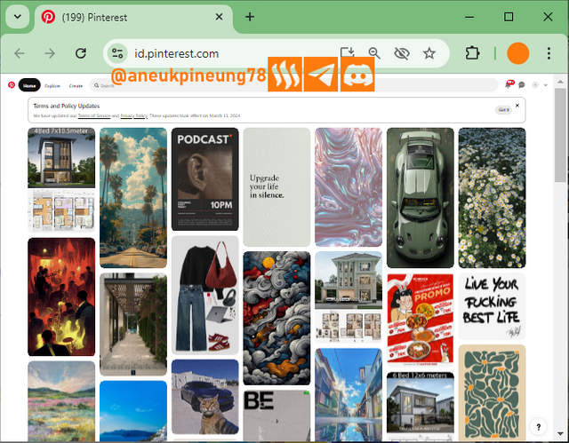
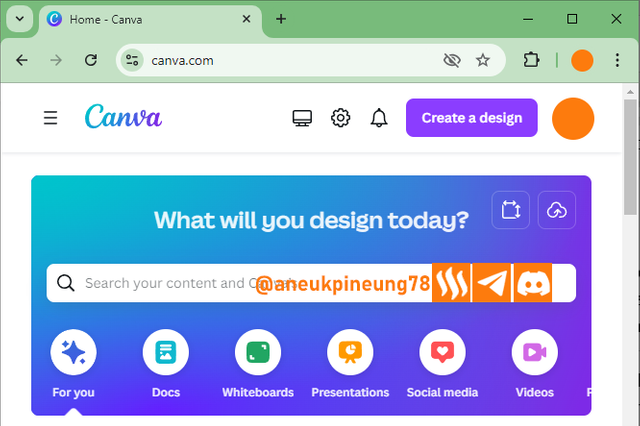
Because graphic design is used to offer an idea, service, goods, and other information as a means of unidirectional communication, graphic design must be made with the main consideration of attracting people to pay attention to it, in other words “eye-catchy”. Attracting attention can be done by playing with colors, font topography, and other elements such as images and even white space.
With the demand for graphic design to capture attention, creativity is important. A good graphic design will leave a lasting impression on the viewer's memory. This is sometimes not only about the image but also about the text it contains.
In addition to being able to explain about the goods being offered, there are often graphic designs that come with minimal information that aims to instill curiosity in the viewers. You know you can expect lots of actions when you see a movie poster like this one below, which showing a man ready for a war. He is ready for a war, but, what is he fighting? Why is he alone? This is the curiosity instilled in the mind of viewers, for those who haven’t seen its prequel, of course.

The importance of graphic design, especially in the business world, for example for the promotion of goods, makes this profession increasingly attractive to young people. They are required to have high creativity in order to succeed in this world, in addition to the provision of education that they can get formally and informally.
Formally, graphic design is included in the field of communication science. In accordance with its function, graphic design is used to convey a message (communication). In Indonesia, graphic design has been introduced as a subject since High School through vocational education.


Task 2 - Pick any three of the principles of Graphic design and talk about them based on your level of understanding.
1 - Contrast
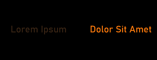
As the name implies, contrast is useful for giving a striking impression to an element in graphic design. Contrast can be useful to prevent elements from masking each other. For example, a dark background requires the element in front of it to have more brightness so that it doesn't sink into the background. So contrast eliminates the possibility of information loss from the design. In the following image, it can be seen that the text on the right is more legible and recognizable than the text on the left, which may be overlooked. In a simple design like this, it may not matter much but not so in a more complex design.
In addition, contrast is also used to make the viewer's attention focused on one particular element in the design that is the target of the designer. By focusing attention on one element, it can be expected that the information located there can leave an impression on the viewer's memory.
2 - Emphasis
Emphasis is achieved by giving a high contrast to a certain element, the purpose of which is to get the focus of the viewer's attention, as well as a way of enhancing aesthetics. Emphasis is used in designs that have many elements (usually uniform), and with which a certain point is highlighted. An example of this can be seen in one of the following poster designs for the series Homeland as seen below.
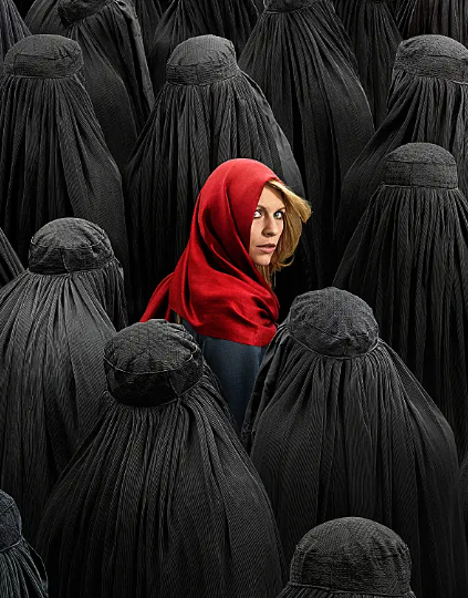
It is almost similar to contrast, the difference is that emphasis is not only achieved with color but also with size and shape. For example, see the following image.
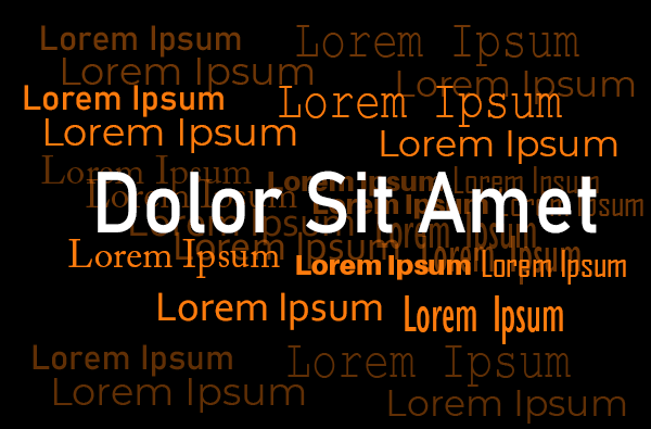
3 - Alignment
Alignment is the most basic element that determines the neatness of a design. Similar to alignment settings in text documents, graphic design also recognizes left, right, center, and left-right (justify) alignment. Alignment may seem trivial but it determines the aesthetics of a design. What is meant by alignment is not only the positioning of text, but all elements in the design including images and shapes and abstract colorings. In the collage below, we would agree that the image on the left (1) is better organized (using left alignment on the top part and right-alignment on the bottom to give it balance) than the image on the right (2).


Task 3 - Practically show us how to make the graphical image below.
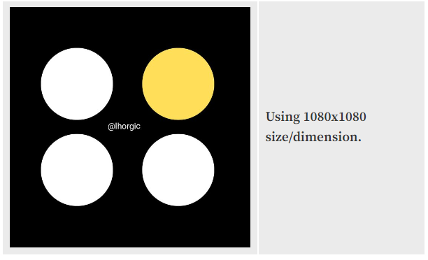
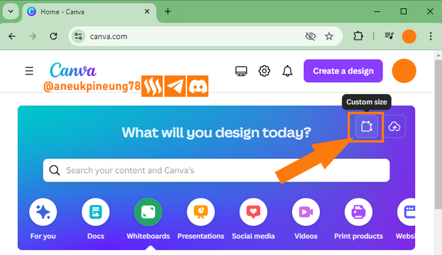
Since I'm doing this with the web version of Canva, https://www.canva.com/, the visualizations will have slight differences with those seen in the course given by Professor Lhorgic. To create such an image on Canva, the steps I took:
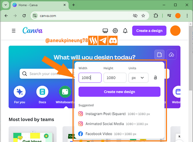
- I visited Canva website, and click the [
Custom Size] button.
- In the dialog box that appears, I fill in the size of the design canvas that I want. Then choose from the suggestions (if any), and then execute by pressing the [
Create new design] button.
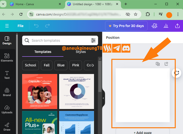
- A canvas of the size I wanted (1080x1080 px) was available with the default color white, I needed to change the color to black, so I clicked on a spot on the canvas.
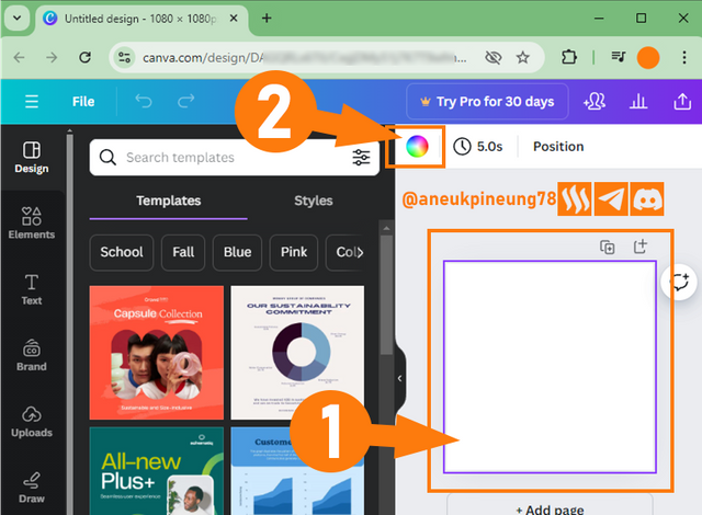
- The canvas has been selected, indicated by the appearance of purple strokes around it (1). I then activate the color window by clicking on the color palette (2).
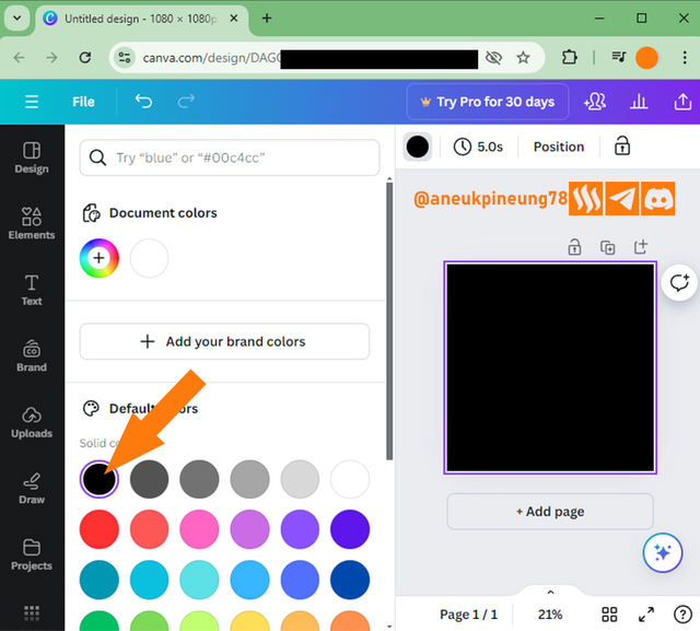
- From the color window that opened, I selected the desired color of black.
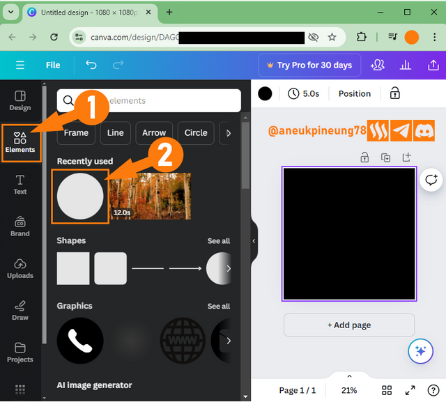
- To add a circle, I pressed the [
Elements] button (1). It just so happened that I had recently used a circle in one of my designs in Canva, so it went into theRecently usedsection which made it easy to quickly add it to the design (2).
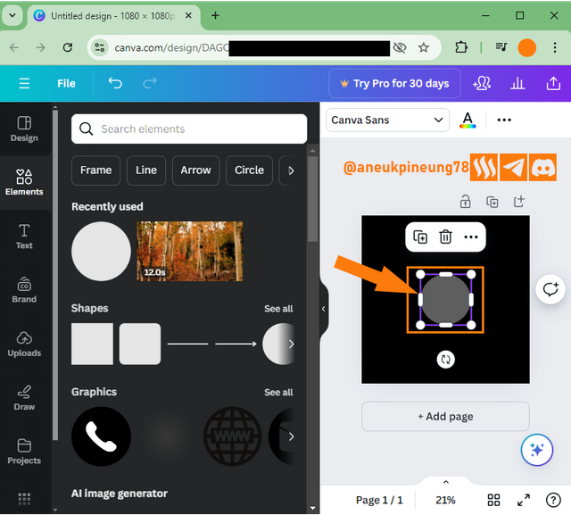
- Now that I have a gray circle in the canvas, I need to change its color to white.
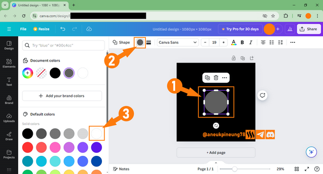
- To change the color, I first need to ensure that the circle is selected, indicated by the appearance of eight white handlers around it (1). I then pressed the color palette to open the color window (2). Then from the color window I selected white (3).
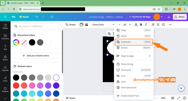
- After changing the color, now I need 3 more circles of similar size, I duplicate them by right-clicking on them and on the pop-up window that appears I select [
Duplicate]. Duplication can also be done by pressing the key combination [Ctrl]+[D].
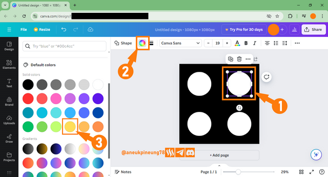
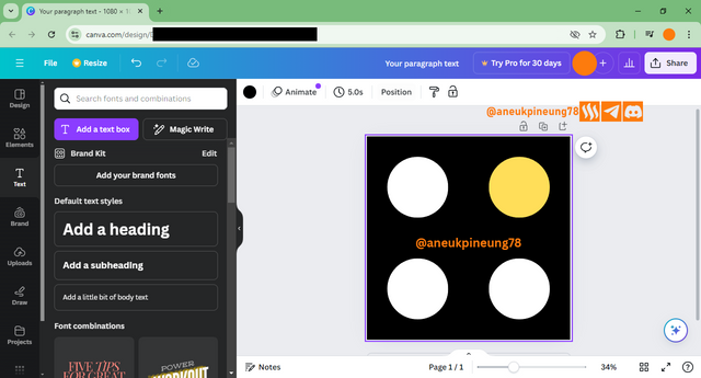
- I kept duplicating until I had all the circles I wanted in place. Now, as per Professor Lhorgic's instructions, I need to change the color of the circle in the top right corner to yellow. Like the previous step of changing the color, this is the same. I make sure the circle is selected (1). Then I press the color pallet (2). And in the color window that appeared, I selected yellow as directed (3).
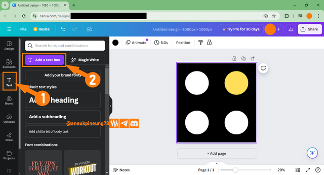
- It's time to add a proprietary watermark. I pressed the [
Text] button (1) to open the Text dialog window and on the opened dialog window I pressed the [Add a text box] button (2).
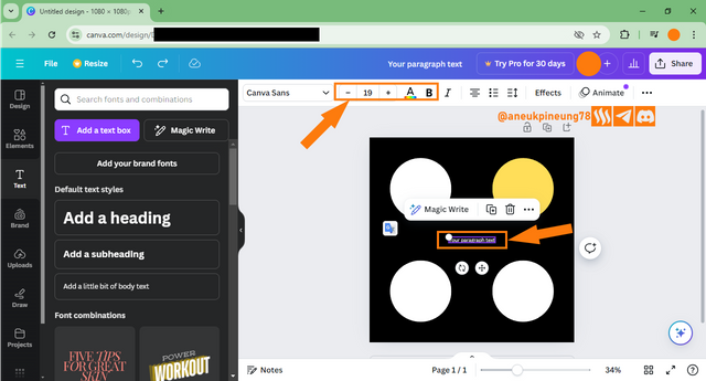
- The text box has appeared on the canvas, next is to adjust the text attributes (color, font size, thickness) so that it looks harmonious with the overall design.
- For the black background color, of course a bright color is needed here to provide contrast to the image. I chose orange (#fd7b0d), I think it gives a strong contrast and also a fresh feeling to the eyes.
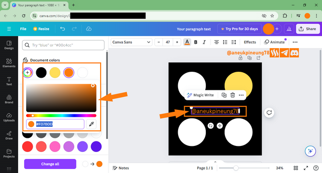
- All done, here's the result.

Thanks
Thanks Profrssor @lhorgic for the lesson. I also want to invite @rayfa, @watii, and @ramadhayani84 to join.
Pictures Sources
- The editorial picture was created by me.
- Unless otherwise stated, all another pictures were screenshoots and were edited with Adobe Photoshop 2021.




Hello @aneukpineung thank you for participating in this week's lesson. We have assessed your entry and we present the result of our assessment below.
Feedback:
• You have clearly defined Graphic design the way you best understand it and I appreciate the effort you put into you well detailed definition.
• Your selection on the principles of design is nice coupled with your comprehensive explanation.It cool to see that you used corresponding visual of these principle to explain your points which is quite commendable.
• Finally, Your practical looks really nice as you've clearly showed us how you transitioned from one phases to the other. In all, you did a good job. I hope you keep up with the energy level. Weldone.
Regards
@lhorgic❤️
Thanks, Professor @lhorgic, it was a great class. Looking forward for some more.
Terimakasih pak atas undangannya🤗
Kesempatan melambungkan SP, Bu @ramadhayani84. Apakah ada mengikutinya?
Kepingin sih ikut pak,tapi belum menguasai pak tentang graphic Dsign🤗🤗🤗maklum belum lancar tentang IT harus belajar dulu sama pak @aneukpineung78
Iya di sini sambil belajar juga sih sebenarnya .. tapi yang penting senang dan kita melakukan apa yang kita sukai sehingga tidak menjadi beban, ya Bu @ramadhayani84, ya?
Itu pasti pak,karena dengan melakukan yang kita sukai denga kemampuan kita itu lebih menyenangkan lagi🤗.
Wah... keren sekali. Kebetulan di tempat saya bertugas ada giat P5 untu desain grafis. Izin shere link untuk dibaca baca guru pembimbing desain grafis yang ada di sekolah saya ya Pak @aneukpineung78. Semoga bermanfaat juga bagi anak didik saya nantinya. Terimakasih
Malahan saya yang justru akan senang jika mendapat koreksi dari para Guru Pembimbing Desain Grafis tersebut. Apa yang saya tulis ini pada dasarnya adalah beralaskan pada tulisan Professor @lorgic, yang menjadi pegangan saya ketika mencari informasi lanjutan di internet. Maksud saya adalah, saya sama sekali tidak memiliki pengetahuan formal tentang mendesain meskipun saya telah melakukan hal ini sejak belasan tahun lalu berdasarkan pengetahuan otodidak.
Akan menarik jika Guru Pembimbing Desain Grafis tersebut diajak ke Steemit, karena pada season 20 Steemit Engagement Challenge saat ini ada kelas tentang desain grafis, dan mungkin pada season berikutnya bisa mendaftar menjadi salah satu lektor di Steemit Engagement Challenge. Ini tentu akan sangat menarik.
Benarkah Bu Sumarni123 mengajar di sebuah sekolah umum? Saya cuma tertarik untuk tahu apakah desain grafis telah menjadi mata ajar yang diajarkan di semua SLTA umum atau hanya di SLTA kejuruan.
Terimakasih, Bu Guru.
Desain grafis di sekolah umum bukanlah mata pelajaran yang harus ada. Desain gragis khususnya di sekolah tempat saya mengajar hanya bahagian kecil dari P5 dengan modul Gaya Hidup Berkelanjutan.
Bukan seperti di Sekolah kejuruan. Karena itu guru pembimbingnya juga belajar otodidak sesuai kemampuan. Terkadang pinteran siswanya ama gurunya hehehe...karena itu tulisan ini saya rasa cocok untuk guru yang saya maksud sebagai referensi nantinya. Untuk teman teman guru sering sudah kami ajak. Mungkin karena waktu jualah yang membuat teman teman masih engan untuk gabung ke Steemit.
Terimakasih sudah membalas komentar saya. Ini merupakan motivasi tersendiri.
Aha. Ini menarik. Jadi itu ibarat suplemen saja, ya. Apabila nanti di antara pasa peserta didik ada yang jatuh cinta pada desain grafis, dan ingin menekuni ini, mereka sudah memiliki dasar ke jenjang pendidikan selanjutnya.
Terimakasih infonya Bu Guru.
Betul sekali Pak @aneukpineung78. Terimakasih kembali untuk ilmunya.
https://x.com/aneukpineung78/status/1834996480698204315
Terimakasih pak sudah mengundang saya di kontes yang sangat luar biasa ini
Kesempatan melambungkan SP, Bu @watii jika sempat mengikutinya.
Insyaallah akan saya coba ikuti pak, terima kasih pak
Congratulations! Your post has been upvoted through steemcurator06.

Good post here should be . . .
Curated by : @𝗁𝖾𝗋𝗂𝖺𝖽𝗂
Iya terimakasih bANG ///
Hi, @aneukpineung78
On behalf of the ᴀʀᴛ & ᴀʀᴛɪꜱᴛꜱ community team
Welcome to this space of creativity, promotion of art and generation of learning.
It would be very interesting to know about you and your relationship with the art world. Tell us if you dedicate yourself to it as a hobby or full time.
Show us some of your creations.
What topics would you like us to start covering?
Finally, remember that you are already part of this family, and we look forward to meeting you.
Would you like to make a post to introduce yourself to the Community?
#artonsteemit