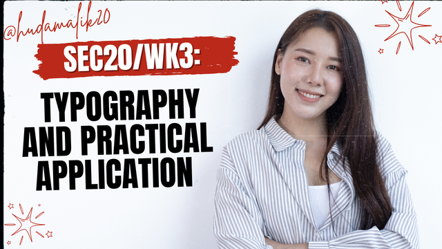
SEC20/WK3: Typography and Practical Application.
I am @hudamalik20 from Pakistan. I hope you’re all doing well. Today, I’m participating in the SEC20/WK3: Typography and Practical Application contest, organized by @lhorgic. After reading the contest post, I’ll be sharing my understanding of typography and applying it practically using the Canva app, as required in the contest.So let's start.

Discuss Your Understanding of Typography:
Typography plays a vital role in graphic design, transforms our simple text into something visually engaging and meaningful. It’s about presenting text in a way that draws the viewer's attention while effectively conveying a message.
In typography, we often adjust elements such as typefaces, fonts, and styles to enhance the visual appeal of the text. Changing font sizes, colors, and line spacing makes our content more readable and impactful. These subtle adjustments can significantly influence how the viewer perceives the message.
For example, in newspapers, headlines are bold and larger to immediately catch the reader's eye. Important articles also use different font sizes or colors to stand out. Similarly, in book or website design, typography helps guide the reader's focus.
Typography is also key in branding and advertising our business. Many famous brands are recognized just by their text style. Advertisements often use typography strategically to make the message clearer and more appealing, such as selecting the right font size and color.
Monospace Typeface
The first typeface is Monospace. This is a font style where each character—whether it’s a letter or a number—takes up the same amount of space. This means that both 'I' and 'M' occupy equal width, which gives it a neat and organized appearance.
in%20#graphics-s_20240924_201629_0000.png)
When I work with programming, I notice that Monospace fonts are very helpful for reading and organizing code. When we write code, the characters align neatly in columns, making it easier to read and compare the text. I use software like Visual Studio Code, and Monospace fonts are set as the default there. These fonts provide uniform spacing for characters, which enhances readability. This typeface is particularly effective in technical contexts.
Blackletter Typeface
The next typeface is Blackletter, also known as Old English. This is an ancient writing style that was commonly used in historical documents. The letters in Blackletter are very dark and thick, with a lot of intricate details.
in%20#graphics-s_20240924_203131_0000.png)
You can find this typeface in history books, certificates, and logos that aim to convey a traditional or historical effect. It carries a serious tone and reminds us of ancient manuscripts, giving it an artistic beauty. I believe it adds depth to designs, making it ideal for projects where a traditional or historical feel is required.
Handwritten Typeface
Finally, we have the Handwritten typeface. This font style resembles our natural handwriting, making it look as though we wrote it ourselves. This design gives us a personal touch, which feels very warm and inviting.
in%20#graphics-s_20240924_203602_0000.png)
Handwritten fonts are especially popular in greeting cards, invitations, and any designs where we want to connect on a personal level. In my opinion, this style adds individuality, as if the text were created specifically for the recipient. It is particularly favored in artistic and informal contexts, where the goal is to make the content more accessible and friendly.
| My first typographic design | in%20#graphics-s_20240924_211910_0000.png) |
|---|
| SN | Items | Answer |
|---|---|---|
| 1. | Typeface/font used | Upper heading: CanvaSans , Lower text font : Ample Display |
| 2. | Colour Hex used | Upperheading- #e75874, Lowertext- #be1558, Background : #fbcbc9 , |
| 3. | Alignment used | Center alignment |
| My second typographic design | 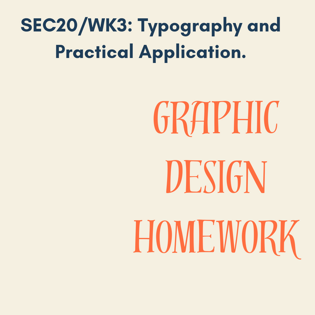 |
|---|
| SN | Items | Answer |
|---|---|---|
| 1. | Typeface/font used | Heading - Glacial indifference font, Text - Distillery Display |
| 2. | Colour Hex used | Heading - ##1e3d59 Bodytext - #ff6e40, Background #f5f0e1 |
| 3. | Alignment used | Right |
| My third typographic design | 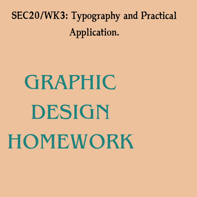 |
|---|
| SN | Items | Answer |
|---|---|---|
| 1. | Typeface/font used | Heading - Austere Display font, Bodytext- ITC Benguiat font |
| 2. | Colour Hex used | Heading- #000000, bodytext- #1e847f, Background #ecc19c, |
| 3. | Alignment used | Left |
| My fourth typographic design | 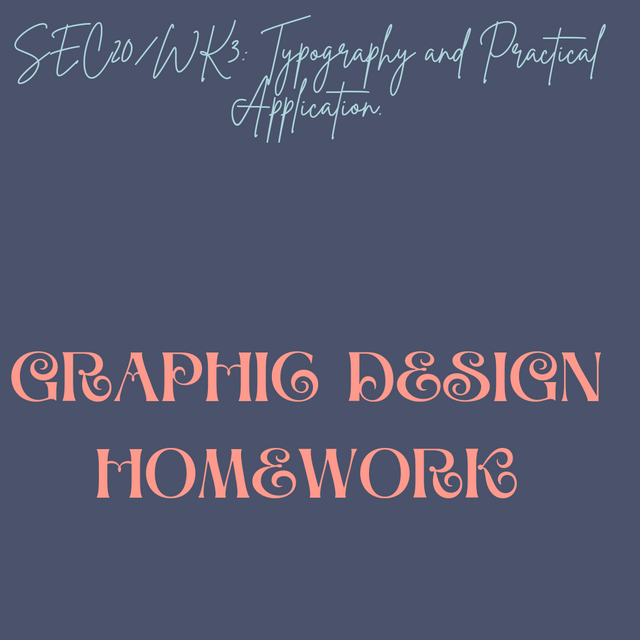 |
|---|
| SN | Items | Answer |
|---|---|---|
| 1. | Typeface/font used | Heading- Brittany font, Bodytext- Aprila font |
| 2. | Colour Hex used | Heading- #aed6dc, Bodytext- #ff9a8d, Background #4a536b |
| 3. | Alignment used | Bottom |
That's all for today's blog. I hope you enjoyed it and found it helpful. Sending my best wishes to everyone ❤️. I would now like to invite abdul-rakin, @sualeha and @aviral123 to join this amazing contest and showcase their creativity.🌸🌼💞🤗
Thanks alot for reading ❤️🤗 .
My introduction post
Thank you so much for your support 🤗💞💐🌺
Upvoted! Thank you for supporting witness @jswit.
Upvoted. Thank You for sending some of your rewards to @null. It will make Steem stronger.
Congratulations, your post has been upvoted by @scilwa, which is a curating account for @R2cornell's Discord Community. We can also be found on our hive community & peakd as well as on my Discord Server
Felicitaciones, su publication ha sido votado por @scilwa. También puedo ser encontrado en nuestra comunidad de colmena y Peakd así como en mi servidor de discordia
¡Holaaa amiga!🤗
He visto en reiteradas ocasiones que la tipografía monoespaciada suelen utilizarlas en diseños informativos ya que, debido a la sencillez y por supuesto, elegancia le acuñan la oportunidad al lector de poder comprender muy bien el mensaje que se quiere reflejar en dicho diseño. En lo personal, no la he utilizado pero, viendo la elegancia que tiene, me dispondré a hacerlo.
Te deseo mucho éxito en la dinámica... Un fuerte abrazo💚
Hello, my friend😊.Thank you so much for your tlcomment.I completely agree with you monospaced typography does add a touch of simplicity and elegance that helps convey the message clearly.
I'm glad you're considering using it.Wishing you the best of luck in everything you do as well. Sending you a big hug🤗💞🌼🌸
Hey @hudamalik20! 🌟 Wow, your typography insights are as vibrant as your designs! 🎨 I mean, who knew fonts could be so dramatic? 😂 Monospace for coding, Blackletter for historical flair, and Handwritten for that cozy, “I totally wrote this myself” vibe! 🤣 Love how you’re making typography sound like a party! 🎉 Can’t wait to see more creativity from you! Keep rocking those designs! 💖✌️