Graphic design is so broad, and because of it, I have decided to make it more comprehensive for easy understanding; let's delve into the definition of graphics, which are visual elements that aid in the expression of ideas and communication of information. They include elements such as shapes, icons, lines, patterns, diagrams, charts, images, and textures; graphics can also be created by drawing, photography (may not be able to change the image's shape but maybe background or filter the colour), painting, etc.
With this definition of graphics, there could be a definition of graphics design, but let's define it.
Question 1: What is Graphic Design? Briefly Share with me your understanding about graphic design
I would have said graphic design is the art of communicating ideas, messages, and information through graphics, but I would say through visual and textual content; anything visual can be used to make a graphic design. That is why graphic design doesn't only materialise to images or complex images with multiple designs; it could also be video.
Question 2: Pick any three of the principles of Graphic design and talk about them based on your level of understanding .
--
I desire to go to the more complex ones, and I will be practising them as well.
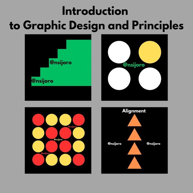
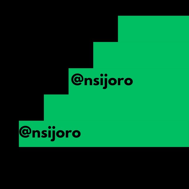
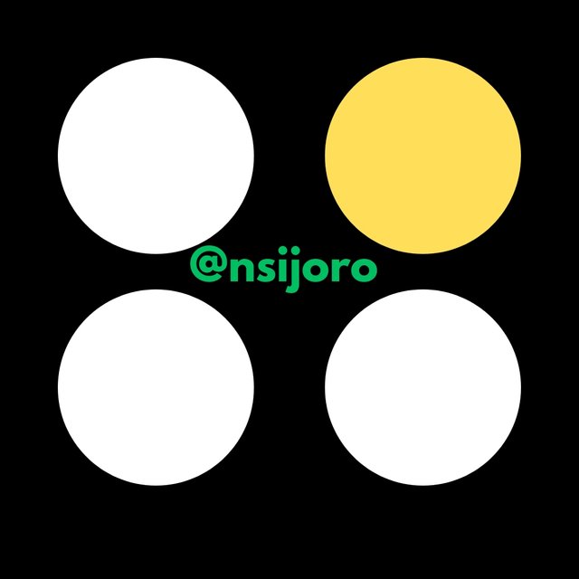
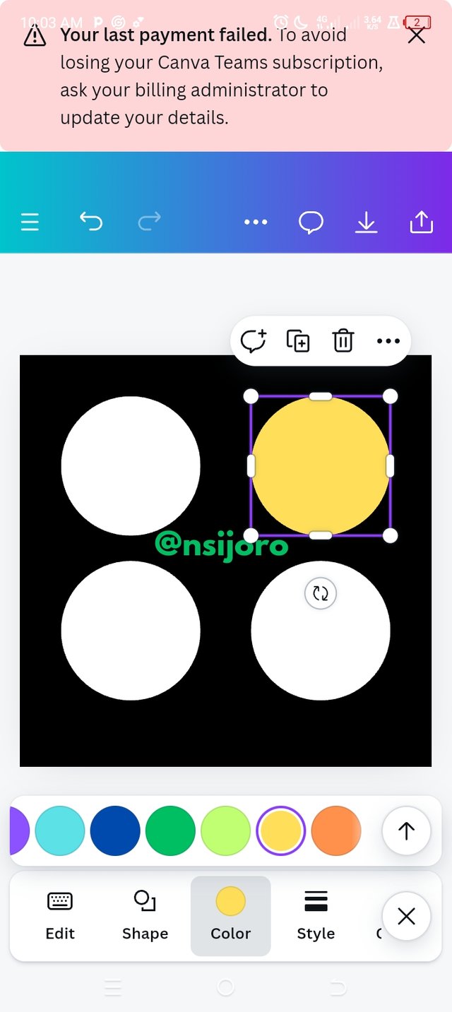
- Hierarchy: To me, hierarchy means the arrangement of elements such as shapes and pictures in order, emphasizing their order of importance. What I mean here is if an element is picked, for instance, a rectangular element, it is arranged in such a way that emphasis is being placed on each of them, and take note that their sizes or heights don't have to be the same so that this emphasis on arranging will be obvious; it could be arranged in the order of increasing or decreasing height, colour, size, position, etc. I will show you a design in which the hierarchy is based on size to prove my understanding of this concept.
 |
|---|
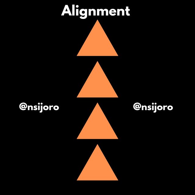
- Alignment: This particular principle is very necessary because it creates a sense of professionalism in designing. As the name implies, it is a way of positioning elements in such a way that their edges align to and are in the same position as other elements. This positioning could be done with different elements and shapes, and they must certainly align with each other to beautify. That is why applications made for graphic design like Canvas have a ruler tool that detects the position of each element from the other.
As I said earlier, an alignment can be on edges, in different positions to the left, right, centre, baseline, etc. The aim is that the edge you desire to match will match.
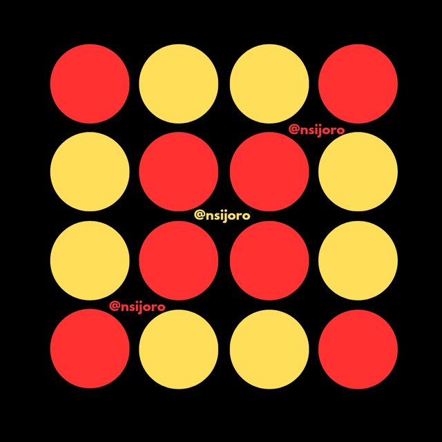
- Rhythm: Looking at rhythm, our focus is continuity, and this continuity could be in colour. As far as I have done my little research, I have also learnt that rhythm continuity can also be in shape or texture, and this is to create a cohesive look that will bring about a consistent pattern and style.
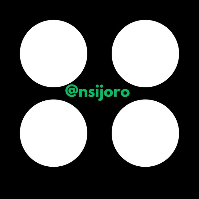
Question 3: Practically show us how to make the graphical image below.
--
You might not see many arrow indications for creating the homework assignment, but I assure you you will know how to create the final image you see below if you follow my text step by step. It may not come with a bulky step, but I follow carefully to understand, just like my tutor ljorgic has taught me.
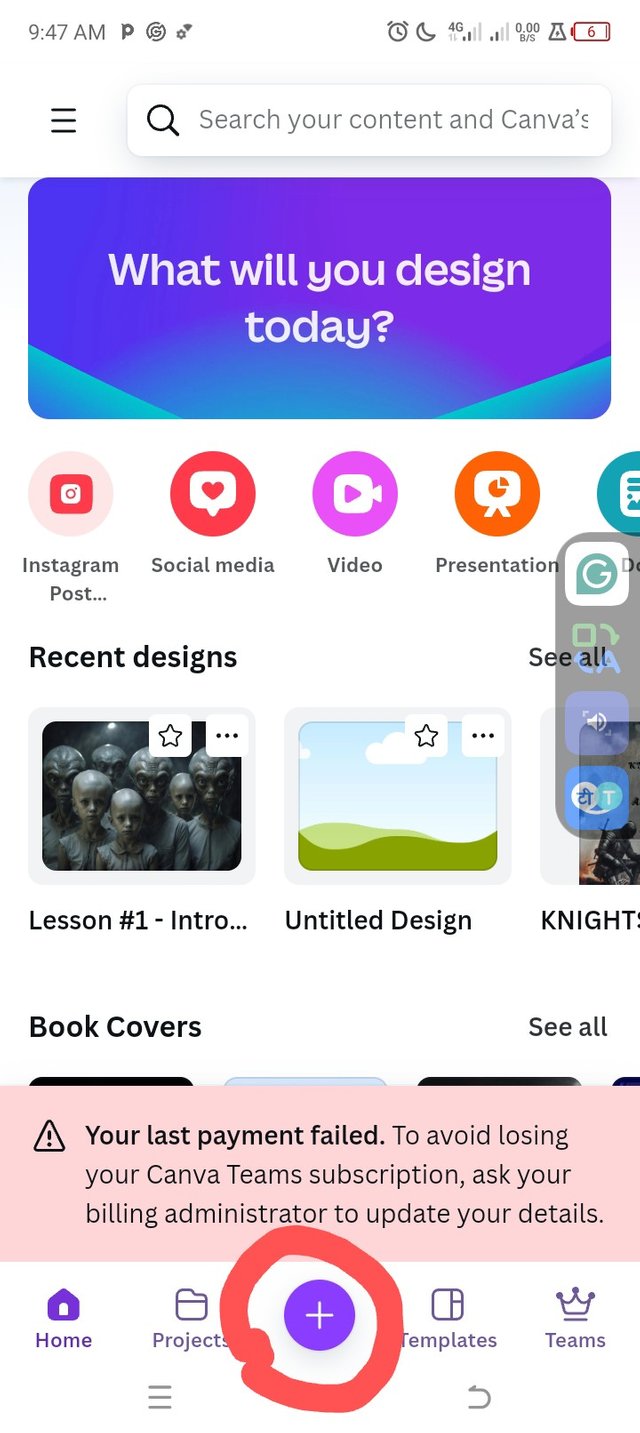
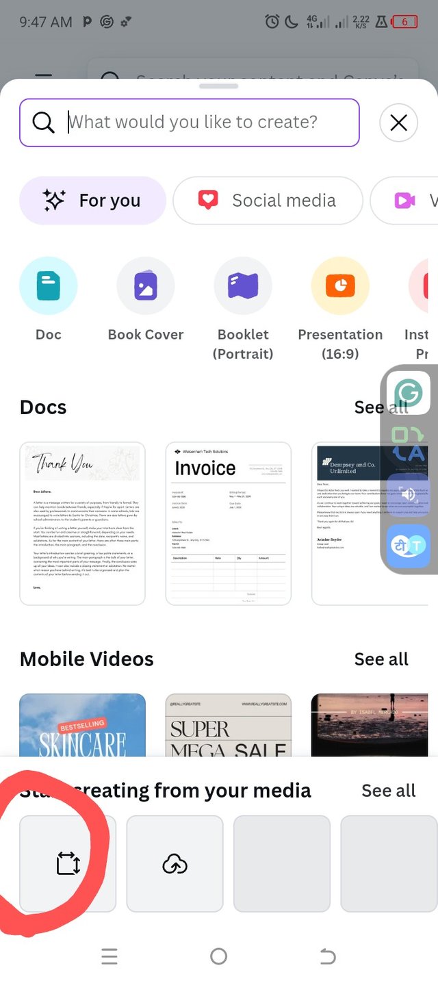
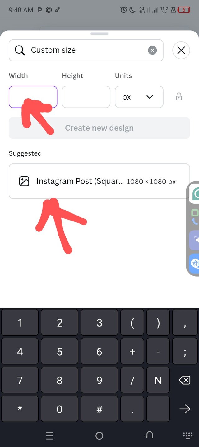
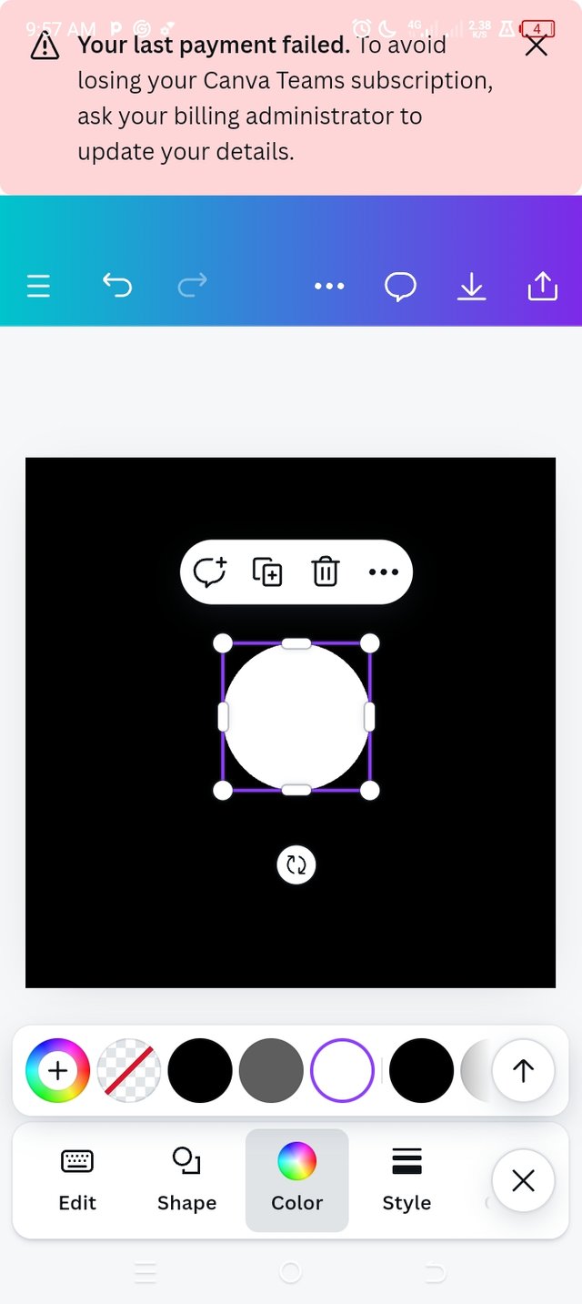
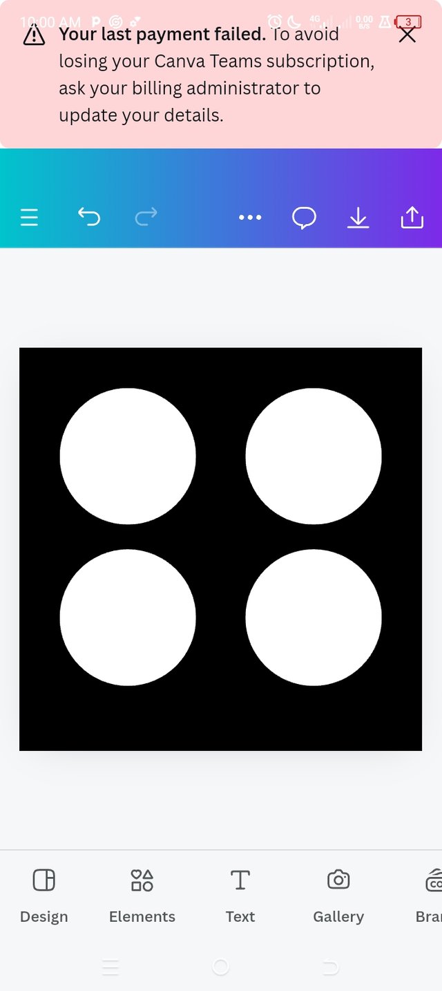
- Make sure you are on the home page; go to the bottom toolbars on your phone, and you will see a button that looks like a cross in the centre. If you have found the button, then click on it; when it appears, you will then see a different dialogue appear at the bottom. Click the next place I circled in red. You can then type the pixel 1080×1080; for me, I had a suggestion come up, which is the Instagram post format.
- After the Instagram image format of pixels 1080 and 1080 has appeared, then go ahead and click on the image that appears; when you click on it, it becomes bordered by a purple lining, indicating that it is the image you are working on (note this because it becomes very applicable as your designs proceed).
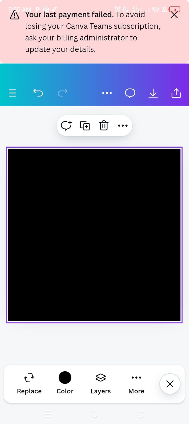
- A new toolbar appears on the image selection, and different tools are found, the colour tool, etc.; click on it and select the preferred black colour.
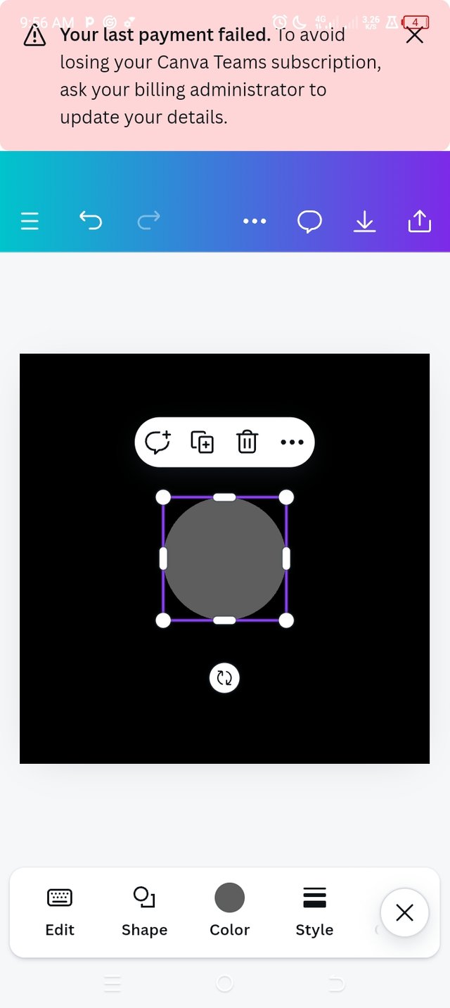
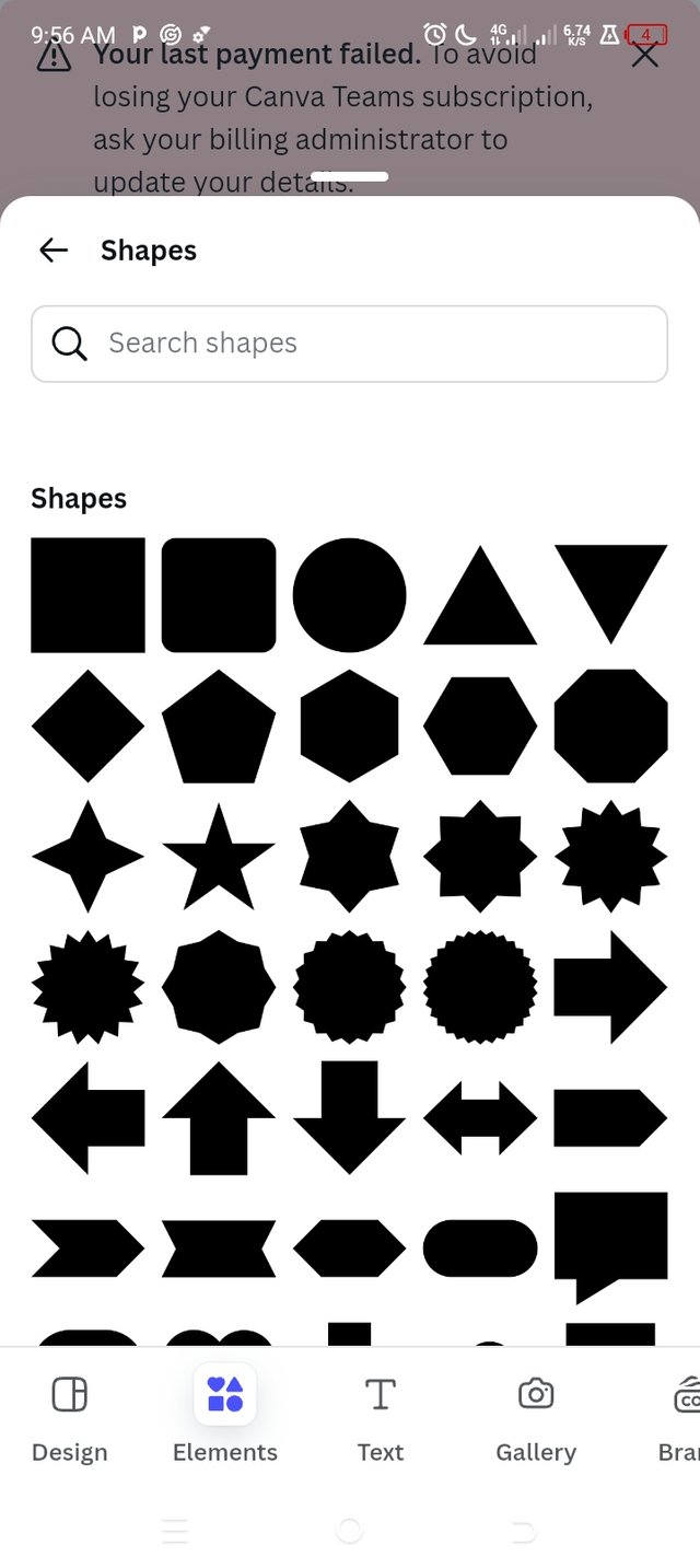
After choosing the colour, click on a place outside this image for another toolbar to display; when the toolbar displays, click on an element, then click on shapes, and select a circle.
- When it appears on the previous image, which will now serve as a background image, adjust it to your desired size using the purple lining on the borders. While the purple lining is still there, go to the toolbar below and change the shape colour to white.
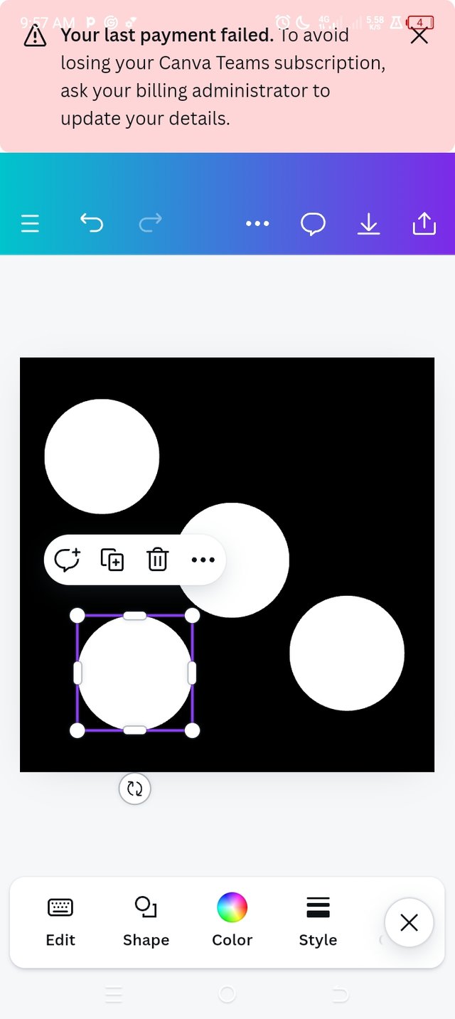
- After this, while the purple lining is still bordered around, you will see another toolbar close to the image. Click on the one that has something like a cross ✝️; it stands for duplicate. Our target is to get 3 more similar images without going through the same process.
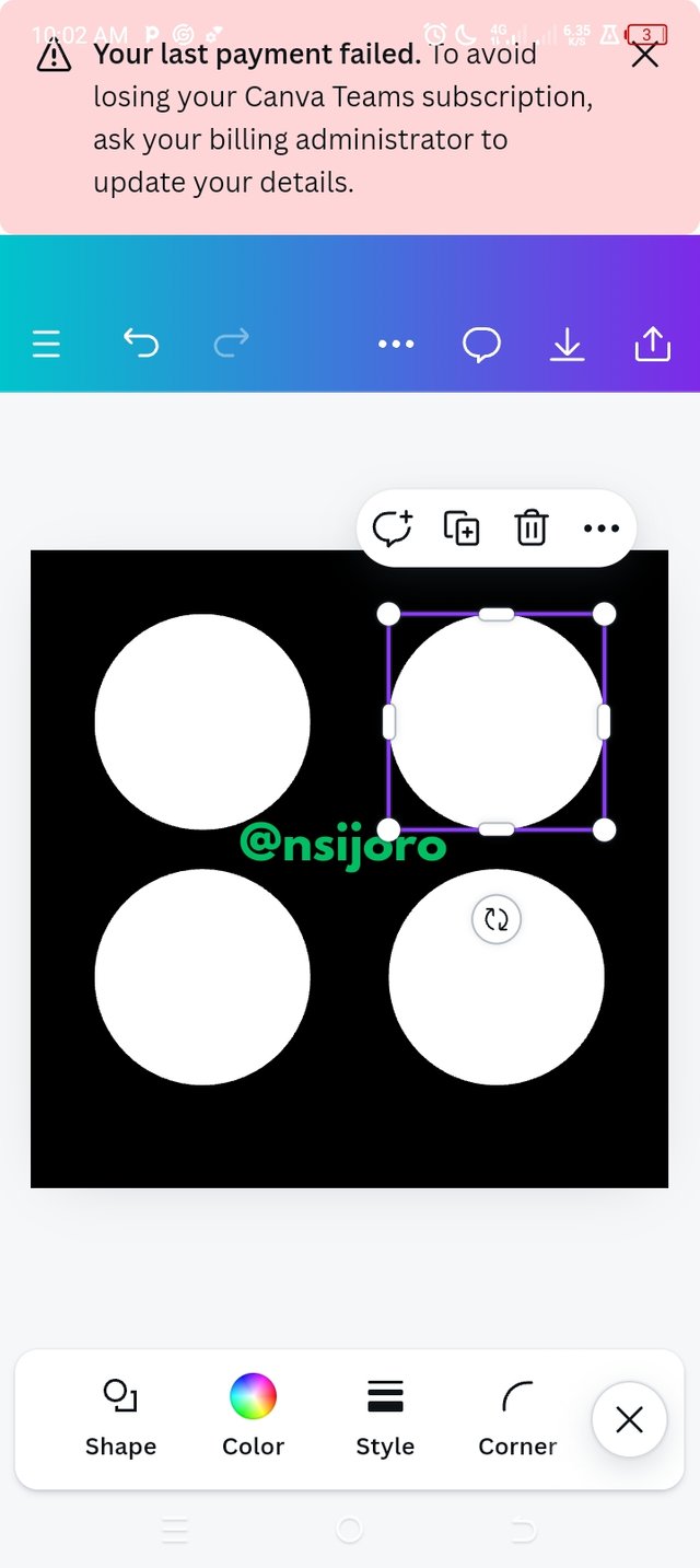
After getting them ready, align them properly by clicking on the body of the image to drag it to its position. Take note of the Canva ruler because this makes the right and left alignment perfect.
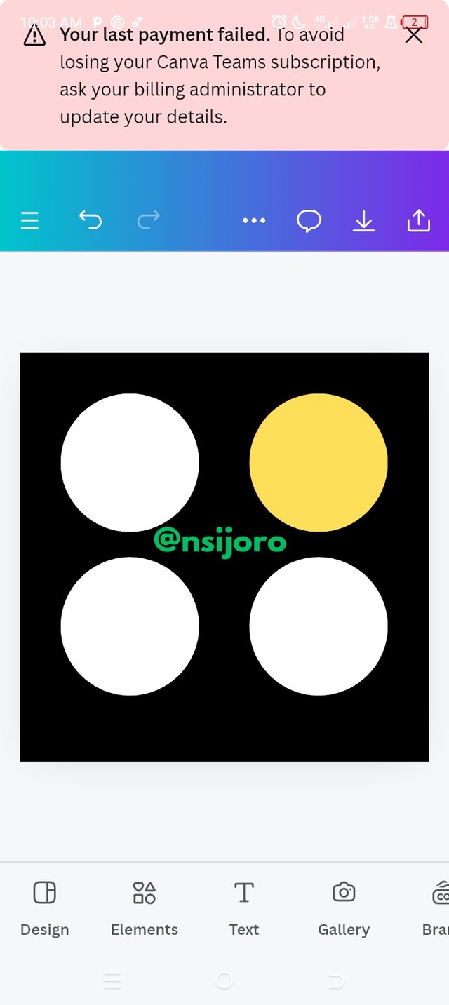
When you are done with the arrangements and alignment, click on the circle that emphasis needs to be placed on; a regular toolbar that you have once encountered comes up; then click on colour and select a yellow colour which is recommended here.
| After Emphasis | Before Emphasis |
|---|
MY DESIGN IS NOW READY
Thank you, friend!

I'm @steem.history, who is steem witness.
Thank you for witnessvoting for me.
please click it!
(Go to https://steemit.com/~witnesses and type fbslo at the bottom of the page)
The weight is reduced because of the lack of Voting Power. If you vote for me as a witness, you can get my little vote.
Upvoted. Thank You for sending some of your rewards to @null. It will make Steem stronger.
@tipu curate
;) Holisss...
--
This is a manual curation from the @tipU Curation Project.
Upvoted 👌 (Mana: 3/7) Get profit votes with @tipU :)
Hola mi querido amigo @nsijoro, un placer saludarte
Me encantó tu trabajo amiga, hiciste un buen desarrollo y a los principios los acompañaste de ejemplos bien precisos para darle un mejor entendimiento, en general se puede observar que seguiste muy bien las pautas dadas por el profesor mostrandonos de una manera bien detallada todo el proceso para la elaboración del diseño final exigido por el profesor.
Te deseo mucho éxito. Un abrazo 🤗
Thank you ma'am, everything you have said is true. I appreciate
X promotion link
https://x.com/nsijoro/status/1834442093260861456?t=v6EOUHrvWV2oakFwLSfnqA&s=19