Range Expansion In Cryptocurrencies
Many traders know about Fibonacci Ratios and how they can be applied to markets to figure out areas of support and resistance. Using a lesser known, but similar method reveals how well expansion ratios can work. In my examples below I will be using simple multiples of a previous range, taken from the first time any particular market has started trading on an exchange.
This is called the Range Expansion technique and all it does is to take the lowest price since inception and connect that to the highest price (called a range) before price broke out to noticeable new highs and expand that range upwards. In my examples to follow, you will notice how price tends to keep doubling in price from the first range i.e. 2 x, 4x, 8x, 16x etc.
Price almost tend to gravitate towards the next range multiple and in many cases previous levels that were broken to the upside will act as support the next time price move downwards towards them again.

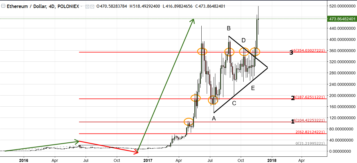
The chart above is of Ethereum based on a 4 day bar, so that I could properly fit all the historical data on it nicely. Notice how I used my Fibonacci extension tool and connected the all time low with the first range high before price broke out much higher (indicated by the red and green arrows).
The red horizontal lines are multiples of the first range we measured from i.e. 200%, 400%, 800% etc. each time doubling the original range. Now look at the orange circles that shows how well price reacted from those levels each time. In the end price tends to move to the next multiple after breaking through a level.
Ethereum has been in a sideways Triangle Correction since the 10th of June this year and finally broke higher, as indicated by the black trend lines and labelled A-B-C-D-E. See how price struggled to get through the 16x (or 1600%) level, will price gravitate higher towards 32x range next?

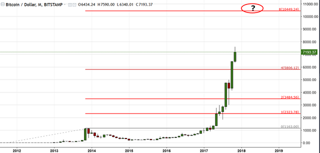
Above is Bitcoin's chart and price is currently heading for the 8x range expansion located just above $ 10 000!

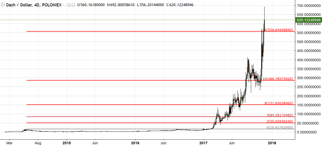
Take a closer look at Dash above, and you will notice how price reacted to each multiple by hanging around those levels before moving upwards again.

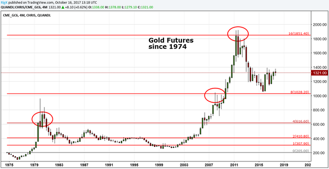
Just to show how well these levels work, I included a chart of Gold. Price reached an all time high at almost exactly the 16x expansion level before moving downwards to current prices.
These levels are great at showing a markets price evolution over time and how price tends to move higher each time, while doubling the original range. This is a great technique to view the "bigger picture" of where prices might be heading in the future, the only variable (an this is a big one) is how long it will take to get there. For that we need to employ timing techniques but more about that in a separate post.
Do not hesitate to ask should you want me to employ the same technique on any of your favorite markets.
Until next time
Richard K aka Cryptogann
P.S. If you enjoyed this post please like it and upvote!
Congratulations @cryptogann! You have completed some achievement on Steemit and have been rewarded with new badge(s) :
Click on any badge to view your own Board of Honor on SteemitBoard.
For more information about SteemitBoard, click here
If you no longer want to receive notifications, reply to this comment with the word
STOPCongratulations @cryptogann! You received a personal award!
Click here to view your Board of Honor
Do not miss the last post from @steemitboard:
Congratulations @cryptogann! You received a personal award!
You can view your badges on your Steem Board and compare to others on the Steem Ranking
Vote for @Steemitboard as a witness to get one more award and increased upvotes!