[Roofs of the world: watercolor, pastel, markers] Part 2
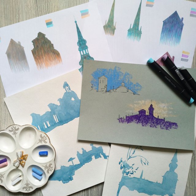
So I began my course on drawing the roofs of different cities in the world. The course is constructed in such a way that simultaneously lessons are given in three directions and on the same topic. I decided that I will sum up the method of comparing different techniques within a single topic. I will paint with watercolor, pastel and markers.
The first part is under the link:
[Roofs of the world: watercolor, pastel, markers] Part 1
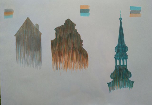
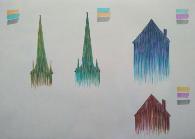
The second exercise in the course is a figured fill. On the example of different materials, I will learn to highlight the outline of the towers and the city.
Markers. In this lesson I'm learning to stroke. In fact, I already know how to stroke for a long time, because the teacher in this direction is the same as the one that was on the course of urban sketching. Therefore, this exercise did not cause me any problems, except problems with color)) The first version of the silhouette of the tower is very pale, so I replaced it with a darker one. And in the end I even tried my own combination of colors with purple.
Watercolor. I paint with watercolor "Nevskaya Palitra". For fills, I use a few shades of blue. I draw on the cheapest and ordinary paper from cellulose, so I have problems with fillings)) And I realized that I needed a brush with a thin tip that would give water easily and leave no traces when the contour was subsequently filled. I do not know yet where I can buy such a brush, because I did not get a chance to look at it. Can you know?
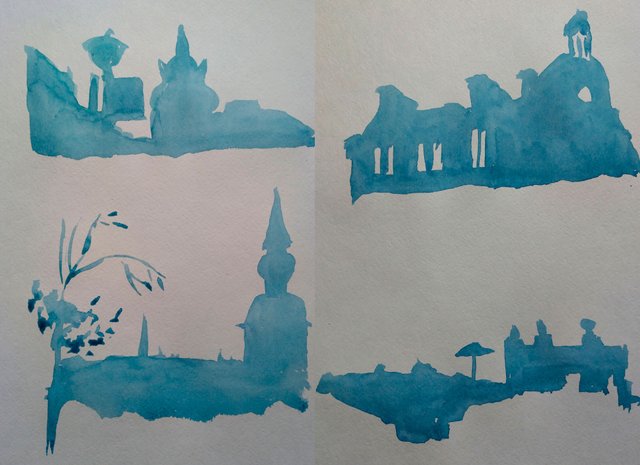
I was thinking about redoing work on cotton paper. But for myself, I know for sure that I will not have any problems with filling it, so I do not want to spend paper on it.
Pastel. Today I paint on paper Canson Mi-teintes, and compared to the Palazzo, on which I drew yesterday, it's heaven and earth. I see a difference in the application of crayons, in its distribution on paper. I want to remind you that I do not paint with pastels yet, so for me it turned out that it's better to take better materials. Work with them is easier.
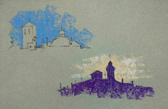
Conclusion. The filling of the volume in different materials goes in different ways. In markers, this is layered hatching, and in watercolors and pastels, filling the volume with one hand movement. Despite the fact that the marker turns out to be longer in time, I like it anyway. And the marker is less dependent on external conditions and on the trembling of the hand)))
All my paintings can be bought for sbd/steem
Thank you for watching!

Join us @steemitbloggers
Animation By @zord189
Order now!

rusteemteam!
Здорово! Мне очень нравится, особенно пастельные зарисовки)
очень интересно получились все варианты, но я больше за пастель тоже)
I love the different style in architecture depicted in those roofs.