SEC S19W4 || Organization using CSS (Box-model,Display, Position, Flex)
I'm excited to participate in the 4th Lesson of Season 19 of the Steemit Engagement Challenge. In this competition, we explore and master the organization of content using CSS, specifically focusing on box-sizing, display, flex, and position properties.
Effective content organization is crucial when working on web projects. It ensures that the website looks appealing and functions smoothly. In this post, I'll answer some questions related to these CSS properties.
SEC S19W4 || Organization using CSS (box-model Display, Position, Flex)
Theoretical Questions
1. Explain the Difference Between Inline Display and Block Display
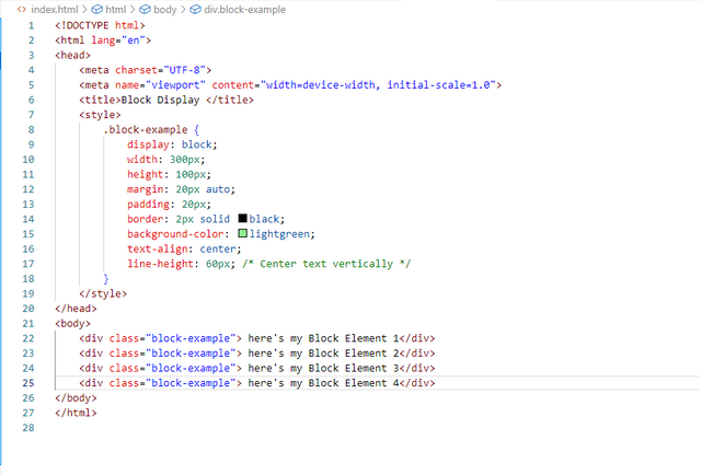
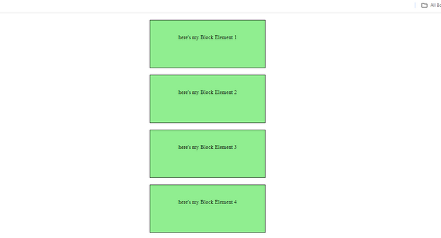
Block Display: Elements with block display take up the full width available and start on a new line. They stack vertically, one on top of another. Examples include < div >, < h1 > to < h6 >, < p >, etc.
To demonstrate block display, I created 4 blocks. As mentioned, in block display, elements are aligned vertically. The first block appears at the top, and the rest are displayed below it. I added colors to each block to clearly show the block display effect.
Inline Display: Elements with inline display take up only as much width as necessary and do not start on a new line. They can sit side by side with other elements. Examples include < span >, < a >, < img >, etc.
To demonstrate inline display, I created four blocks. Inline elements stay in the same line without starting a new one. I assigned height, width, and color to each block to make them visible. By applying the inline display property, all the boxes are displayed in a single line in the output.
2. What's the Difference Between Margin, Padding, and Border?
Margin: The space outside the border of an element. It separates the element from other elements on the page.
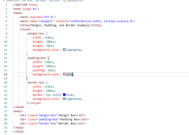
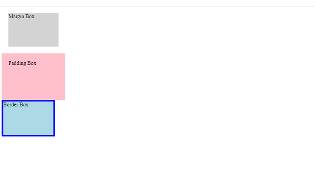
To demonstrate this, I created a box with color, height, and width. I then used the margin property to give it a 20-pixel margin. This means the box will have a 20-pixel space on all sides, separating it from other elements by 20 pixels.
Padding: The space inside the border, between the border and the content of the element. It pushes the content inward.
As mentioned above, padding allows us to add space inside a box, so the content doesn't start right from the edge. To demonstrate this, I gave a box some padding. I applied 20 pixels of padding, which means any text inside the box will be 20 pixels away from the border on all sides.
Border: The line that surrounds the padding and content of an element. It can have different styles (solid, dotted, dashed, etc.), widths, and colors.
To show a border, I used the border property. I created a box and applied the border by first specifying the border property. I set the width of the border to 5 pixels, chose the solid type from the three available styles, and selected the color blue. This resulted in a thick blue line around the corners of the box.
3. Define Position Property
The position property in CSS determines how an element is positioned in the document. There are four main values:
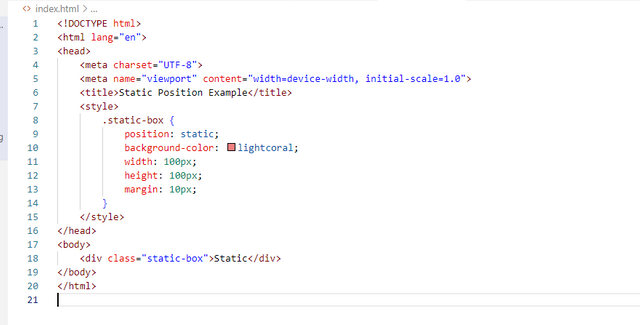
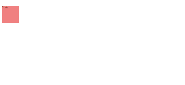
- Static: Default value; elements are positioned according to the normal flow of the document.So as the example code I havw shared the .static box element will appear in the normal document flow. It will be positioned according to its place in my HTML and will be affected by margins and padding as usual.
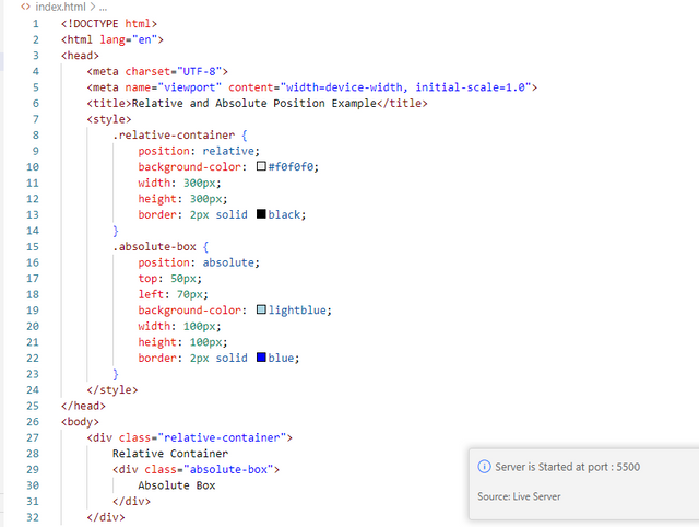
- Relative: Elements are positioned relative to their normal position. Adjustments are made using top, right, bottom, and left properties.As the example code I have shared my relative-box element will be positioned 20px down and 30px right from where it would normally be. The space it originally occupied is still preserved in the layout, so other elements are not affected by the move.
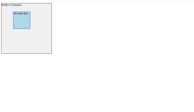
- Absolute: Elements are positioned relative to the nearest positioned ancestor (an ancestor with a position other than static). If no such ancestor exists, it is positioned relative to the initial containing block.As the example code I have shared my .absolute-box element is positioned 10px from the top and 20px from the right of its closest positioned ancestor (the .container element). It does not affect the position of other elements.
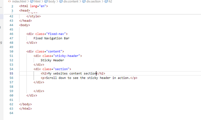
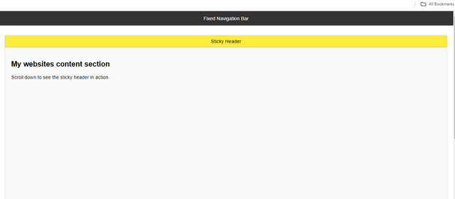
- Fixed: Elements are positioned relative to the viewport, which means they stay in the same place even when the page is scrolled.In this example, the
.fixed-navclass usesposition: fixed;to ensure that the navigation bar remains fixed at the top of the viewport.
This positioning method detaches the element from the normal document flow, so it doesn’t move when the page is scrolled. The top: 0; property places it exactly at the top of the viewport, and width: 100%; ensures it spans the full width of the screen. The z-index: 1000 property is used to keep the fixed navigation bar above other content.
- Sticky: A hybrid of relative and fixed. Elements are treated as relative until they scroll to a certain point, then they are fixed.In the code I have shared it will scroll with the rest of the page content.
However, once it reaches the top of the viewport actually it stays in place, effectively sticking to the top. This sticky behavior allows the header to remain visible as the user scrolls through sections of the page.
4. Differentiate Between Grid and Flex Display Properties
- Flexbox: It is designed for one-dimensional layouts. It works on a single axis (either in row or column). It is great for distributing space within an item and aligning items in a container.
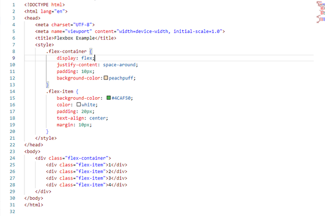
In the Flexbox example, I set up a flex container with display: flex;. This property allows me to arrange child elements (flex items) in a row. The justify-content: space-around; property distributes the space evenly between the items, with equal space on the left and right sides of each item.
The .flex-container has padding: 10px; to create space around its edges and a light gray background color. Each .flex-item has a green background, white text, padding for spacing inside, and margin to separate them from each other. This layout is simpler than grid and works well for arranging items in a single row with consistent spacing.
- Grid: Designed for two-dimensional layouts. It handles both rows and columns. It allows for the creation of complex layouts and is great for overall page structure.
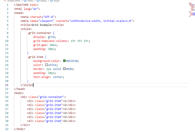
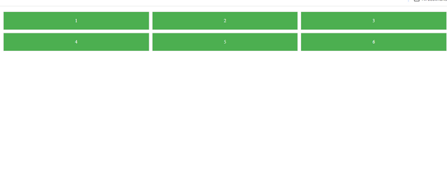
In the Grid Layout example, I used the display: grid; property to set up a grid container. The grid-template-columns: 1fr 1fr 1fr; rule divides the container into three equal columns, so each grid item takes up one-third of the container's width.
I added grid-gap: 10px; to create a 10-pixel gap between each grid item, making the layout look organized. The padding: 10px; inside the container ensures that the grid items are not touching the edges of the container.
Each .grid-item has a green background color, white text, and padding of 20 pixels inside to space out the content from the edges. The border adds a light gray line around each item to make them distinct.
2. Practical Questions.
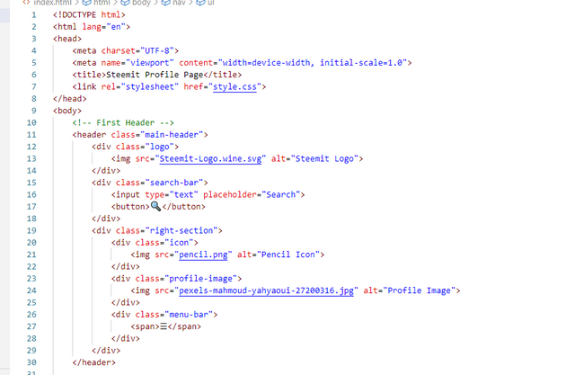
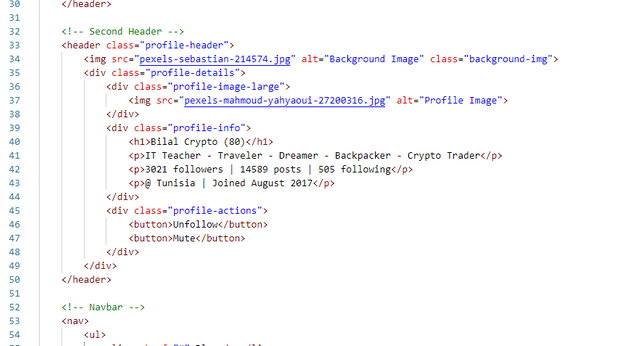
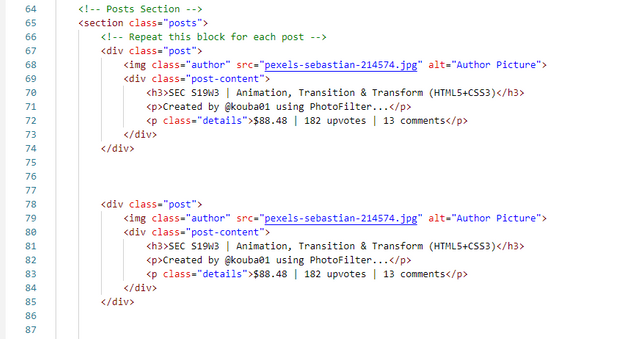
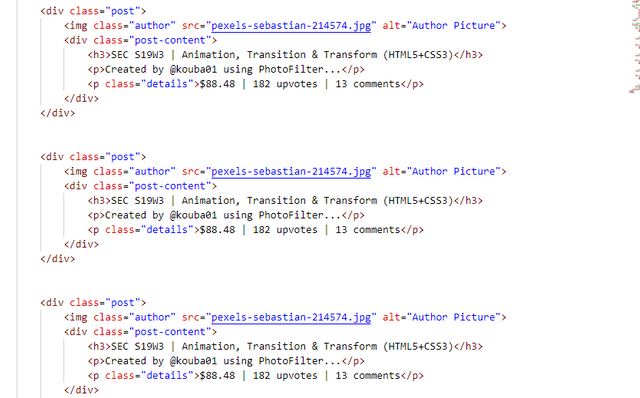
Here's my HTMl Code:
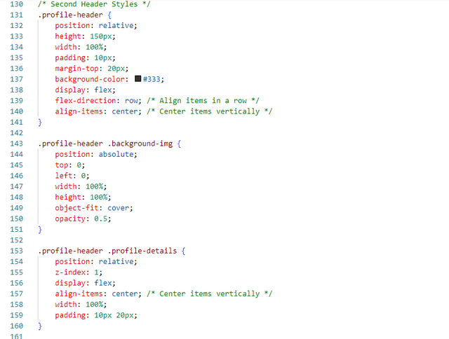
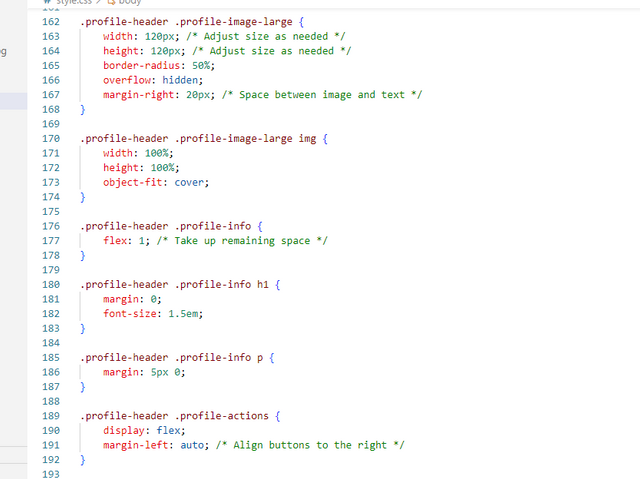
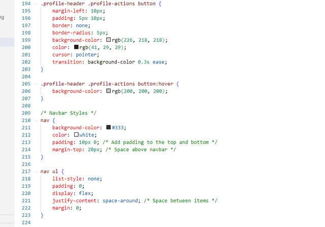
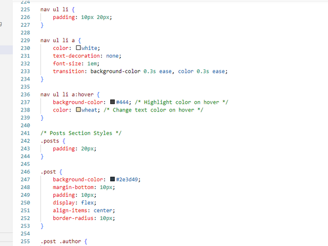
I designed the webpage based on the assignment's instructions to create a similar layout while incorporating my own creativity.
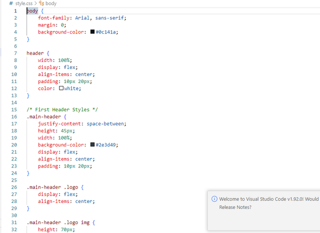
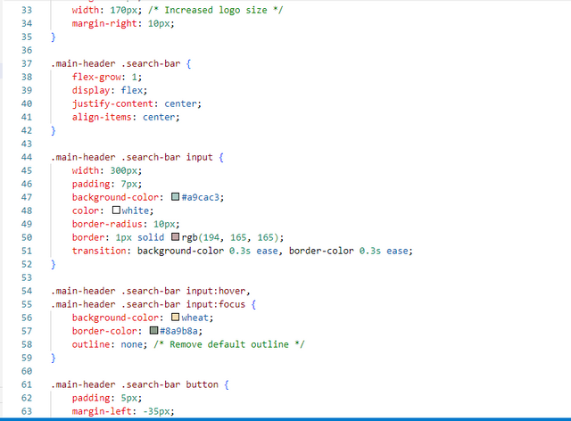
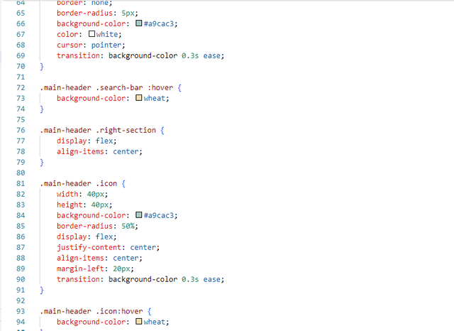
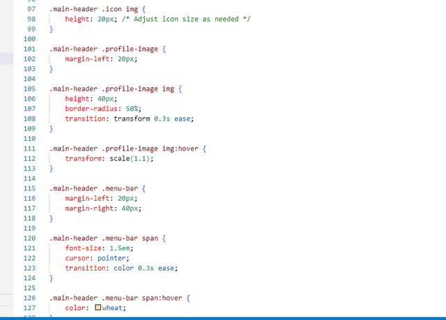
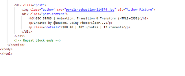
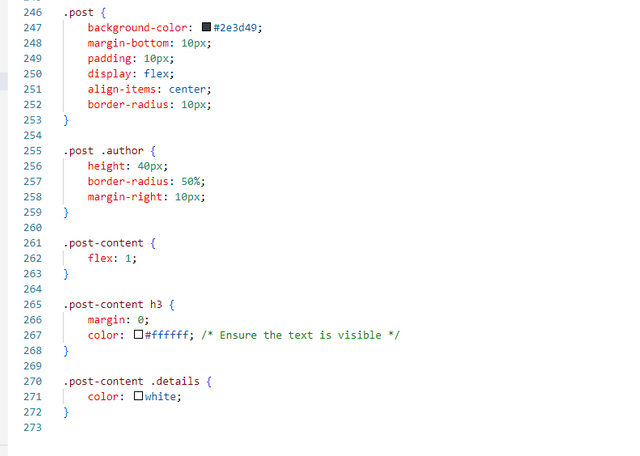
I experimented with different colors and added hover effects to enhance interactivity. The design includes a main header with a logo and search bar, a profile section with details and action buttons, and a navigation bar beneath the profile header.
I used hover effects for links, buttons, and search elements to improve user experience and make the page visually engaging.
 |  |
|---|
 |  |
|---|
Here's my CSS code:
 |  |
|---|
 |  |
|---|
 |  |
|---|
 |  |
|---|
All images are taken by my laptop...
That wraps up today’s blog.I hope you enjoyed it. Best wishes ❤️. I’d like to extend an invitation to @josepha, @mateenfatima, and @rafk to join this fantastic contest and share their creative work.


Thank you, friend!


I'm @steem.history, who is steem witness.
Thank you for witnessvoting for me.
please click it!
(Go to https://steemit.com/~witnesses and type fbslo at the bottom of the page)
The weight is reduced because of the lack of Voting Power. If you vote for me as a witness, you can get my little vote.
Upvoted. Thank You for sending some of your rewards to @null. It will make Steem stronger.
Hello dear friend
Greetings to you hope you are well and enjoying happy life. Your explanation of theory part with examples are fabulous and easy to understand. You understand well the lesson and perform well too. Practical part is interesting where make similar output using HTML and CSS. This shows your love with web development. Keep it up. I wish you more success.
Thank you so much for your kind words.I'm glad you liked my explanation and examples. Your encouragement means a lot to me. I'll keep working hard on my web development skills.Best wishes to you too🤗🌸🌼🌺💞
You have shown your understanding to the topic by displaying the beautiful work you have done. I wish you the best of luck.
Thank you so much @josepha for your comment I am happy you liked my work I also wish you best you best of luck 🤗🌸 .
You have presented a beautiful work here my friend. Indeed you have put in a lot for this task. The final output of your practicals is very amazing. I wish you success in the contest
Thank you so much for your kind words and support.I'm really glad you liked the work. Your encouragement means a lot to me. 😊
you included the search option as well, that's cool. hope you are having good time at steemit, hudamalik20.
You did well! keep the good work up