Generating Thin Style DDG
After a night spent experimenting with the DDG, Deep Dream Generator, I am still wide awake and continuing my experimentation.
I find one of the drawbacks to choosing which design to implement is the small aspect of the design on the DDG Gallery page, in that the detail on such a small photo is insufficient to imagine how the effect might be layered onto whatever test subject one has chosen.
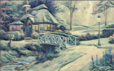
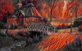
Therefore, I decided to create my own choice template gallery in order to serve as an example of the different patterns or styles that are available in the Thin Style Generator. There are 18 choices, so I am dividing this post into three parts for the purpose of illustration. Note that this is only Thin style. Perhaps at a later date I will illustrate the Deep Style effects.
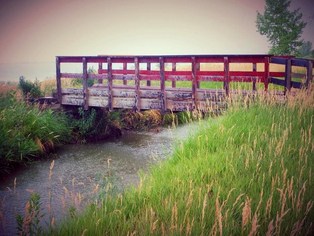
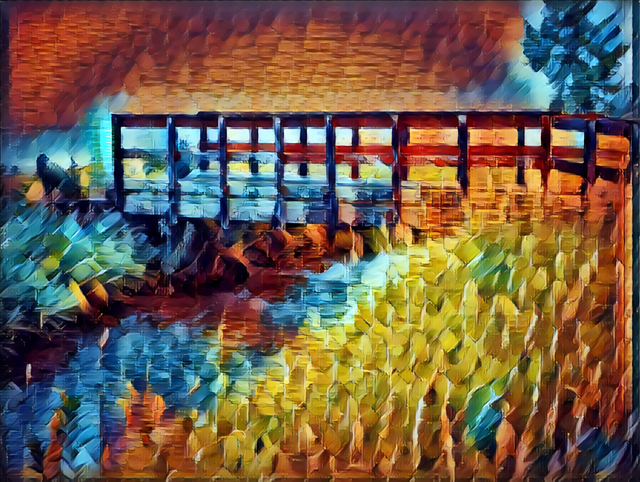
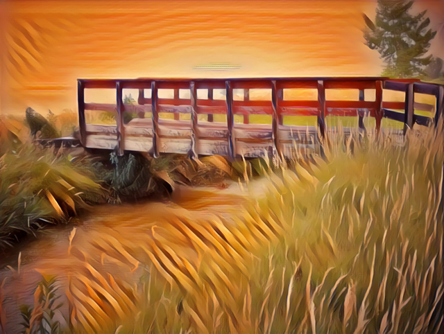
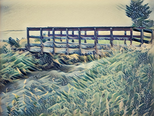
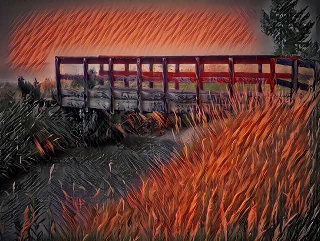
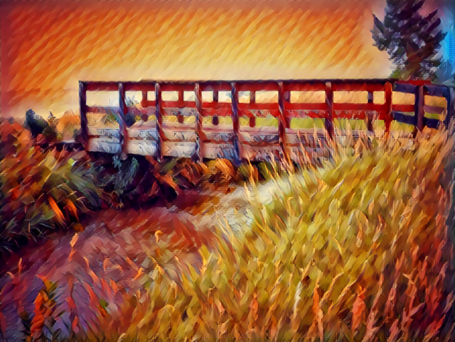
I begin with my basic photo, the red bridge, and will show the first six thin style choices in order of sequence. I know which outcomes I prefer, but I'd love to hear from you which are your favorites!
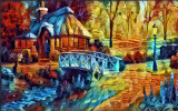
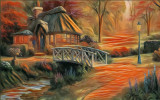
style #1
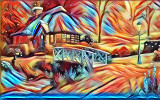
style #2
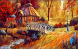
style #3
style #4
style #5

style #6
Click here for Part Two of Generating Thin Style: here
above style examples are from the Deep Dream Generator Thin Style Gallery and are used for illustrative purposes only. All other photos (with the exception of bottom meme) were created by torico with the deep dream generator using the thin style gallery images using my original photo, red bridge
follow me!
What a great idea to do one photo in all the styles, i've been too lazy to try it!
yeah i got over excited. but its taught me a bit more about the settings. in some ways i wish i could mute the intensity of the effect, but it seems like its more of an all or nothing. hopefully the next edition might have a bit more mask control.
part two is up
This post received a 10% vote by @eternal.witness courtesy of @juliakponsford from the Minnow Support Project ( @minnowsupport ). Join us in Discord.
Upvoting this comment will help support @minnowsupport.
This post received a 10% vote by @minnowsupport courtesy of @juliakponsford from the Minnow Support Project ( @minnowsupport ). Join us in Discord.
Upvoting this comment will help support @minnowsupport.
This post has been resteemed by @lovejuice courtesy of @juliakponsford from the Minnow Support Project ( @minnowsupport ). Join us in Discord.
Upvoting this comment will help support @minnowsupport.
This post has been resteemed by @msp-lovebot courtesy of @juliakponsford from the Minnow Support Project ( @minnowsupport ). Join us in Discord.
Upvoting this comment will help support @minnowsupport.
This post has been resteemed by @msp-nomad courtesy of @juliakponsford from the Minnow Support Project ( @minnowsupport ). Join us in Discord.
Upvoting this comment will help support @minnowsupport.
This post has been resteemed by @msp-shanehug courtesy of @juliakponsford from the Minnow Support Project ( @minnowsupport ). Join us in Discord.
Upvoting this comment will help support @minnowsupport.
This post has been resteemed by @minnowsupport courtesy of @juliakponsford from the Minnow Support Project ( @minnowsupport ). Join us in Discord.
Upvoting this comment will help support @minnowsupport.
I'm not sure which is my favourite. I like them overall. What bothers me is that the sky in donor image tends to end up a regular pattern and the style images are anything regular.
yes, i agree. i did all of the images on default settings but it almost seems like i should dial them down to low to feel comfortable with the outcome. i did that as a test but it makes almost not difference as to the intensity.
I wonder to what degree you'd be happy to "cheat". IE in the donor image add some fake texture to the flat-coloured areas (swirls in the sky) and see if that improves things.
Like the style transfer is good. But, if we can think of styles as having a vocabulary that maps onto the underlying objects that the image represents, then I think that the style transfer will function better if there is more overlap between the style vocabularies.
you know i never thought of doing it that way. i def could as an experiment, some moody clouds. i'm really in love with #3 the snow scene. it reminds me of the japanese prints my dad brought home when he served in the army. i love how the grass becomes a broiling sea rolling over the land. gnashter mentioned something about cutting out images with certain textures to layer on other stylized backgrounds, but i think your way might be easier. seems like the more edited the donor image is the more difficult it is to mask, but thats on limited trials. so many ideas..
That snow bridge one was probably my favourite too (if I was pressed). Very Ukiyo-e like, esp. "The Great Wave" by Hokusai. So many ideas! To get that trippy feeling maybe try a style image that has no objects in common with the donor image.
yep i had to do the real world today but now ima play...
Congratulations @torico! You have completed some achievement on Steemit and have been rewarded with new badge(s) :
Click on any badge to view your own Board of Honor on SteemitBoard.
For more information about SteemitBoard, click here
If you no longer want to receive notifications, reply to this comment with the word
STOP