Design Basics #06 - Design YOUR Brand
This series teaches you how to create your own design, with ease and confidence. If you are new to this series check out Design Basics #01 - How to select a picture or read my last post Design Basics #05 - 10 ways to max Canva
Today we learn how to design YOUR Brand. It's a easy to follow and hands on guide. At the end of your post, you will have your very own brand design - guaranteed. If you like this, please leave an upvote to support me. Thank you!
What is a Brand?
Before we get started, I want to tell you a bit more about Branding. The term originally comes from branding a cow with a hot iron to mark it as your cow. We now know that branding is a marker that tells others what is your stuff. It marks your content as a seal of quality.
This is important because you want others to easily recognize your content among many other posts in the timeline. For this to work, it should look always similar in some way or another. These can be: Shape, color, font, icons, people or comic characters, overall style, even the photos you use.
What is also important about a brand is, that it tells others about the character of your content. Is it strict and to the point? Or crazy and loud? Or fun and dynamic? There are many options.
Step 1: Choose a Style
A good source for inspiration are either youtube or pinterest (search for "brand design"). Since we are on steemit, you most likely want to create a brand design for a blog, not a fruite juice.
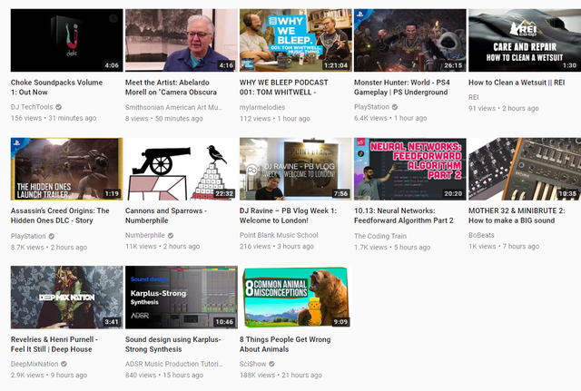
Looking at Youtube, you can easily spot some channels that are professional enough to have a brand design. Brands like "The Coding Train", "Deep Mix Nation", "ADSR" or "SciShow". All these brand designs work at any size and are easy to remember and recognize. Observe how most of them use huge font sizes, so you can still read the message. This is important because most people will look at the thumbnail first.
Make sure that you settle for one style that is very precise to what you what the audience to know or feel about you and your content. Unless you are a great actor, your content and your personality will probably match. So you can use your personal trades often also as the brand trades. Here are some possible choices:
Does your content / do you feel:
- soft or hard?
- steady or wild?
- colorful or mute?
- natural or tech?
- mild or aggressive?
Let's say you are a kind person that posts a lot about living in and with nature. So the qualities would most likely be soft, steady, somewhat colorful, natural and mild.
Let's head over to Canva.com to start our design process. Be sure you open this in a second window or tab, so you can switch back and forth between this post and your design. If you are totally new to Canva, have a look at my post Design Basics #04 - Using Canva
Step 2 : Choosing a base design
So far we searched on youtube and pinterest to get some inspiration. We took time to think about our style and who we want to be. Now we are going to shape this into a design. Again, for our example we chose these qualities: soft, steady, somewhat colorful, natural and mild.
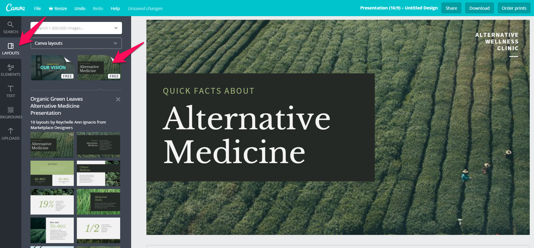
On the Canva page under "Create a design" in the top bar, we select "Presentation 16:9". We click that and scroll through the pre-made designs on the left, to see if anything comes close to what we need.
"Alternative Medicine" looks promising. There are some elements i don't like yet, but we can fix that. If you choose a design, always check for these factors:
- varying text amounts can fit
- it works with a lot of pictures
- the text is easy to read (don't use thin fonts or make them thicker later)
Step 3: Adapting the Shapes
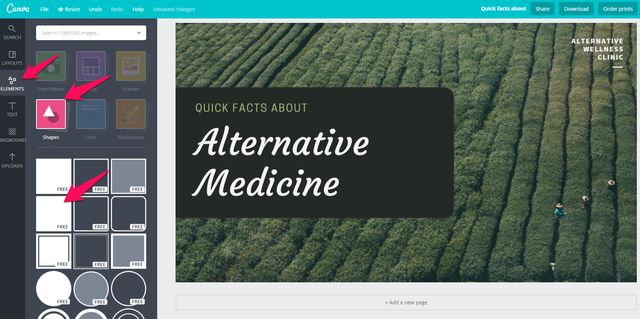
I think we need a design that is a bit more playful and open. So I went ahead and exchanged the rectangle in the back with one that has rounded edges. To do this, first delete the shape in the back by clicking on it, then click on the "dumpster" icon in the top right of the window. I also chose "Courgette" as the main font and "Copper Hewitt" as the second font.
Step 4: Choose a photo
It's time we choose a photo that is somewhat exemplary for all other photos we are going to use. They don't all have to be the same, but they should all work with the design. So if you have much variation in your photos, test several of them with your design and adapt it accordingly. Good & free photos can be found at unsplash.com
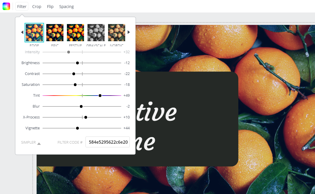
I selected a nice, colorful photo of oranges. On Canva.com click in the left, grey bar on "uploads" and upload the file. Drag it onto the background. Click the photo and then click on "Filter" in the menu at the top of the white area. Click on "Advanced Options". I set the filters as you can see in the pictures. You can use the Filter Code "584e5295622c6e20" to get the exact same results.
I set the filters in way that make the photo softer and a bit old-schoolish, to fit the character of our example brand we selected in Step 1
Step 5: Tweaking the design
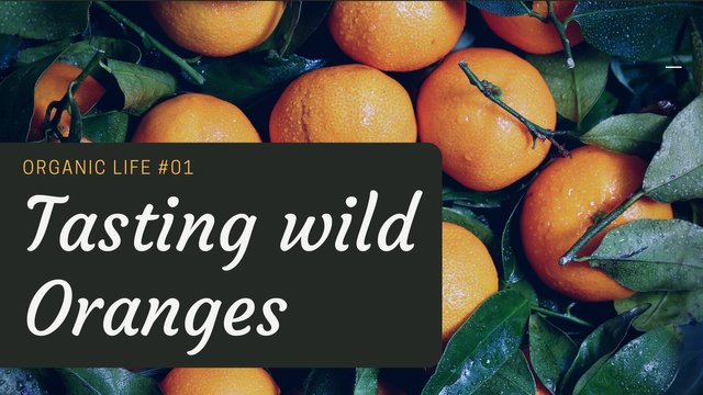
Upon seeing the design in combination with the oranges, i decide that the color of the second font will be matching evey photo i use in the future. The text on the top right has to go and the text in the left box needs to fit better into the box. Also the box needs to be a bit lower and bigger. Also the box in the back needs a bit more of a blueish hue in it's gray to fit the retro effect on the photo. I set it to color code 232729 - To do this click: box -> click the color in top left of white area -> click the plus sign in the pop-down window -> copy & paste color code
After playing a bit around with the design. I decided the text needs to be even bigger and it is a ok solution to adapt the background box a bit to different text size. Yes, you can't fit many words into this design, but remember: You need to be very precise with you message.
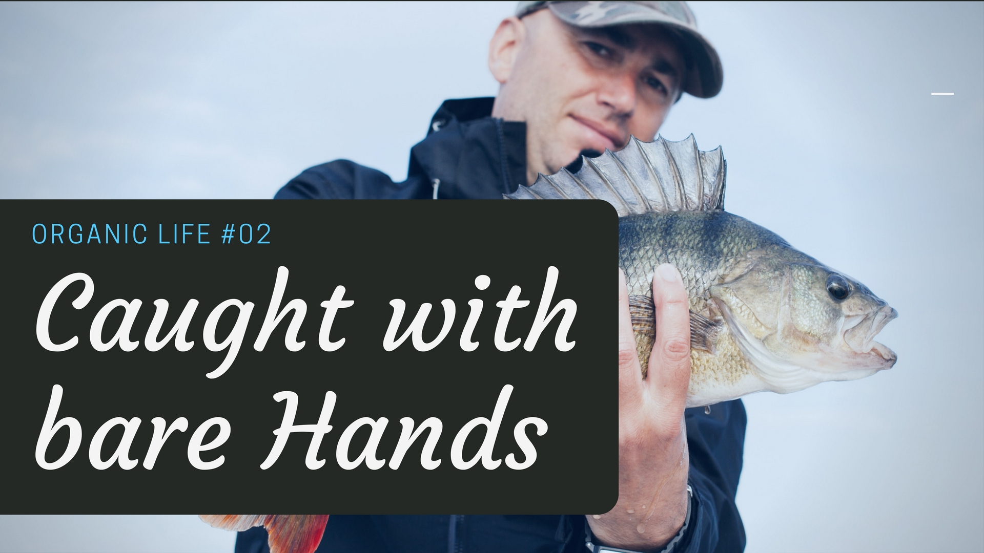
Observe how our photo filter gives every image the same feel, regardless of their original color scheme.
The text might look a bit too large, but remember: It needs to work in the Thumbnail too - and that is only 130 px wide on Steemit.

Photo sources:
https://unsplash.com/photos/GTHUUAtOZ-U
https://unsplash.com/photos/VBi_S5K9dsM
https://unsplash.com/photos/Zh6C3GydNBA
I think we created a beautiful, relaxed and recognizable design in just 5 quick Steps.
Post your own creations in the comments
Make your own design and post it here. I will give you some feedback on it.
Thank you for reading. Use the comments to ask and share your thoughts :)
Find all posts of the Series here:



Fantastic tutorial, I use Adobe Spark post to create my images. I would try to use pictures from unsplash more often.
Thank you. I'm doing video tutorials now. A lot of that can be translated to Photoshop and other Adobe software too
Congratulations @multi4g! You have completed some achievement on Steemit and have been rewarded with new badge(s) :
Click on any badge to view your own Board of Honor on SteemitBoard.
For more information about SteemitBoard, click here
If you no longer want to receive notifications, reply to this comment with the word
STOPCongratulations! This post has been upvoted from the communal account, @minnowsupport, by multi4g [same on steemit] from the Minnow Support Project. It's a witness project run by aggroed, ausbitbank, teamsteem, theprophet0, someguy123, neoxian, followbtcnews, and netuoso. The goal is to help Steemit grow by supporting Minnows. Please find us at the Peace, Abundance, and Liberty Network (PALnet) Discord Channel. It's a completely public and open space to all members of the Steemit community who voluntarily choose to be there.
If you would like to delegate to the Minnow Support Project you can do so by clicking on the following links: 50SP, 100SP, 250SP, 500SP, 1000SP, 5000SP.
Be sure to leave at least 50SP undelegated on your account.
Many thanks for the practical design tips with excellent examples.
thank you :) feel free to ask, if you run into problems
Great work here. I've never actually used Canva before, it looks pretty cool. I'm pretty well stuck in my Photoshop rut though :)
Thank you. Canva is great, but of course photoshop is a lot better. That said canva can be used across teams on many devices. So it has it's benefits too :)