Design Basics #01 - How to select a picture
Here are some easy to follow basics, if you want to design your own cover art for your book, music, cd, video, post, ect.
It's all about emotion
The first thing to keep in mind when creating a design is: You want to inspire emotion in the viewer who looks at your design. So, when you select a picture look for these qualities:
- Does the color scheme fit your purpose (cold, warm, natural, technical, flashy, simplistic, ect.)?
- Does the scene in the picture tell a story that fits what you want to express with it?
- Is the scene interesting and do you want to delve into it (do you want to be there? do you want to explore it?)?
Weight of a picture
Now that we have cleared what kind of picture content you are looking for, you should also keep in mind that pictures have a weight. In general there are 2 kinds of pictures: centered and uncentered
Centered pictures
If a picture is centered - meaning it's main element is dead center, it is perceived in ways like static, powerful, intimidating, strong, aggressive, dominant. You only want to use these kinds of photos if any of these characteristics apply.
Look at the 2 photos below and write in the comments in one sentence what kind of story you would imagine when seeing them (this is a good exercise for everybody - so please share your experience)
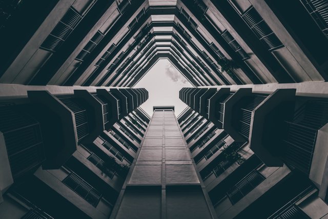
photo source unsplash.com

photo source unsplash.com
Uncentered pictures
If a picture is uncentered - meaning it's main element is off to one side of the picture, it is perceived in ways like dynamic, fluent, soft, moving, accessible, inviting, open, approachable. People appear to be kinder, more creative, even artistic.
Again: Look at the 2 photos below and write in the comments in one sentence what kind of story you would imagine when seeing them (this is a good exercise for everybody - so please share your experience)
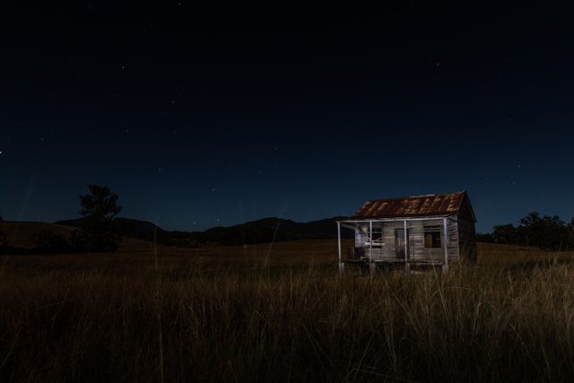
photo source unsplash.com
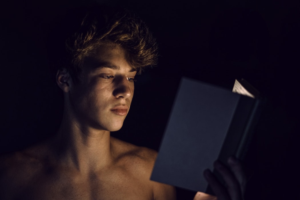
photo source unsplash.com
Space for your Text
Now that we have decided on the color, content and weight of the picture, we should keep in mind, that we need space for our text. So you should select a picture that is rather simple or at least has enough space where nothing (or little) is going on, where you can put your text. Otherwise the eyes of the viewer will be distracted by all the information in the picture and find it hard to read your text. Also keep in mind, while your title might be huge, the other text, like author names, genre, label, logos, ect. are much smaller and need a place with little to no action in the background.
Example 1
There is way too much going on in this picture to place text anywhere. The only way to use this, is to put either a solid color box behind the text, or a solid color above or below the picture. Unless you absolutely need a picture like that, it's not a good choice.
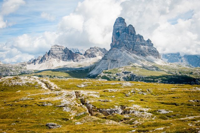
photo source unsplash.com
Example 2
In this picture you have a lot of space above or below the mountain to put your text. Of course you also need to decide where to use the picture. On youtube you need a picture that is wide, not high. So this would be a problem. But for a e-book cover this picture is good.
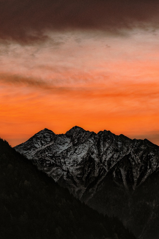
photo source unsplash.com
Faces stimulate emotion
Lastly, you should consider to have a face in your picture. Because we humans connect to faces - looking at a face always triggers an emotional reaction. If you use your own face, for example for a dtube cover, keep in mind to make the face expression that you want viewers to feel - and make your face as big as possible in that picture (because thumbnails are small and you still want people to understand the face expression).
Example 3
Here is a picture of a dog. As you can see, there is lots of space for text. But you can also see that you automatically feel emotions when looking at the eyes of the dog. And because the dog is of center, he feels approachable and soft. You want to cuddle him - at least i want to :)
Btw: Here is an extra insight -> Left in pictures is in most cases HOME and Right is in most cases AWAY. So if a person enters from the left, they are going away (leaving home) and if they enter from the right, they are coming home (leaving from the place away). So in this case the dog is looking AWAY. You experience the dog as close to you, even your dog, and he is looking into the wild. Would the dog be on the right looking to the left, he would be in the wild and looking towards home. If you have problems understanding this, imagine two lines: One going from top left to bottom right and one going from bottom left to top right. The first you will experience as falling, the second as rising. This is because we see left as where something starts (it's home) and right as where it ends up (away). Accordingly any graphic of time progression or development goes from left to right.
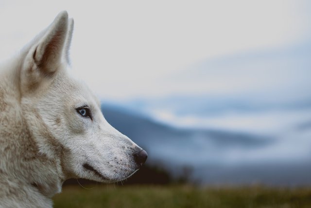
photo source unsplash.com
With is, i conclude my first episode of the Design Guide. Feel free to ask questions in the comments or post picture links to get some feedback.
Please support this project with a Upvote or resteem - it would help me a lot
Also consider following me, so you don't miss the rest of this series.
This Series was written for the @thewritersblock - if you are a writer of poems, novels & fiction, join us.
I love this. Thank you! I'm not a writer, but it gives some interesting concepts to photography and wanting to share a story without words.
Thank you. I didn't even think about that. In the next parts of this Series there will be some more stuff that is interesting for photographers :) Feel free to suggest topics :)
Sorry I am slow replying here. Things were insane last night. This article has a lot of useful info in it. I suspect I need to redo my Misty Vale cover art for more reasons than I first thought. Thank you!!
Don't worry, and thank you for all your help! If you want you can send me the cover on discord and i can have a look at it and give you some feedback. :)
Nice article! I am a photographer some of them i already new but some not!!
Thank you!
Thank you. That's why we are on Steemit. Feel free to share you knowledge here in the comments. I'm sure there is a lot i don't know either :)
Great job! thank you.
you are welcome :)