CopenSteem logo
My talent for procrastination knows no boundary. Yesterday I made a first page in a new comic even though I already are am doing a long story about Phill from GCHQ. Today I made a logo for the Copensteem meeting that @meanmommy33 is organizing.
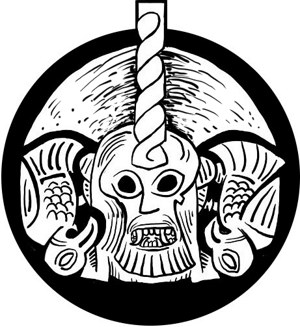
Here it is:
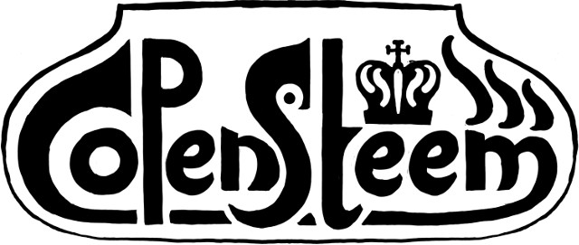
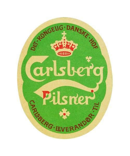
The logo is still a sketch. It is drawn in freehand and in the style called skønvirke, a Danish variant of art nouveau. It is know from the label of the Carlsberg beer made by the fabulous artist Thorvald Bindesbøll which my logo very much refers to.
It also reminds me of the strange Cartoonist Storm P.
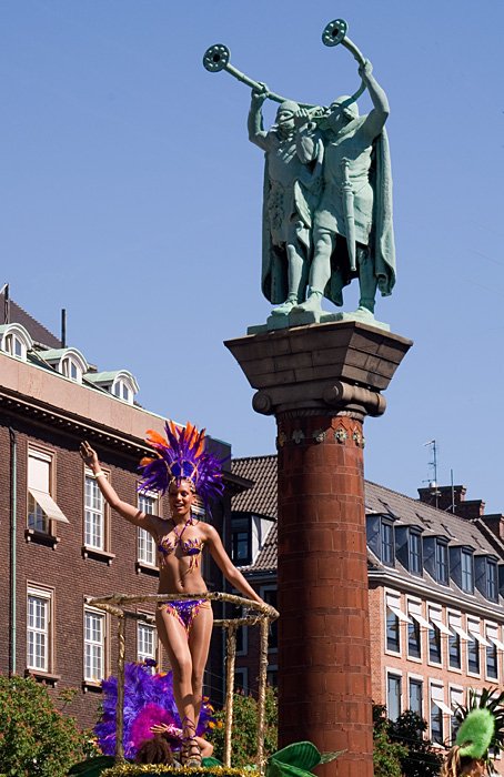
It incorporates the Steemit logo and a Danish crown with stylished steemit flames inside, because... crowns always make things look good. The top of the capital C and S could also be lurs an ancient blowing horn from the bronze age. In the city hall square there is a statue of two men blowing in these instruments.

AWESOME !!!! Oh, @creutzy is a co-organizer by the way ;))) Hehe!
Can't wait! Let the Steem start flowing in CPH! :D
Never even saw the profile of @creutzy - I added him.
He's pretty awesome ;) thanks!
I like it. Should have some colours though? Red, white and blue, just to make steemish and danish even more :)
I always make logos and the like in black and white - then I am sure it can be used for all print-methids and that it works in its most basic form. Adding colours are easy. Here's a fast red one.
Looks better! Adding blue to the Steem above the "M" would look a bit weird right?
You always have to try to see how it works. It's a bit unbalanced.
Yes, I agree, but at least we tried ;)
Agreed! :D
great steemfest.......
thank's for sharing