My entry for Decentmemes.com Logo Contest
Hi everyone, there is a new contest for creating a logo. You can join if you want here.
The name stands for both decent and decentralized and the project focuses on original texts on the memes and manual curation with a future bot that rewards authors that have proven themselves not to try anything fishy! You can read more about upcoming features in the announcement post here.
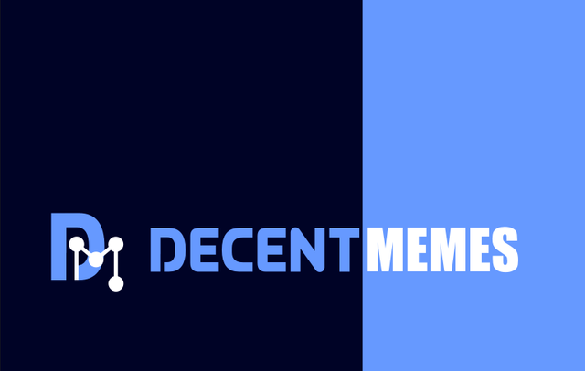
I decided to make a simple logo connecting D and M from the title. The idea is about decentralization, so M is made of connected dots. For "memes" I used font Impact, which is one of the most used fonts for memes. The website DecentMemes.com is dark, so I prepared a version which would fit into it. There is also a version for white background.
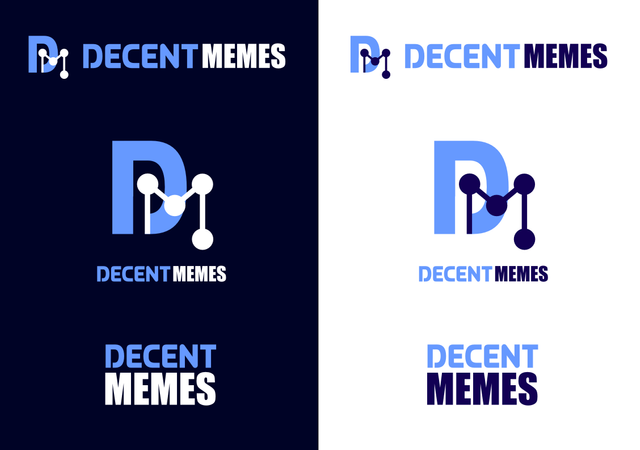
I made also one more simpler variant....
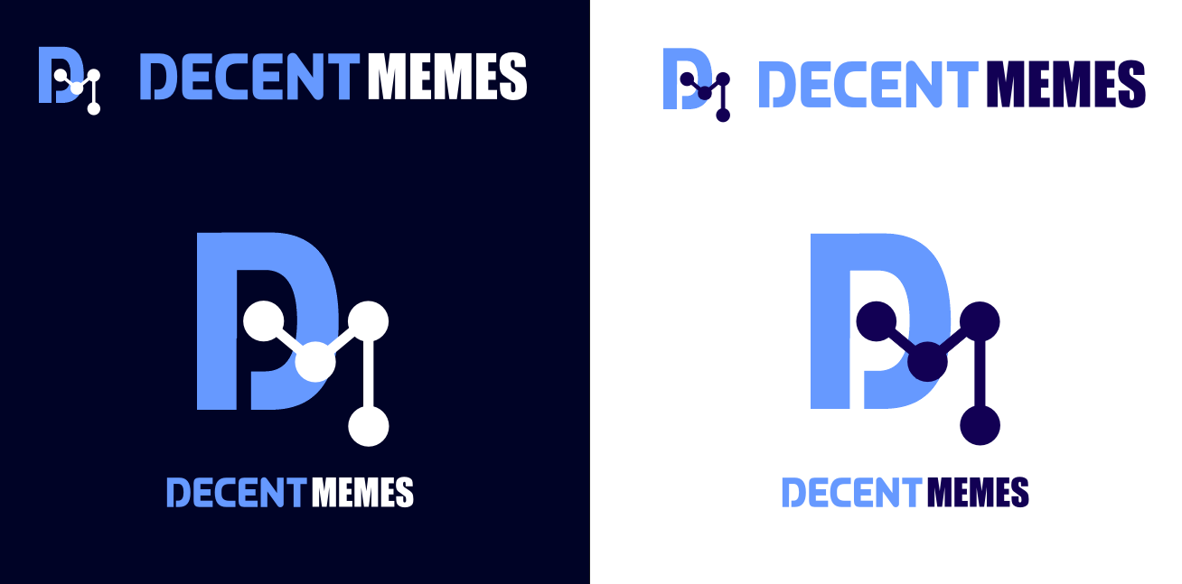
Here are the files in png.


Thanks for watching!
Follow me on Steemit
What is that first font? I get the inclusion of the IMPACT font. I think maybe an all impact font version could look good too unless you really want to differentiate the two elements.
I like the difference between fonts, it gives it something interesting.. the second font is Queen of Camelot :)
Also! I think you entry is one of the best. I see other designs with that god damn pepe frog thing. Not sure the word "decent" goes with that thing.
thanks so much :) I think there will be more good entries, its enough time..
I also think pepe is not a good choice... we shouldnt make a mascot for all memes from just one... it should be more neutral and the fact of decentralization should be highlighted..
The political significance of that frog is hard to ignore. I think alt-right when I see that, it seems to be their mascot but I will have to double check that one.
Awesome logo! Well done! <3