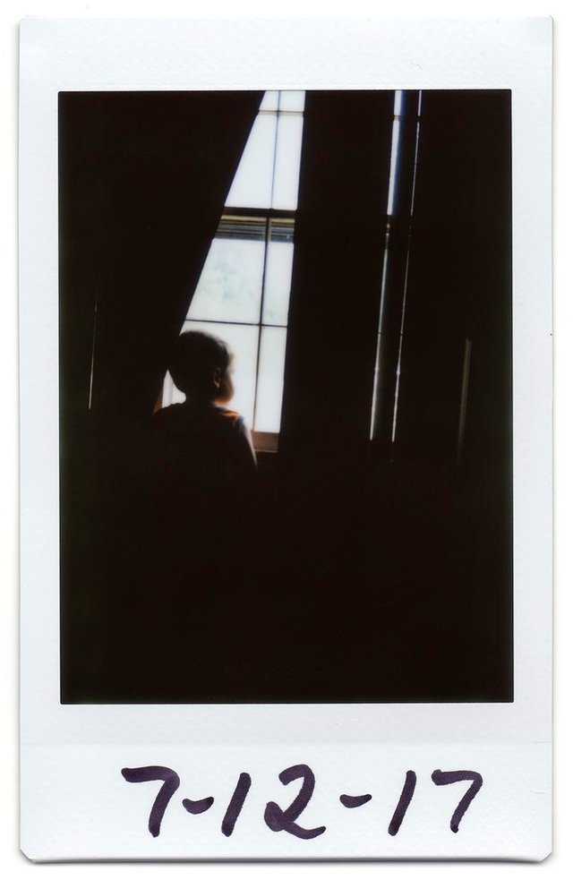
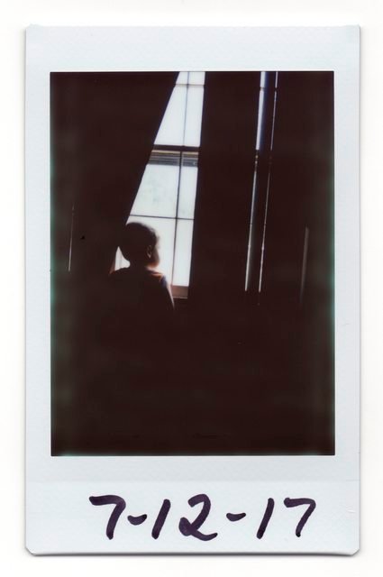
THE DAILY POLAROID :: 006 :: The Window

EDIT: After allowing the photo several more minutes to finish developing, I decided to scan it again and update this post. I found that the black levels in the shadowed areas were much richer and more evenly distributed (as was originally intended when I shot it), lending to a much more pleasant over all feel.
Here's what it looked like before the post edit:


If you like this article then click here to read more about the subject.
Nice photo. I like the polaroid theme. Very retro and cool
Super! You rock!