Neptune's Mug: Learning GIMP #2
I'm not done with learning GIMP yet, and as long as I'm still learning new techniques and refreshing old ones, you're welcome to join me on my journey.
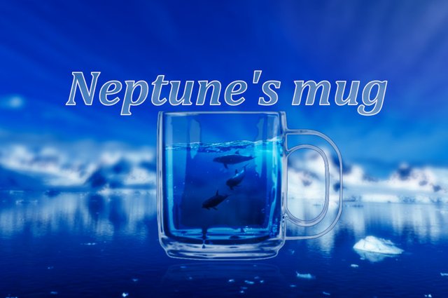
Neptune's mug
With a couple of hours to myself (a rare luxury nowadays), I started up GIMP again and thought of something to try out. Something I've seen done many times before, but never tried myself, is the art of capturing a bit of underwater life in a glass or bottle. This is going to be a study of methods and techniques, not of composition; I just want to get a feel of working with GIMP and discover how different it is when compared to Adobe Photoshop. When the general idea is in your mind's eye, the hunt for free to use source images begins.
I really liked this picture the second I saw it, and it also has that cold freezing temperature to it; perfect for what I have in mind. This will be the background:
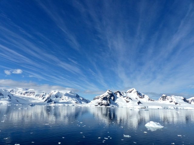
Background - source: Max Pixel
I found this picture of a glass in .png format, so I thought it was going to be translucent already, but it wasn't; we'll have to find a way to "fake" that for the final image:
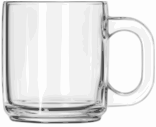
Mug - source: Wikimedia Commons
For there to be some aquatic life inside the glass, this picture of three dolphins photographed underwater will do nicely, especially because the blue hue already closely matches that of the water picture I found:
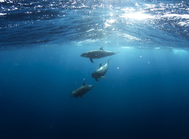
Dolphins - source: Max Pixel
Here it is; the picture of water, with surface and partly underwater, as seen through glass:
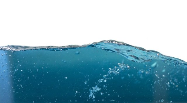
Water - source: Pixabay
We'll start with the mug, as it will be literally containing the foreground material inside it. After we duplicate the layer, we choose the "Scale tool" and shrink the glass, and then we move it to the desired spot with the "Move tool". We must create a layer mask to hide all the white and make it translucent. In GIMP we choose the "Select by color tool" and click on any white part of the layer to select every white pixel. Then we right-click on the layer and select "Add layer mask", choosing "Selection" from the dialogue box. I've also placed a layer behind it, filled with gray, just to make it visible and see what I'm doing in the next steps.
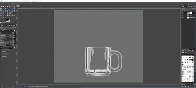
Masked Mug
The next step is to drag and drop the water image into the composition; we can just drop it on top of the other layers, as we'll be using a special blending mode for that layer to make it blend in with the glass; I initially used "Multiply" from the layer dialogue in the top-right corner of my work-space, to be able to see through the water while editing it's layer mask. After adding the layer mask, choosing "White" from it's dialogue box to make everything visible, grab the brush with a soft edge and start painting the mask black, only leaving the inside of the mug white:
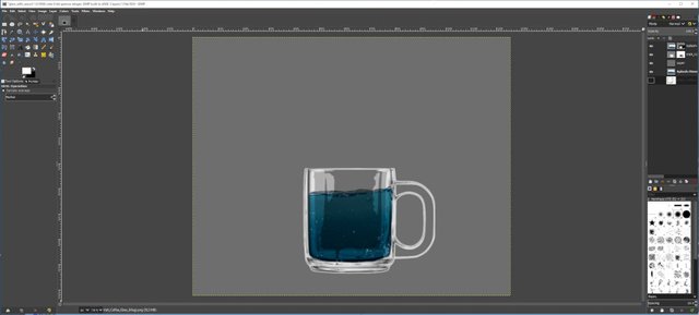
Add Water
This is already starting to look like something... Next phase is dragging in the dolphins, resizing and moving them. I've now changed the layer blending mode of both this layer and the water layer to "overlay", and essentially duplicated the mask from the water layer, where I already masked out the inside of the mug:
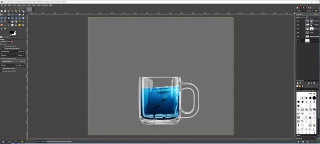
Add Life
We're ready to place the background behind the glass, but first I grouped all three layers with the filled glass, made a copy of that group and merged the layers in the copied group to make one layer that contains the mug-composition. And than I copied that merged layer again, to correct a mistake I made in the thinking process: I want the water and the glass both to be semi-transparent, but not the dolphins! I needed the extra layer to cut out just the dolphins, to achieve this effect:
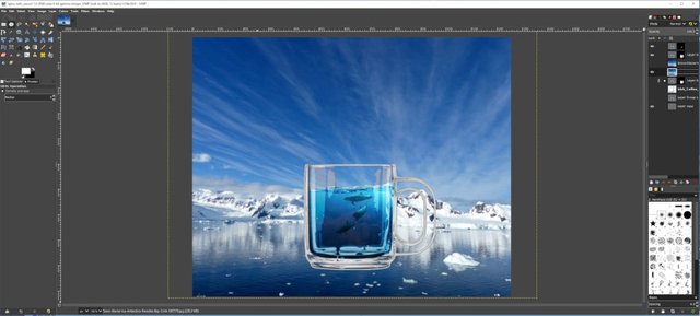
Add Background
The background itself I also copied, and applied a heavy "Gaussian blur" from the "filter" menu:
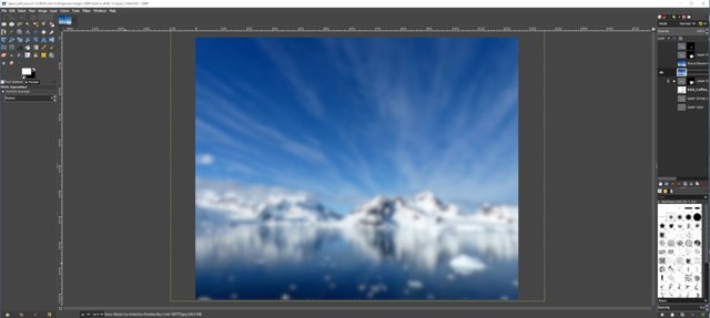
Apply Blur
The focused background image is on top, so we add a layer mask to that layer and click the mask to make sure we're working on the mask, and not the image itself. With the "Gradient tool" we paint a black-to-white gradient on the mask, to only reveal the lover part of the focused layer, so the water beneath the glass is in focus only, and the upper three quarters of the background is blurred with the blur gradually fading in:
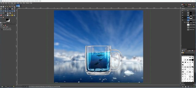
Add Shallow Depth Of Field
If you look closely at the next image, you'll see a very faint reflection of the mug in the water beneath it; I'm not going to explain that in detail, but it's just a vertically flipped copy of the mug-composition with a very low opacity to make it almost completely transparent. The important thing about this next step is the addition of a sky-blue layer on top, which makes everything blend in better. The blending mode is set to "Overlay" again, and I added a layer mask with a radial black-to-white gradient in the top-right corner, to keep that corner slightly lighter by excluding the blue overlay there. This overlay also gives the mug's glass that blue-ish shine:
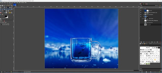
Add Blue Overlay
We're almost done! We select the "Text tool", choose a bold font and type in something that comes to mind:
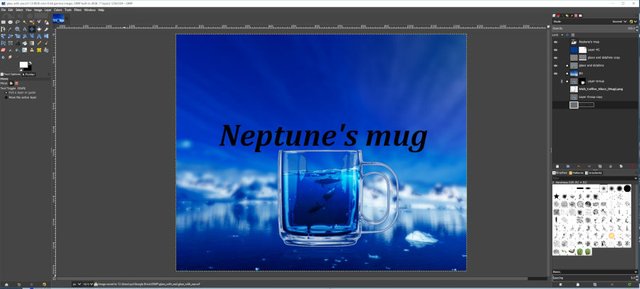
Add Text
This is a bit boring though, so we'll spice it up a little. Right-click on the text layer and select "Alpha to selection" to turn the text into a selection, and hide the text layer itself by clicking on the eye-symbol in front of it in the layer dialogue on the right. We're going to make the text part of the background, but lighter. We'do this by clicking on the blue overlay layer's mask, so we can hide the text on that layer: select the "Bucket fill tool" and click inside the selected text to fill it with black. Then we add a new layer on top to make the white outline on it.
Initially I outlined the text by selecting "Stroke selection" from the "Edit" menu, but this resulted in a lot of jagged edges in the white lines, even with "Anti aliasing" checked. Much better results I got from choosing "To path" from the "Select" menu first, and then "Stroke path" from the "Edit" menu:
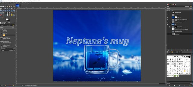
Almost Done
The only things left to do to get to the final result were to lower the opacity on the mug-composition some more to see the background through the water (everything except the dolphins, remember?), and add opacity to the reflection I made in the water beneath the mug. As a final step I cropped the image to be more of a landscape composition.
I must say that GIMP doesn't disappoint so far. Photoshop is a lot faster, that's for sure; some actions do take a while to perform when working with higher resolution images in GIMP. Also this project took almost double the time because I never saved my progress on the first try, and GIMP crashed during a resize operation... Let this be a lesson: ALWAYS save your progress regularly! ;-) On the second try it took me almost an hour; I didn't tell you about the small touch-ups I had to make to each mask, as the "Select by color tool" and other selection tools aren't perfect. This is also a reason to always work non-destructively by duplicating each layer and working with layer masks, as opposed to actually erasing pixels from the layer; a mistakenly erased part on the mask can easily be painted back in with a white brush :-)

Netptune's Mug
Not perfect, again, but I'm still glad with the end result. I should work on the mask from the mug; notice the dark lines around the light reflections above the water surface. Also the glass itself looks a bit fake because there's no distortion whatsoever visible looking through it. I could mask that out and add another copy of the background image, but slightly reduced in size so everything behind glass looks smaller. And this should also have a "vignette"... But I'm sure you can figure that one out all by yourself now ;-)
Thanks so much for visiting my blog and reading my posts dear reader, I appreciate that a lot :-) If you like my content, please consider leaving a comment, upvote or resteem. I'll be back here tomorrow and sincerely hope you'll join me. Until then, keep steeming!

Recent articles you might be interested in:
| Latest article >>>>>>>>>>> | Dicktor Van Doomcock Defends Geek Culture |
|---|---|
| Camel Inspired | Banksters Paradise |
| End Of Days | Don't Trust The Car Mechanic! |
| World On Fire | The Phantom Of Entitlement |

Thanks for stopping by and reading. If you really liked this content, if you disagree (or if you do agree), please leave a comment. Of course, upvotes, follows, resteems are all greatly appreciated, but nothing brings me and you more growth than sharing our ideas. It's what Steemit is made for!


Just for Full Disclosure, I'm invested in these crypto-currencies:
Bitcoin | Litecoin | EOS | OmiseGo | FunFair | KIN | Pillar | DENT | Polymath | XDCE | 0x | Decred | Ethereum | Carmel | XYO

@helpie is a WITNESS now! So please help @helpie help you by voting for us here!

This is good man. Really good.
Steem on
Blessings
Thanks so much for the kind response @iamthegray :-)
Hello @zyx066, thank you for sharing this creative work! We just stopped by to say that you've been upvoted by the @creativecrypto magazine. The Creative Crypto is all about art on the blockchain and learning from creatives like you. Looking forward to crossing paths again soon. Steem on!
Thanks so much for this support @creativecrypto, it's an honor! :-)
Nice idea and realisation. The blue overlay did all the magic :)
Thanks so much for the response @dalz, I really appreciate that :-) And yes; the overlay blends everything in nicely. But it's clear that I need more practice...
Congratulations! Your post has been selected as a daily Steemit truffle! It is listed on rank 16 of all contributions awarded today. You can find the TOP DAILY TRUFFLE PICKS HERE.
I upvoted your contribution because to my mind your post is at least 9 SBD worth and should receive 146 votes. It's now up to the lovely Steemit community to make this come true.
I am
TrufflePig, an Artificial Intelligence Bot that helps minnows and content curators using Machine Learning. If you are curious how I select content, you can find an explanation here!Have a nice day and sincerely yours,

TrufflePigThank so much for the support @trufflepig! :-)
Hi @zyx066!
Your post was upvoted by @steem-ua, new Steem dApp, using UserAuthority for algorithmic post curation!
Your UA account score is currently 3.500 which ranks you at #6465 across all Steem accounts.
Your rank has improved 73 places in the last three days (old rank 6538).
In our last Algorithmic Curation Round, consisting of 405 contributions, your post is ranked at #179.
Evaluation of your UA score:
Feel free to join our @steem-ua Discord server