We draw the letter E- CONTEST
Hi my Steemit friends,
I missed the Letter D Contest but for this next round I made sure I will be able to participate. It was a hit or miss that I should admit and see for yourself as you read below the process when I created my entry.
This is my official entry to We Draw The Letter E - CONTEST of @ran.koree
I had to look back and see how was my progress with the previous entries I had done, the B and the C letters. The B is inspired by the banana fruit pretty obvious then the letter C is by an Aztec colors. I wonder now what will the next letter look like. I admire the works of a fellow participant @yangyanje because his or her entries look consistent. I wish I can do something similar.
For this round, my heart is divided. Do I go for a fruit inspired entry or should I continue with the Aztec inspired palette? Honestly, I started with a big circle like how I started with my letter C entry before. I felt hopeless at this point.
It could go bam or dang at this point. Let us see what happens
Yeah, you could have guessed it as I added that part in the middle to make it look like an E. What else?( Yawns) ah random dots here and there let us see.
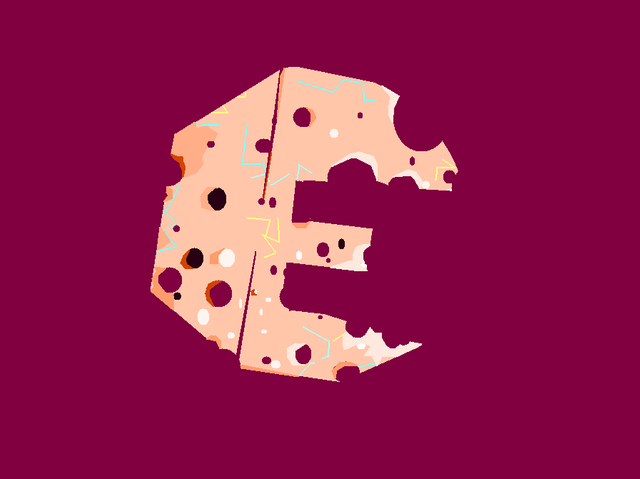
Looking like a moon with craters so I just added those zodiac lines randomly and lazily. It is a come what may at this point. I do not like what is on my screen grrrrr.
Oh that cheesy moon again. I did that already on my letter C entry. Sigh. So I decided to cut the plump edges and turned them into boxy sharp lines. I am liking it at this point. Gave me enough momentum to proceed. I retained the craters and zodiac lines then added some shadows and lights. The crack in the middle helped define the letter E better. That is the most important decision I made for this piece. I am happy now.
The letter is fighting to be recognized still so I decided once again to trim the sides and make them look sharp and linear. Another best decision I made for this entry. I could not be happier. Whew. I almost gave up and might have opted for the previous plump look but I am glad I took that courage to edit some more.
Thank you very much hope you enjoyed reading my journey.
@theithei
Here is the link to @ran.koree post if you want to catch up and join so hurry before it is too late:
https://steemit.com/contest/@ran.koree/we-draw-the-letter-e-contest






Hi @theithei
As a follower of @haccolong this post has been randomly selected and upvoted by @hoaithu's Curation Trail with 20upvotes
This is random free upvote daily when you follow @haccolong
Use Partiko for activities on Steemit, you will receive bonus points. Dowload Partiko app for your phone at here. If you difficulty when convert points (Partiko) to upvote, check the instructions here.

Good details and shaped. Specially like the lines, holes. Colors are great too.
Posted using Partiko iOS
I really like the contrast of the background colors and the letter .... good use ...
You can recognize the letter E ..... good, nice work :)