🗼✉️ Sender-Receiver-Model
Perhaps there is a communication problem....
💻 My laptop is trying to give me so many "important" information with his glowing and blinking icons, but I really don't understand most of them.🏛🇬🇷
Like what does this fancy circle with the "N" in it mean? North?🧭 Why is this crazy machine showing me the north? You are not a compass, silly laptop. Stahp it!
The next big question is, who designed it? Who thought it would be a great idea to make a bar with blinking icons underneath the screen. Just to distract the user and showing useless info... I don't know, but if you are using a similar laptop and you know what this icons mean, let me know. And please tell me if you really need that information.📝
However, back to the project...
So the glowing and blinking icons inspired me to create a picture.💡
(And at this point I'm sure it was not the intention of the laptop designer.)
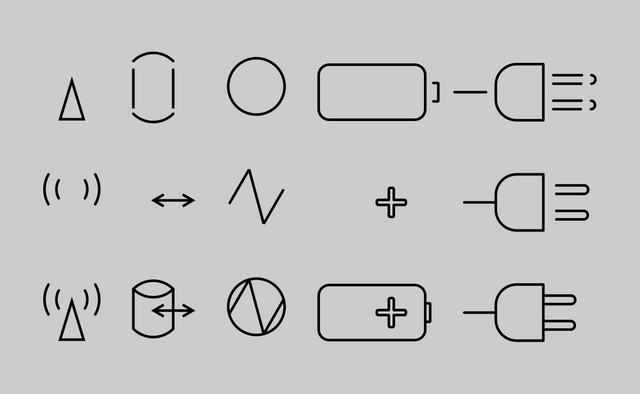
As a first step, I drew the symbols. I have tried to make it as accurately as I could, but also as simple as possible. Not a big deal when working with icons, you know. However, for me it was quite difficult, because I don't have much experience with vector graphic software right now.🐥 And this is the result:
🦶 The next step was to add some nice colors and to figure out, how to let the icons shine. 🎨✨ I had a rough idea where to start, because I've watched one or the other tutorials in the past and I could remember some steps.
(btw when I started to post my stuff on steemit I participated in a competition and I have tried to make some fancy page dividers. They were super fancy, hahaha!)
✔️ After I chose the color I have tried to create a sheen. I copied the icons and added a lighter color to them and then blurred everything. And it looks like this (you can see that I have tried different colors and different blur intensities.)
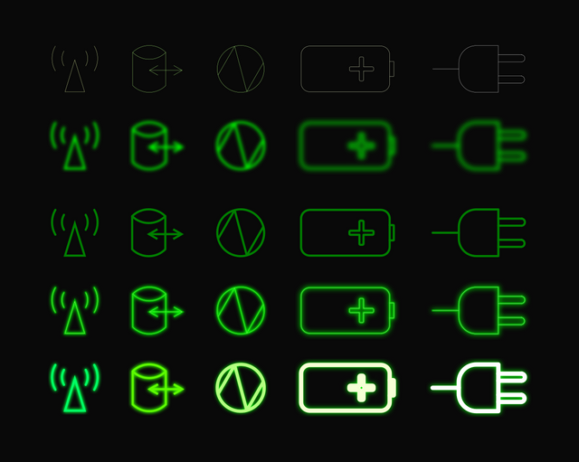
I decided to go with some lighter green shade and not very strong blur. Just a little bit. There...

Unfortunately I had to separate one icon from the others, but it's still sending messages and signals. It needs more space for itself in order to reach its full potential.

⬆️ This icon is sending you sweet kisses and this note:
🥬 🐐💨 🍬
The time has come to fusion everything together. I started with the background to have a reference how dark this picture will turn out. Choosing the right black shade is very important to me and I always try not to use the default black color (#000000) or the default white color (#ffffff) – they are too dominant and absolute I think.
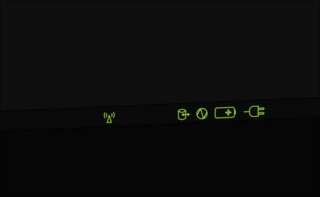
Next step was to tilt the bar with the icons a little bit to add some dimension. To complete the picture I filed the last part with another black shade...
And here it is! The finished product ...
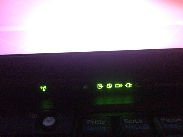
... and the original photography right underneath, so you can compare both directly.
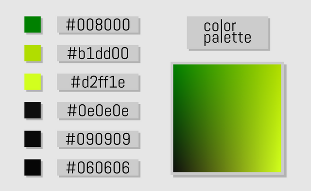
And to complete this whole project I want to share the color palette with you.
More projects like this are planned, and more content is coming soon! To shorten the waiting time feel free to check out my other projects 🍔 especially my last one 🏀.
So see you around!
Cheers!
Thanks for using eSteem!
Your post has been voted as a part of eSteem encouragement program. Keep up the good work! Install Android, iOS Mobile app or Windows, Mac, Linux Surfer app, if you haven't already!
Learn more: https://esteem.app
Join our discord: https://discord.gg/8eHupPq
Thanks for your support and for making steemit a more pleasant experience at all. I'm still fascinated how easy and smooth esteem app works! Just awesome!