Getting to Know Autodesk Sketchbook #1
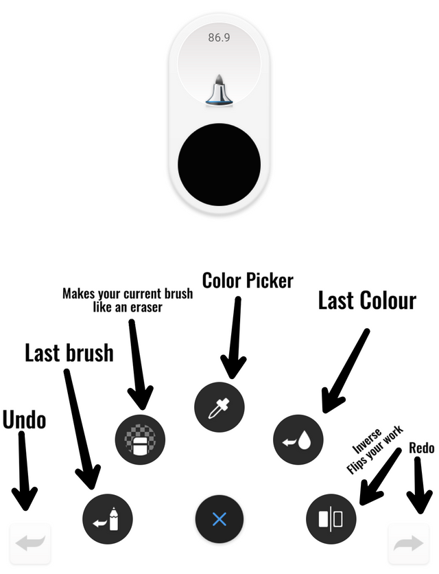
So I figured out that before I exhibit another 'How it's made', it will only be right for me to explain the basics of the app. What good is it to jump before walking eh? And what good is it to explain without no comprehension whatsoever? The aim of this post is to familiarise you with the app so that you can get along nicely. And also, it will be a good reference from me for those who feel lost. Let's get on to it.
Current Version V5.0.2
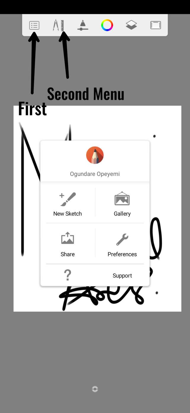
The first menu brings out four major options; New Sketch, Gallery, Share and Preferences. The NEW SKETCH basically allows you to create your own sketch which you can start your work on. There are fixed aspect ratios there, the first of which will depend on your screen resolution, the second allows you to create your custom resolution. Now this custom resolution is what I use the most because it offers me the ability to up the notch a bit higher for quality sketch. Please note that more resolution means you'll have to work with a lot less layers and it will take alot of ram to work efficiently. So be careful when playing with the custom resolution slider. Others apart from the first and second include but not limited to resolutions for Mobile Devices.
Quick tip: Always create a custom resolution with above average quality before starting an artwork. This will help keep the overall quality of the final outcome good.
The GALLERY shows you your toon gallery, those saved in Autodesk - not your phone's gallery. From there you can have access to your completed or not - so - complete artworks to relish or finish the job. Before entering this menu, you will be prompted to either save or discard your current artwork. Saving an Artwork in the gallery may take some significant amount of space in your storage device, nonetheless it is a good way to backup your progress. On devices with 1gb or ram, they may experience some occasional crashes.
The SHARE doesn't have much to it, save your artwork to your device in either png or jpg format. PREFERENCES just gives you the ability to tweak some - not so important - settings. I'd advice you not to touch this.
SELECTION
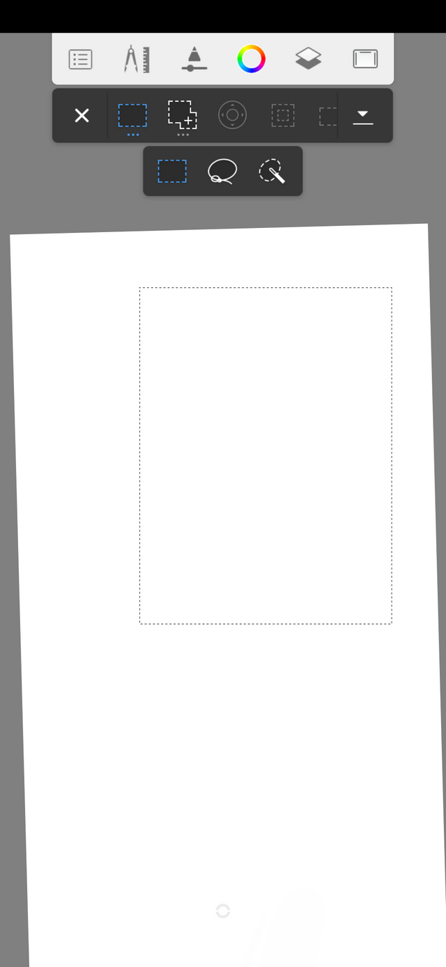
In the second tab is the selection. This selection is very important when you know your way around. It allows you to highlight a section of an image by drawing on the screen. You can either choose a rectangular selection or you can choose the free draw selection mode which provides you more flexibility. After clicking on your preferred section [Rectangle or Lasso], beside it, you'll have to choose your preferred selection mode. By default, it is on REPLACE. What replace actually means that if you draw a subsequent selection after the original, it will erase any selection you have and replace it with the new one. You can, of course, change it to ADD which merges new selection with the previous one (I use it alot because I can't select everything I want at a single stretch and I have to draw in bits to attain a high degree of accuracy while selecting). The REMOVE can also be used to erase certain parts of a selection. REMOVE deletes certain parts of your previous selection when you draw on it.
TRANSFORM
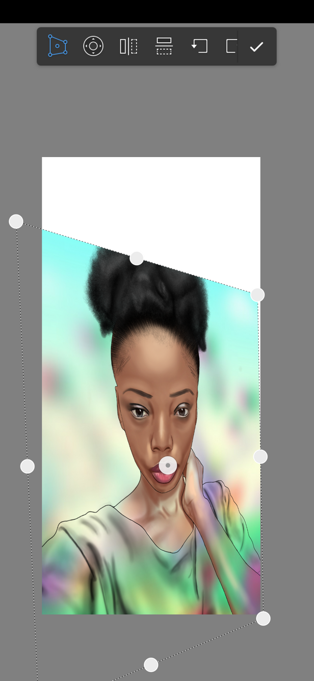
This is not really a complicated option. The first Icon up there is the DISTORT which allows you to change the perspective of an image in every angle. Most times, I use this to integrate my text into an image's perspective so it doesn't look awkward.. So yes, I really only use this for texts. The NUDGE just shows navigation buttons that enables you move the image Up, Down, Left, Right. The next two icons are the FLIP VERTICAL and the FLIP HORIZONTAL which are self explanatory. And with the next two, you will be able to rotate your image anti-clockwise and clockwise respectively.
FILL
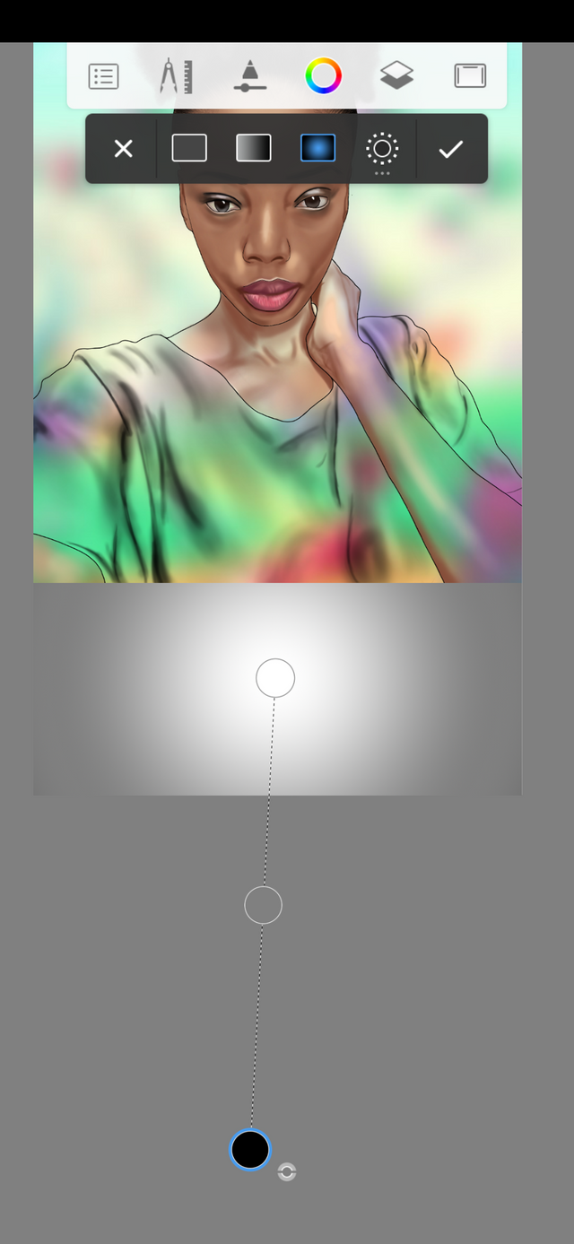
This may strike the average noob as a tricky process, but when you look closely, it's pretty easy. Basically, the fill tool allows you to colorize enclosed areas, ENCLOSED AREAS ONLY. By simply tapping on the area, you get it done but then... If it isn't enclosed, then it fills up the entire image. We have the solid fill gradient fill and the radial fill which all work differently. The gradient and radial fill are quite useful in the making of classic backgrounds, it can offer respite from the conventional solid colour. Right beside everything. The 'sun' icon is the tolerance. Now, it is the tolerance that determines how strongly you fill an area. Increasing the slider to the maximum means that the area you're trying to enclose will be filled with maximum intensity and extreme neatness but the area has to be greatly fenced else it will spill out easily and fill the whole picture. You wouldn't need to use maximum intensity anyways but the higher you go, the more the fill intensifies.
SYMMETRY
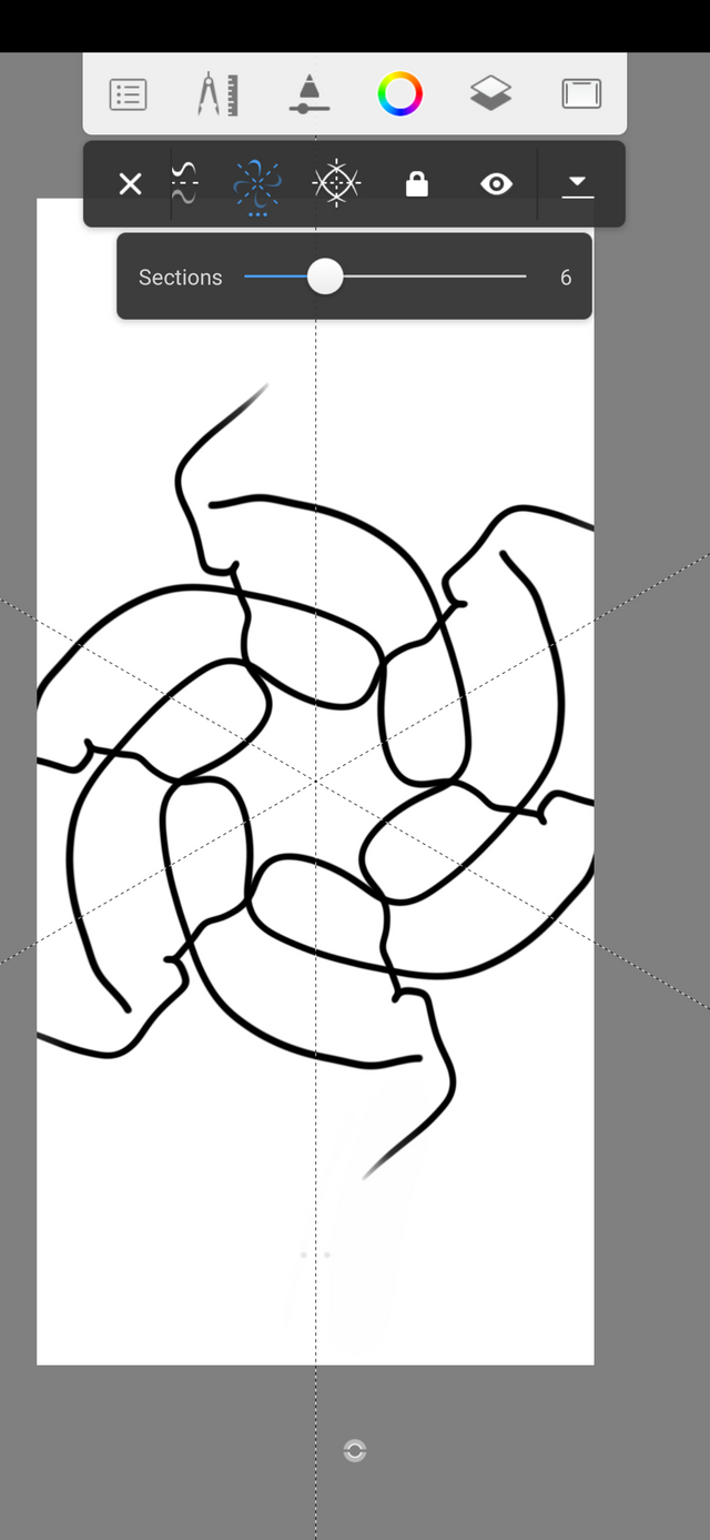
This allows you to draw simultaneously and mirror your actions on sections of your sketch. This feature will come in handy for those who like to draw patterns. If mastered, it can offer you way less time to complete your pattern.
PREDICTIVE STROKE
This helps to straighten up your curves. For those who need to draw straight lines and your hands are shaky, the predictive stroke helps straighten it out.
NB: It doesn't smoothen out your curves but instead tries to straighten it and the higher you turn it up, the more it tries to recognize a curve and correct it.
IMPORT IMAGE
In simple terms tautological terms, you can import an image from your gallery from here. This option is the preferred option for adding an image to a sketch - let's say as a trace. So I create a high quality sketch, and I import an image from here and this way, the quality of the image imported doesn't compromise the quality of the sketch.. Like a standalone irrelevant outsider.
PERSPECTIVE GUIDE
For those who are in depth in outlining and detailing. It takes you to that vantage point where the image can be represented with lines with malleable perspectives.
TEXT
You already know. Sad thing is, Autodesk Sketchbook doesn't have classic, decorative or your favourite kinda font. If t only sports five of the Sans - serif family which to me is very bad. Distortion of text is the only good thing about this.
TIME LAPSE
Record your Autodesk actions in a very fast time lapse. The focus point of the video, however, is only on the sketch and not anything else - not the menu nor your layer tab.
That's it for now, We'll cover more grounds later on.
Thanks for using eSteem!
Your post has been voted as a part of eSteem encouragement program. Keep up the good work! Install Android, iOS Mobile app or Windows, Mac, Linux Surfer app, if you haven't already!
Learn more: https://esteem.app
Join our discord: https://discord.gg/8eHupPq
Congratulations @marvel1206! You received a personal award!
You can view your badges on your Steem Board and compare to others on the Steem Ranking
Vote for @Steemitboard as a witness to get one more award and increased upvotes!