How It's Made #1 : Full Artwork Autodesk Sketchbook
What makes a great arwork? A great deal of patience, observation and of course creativity. Overtime, people have continually asked me how I go about tooning and I try to give them the details. When they make attempts at replicating what I've done, they end up disappointed. But why is that? They forget that Rome is not built in a day, how do you expect to jump from "I-don't-know-how-it's-done" to perfection overnight? My point is, persistence is also an important factor.
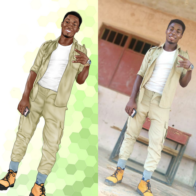
That aside... I try to avoid full pictures as much as possible because they always require twice as much efforts, and twice - if not thrice - of the time spent. And ironically, they don't make the shading, shadows and highlights obvious, like the portrait does .. But getting them was going to be inevitable on the long run.
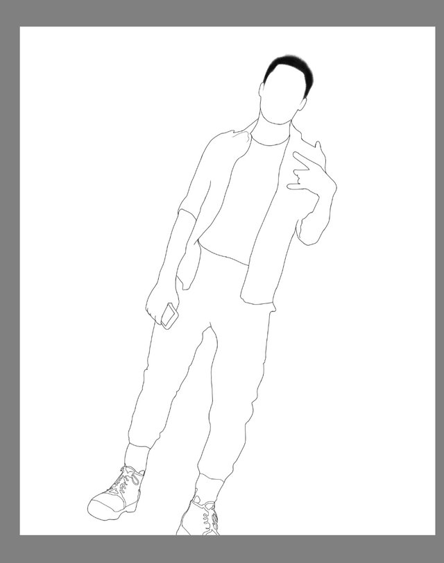
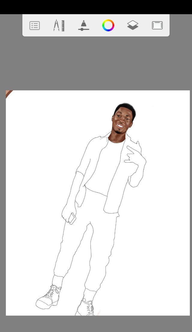
Typically, I start an artwork with the hair.. I give it a nice matching texture with the appropriate details before I move to outline the head. But for this, I strayed a little bit out of the norms. Although I still started with the hair, I didn't stop at the head outline. I outlined the whole body at a stretch, something I do in bits. My reason? I tend to easily get discouraged when working on full pictures so doing this gave me the kind of "I've-gone-this-far" feeling.
I remember when I started sketching and my hands consistently made a mess out of the outlines, I considered getting a stylus pen but the idea fell through. So I improved on my stability until I no longer have to worry about it. Now, this is one of the biggest problems for those getting into it. Messy outline can distort the overall quality of the final image that is why I always encourage people to perfect their flaws bit by bit before attempting a portrait.
Good outline + good texture + bad texture = messy outcome
Bad outline +good shading + good texture = sub-par outcome
Good outline + bad shading + good texture = messy outcome
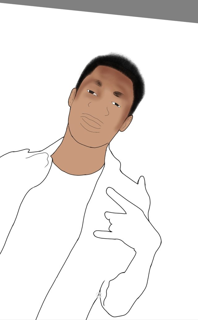
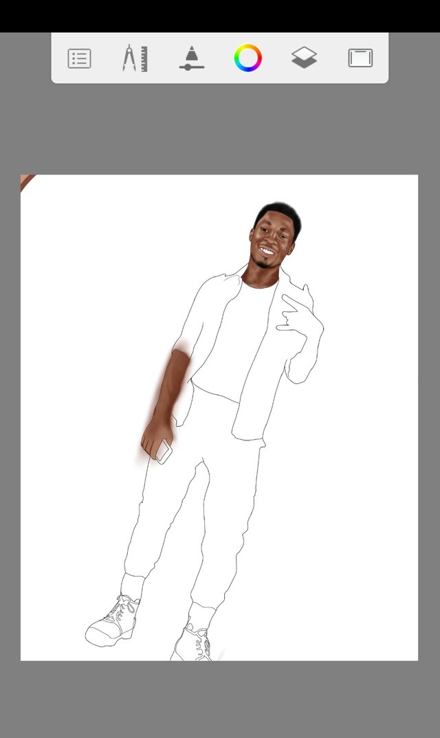
Getting to the shading. I filled the head and neck with a slightly light chocolate colour and I chose a much darker version for the shadows. Something I would have chose before would have been a little bit of dark chocolate but I observed that to get a better outcome, we would need much deeper and darker shades so I went all in. (This was my first attempt at very dark shades).
I must confess at this point, I really considered giving up. This stage discouraged me because I had no idea how the outcome would be. I had to initiate one of Rita Ora's album in order to get me to continue stroking with the hard airbrush (with a highly inconsistent size and opacity). So I continued stroking with the hope that it will get better overtime.
And yes, it got better. The face started to take shape when I got to the mid section. I had filled the eyes and shaded the nose. I always make sure that my shading always make a nice blend. I try to make the dark and light areas all fade into each other as much as possible because the transition is the key when you're looking to shade.
At this point, I had perfected everything about the head, alongside the neck. What did I do? I continued shading as I've been doing with until I was done with the head. I also moved to the lips and shaded with a sort of wine colour (sorry I'm not good with colour names) then I shaded the teeth gum with dark brown - I would have done it with the appropriate colour but I needed something that would be obvious from afar, it is a full portrait afterall.. The beards were the easiest; I just used the HR texture for it and that was it. Then I gave the neck the same dose of hard airbrush. Now the highlights on a norms would have been done with light yellow but hey! For this picture, I was straying from the conventional so.. . I used pure white. Hard airbrush, preferred size and opacity, good to go.
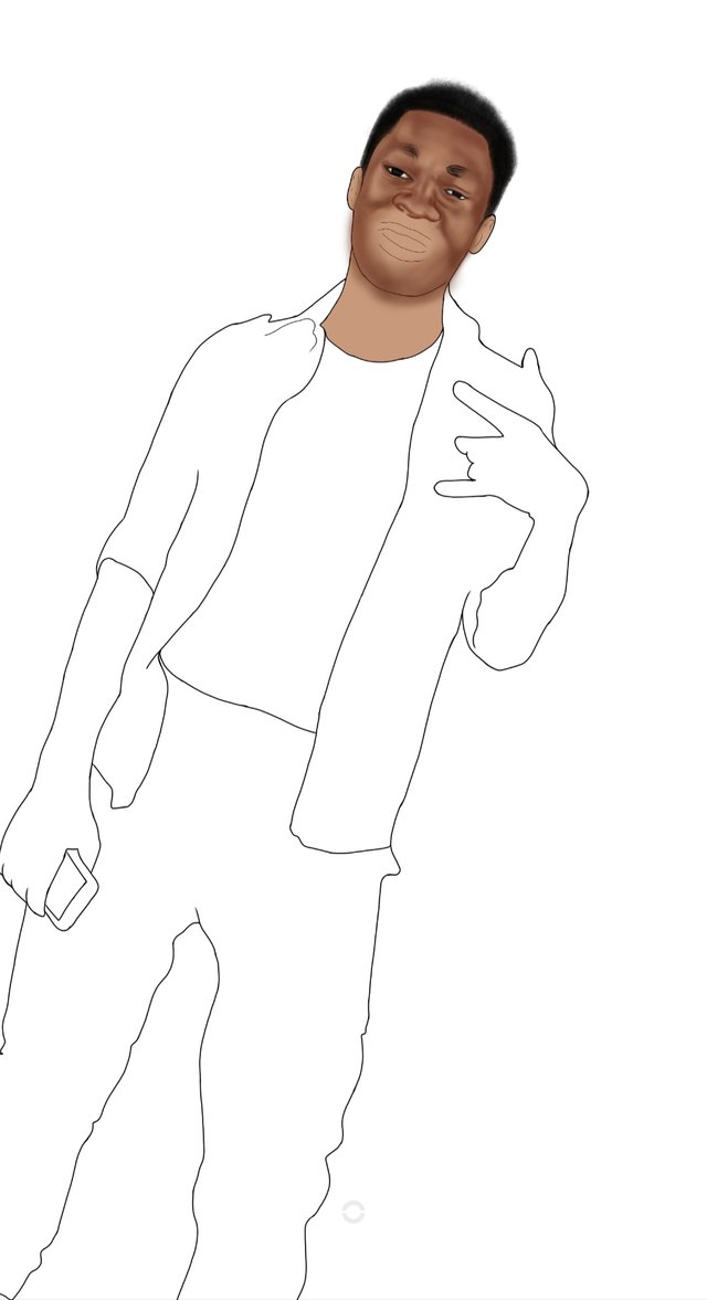
Just look at how awkward the left hand looks like without the wristwatch. Occupational hazard, lol. I had started shading the cloth after filling it with a light green color. The portion I started with on the cloth was the most challenging I must say.
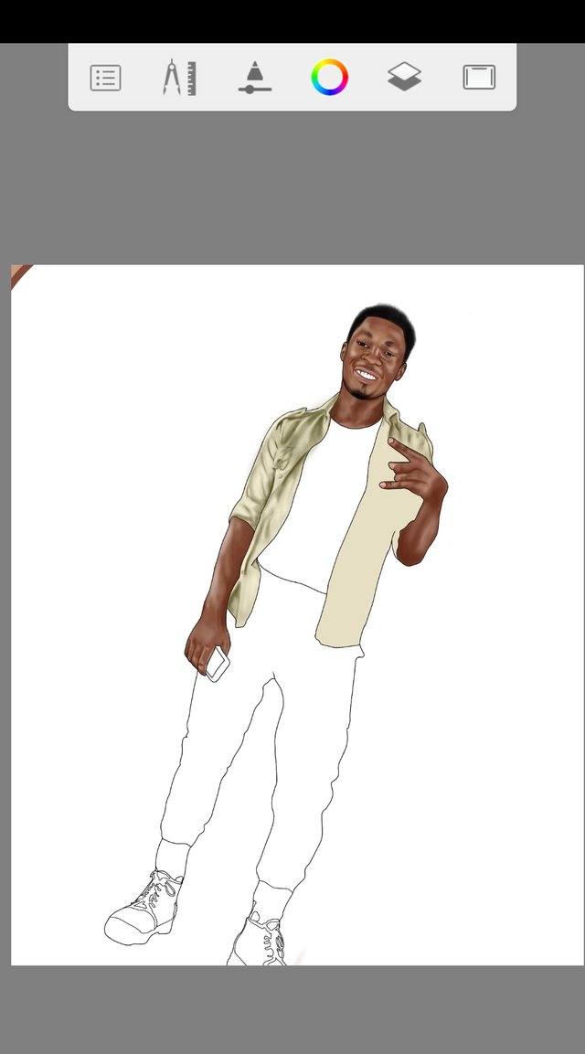
I had to reduce the light green foundation to a little bit dark shade of lemon so as to give room for highlights. The highlights for the cloths would have really been invisible if I had used a light green foundation. And That was it, everything aligned at the end. I used a total of 17 layers for everything.

Stay tuned for more...
AUTODESK SKETCHBOOK
ANDROID
TIME SPENT: 6 HOURS
Thanks for using eSteem!
Your post has been voted as a part of eSteem encouragement program. Keep up the good work! Install Android, iOS Mobile app or Windows, Mac, Linux Surfer app, if you haven't already!
Learn more: https://esteem.app
Join our discord: https://discord.gg/8eHupPq
Thank you!