I Drew Apsu! Coloring in Layers [Photoshop Tutorial]
"He's a pirate, he's an engineer. He's a pirate engineer!" Hello I'm @shello, and this is my entry for the Create @apsu Art Contest. There is about 4 days left, you can read the contest post and enter here!
The goal is to draw, paint, or otherwise make an artwork of Steemian @apsu, although no pictures of him exist on Steemit, nor does anyone here know what he looks like. This is what I came up with yesterday c: I'll also show you how to digitally color a drawing in Photoshop!
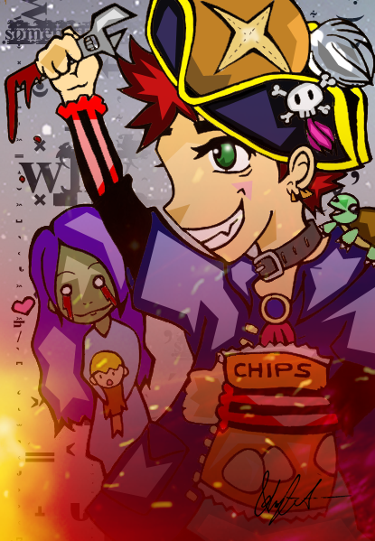
This is my version of him!
To make this picture, I drew and inked it manually, then colored and added effects in Photoshop. A somewhat lengthy adventure, but I love how the style came out. I usually find it easier to say that "I can't draw", rather than explaining how slow I am when it comes to it. Let's go look at the step by step process!
Drawing
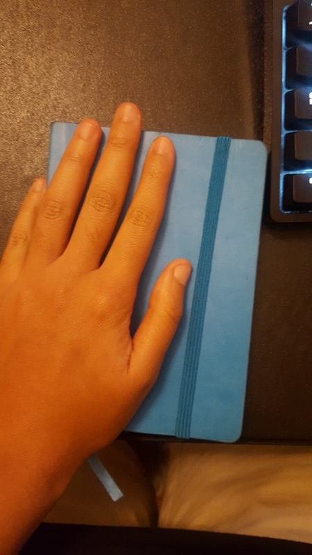
I am using a Pentalic sketchbook a Pentel mechanical pencil, andPilot G2 pen. If you cannot draw with a pen, it is more than likely that the paper's surface area is too bumpy. The pages in the Pentalic book are weighted, almost like card stock, but extremely smooth to allow for remarkably clean erasing.
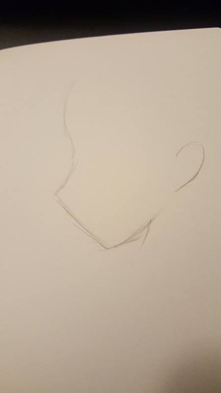
I start by outlining the direction that I want his head to be facing.
The I dropped my pen,
...and it rolled under my desk.
by the time I retrieved it,
the main drawing was done.
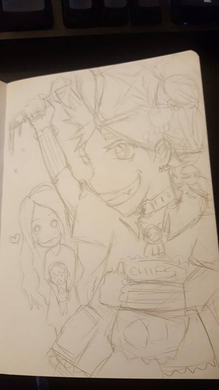
I only use one page, and draw on the fly without a body frame. I did my best to visualize what @apsu's life looks like to me based on his Steemit articles and posts. I alternate between erasing and sketching to get the lines as close to the final as I can, dark enough to see while inking, but light enough to erase.
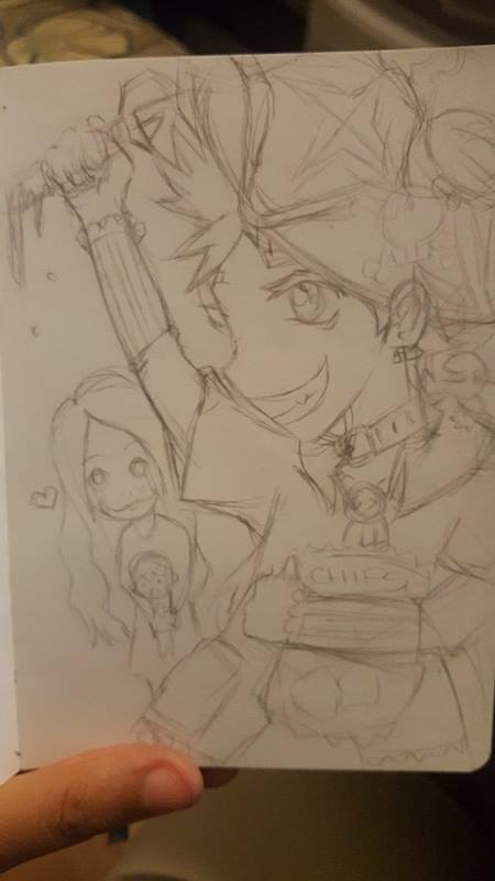
Many people who draw, do it quickly to try and work out each path as a single line during sketching. I instead take short strokes to gauge and compare several angles and similar paths making my rough drawing look coarse, but allowing me more choices for when I clean up in ink.
Inking
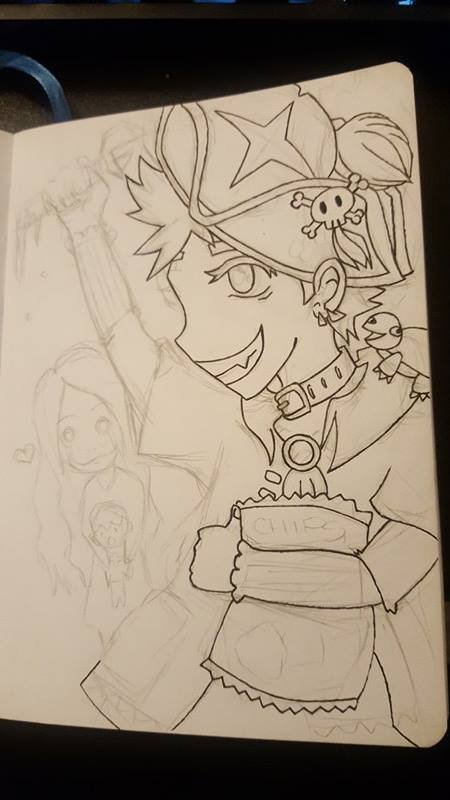
I begin by slowly etching a single path for each line. It doesn't have to be perfect, but should clearly indicate which path I'm taking.
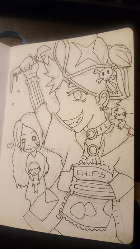
Doesn't look too impressive... Good thing I ink it twice! The first time is like an ink sketch, and the second one is solidifying lines.
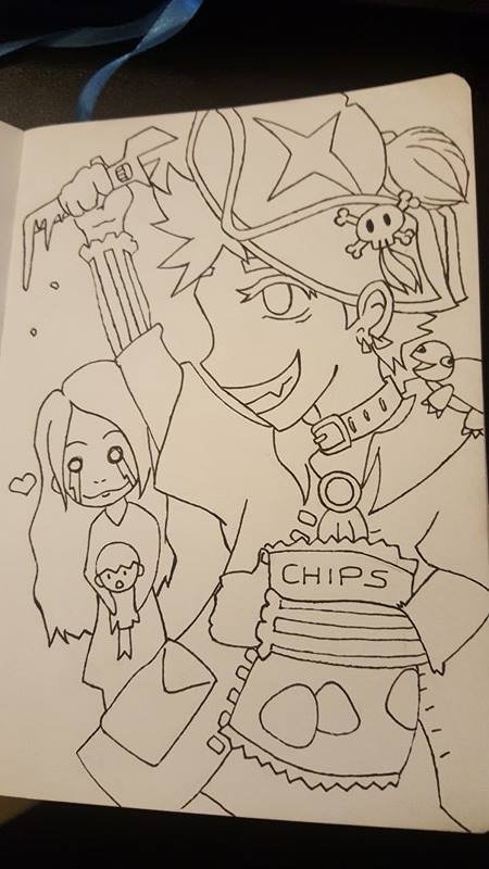
I erase all of the pencil now, so when I pull my pen back out, I can get the lines very clean. My art style uses bold lines to accent, add depth, and to make is easier to colorize. I can't color well manually, so I do what works best for me!
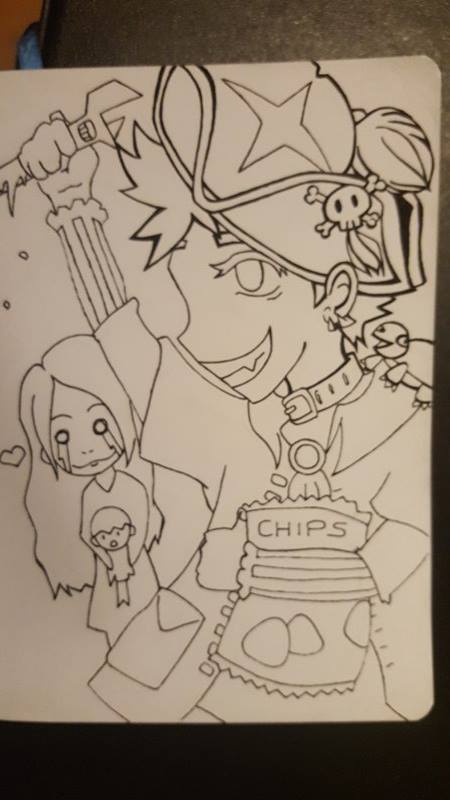
You can already see the difference at the top of @apsu's head here. Drawing bold lines takes more skill than you think it would. You have to decide which side to thicken from, and how you want to bend the line, or sharpen the edges.
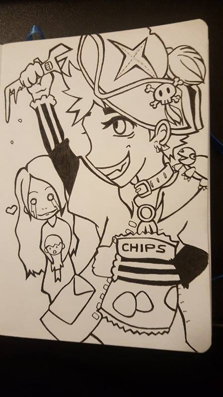
Adding depth and cleaning lines make a huge difference for drawing, and gives you an opportunity to correct mistakes. This ink looks a lot smoother than just doing an outline.
Digital Prep
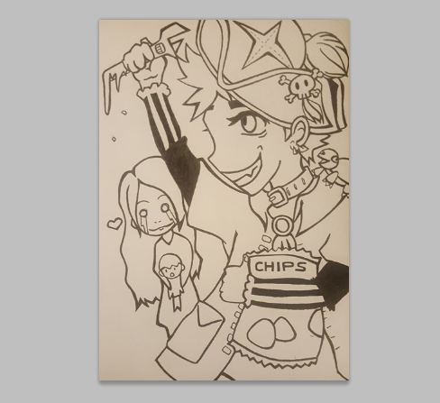
I took a photo with my phone's camera, then opened it up on my computer in Photoshop (CS5). I got the page as flat as I could. Then after opening it, I cropped it to make the image look closer to a digital drawing.
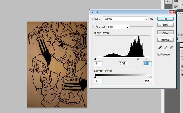
Then pen looks washed out and not dark enough to use. Go to Image> Adjustments> Adjust levels to change how dark and how light different parts of your image are. I drag the middle slider to the right to make the already dark parts of the outline, even darker, gaining contrast to the background. This is important in order to separate the background out to be able to color the image.
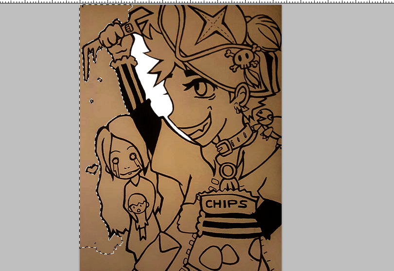
You have to magic wand the entire background of the paper out to make sure that you end with only the ink outline that you can color inside. If you don't know how to do this, I have made a full tutorial here.
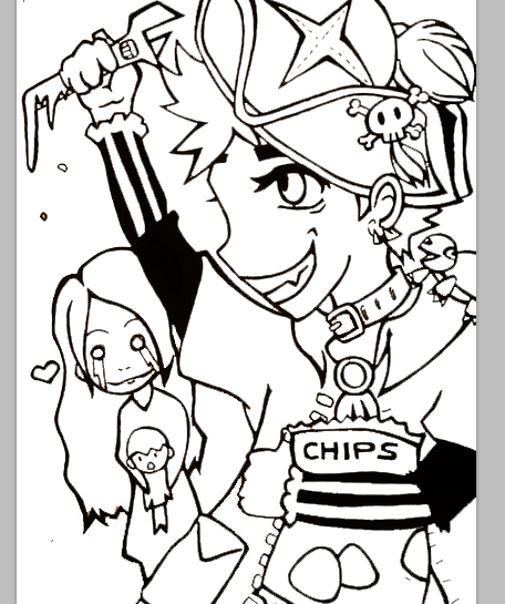
After cleaning the image up I now have 2 layers; an outline that is "see-through" on the inside, and a white background underneath.
Digital Coloring
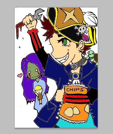
This is what happens if you try to use paint bucket ONLY, inside the outlined area. Because the pen isn't exact, the color doesn't extend fully into the outline. This is a good start, but you also want to duplicate the outline layer (so you have two) BEFORE any coloring takes place.
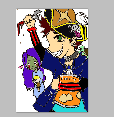
It's extremely hard to tell but this second image has darker outlines because the layer is duplicated. The goal is to paint bucket inside the bottom one and not touch the top one, so that the outline stays consistent and doesn't warp the color.
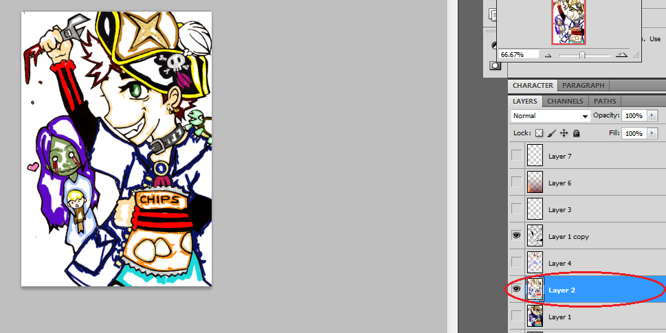
Between your two outline layers, you create a new layer ONLY to color close to the edges. It's important to keep in mind that each layer should only serve one purpose, that way your art can still be modified late into editing. This brush layer (Layer 2) is underneath the top outline (Layer 1 copy), and above the outline you had filled earlier with paint bucket (Layer 1). Only the top outline and brush layer are visible here.
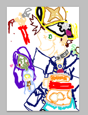
This is what the brush layer looks like by itself, we never color in the top outline to preserve quality.
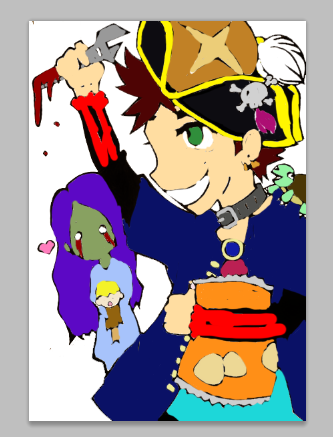
No matter how close you think you can color to the edge, some of it will spill into the outline. Since the brush layer is above the main outline, you need a second outline to create the illusion of coloring perfectly in the lines. If I don't add a top layer outline, my drawing looks like this...
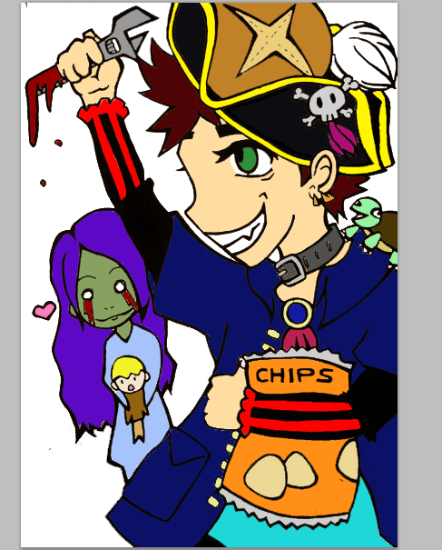
Instead of this.
Effects
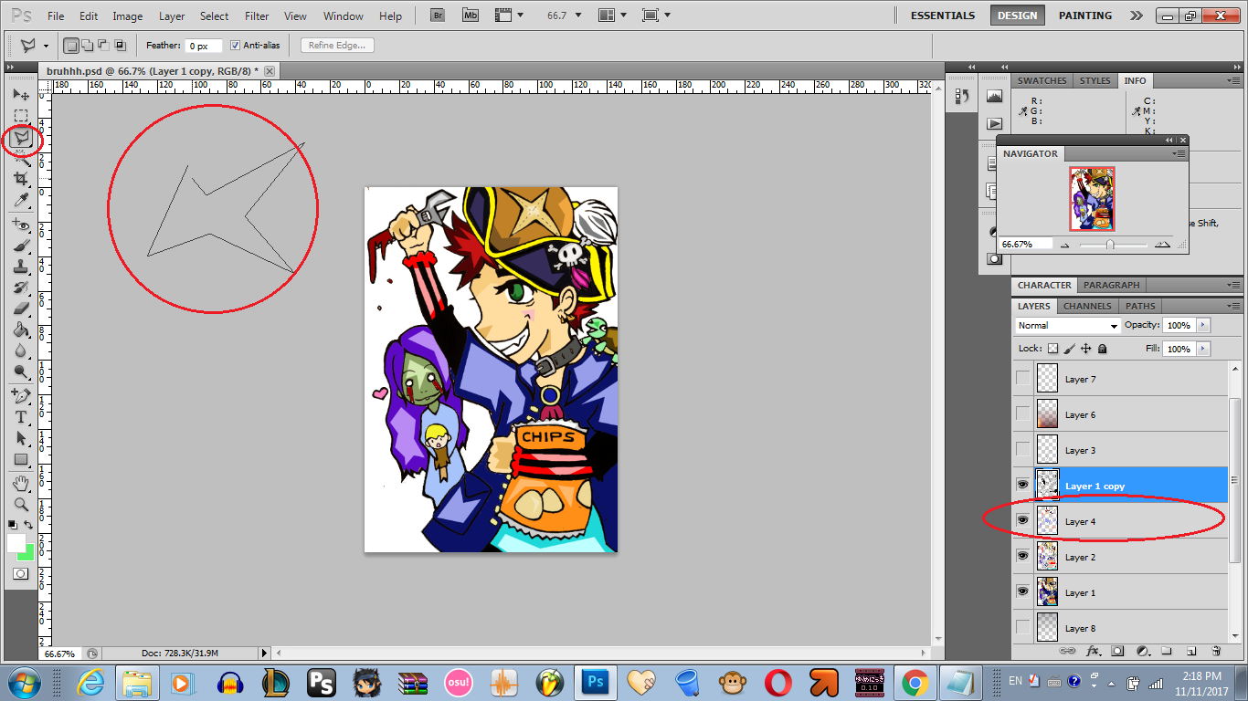
I pull out the polygonal lasso tool, which is fun for making shapes with sharp edges. Right under the top outline, I make a new layer for highlights only. You select where you want to put a highlight, and left click to add another point to the shape (any length/angle you want) and to back-step to the previous point press the delete-key. (Do this on the canvas where you want the shape) Pressing enter while using this tool seals your end point to the beginning as well.
When your shape is ready, you will see a flashing dotted line. Take paint bucket and fill it in with the color of your choice. It will leave ZERO outline.

Here's what it looks like by itself. I use pastels mainly, to give the image a cute/cartoony look in addition to bold lines.
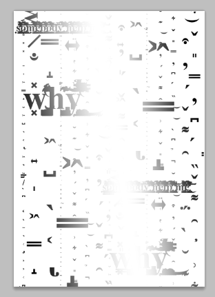
I go to this site to make the same "glitch text" that @apsu uses to creepify his blogs and present a horror appeal in an otherwise normal post. I type some words, copy/paste into PS, and change the font-sizes , right-click and present text as "vertical" and make an assortment as it's own layer. Then I blend option the layer to have a gradient overlay.
This layer goes behind everything except the white background, adding it subtly to the image.

Then underneath the glitch layer, I have a transparent png which looks ashey and Pompeii-esque. That picture is actually a very small section of this larger free use image.
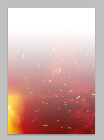
Same goes for this image. It is originally much larger than the tiny section I use to accent and blur between analog and digital. I add this transparency as the new top layer, to "tint" the colors underneath it, giving my drawing a unique color pallet.
Who is Apsu?

That's a good question. From what I know, he is a pirate engineer from Finland. I drew him with a wrench, because he wouldn't be as exciting with a calculator. He is joined by his trusty companion @turtledance24, who is always lurking in the shadows, up to no good.
Be warned! Horror follows @apsu no matter how uplifting and happy his stories may appear to those who... don't read them all the way through. Death and fright bring him delight, who would love someone like that?
His wife must be the undead.
She holds her son, whose face is covered in disbelief from the destruction left behind by @apsu. When not summoning or sacrificing people into a volcano, he enjoys eating snacks... like a lot. As in there is no such thing as too many snacks for this guy. He is the snack lord. -And if that bag of chips isn't enough, he always has the sourdough loaf he baked this morning, tucked away in his hat.
Hello I'm @shello, and this is my entry for the art contest. Thank you!

Oh wow, it is quite a process! Thanks for the wonderful step by step breakdown. Looks great :):)
Thank you so much for stopping by @therneau :3 I draw so slow, I don't even want to admit how long this took! But it was good practice for me as I've been meaning to draw more often! I appreciate the love
shello
Yeah, sure thing. It's only a pleasure :):)
What a sweetheart <3 :D
Well I have to admit, I think this is awesome :D I love how you showed off the process phase by phase and explained what you are doing.
All the details are fun, I had to read into the end why there is a zombie with a baby in the background.. not what I expected it to be :)
Thank you for the entry!
I'm super glad that you like it Apsu! I usually don't draw any more because I can lose days easily just doing one thing xD I felt compelled to enter because it offered me a real challenge. Hahah, I also don't know what you're wifey looks like so this is what I thought. You're a pretty awesome friend, and Steemit needs more great users like you ^_^
Happy one year again!
It's nice to hear someone call me challenging ;_;
I mean, of course I loved it. My wife doesn't look quite as much like a zombie (most of the days) but otherwise it might be really close to her :)
Thanks and you too, we need more shellos in Steemit!